


Famous logos with apostrophes: Brands with apostrophes in their logos
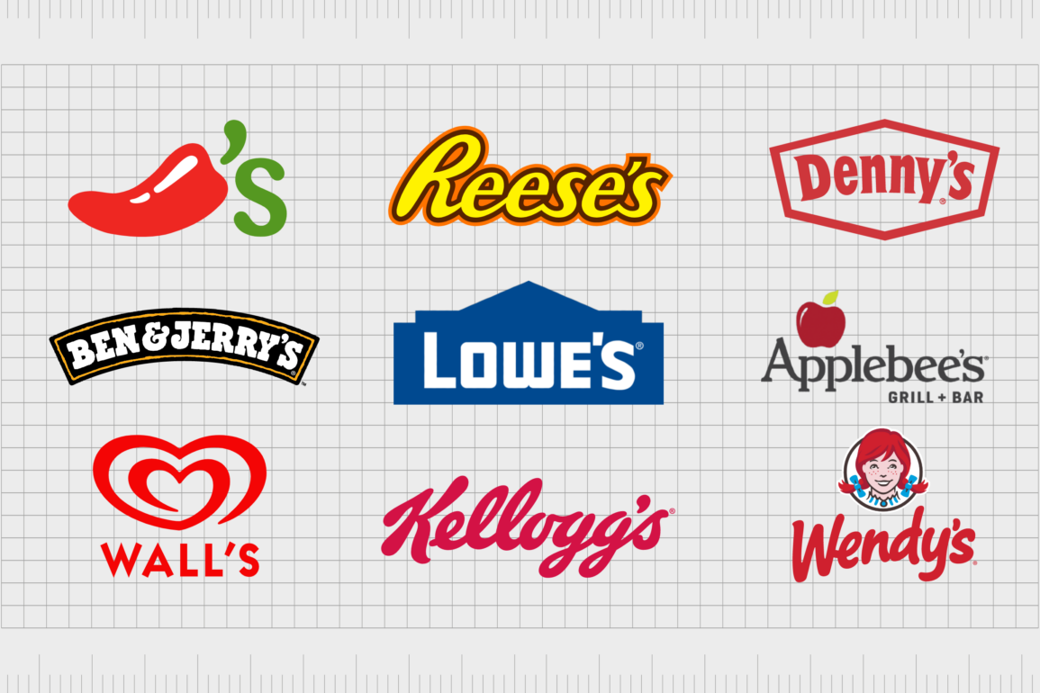
Famous logos with apostrophes aren’t as common today as they once were.
Apostrophes and good grammar may be an essential part of the English language, but they don’t always work well in branding. After all, many of today’s business leaders are attempting to simplify their logos and imagery, leading to the abandonment of various characters.
Apostrophes in logos also have a few issues for companies shifting into the new world of online selling.
As the digital world continues to evolve, many searching for businesses online won’t use the right grammatical components on a search engine. This can make some companies harder to find if their apostrophes are critical to their names.
Despite this, there are still various examples of famous brands with apostrophes in their logos. Sometimes, using these components can help enhance the imagery of the business by providing an extra differential embellishment.
What brands use an apostrophe in their name?
Apostrophes are complex grammatical constructs. They’re commonly misused, not just by consumers but by businesses too. This can attract many negative customer discussions when a company misuses an apostrophe.
A common trend in the business landscape involves removing apostrophes from logos and names entirely. This has occurred for large organizations like “Barclays,” which removed the apostrophe after the company stopped being associated with the family who founded it.
When brands use apostrophes in their name, it’s often for two distinct purposes.
The first is to denote possession. A company like “Barclays,” attempting to highlight the business belonged to a specific family, might have used an apostrophe for some time.
The other reason to use an apostrophe in a logo or business name is to replace a letter. We’ve seen this among companies attempting to attract a younger audience with a more colloquial appeal.
Dunkin’, for example, uses the apostrophe to replace the letter “g” from the word “Dunking,” and make the brand appear more unique.
Famous brands with apostrophes in their logos
The number of famous logos with apostrophes has begun to drop over the years as business leaders look for ways to simplify their image.
However, there is still a wide range of organizations that have retained their apostrophe, either to ensure consistently good grammar or to reference the sophistication of the business.
Today, we’ll look at some of the better-known companies with apostrophes in their logos and how they enhance the business image and personality.

1. Kellogg’s
Perhaps one of the best-known examples of famous logos with apostrophes comes from the cereal company Kellogg’s, or the “Kellogg company.”
This business was initially launched in 1906 by Will Keith Kellogg. The apostrophe in this title is a reference to ownership, highlighting the company’s connection with its creator.
The Kellogg’s logo results from the organization wanting to create a nourishing image that also offers a hint of luxury.
It’s a simple wordmark designed in script font to look almost like a signature. This adds to the personal and human nature of the company’s branding and helps to make it more appealing to families.
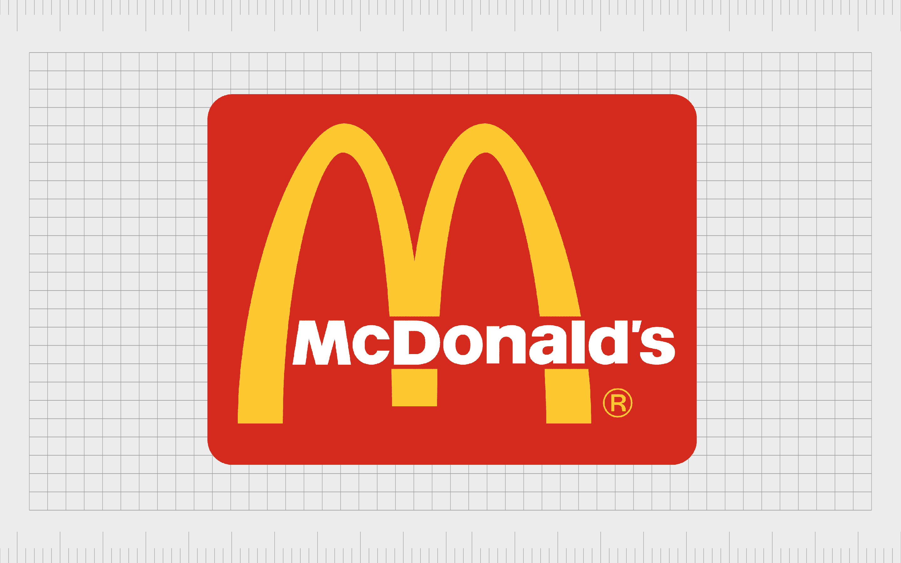
2. McDonald’s
Another excellent example of a brand name with an apostrophe, McDonald’s previously drew attention to its full name in its image. However, it has since evolved to remove the wordmark entirely, now focusing only on the “golden arches” most commonly associated with a brand.
The use of the apostrophe in the McDonald’s name is once again a reference to the name of the founder and the ownership he had over the company.
As many people struggled to remember whether an apostrophe was actually present in this name over the years, McDonald’s eventually scrapped the design, leading to the image we know today.
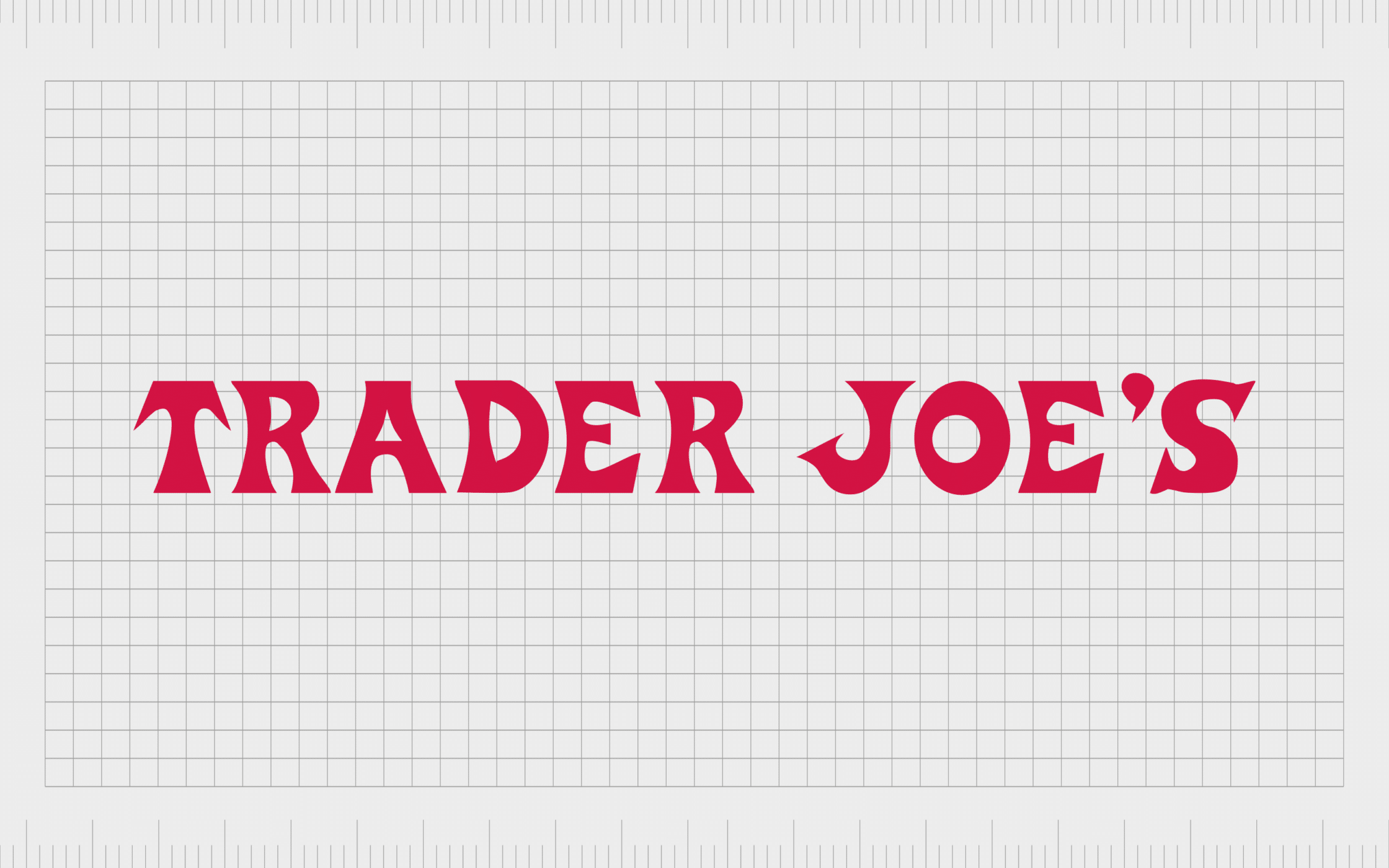
3. Trader Joe’s
Trader Joe’s is an American chain of grocery stores first launched in 1958 with a relatively old-fashioned wordmark.
The logo of Trader Joe’s features stylized serif font intended to look fun and funky to attract a wide range of customers. The color red is a symbol of passion, making it a good choice for a place that sells a wide range of necessary goods.
Supermarkets and grocery stores with a strong family-focused image generally use apostrophes in their name as a way of delineating possession.
In the case of Trader Joe’s, the company’s apostrophe is a reference to the name of the founder, Joe Coulombe, who wanted to open a family-friendly grocery store.
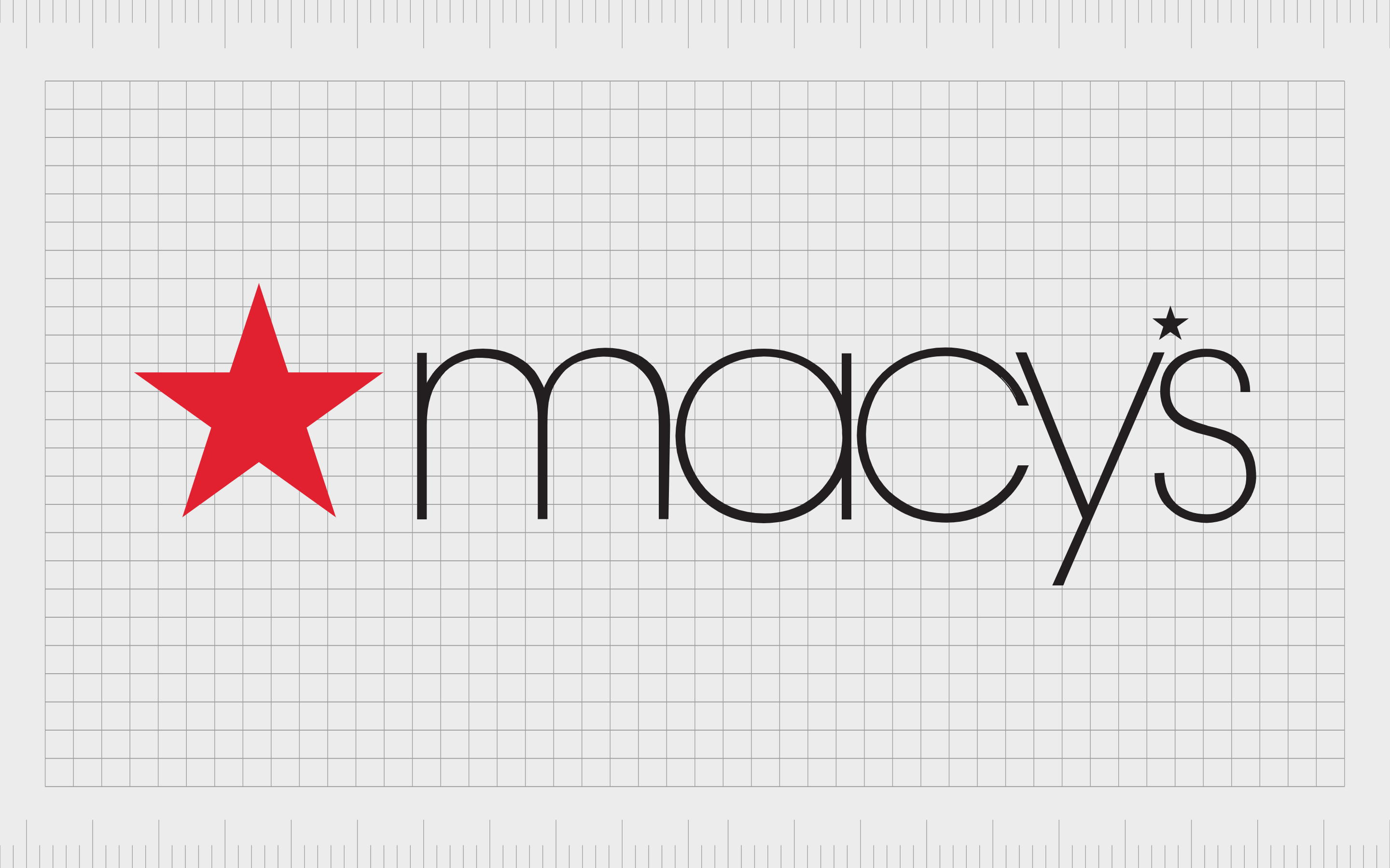
4. Macy’s
Macy’s is an interesting example of brand logos with apostrophes. Unlike most companies, Macy’s removes the apostrophe in its image and replaces it with a star – a key symbol for the business. The organization specializes in retail and clothing sales and was first launched in 1858.
One of the largest department stores in the United States, the Macy’s brand has taken the country by storm since its initial inception and updated its branding a number of times in the process. The Macy’s logo today features two stars to reference excellence and superiority.

5. Levi’s
Otherwise known as Levi Strauss & Co, Levi’s was originally introduced in 1853 as an American clothing company. The brand is now known around the world for its denim jean products. Over the years, Levi’s has branched out to multiple locations globally.
Levi’s logo today is simple, bold, and effective.
The “batwing” logo combines the shape of a rectangle with two curves at the bottom. The wordmark, depicted in thick, block typography, is an insight into the confidence and strength of the brand. The apostrophe in this image is also a reference to the company’s founder, Levi Strauss.
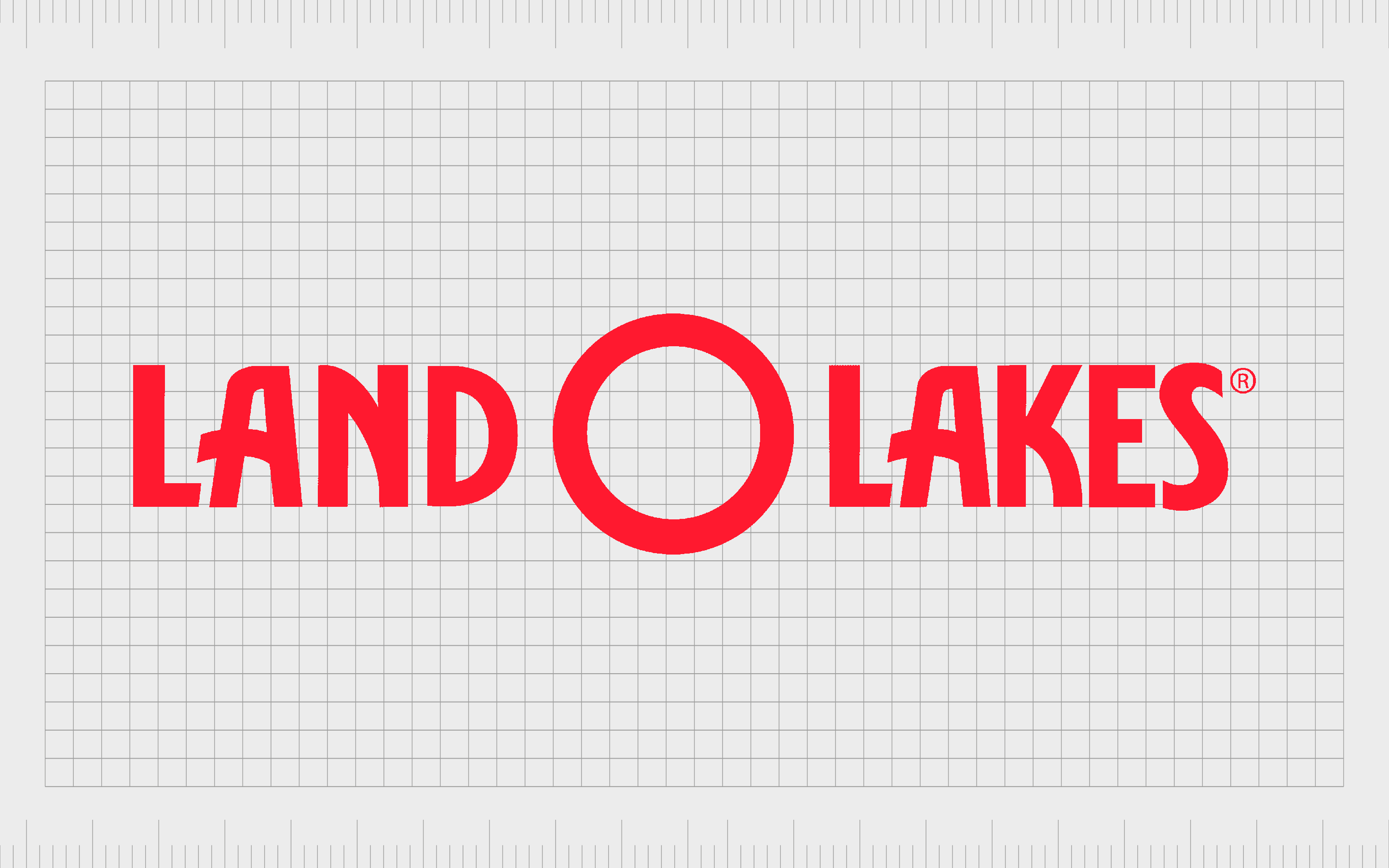
6. Land O’ Lakes
An agricultural cooperative from the United States, Land O’ Lakes was first launched in 1921 and focused primarily on the dairy industry. The company produces around 12 billion pounds of milk per year, and it’s one of the top Co-Op companies in the world.
Land O’ Lakes uses its apostrophe to replace the letter “F” in “Of” to make the name seem more friendly and approachable.
The overall logo of the company is simple and modern, using block typography in deep grey coloring to demonstrate sophistication and professionalism. The image also includes the “Inc” component for incorporation.
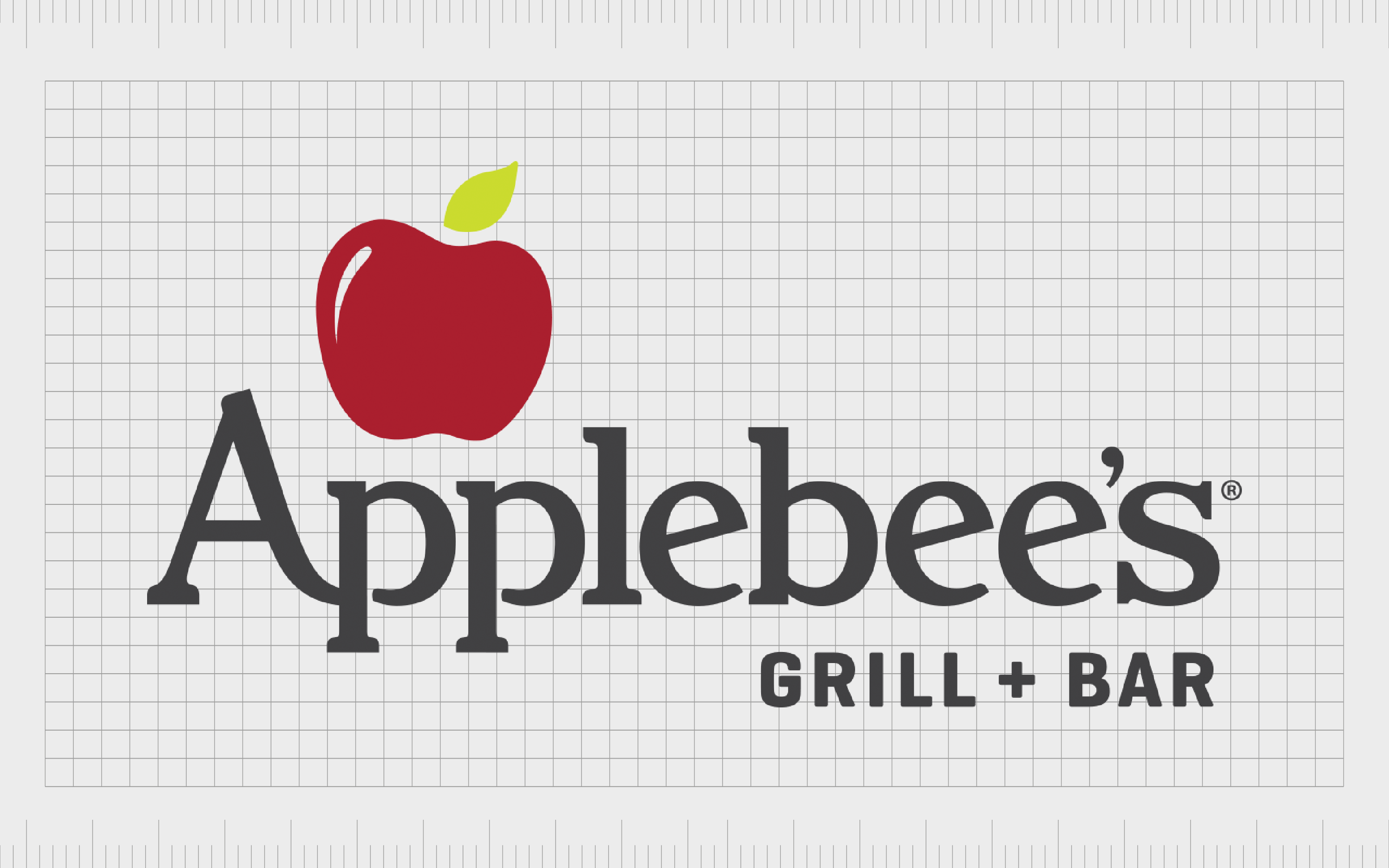
7. Applebee’s
Logos with apostrophes are perhaps most common in the fast food and catering landscape.
Many popular restaurants and eateries use logos to demonstrate a sense of ownership. This is the case with Applebee’s restaurants, an American company that first launched in 1980. This company is one of the biggest casual dining groups in the USA.
The Applebee’s logo is simple and eye-catching. The wordmark is a sans-serif typography design, where the letters “A” and “P” seem to be connected. The apostrophe in the wordmark is very subtle and easy to miss. There’s also a large image of an Apple included in this emblem.
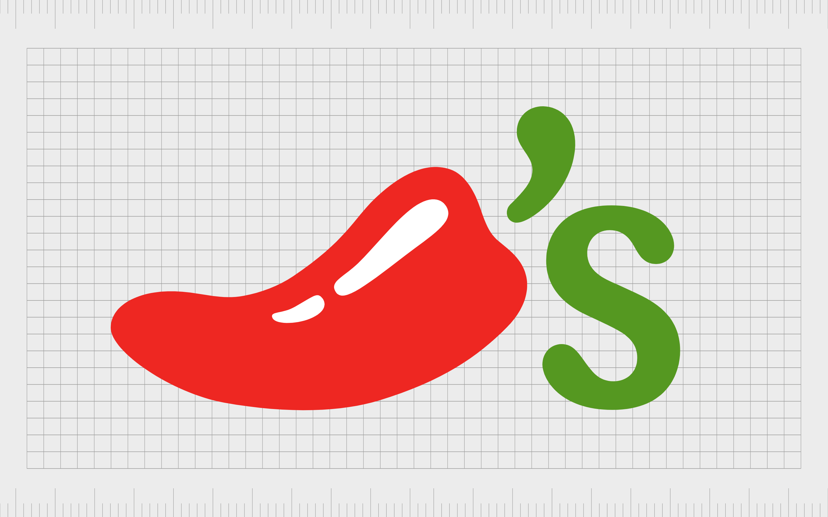
8. Chili’s
Another example of a well-known eatery with an apostrophe in its logo, Chili’s takes a unique approach to adding this grammatical element to its image. The Chili’s bar and grill was first launched in 1975, focusing on delivering a range of different foods to people across the United States.
In the past, the company did use a wordmark with an apostrophe in the shape of a chili. Now, the updated image uses the apostrophe as the stem of the Chili, with the “S” placed next to it in a bold green sans-serif font.
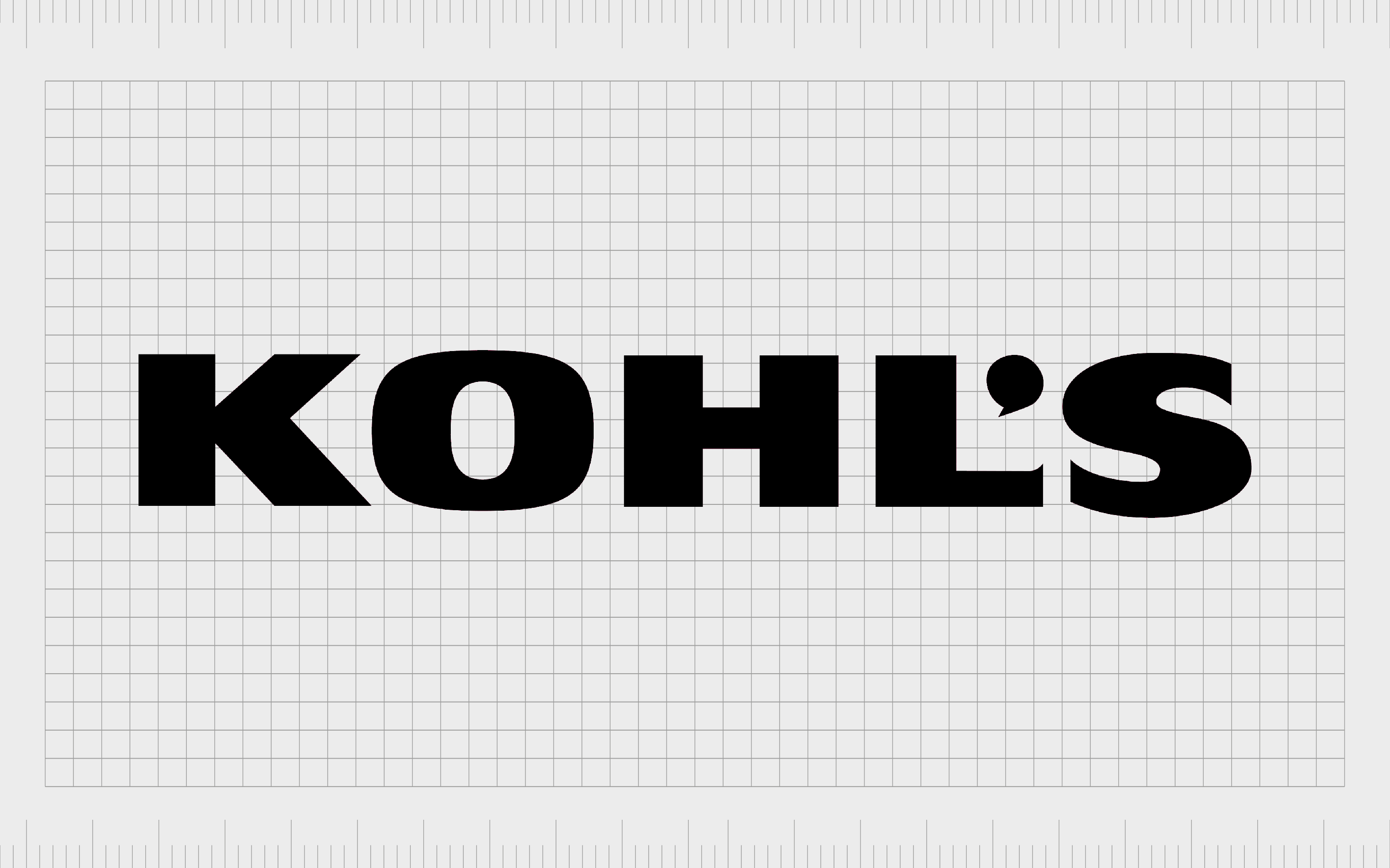
9. Kohl’s
Launched in 1962, Kohl’s is a popular American department store and retail chain.
It’s currently the largest department store group in the United States, with more than 1,100 locations in virtually every state outside of Hawaii. The company was founded by Maxwell Kohl as a corner grocery store in Wisconsin before it expanded.
The Kohl’s name and logo are a reference to the founder who initially created the company, so the apostrophe in this image makes sense. The overall logo is a bold and confident wordmark in sans-serif black font. The apostrophe itself is rounded to symbolize community.
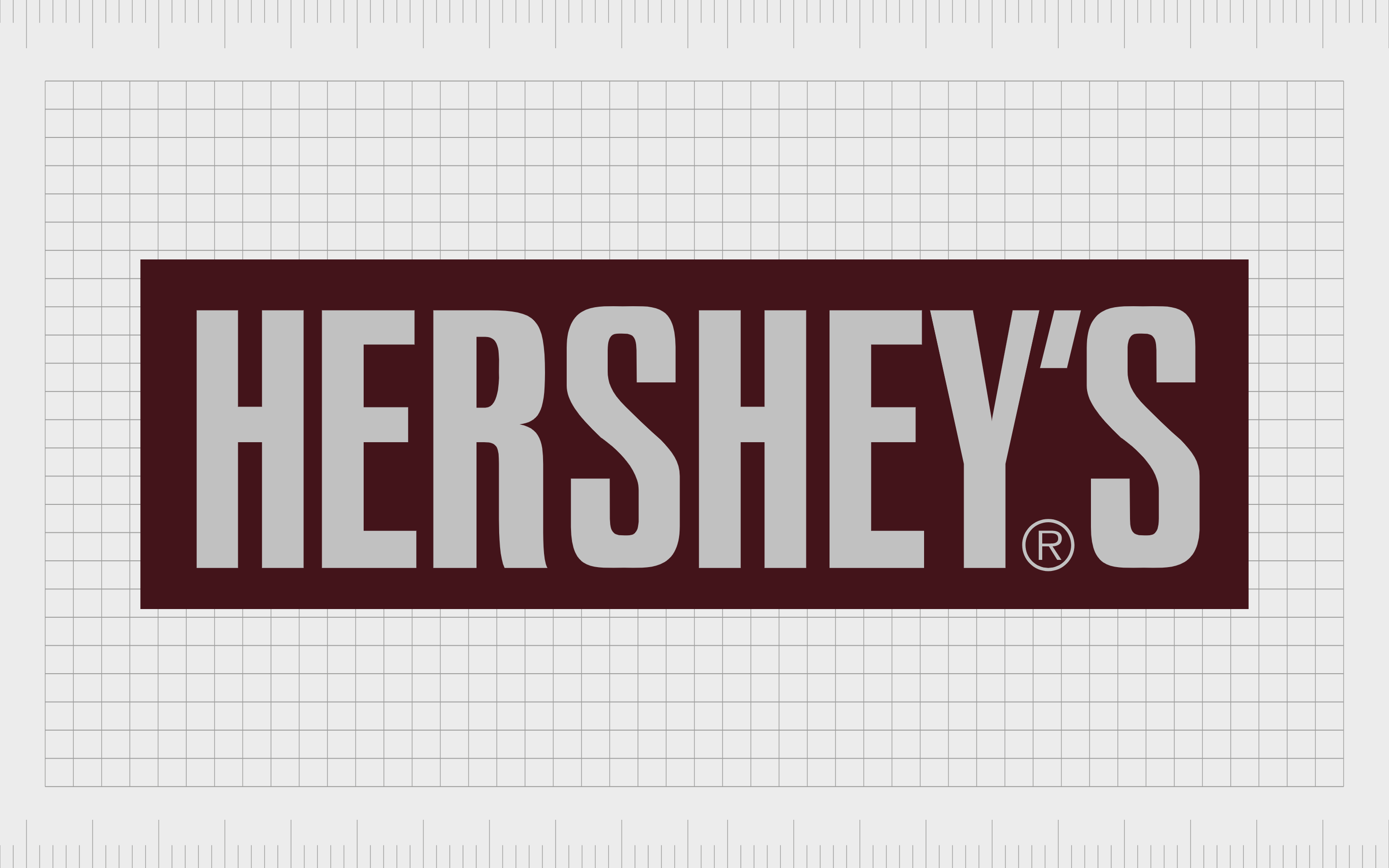
10. Hershey’s
Perhaps the most well-known chocolate company in the United States, Hershey’s, or the Hershey company, is an American multinational company responsible for various baked products and beverages.
While the apostrophe has been removed from Hershey’s logo over the years, it remains an important part of the company’s name.
Hershey’s previous logo demonstrated the apostrophe in a large and bold wordmark. However, the company has simplified its image to be “Hershey” in recent years. This may have been due people’s inability to remember whether an apostrophe was necessary.
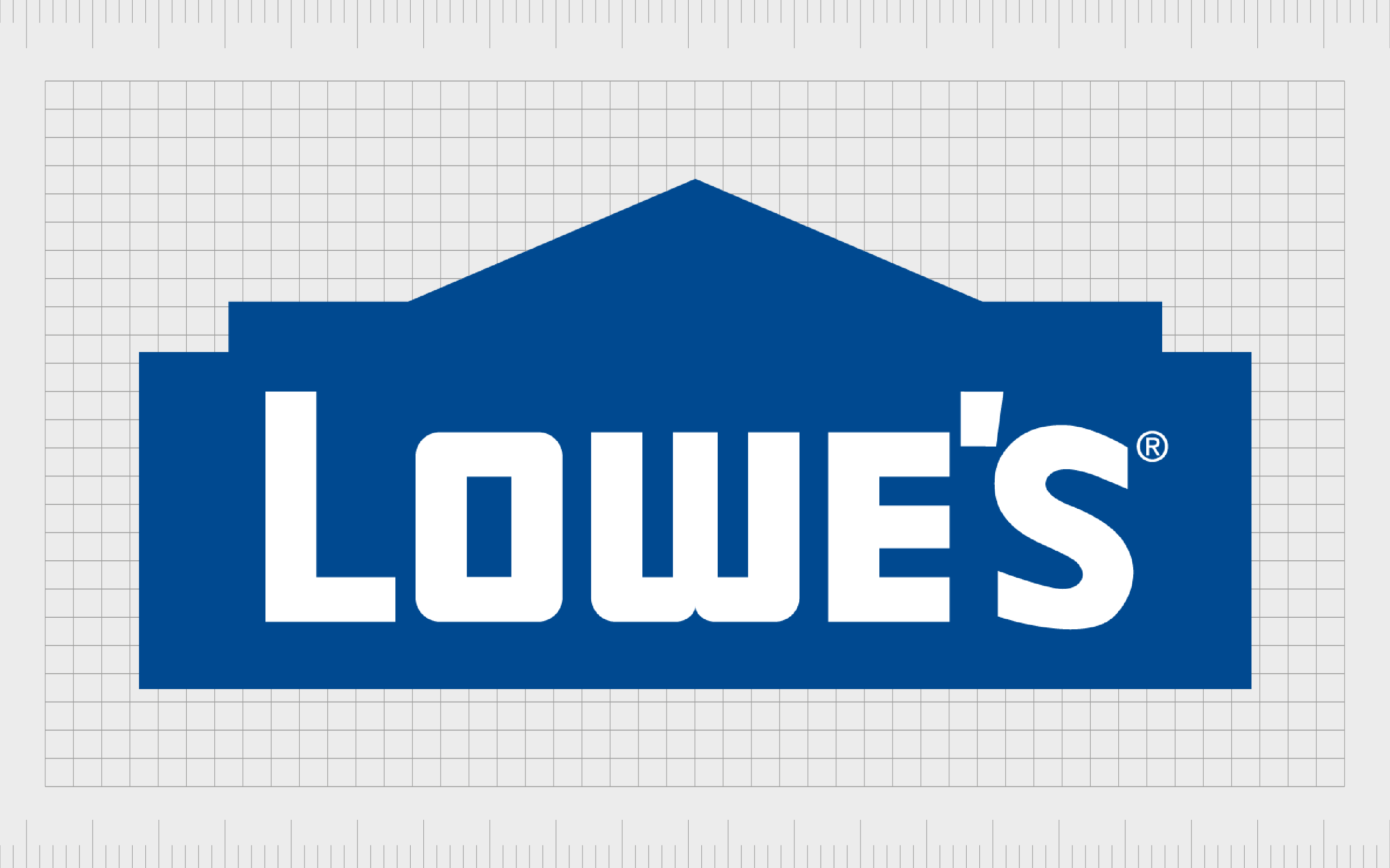
11. Lowe’s
One of the better-known logos with apostrophes in the American market, Lowe’s Companies Inc is an American retail brand focusing on home improvement. The company was initially launched in 1921 and was founded by a man named Lucius Smith Lowe, who gave his name to the business.
The apostrophe in the Lowe’s logo is a reference to the founder’s ownership of the brand.
The overall image of Lowe’s is trustworthy and reliable thanks to the colors white and blue. The image of the house shape behind the wordmark also reminds customers of home improvement and DIY projects – the main focus of the business.
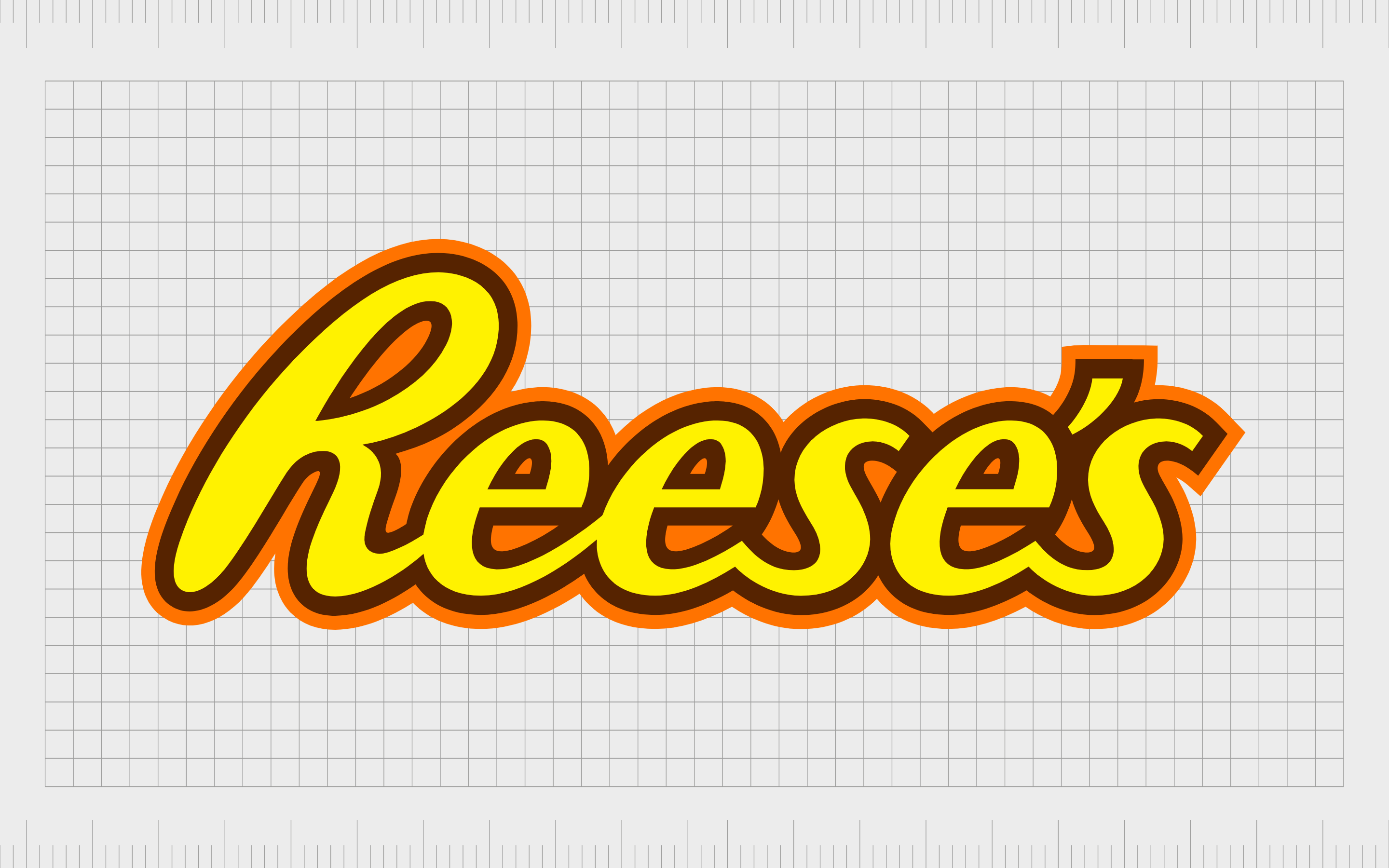
12. Reese’s
The Reese’s logo is particularly well-known throughout the American landscape, but it has begun to have an impact in other regions of the world, too.
Best known for its chocolate and peanut butter creations, Reese’s is a confectionary company first launched in 1928. The organization is owned by the Hershey Company, and was first created by H.B. Reese, hence the use of the ownership apostrophe in the title.
The Reese’s logo is a playful and eye-catching image depicted in the colors brown, yellow, and orange. The slightly cursive nature of the font makes it look similar to a signature.

13. Wendy’s
Another excellent fast-food logo leveraging the use of an apostrophe in its image, Wendy’s has one of the most recognizable images in the world. The company was first introduced in 1969, and the name was chosen as a reference for a nickname for one of the founder’s daughters.
The Wendy’s logo uses an apostrophe as a symbol of ownership, like many of the examples mentioned. There are also various other interesting elements to this logo, such as the “Mom” shape in the neck of the character and the picture of Wendy herself.

14. Denny’s
Denny’s, sometimes referred to as Denny’s diner, was first introduced to the American fast-food market in 1953. Today, it is one of the largest diner-style restaurant chains in the world. The Denny’s company was initially a coffee and donut shop created by Harold Butler and Richard Jezak.
Like many of the brand logos with apostrophes mentioned, Denny’s uses an apostrophe in its image to reference ownership, although in this case, there’s no reference to the company’s founder.
The overall brand emblem is a fun and quirky symbol with a stylized font that seems to be bouncing off the page.
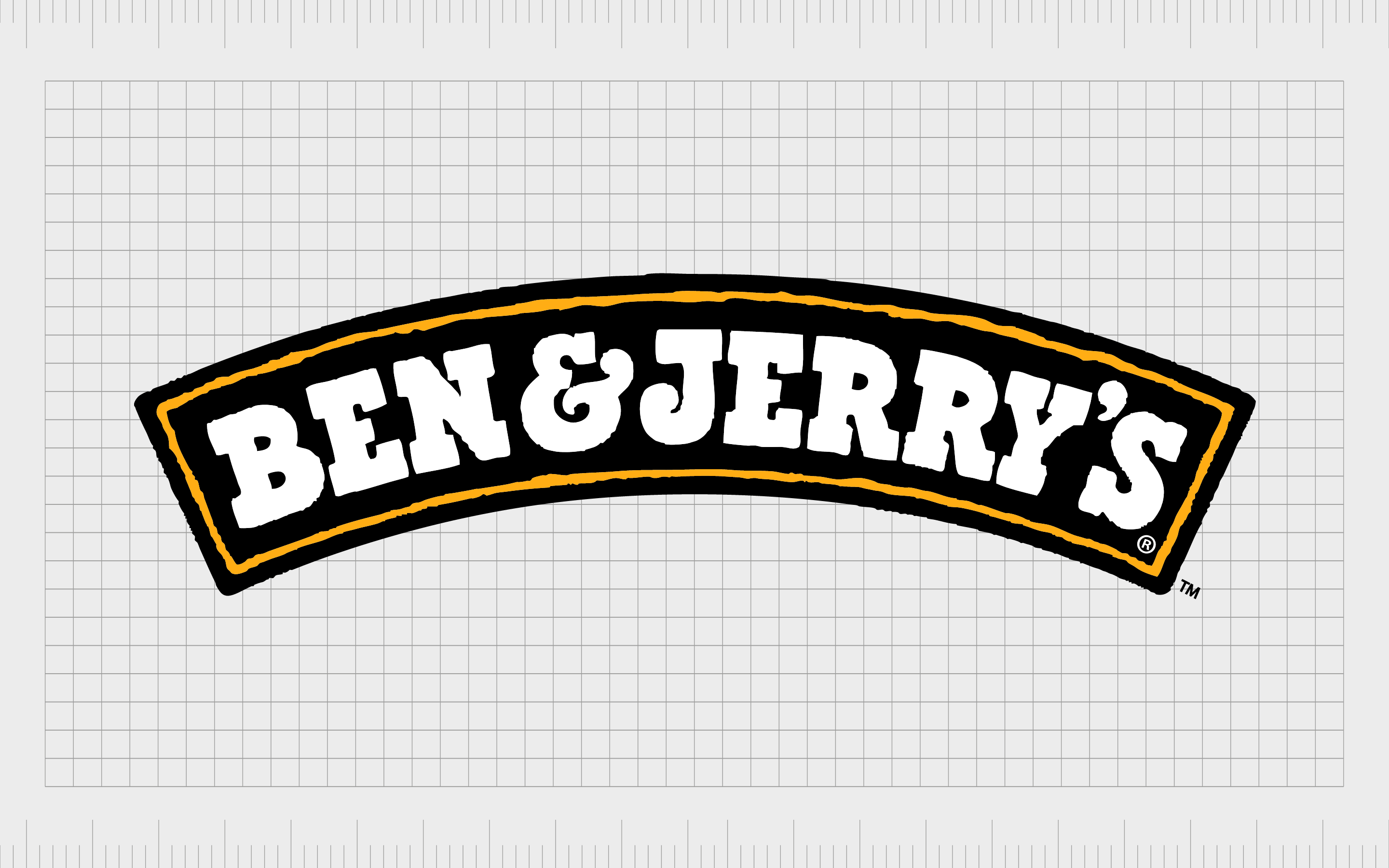
15. Ben and Jerry’s
Similar to fast-food restaurants, ice cream and confectionary companies often use an apostrophe in their logos, too, usually as a reference to the founders of the brands.
The Ben & Jerry’s ice cream company was initially created in 1978 by Jerry Greenfield and Ben Cohen. The name of the business is based on the names of these two men.
Fun and textured, the Ben and Jerry’s logo is shaped into a curve to remind us of smiles, rainbows, and even the rising sun. The Ben and Jerry’s font choice is artistic and decorative to make customers think of the creativity which goes into the company’s ice cream flavors.
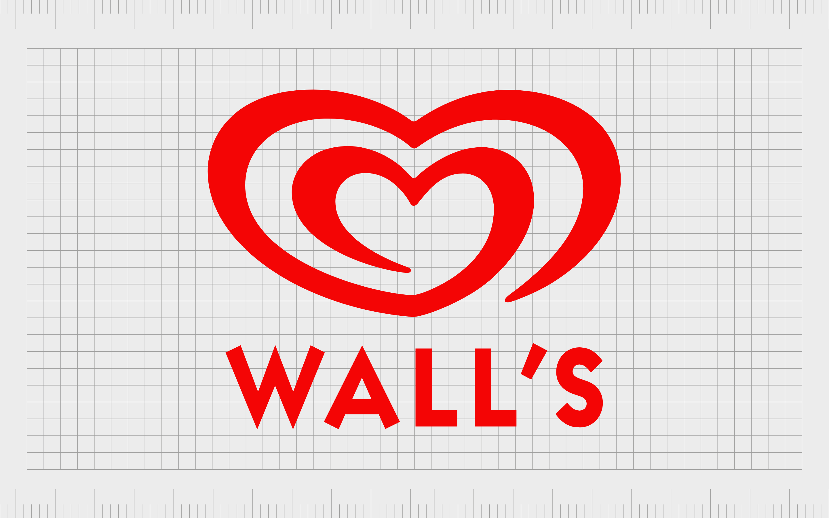
16. Wall’s
Like many brands with apostrophes in their logos, Wall’s uses its apostrophe to signal the ownership of Richard Wall, the founder.
Wall’s is a British frozen dessert and ice cream brand that first launched in 1922 and is currently owned by Unilever. The organization also owns the rights to soft-serve ice cream mixes from Mr. Whippy.
The Wall’s logo is a fun and fresh image, combining a wordmark with a symbol similar to a swirling heart. The image is meant to demonstrate compassion and love while reminding us of the shape of soft-serve ice cream as it’s distributed into a bowl.
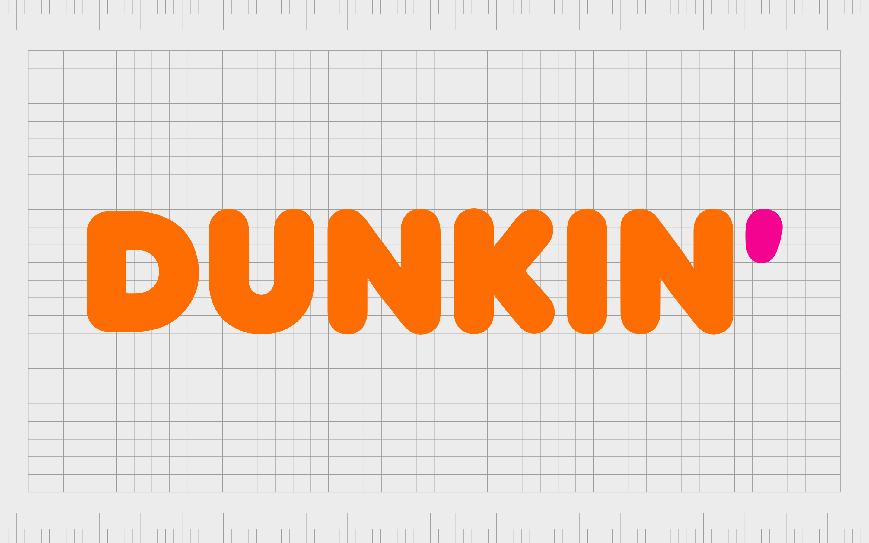
17. Dunkin’
Previously known as Dunkin’ Donuts, Dunkin’ is one of the most popular quick-service restaurants in the United States, as well as a leading coffee and donut company. The business was initially launched in 1950 and was created by Bill Rosenberg.
Over the years, this business has simplified and enhanced its logos multiple times. The current Dunkin’ Donut’s logo is the most minimalist of the images created by the company, removing the “Donuts” element entirely.
However, the apostrophe still remains and stands out in a separate color from the rest of the wordmark. Unlike other companies, Dunkin’ uses its apostrophe to replace a letter. The removal of “Donuts” was to draw attention to the versatility of the brand.
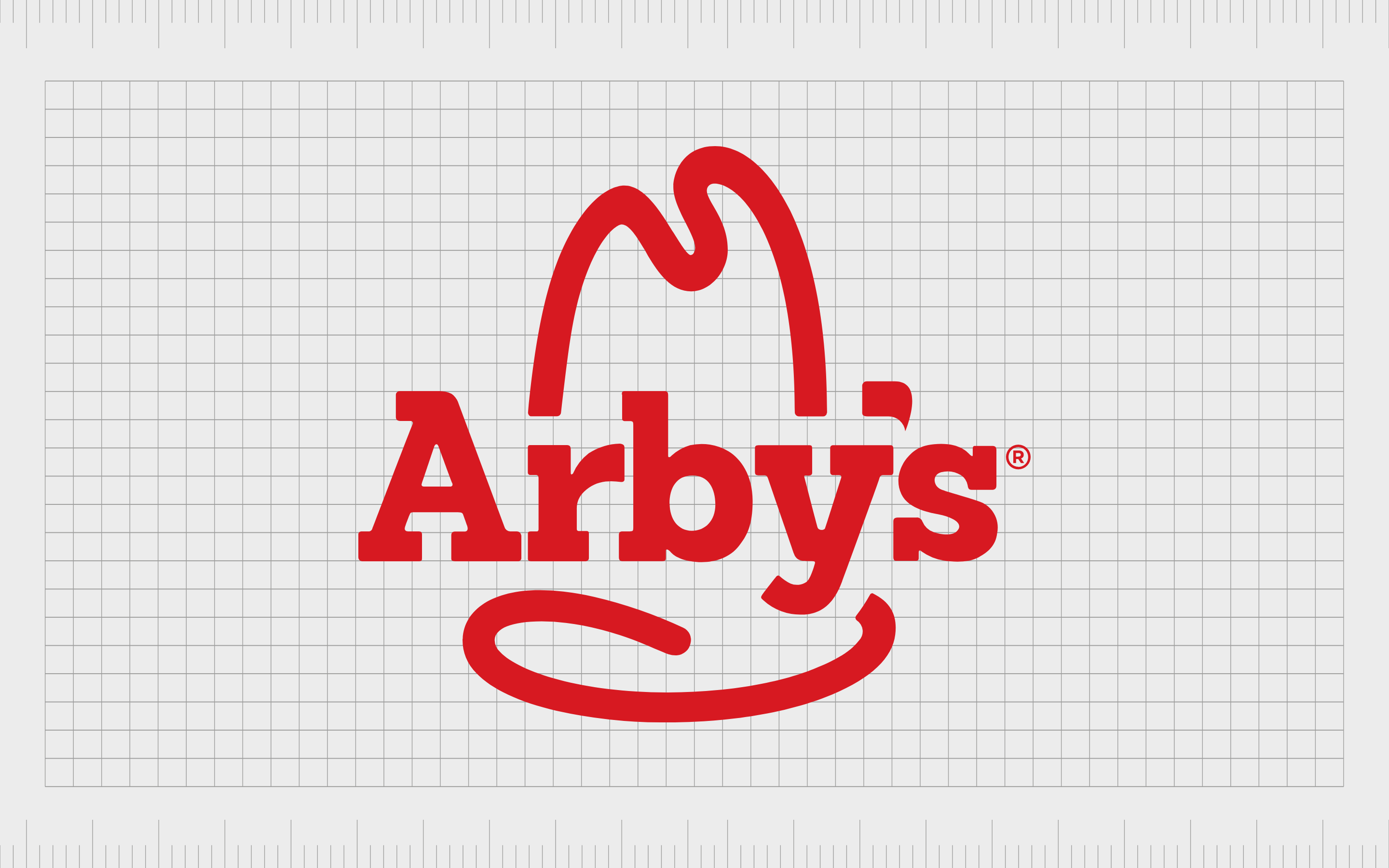
18. Arby’s
One of the most popular fast-food sandwich restaurants in the United States, Arby’s has developed a strong global following. The company was initially launched in 1964 and was created by a pair of brothers.
Interestingly, the name “Arby’s” was chosen based on the letters “R” and “B,” the initials of the Raffel Brothers.
The Arby’s logo uses an apostrophe as a symbol of ownership relating back to the initial founders. The overall image is a reference to the Texan-style foods of the company and its focus on various western dishes with a large, simplified hat behind the wordmark.
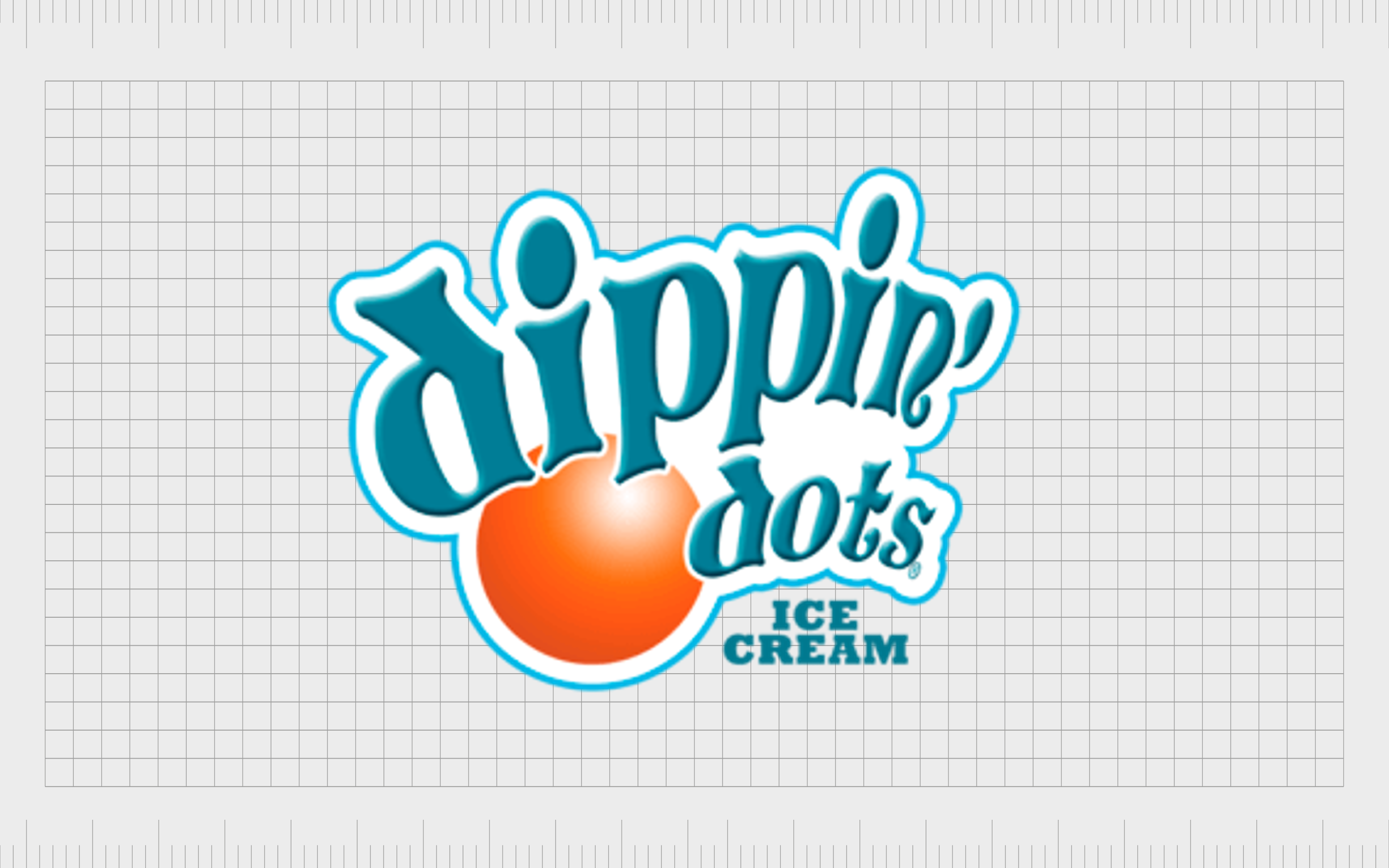
19. Dippin’ Dots
Dippin’ Dots is one of the more famous ice cream snacks in the United States, originally created by Curt Jones in 1988. The confectionary treat is designed by flash-freezing an ice cream mixture in liquid nitrogen.
Made by Dippin’ Dots Inc, the product is sold across 14 countries and requires specialist storage. The name “Dippin’ Dots” was chosen as a descriptive title for the treat.
The apostrophe in this brand name is intended to make the company and food product feel more approachable to its audience.
Dropping the “g” in “Dipping” helps the name seem more fun and engaging. The name works well with the light-hearted and playful nature of the overall logo, which includes bright colors of teal and orange.

20. Dreyer’s
Another popular ice cream brand with an apostrophe in its name, Dreyer’s was introduced in 1928 by two men, Joseph Edy and William Dreyer.
The two came up with two signature names for the business, based on their own names, Edy’s, and Dreyer’s, both of which used the possessive apostrophe to demonstrate ownership over the brand.
Today, Dreyer’s is a fun example of logos with apostrophes because the apostrophe in the logo is stylized to look like an ice cream cone.
The Dreyer brand also uses a highly traditional-looking emblem, with a serif font to demonstrate history and heritage and a golden and brown banner. There’s even a tagline “scooping since 1928.”
Are logos with apostrophes a good idea?
While logos with apostrophes are somewhat less common today, there are still plenty of excellent examples out there. Brands with apostrophes in their logo generally use them not just for grammatical purposes, but to make a statement about the origins and personality of the company.
An apostrophe can be a chance to showcase a friendly and youthful attitude within a company. This is often the case with organizations that drop a letter from their name to replace it with an apostrophe, like Dippin’ Dots, or Dunkin’.
An apostrophe can also add a fun embellishment to a logo, as is the case with the Chili’s logo, and the Dreyer’s ice cream emblem.
At a basic level, an apostrophe simply highlights where the company began, drawing attention to the name of an initial founder or someone involved with the conception of a business.
While apostrophes can serve an important purpose in a business name and logo, they also have some challenges associated with them.
It can be difficult to make an apostrophe stand out in a logo, and it may cause some confusion among people who aren’t sure whether a title should be spelled with grammatical components or not.
As with virtually any brand naming or logo creation decision, it’s generally a good idea to speak to the experts if you’re not sure which strategy will work best for you.
Exploring apostrophes in logos
Logos with apostrophes can serve an important purpose in identifying the history, personality, and nature of a brand. Chosen and used correctly, they can assist a business in making the right impression on an audience, but it’s important to be cautious.
If you’re not sure whether joining the list of brands with apostrophes in their logo is a good choice for your business, consider working with a naming agency and logo expert before you dive in. A little extra planning can ensure you leave a lasting impression on your audience for all the right reasons.
More than anything else, it’s best to ensure the apostrophe actually makes sense in your logo, or you risk losing credibility and harming your reputation.
Fabrik: A branding agency for our times.

Clarity starts with a conversation.
Thanks—we’ll get back to you shortly.
Whether you're navigating a rebrand, merger, or simply need a clearer identity—we’re here to help. No hard sell, just honest advice from people who know the sector.
Let’s start with a simple question…
Prefer to email? Drop us a line.
Fabrik’s been helping organisations rethink and reshape their brands for over 25 years. We’ve guided companies through mergers, rebrands and new launches. Whatever stage you’re at, we’ll meet you there.