


Heineken logo history: The story of a global beer brand
Easily one of the better-known emblems in the world of alcoholic beverages, the Heineken logo is recognizable all over the globe today. Its bright color choices and simple yet compelling design have helped to transform Heineken into one of the industry’s most memorable brands.
While most people are familiar with the Heineken logo as it stands today, few know much about the Heineken logo history or where the emblem first came from.
Like many long-standing organizations, Heineken has made several changes to its brand identity over the years, adapting to suit the changing trends of a modern audience.
The Heineken logo is an excellent example of how a simple graphic or motif, like a wordmark with a red star, can capture the hearts and minds of a huge audience.
Today, we will be taking a closer look at the Heineken brand, its visual identity over the years, and the unique components of its logo.
The Heineken emblem: Introducing Heineken
Heineken is a Dutch brewing company, first founded in 1973. The company is best known for its iconic visual identity, which features various elements, from an eye-catching logo, to a signature green bottle (or can) with a red star motif.
Though Heineken was officially founded in the 1800s, its origins date back even further to a brewery on the Amsterdam Nieuwezijds Achterburgwal canal.
A man named Gerald Adriaan Heineken purchased the brewery in 1864 and hired an innovator named Dr. Elion to develop a new yeast for a specific kind of fermentation.
At the same time, the founder established Heineken’s Bierbrouwerij Maatschappij company, and the first Heineken beer was created.
Even in its early years, Heineken quickly gained a lot of popularity and accolades. The beer won four awards between 1875 and 1900 for its high-quality beer products. Some of these awards are still mentioned on the labels of certain Heineken products.
Heineken meaning: What does Heineken mean?
The Heineken beer company is named after its founder, Gerald Adriaan Heineken. However, the word “Heineken” in German also has its own meaning: “to write.”
Heineken logo history: The evolution
Today, the Heineken logo is an instantly recognizable emblem featuring a green wordmark with a red, five-pointed star. However, the design went through a number of changes throughout the company’s extensive history.
Let’s take a closer look at where the Heineken logo history began.
1864
The first Heineken logos produced for the brand were similar in style to the emblems chosen for many beer companies at the time. To begin with, the company chose a blue oval badge with a picture of the iconic brewing factory in the center.
The original name for the Heineken company was also placed around the border of the oval in white.
In 1973, this logo was updated, featuring a new color palette with a lot of similar elements. The brewing building image was removed to draw more attention to the Heineken name. Additionally, shields were added, similar to a coat of arms, on either side of the oval badge.
1884
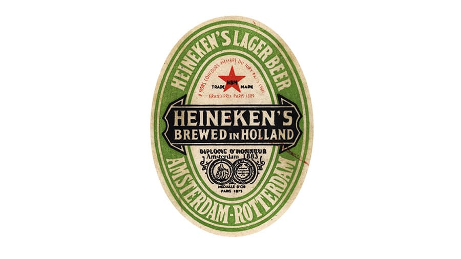
The first instance of the Heineken green color palette emerged in 1884. The new emblem maintained its oval shape and was divided into three sections, with the name of the company on the bottom and the location where it was founded on the bottom.
In this design, the words “Pilsner Bier” were included in a banner across the center of the oval, and a five-pointed star was placed above the banner, with the letters “HBM” in the middle.
In 1889, this design was updated slightly. While many of the elements remained, the green coloring was made slightly darker and more intense. Some red inscription was added around the star, marking the introduction of the core color palette for the Heineken brand.
For some time, the Heineken logo remained untouched in the international market.
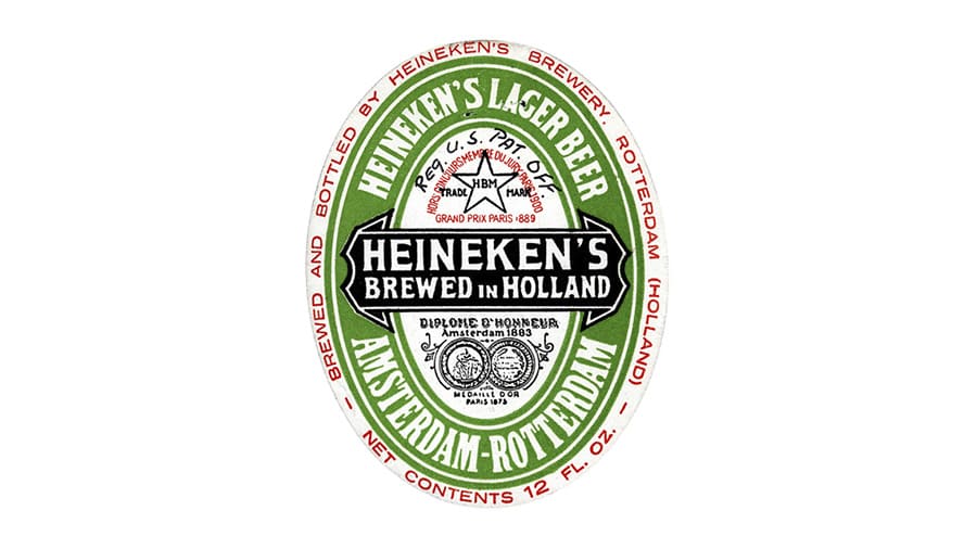
However, in 1930, the company designed to update its label again with a more refined version of the previous emblem. This new design included the words “Brewed in Holland” to pay homage to the company’s origins as it expanded overseas. The star in the design was transformed into a red shape.
1951 marked yet another small update to the Heineken logo. The red star was changed back to white to help avoid any connection with communism and Russia following the Second World War.
The green coloring was made brighter yet again, and the bottom part of the logo with the brand’s accolades displayed became more ornate.
1954
In 1954, the Heineken logo was simplified slightly, and the color palette was updated. The bottom section of the logo featuring the company’s awards was updated to include an orange/red shade.
The Heineken Banner across the center of the oval was also made more simplistic, with the “Brewed in Holland” element removed. The wordmark was also refined with a simple serif-style font.
In the mid-70s, the designers flattened the oval slightly and removed some of the inscriptions to make the overall label a little easier to read.
In 1974, one of the most compelling components of the Heineken logo today was introduced – the bright green wordmark. The design featured the same font style as the emblem on the previous bottle letters, with soft serif letters and mild contours.
The second official logo for the Heineken beer company was introduced in 1991, featuring a similar wordmark to the first, in a slightly softer shade of green. The biggest addition to the logo was the solid, red, five-pointed star, placed to the left of the wordmark or above it in some cases.
Today, this version of the Heineken logo is used in numerous brand assets around the world. However, sometimes, only certain elements are used on their own.
Occasionally, Heineken will produce assets that only feature the wordmark in a ribbon. In other instances, only the red star remains as the core identifying feature of the company.
The Heineken logo: Colors and fonts
Today, the Heineken logo is one of the best-known emblems in the world, even among people who don’t drink alcohol. The core components of the brand’s visual identity, its green wordmark and red star, have remained with the company for more than 30 years.
If you’d like to take a closer look at the Heineken logo, you can find some useful resources here:
What color is the Heineken logo?
Throughout the years, the Heineken logo colors have been refined and enhanced as the company has evolved. However, the shades of green and red have been a consistent part of the brand’s visual identity for quite some time.
The current version of the Heineken logo color palette features three main shades: green, red, and black. In some cases, the red star in the logo is also outlined by a silver border or a white border, depending on the background.
Red
Hex color: #ED1C24
RGB: 237 28 36
CMYK: 0 88 85 7
Pantone: PMS Bright Red C
Philippine Green
Hex color: #048743
RGB: 4 135 67
CMYK: 97 0 50 47
Pantone: PMS 355 C
What font does the Heineken logo use?
Heineken uses a simple, soft, and curved serif font specific to the company itself. The Heineken logo font is sometimes referred to as the “Heineken serif,” and it was developed by the Eden design firm, based on another well-known typeface known as Horizon.
The refreshing Heineken logo
The eye-catching Heineken logo is a fantastic example of how a simple emblem can help a business capture the attention of its target audience for generations. Today, the eye-catching design combines the power and confidence of the red star graphic with a sleek and sophisticated green word mark.
The attractive logo demonstrates the unique nature of the brand, its professionalism, and its passion for developing incredible beverages for consumers worldwide.
Heineken logo FAQ
What is the meaning of the Heineken logo?
The Heineken logo is meant to represent excellence, sophistication, and heritage. The red star in the emblem is meant to represent an authentic brewer’s symbol, and the star shape has been a component of the brand’s visual identity for decades.
Why is the “E” turned up in the Heineken logo?
The custom Heineken typeface was chosen to make the beer brand appear more approachable. Alfred Heineken wanted the label of his beer to appear friendly, so he decided to upturn the “E” and make the serifs on the characters a little softer.
Is Heineken Irish or German?
Heineken is neither a German nor an Irish brand. It started as a Dutch brewing company and eventually moved its production from Amsterdam to Zoeterwoude, in Southern Holland.
Fabrik: A branding agency for our times.

Clarity starts with a conversation.
Thanks—we’ll get back to you shortly.
Whether you're navigating a rebrand, merger, or simply need a clearer identity—we’re here to help. No hard sell, just honest advice from people who know the sector.
Let’s start with a simple question…
Prefer to email? Drop us a line.
Fabrik’s been helping organisations rethink and reshape their brands for over 25 years. We’ve guided companies through mergers, rebrands and new launches. Whatever stage you’re at, we’ll meet you there.