


A look at the Fantastic Four logo history from inception to the present day
You don’t have to be a comic book buff to be familiar with the Fantastic Four logo; the design has become a common part of the pop culture landscape over the years. However, you may not know much about the Fantastic Four logo history unless you’re a true fan.
While the Fantastic Four might not be as popular or well-known as The Avengers, or the X-Men, they’re still one of the most popular teams created by Marvel Comics. Over the years, the group has inspired countless television shows, movies, books, and even video games.
Around the world, there are endless examples of Fantastic Four merchandise too.
If you’ve ever wondered about the origins of Superhero logos, you’re in the right place. Today, we will be taking a closer look at the Fantastic Four symbol, the wordmarks used throughout the year, and the overall branding. Let’s dive in.
What was the Fantastic Four inspired by?
The Fantastic Four is a superhero team produced by the Marvel Comics company. The team first debuted in 1961 with the comic book named “The Fantastic Four #1”. Like many famous Marvel groups, they were designed by writer Stan Lee and artist Jack Kirby.
According to some reviews, the initial inspiration for the Fantastic Four group came from a growing obsession with space.
Sue and Johnny Storm, as well as Ben Grimm and Reed Richards, the four characters in the team, were space adventurers who had their bodies altered when they were doused with cosmic radiation.
The characters connected with the Fantastic Four are the Invisible Woman, the Human Torch, the Thing, and Mister Fantastic. All of these individuals have their own unique powers.
While Mister Fantastic can stretch to infinite limits, the Thing is inhumanly strong and almost indestructible. The Human Torch can generate flames and fly, while the Invisible women can turn invisible and project powerful forcefields outwards.
Over the years, the Fantastic Four have commonly been portrayed as a loving but dysfunctional family. They’re well-known for recurring encounters with Galactus, Doctor Doom, and various other well-known characters from the Marvel Universe.
Fantastic Four logo history: The comics
For a full look at the Fantastic Four logo history, we should start with an overview of some of the designs associated with the comic books. Like many superheroes, the Fantastic Four were often depicted with the use of specific wordmarks in the comic book landscape, as well as unique symbols.
The symbol appeared on the character’s costumes (we’ll review this below).
1961
The initial logo created for the first edition of the Fantastic Four was created using uneven, bouncy font, potentially to make the group look more fun and endearing. This design was often used in a variety of different colors.
In some instances, a small “the” was placed before the main name of the group, although this wasn’t always present.
1972
During the 70s, another version of the wordmark was introduced. This featured far more straightforward font, though the word fantastic was curved at the bottom, while the word four was curved at the top, so they fit snuggly together.
1998
In the 1990s, the Fantastic Four returned to a wordmark that was similar to the original font. However, this version often used shadowing to make the words appear as though they were hovering on top of the page. Once again, numerous color palettes were used.
For a short time, another logo was used, which featured the name of the characters on top of their well-known symbol.
2014
A modernized version of the Fantastic Four wordmark was introduced during the 2000s. This seemed to connect all of the letters of the word together, with a bold line at the top of the piece. The letter “A” was replaced with a four in this design.
Various color palettes were used to depict this design. Although the image was quite modern, it wasn’t the most legible option.
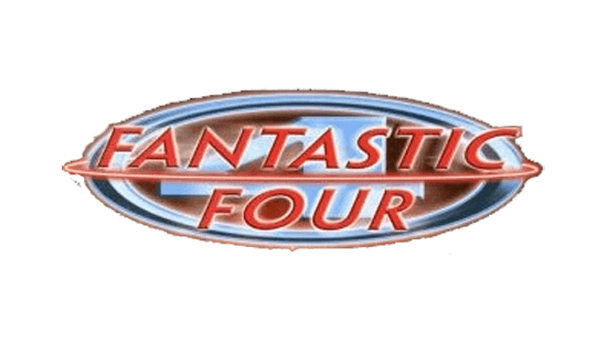
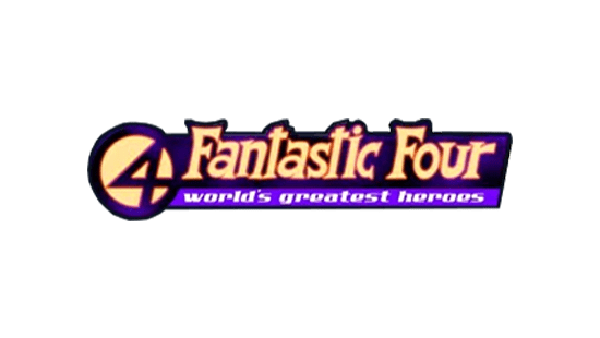
2018
The most recent version of the Fantastic Four logo used in the comic book world was introduced in 2018. This design looks a little more old-fashioned than the previous wordmark. However, it’s a lot clearer and easier to read.
It features the name of the group in a 3D font, which makes it appear as though we’re looking up at the Fantastic Four Sign.
The symbol of the Fantastic Four has also been included in this design. Next to the word “Four,” we see the 4 glyph surrounded by a circle.
The Marvel Fantastic Four logo in movies and animation
Just as the Fantastic Four logo history in the comic book landscape went through a number of changes, there have been various different instances of the design in the world of animation and movies.
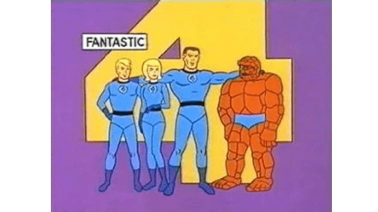
In the early days, the Fantastic Four title page usually included an image of all four characters, placed in front of a large yellow 4.
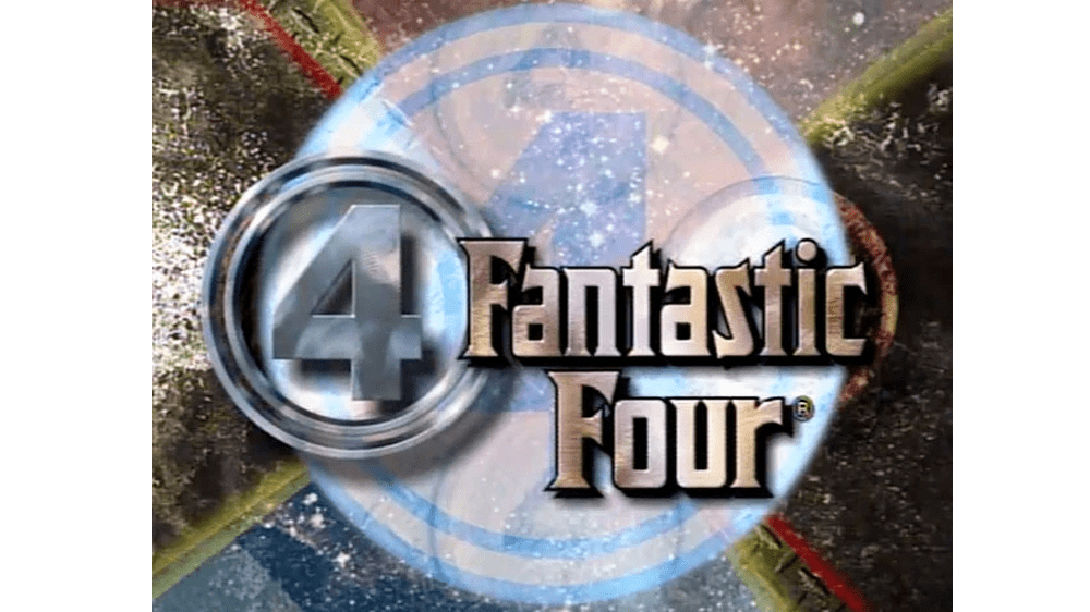
1994
In the 1990s, another version of the Fantastic Four logo was introduced, also taking inspiration from the previous comic book wordmark. In this design, the glyphs look almost metallic. We also see two versions of the Fantastic Four symbol.
One is placed to the left of the wordmark, while the other appears almost transparent behind it.
2005
In 2005, the first Fantastic Four movie was created, starring a number of leading actors at the time. The film featured a modern title screen, which included the Fantastic four symbol, separating the two words in the title.
The color palette for this design was extremely modern, with an almost metallic edge to it.
2015
The remake of the movie in 2015 used a logo similar to that of the previous comic books, wherein the creators replaced the letter “A” with the 4 glyph. The design featured a font that was a lot slimmer and more modern than the original movie’s wordmark.
It was intended to look powerful and futuristic.
The Fantastic 4 symbol: Colors and fonts
Perhaps the most recognizable aspect of the Fantastic 4 brand identity is the group’s unique symbol. In almost all instances of their appearance on page and screen, the Fantastic 4 have used a similar emblem. It typically features the number 4 placed inside of a circle.
The most recent version of the design has been depicted in numerous colors and styles.
For this logo, we see the 4 of connecting to the right-hand side of the circle. However, in earlier iterations created in the comic books, the 4 seemed to spread across the entire cycle.
If you’d like to explore the Fantastic Four logo or symbol in closer detail, you can find some useful resources here:
What color is the Fantastic Four logo?
The Fantastic Four brand identity has had a number of different shades associated with it over the years. It’s hard to define a clear set of Fantastic Four logo colors. However, it’s worth noting that the colors often associated with the team are blue and white.
These are the tones we see in a number of the Fantastic Four logos, as well as on the team’s uniforms.
What font does the Fantastic Four logo use?
The Fantastic Four logo has used a number of different font styles over the years. In the comic book landscape, the most recent version of the logo features a serif font in capital letters with sharp components. Within the movie world, the most recent logo is a lot simpler.
It’s a sans-serif font with sleek, narrow lines.
The Fantastic Four logo: Fantastic branding?
Looking at the Fantastic Four logo history, we can see clear evidence of how easily a superhero team can be branded, just like a company or organization.
The Fantastic Four might have had many different wordmarks and symbols associated with them through the years, but some consistent elements have remained. Bold, uppercase letters are present in almost every Fantastic Four emblem seen above.
Additionally, the Fantastic Four symbol, featuring the number 4 inside a circle, is a common part of the group’s visual identity.
Fabrik: A branding agency for our times.

Clarity starts with a conversation.
Thanks—we’ll get back to you shortly.
Whether you're navigating a rebrand, merger, or simply need a clearer identity—we’re here to help. No hard sell, just honest advice from people who know the sector.
Let’s start with a simple question…
Prefer to email? Drop us a line.
Fabrik’s been helping organisations rethink and reshape their brands for over 25 years. We’ve guided companies through mergers, rebrands and new launches. Whatever stage you’re at, we’ll meet you there.