The EA logo history: Evolution of the Electronic Arts logo

For many avid gamers, the EA logo is one of the most iconic emblems in video game history. Simple but eye-catching, this compelling logo has evolved numerous times to suit an evolving industry and adhere to the changes in EA’s personality.
Starting in 1982, the EA logo history provides an interesting insight into the transformation of a major gaming brand.
Despite controversy over its pay-to-play games and strategies around in-game transactions, the EA company and Electronic Arts logo has earned significant attention. Today, it’s one of the world’s most recognizable video game logos.
However, while most people are familiar with the EA symbol as it stands today, many don’t know where this iconic emblem began. Today, we will look back through the EA Games history to provide you with a useful overview of the brand’s transformation.
Is EA a brand? Introducing EA
Otherwise known as “Electronic Arts,” EA is a video games company from America, first founded in 1982. The company was created by an ex-Apple employee known as Trip Hawkins and quickly became a pioneer in the early home computer gaming industry.
EA was also one of the first companies to refer to developers and programmers as “software artists.”
When initially launching the EA company, Hawkins spent significant time refining his business plan and exploring professionals to help him bring his vision to life. Initially, when incorporating his company, Hawkins chose the name “Amazin’ Software” for his brand.
However, his employees universally disliked the title, pushing him to change to “Electronic Arts” by the end of 1982.
EA set itself apart from other video game companies at the time by heavily promoting its developers when other organizations would often keep them in the background. EA gave each developer photo credits in their games, as well as full-page ads.
Over the years, EA created a number of sub-labels connected to the organization, such as EA Sports and EA Worldwide Studios. The brand also made various strategic acquisitions over the years to help it grow, purchasing brands like “Distinctive Software” in 1991.
Today, EA develops and publishes games for some of the world’s most well-known franchises, including The Sims, Dead Space, Mass Effect, and Battlefield. EA Sports is also still running today, producing games like FIFA and Madden NFL.
EA also has its own self-developed digital distribution platform named Origin, which competes against the Epic Games Store, and Valve’s “Steam.”
EA logo history: The evolution of the EA symbol
EA has long been committed to creating a memorable visual identity for its brand. The Electronic Arts logo has gone through a variety of changes as the company has worked at developing its identity and connecting with its audience on a deeper level.
1982
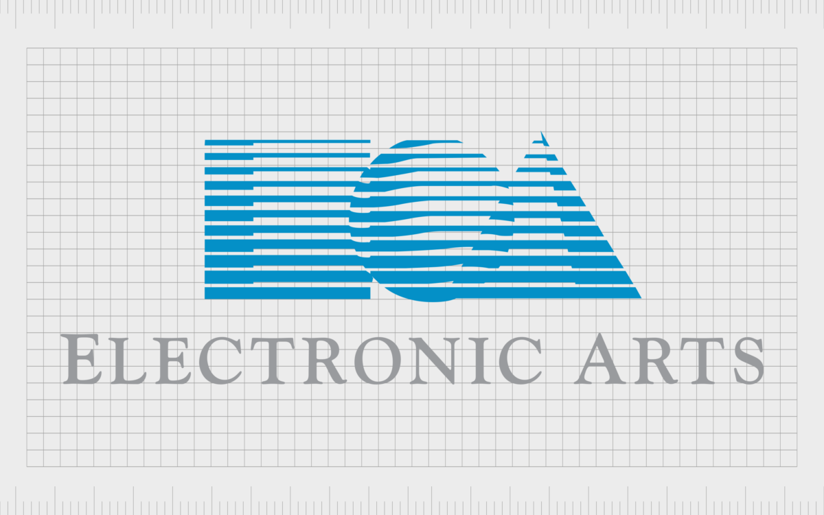
The original EA logo was a geometric logo featuring the grey inscription “Electronic Arts” alongside three shapes: a triangle, a ball, and a cube. The triangle and the square were seen by many to be representative of the letters “E” and “A.”
However, many were confused by the inclusion of the ball shape, which some suggested might be connected to the “O” in Electronic.
Other interpretations of the EA logo have suggested the shapes weren’t intended to stand for any letters at all and were instead representative of deeper symbolic concepts. The circle is often a shape used to delineate inclusion and global appeal.
1993
In 1993, a vivid version of the Electronic Arts logo was introduced, highlighting the meaning behind the shapes even further. In this emblem, the second E in “Electronic” was transformed into a blue square. The “O” was a red circle, and the “A” for Arts was a green triangle.
The font choice looked almost like stencil-style lettering, with various gaps between sections of the characters. The color palette was also a lot bolder in this design, with the grey typography updated to a bold black alternative.
1995
In 1995, EA switched to a much simpler logo for its emblem. The shapes were removed entirely, leaving behind a simple serif-style logo on a white background. The monochromatic logo was simple but effective.
The geometric typeface featured thin, long serifs intended to highlight the sophistication and professionalism of the company.
In 1997, an updated version of this logo was introduced, with a slightly thinner font and more spacing between each of the letters. However, the color palette remained the same.
2000
During the 2000s, Electronic Arts introduced a variety of new logos still in use by the brand today. The first was another geometric style logo, which drew attention to the initials at the front of the words “Electronic Arts.”
There was no full company inscription used on this logo. Instead, we saw a highly stylized monogram with sharp letters and lines.
Another variation of this logo was also present, which featured the same monogram, but in a deep blue color to symbolize trust and reliability. In this version of the logo, the full name of the company was also included in a soft grey font.

In 2006, Electronic Arts unveiled another alternative version of its monogram logo. This time, the “EA” letters appeared in a white font on a black circular background.
2020
While some of the earlier logos from EA are still in use today, Electronic Arts also created a new emblem in 2020 with a handful of variations. One option simply presents the name of the company in a simple sans-serif font, with a pink/coral color chosen for the design.
The alternative variation includes the EA monogram most people are familiar with, depicted in white on a matching pink circular background.
The Electronic Arts logo: Alternatives
As mentioned above, throughout its history, EA created a number of labels for its games and assets. The best-known of which are EA Games and EA Sports.
The EA Games logo
The EA Games logo was used for the group now referred to as EA Worldwide.
EA Worldwide Studios are responsible for a variety of combat, action-adventure, and role-playing games marketed under the EA brand. The majority of these games now feature the standard EA logo, but you may be familiar with the logo introduced in 2002 too.
This symbol featured a circular badge designed to look three-dimensional. In the middle, we see the EA monogram in dark blue, with the word “Games” written underneath in all uppercase letters. The combination of blue shades establishes EA as a reliable, trustworthy brand.
The EA Sports logo
The EA sports logo is often seen on sporting titles produced by the company, such as FIFA and Madden. Similar in a lot of ways to the EA Games logo, this emblem is depicted in a circular badge, with the EA monogram in black, above the word “Sports.”
This emblem is much simpler than the EA Games logo, with no three-dimensional elements.
The EA logo: Fonts and colors
Today, the EA logo comes in a number of different forms and shapes, depending on the game or product in question. However, while the colors and components of the emblem may vary, the EA monogram remains a consistent part of the company’s overall visual identity.
This eye-catching geometric logo aims to capture the attention of a modern audience while showcasing the company’s creative and artistic nature.
The Electronic Arts logo today is a highly recognizable symbol that works well across various mediums and environments.
You can take a closer look at the EA logo portfolio with some of the resources below:
What color is the EA logo?
The colors of the EA logo have varied drastically over the years. Even today, there are a number of variations of the EA logo colors in use. Some of the most common EA symbols include a simple monochromatic color palette of black and white.
Other versions use the color blue, which has been associated with the brand for quite some time.
The official EA logo, used in most of the company’s branding and assets today, features a bright color of grapefruit red with white elements.
Here is the EA logo color hex code for this unique shade:
Hex: #f05556
RGB: 240 85 86
CMYK: 0 65 64 6
Pantone: PMS 178 C
The color choice is quite unique for the gaming industry and helps to separate EA from many other competitors in its landscape.
What font does the EA logo use?
The primary EA logo font is unique to the company and was designed specifically for the company’s emblem. The “EA” monogram is made up of numerous sharp lines and components intended to make the logo look more modern and geometric.
When the Electronic Arts wordmark is used, it’s often depicted in a sans-serif font, custom-designed for the organization. It’s known as Electronic Arts Display.
The excellent EA logo
Looking at the EA logo history, the company has made several crucial changes to its identity over the years. Today, the Electronic Arts logo comes in various shapes and colors, depending on the asset in question.
However, although the EA logo can vary, it maintains consistency with an eye-catching monogram in every variation. The EA logo sets the company apart as a highly innovative and creative company focusing on the future and transformation.
Fabrik: A branding agency for our times.
Clarity starts with a conversation.
Thanks—we’ll get back to you shortly.
Whether you're navigating a rebrand, merger, or simply need a clearer identity—we’re here to help. No hard sell, just honest advice from people who know the sector.
Let’s start with a simple question…
Prefer to email? Drop us a line.
Fabrik’s been helping organisations rethink and reshape their brands for over 25 years. We’ve guided companies through mergers, rebrands and new launches. Whatever stage you’re at, we’ll meet you there.


