From arcade to console: The Donkey Kong logo story

For fans of video games, few emblems are more recognizable than the Donkey Kong logo. Perhaps one of the most famous franchises in video game history, Donkey Kong changed how we look at home entertainment forever.
But where did Donkey Kong logo history begin?
At present, Donkey Kong is considered one of the most memorable and meaningful characters in video game history. First introduced in 1981, Donkey Kong was originally introduced as an antagonist (or villain) in the Mario game series.
However, over the years, the story of Donkey Kong has been developed, transforming the gorilla into a multi-faceted mascot in his own right. Like many video game logos, the Donkey Kong emblem has evolved, becoming increasingly more eye-catching and modern.
Today, we will be taking a closer look at the evolution of the Donkey Kong logo and the character’s growth.
What was Donkey Kong’s original name?
Donkey Kong is a video game character and franchise originally created by Shigeru Miyamoto on behalf of Nintendo. The game series follows the adventures of an animated gorilla named Donkey Kong, as well as his friends and family members, such as Diddy Kong.
The franchise consists mainly of platform-style games, action puzzles, and side-scrollers.
When he was first introduced, Donkey Kong was briefly known as “Mr. Video” and “Ossan,” a Japanese term used to refer to a middle-aged man.
Donkey Kong was created in 1981 to help boost the appeal of Nintendo video games. In the late 1970s, Nintendo was shifting away from producing playing cards and toys and focusing more heavily on the arcade landscape, but its original creations simply weren’t producing enough revenue.
Minoru Arakawa, the founder of the American subsidiary of Nintendo, asked CEO Hiroshi Yamauchi to create a new game for the failing Nintendo arcade cabinets.
Originally, the game perceived was intended to be based on a love triangle between characters from the Popeye franchise, but Nintendo couldn’t acquire a license to use the characters.
The antagonist in the story became a gorilla (Donkey Kong), and Popeye himself became Mario. The resulting Donkey Kong title was one of the earliest platform games, following Mario ascending a construction site to rescue a damsel (Pauline) from Donkey Kong.
Why does Donkey Kong wear a tie?
While the original Donkey Kong character didn’t have his own necktie, the design was introduced in 1994, marking Donkey Kong’s position as a major character in the Nintendo landscape.
By giving Donkey Kong a tie, Nintendo wanted to encourage fans to look at the character from a new perspective. A tie symbolizes sophistication, maturity, and responsibility.
Is Donkey Kong a good guy?
Originally, Donkey Kong was a villain designed to fight against Mario. In fact, he was the first antagonist Mario ever came up against, long before Bowser. However, as the Donkey Kong franchise developed, the character became more multi-faceted.
Subsequent Donkey Kong games presented the character as a protagonist with his own quest for justice.
Donkey Kong logo history: The evolution of Donkey Kong
The official Donkey Kong logo hasn’t changed much over the years. When it was first introduced, the design was relatively simplistic, as it was intended to be placed on arcade cabinets. Over time, the design has evolved to become more dynamic and colorful.

The original Donkey Kong logo isn’t too different from the one many of us know today. The design featured a wordmark, where the letters were crushed together, overlapping in some areas. The sans-serif characters were depicted in red, with a thin black outline.
In the center of each “O,” we see a white star with rounded edges.

As Nintendo began diving deeper into the Donkey Kong franchise, they expanded on the logo. While many of the elements of the previous design remained the same, this emblem was more refined and colorful.
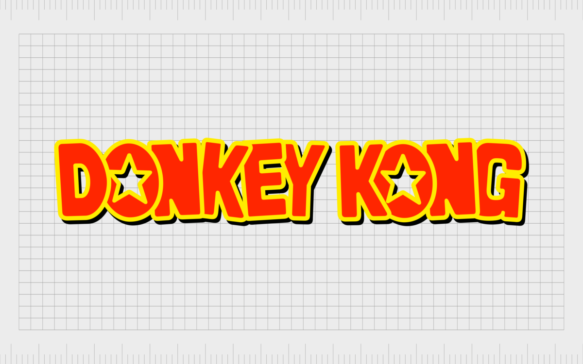
The letters now had an extra dimension to them, thanks to the inclusion of black shadow. The primary outline around each red letter was switched from black to yellow too.
The red coloring was made brighter and more vibrant, while the stars in the center of the “Os” were sharpened and refined.

1999
Used only briefly for the Donkey Kong 64 title, a new version of the Donkey Kong logo was introduced in 1999. This wordmark eliminated the star shapes to create a more streamlined design presented on two levels.
The colors were simplified, and the bright yellow became an almost golden color. The letters were also changed slightly, with sharper points on the “Ns” and more rounded elements around the other characters.

2010
The most recent Donkey Kong logo was introduced in 2010, and it’s similar in a lot of ways to the design from 1994. The shape of the letters and their positioning are the same. Additionally, the stars in the middle of the “Os” made a return.
While the color palette is similar, it has been enhanced with more gradients, shadow, and light throughout the letters.
Other well-known Donkey Kong logos
Aside from the primary Donkey Kong logos, numerous other designs have been introduced for specific games in the Donkey Kong series. You may be familiar with some of the following emblems, chosen for Donkey Kong’s most popular games:

The Donkey Kong Country logo
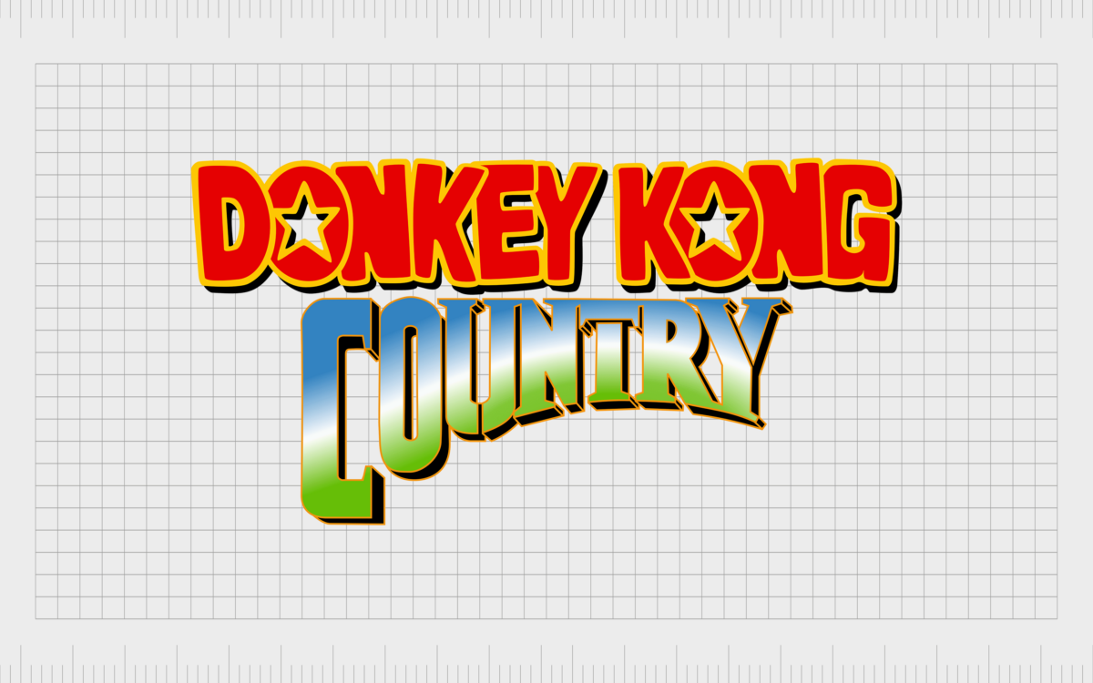
Numerous versions of the Donkey Kong Country logo appeared over the years. However, the most well-known emblem is the one above. This features the iconic Donkey Kong wordmark, with the word “Country” written underneath.
The letters in Country are curved towards the button, creating an interesting shape. They also feature a gradient of green, white, and blue colors to symbolize a landscape.

Mario vs Donkey Kong
The Mario vs Donkey Kong logo is also a relatively well-known design. This featured the classic Mario wordmark on the top level of the emblem and the Donkey Kong logo on the bottom. The colors have been refined slightly to create a more balanced design.
The “Vs” symbol in the middle is presented in a multi-pointed green star.
The Donkey Kong logo: Fonts and colors
The Donkey Kong logo is a simple, engaging wordmark designed to capture the attention of a younger audience. Bright colors and fun, bouncy characters in the wordmark have given the Donkey Kong logo a compelling aesthetic over the years.
In fact, the logo has been so successful Nintendo hasn’t really made a lot of significant changes to its appearance.
Today, the Donkey Kong logo is one of the better-known emblems in the video game world. Even in many of the Donkey Kong game titles, the same consistent emblem is used to reference the franchise.
Here are some useful resources if you want to take a closer look at the Donkey Kong logo:
What color is the Donkey Kong logo?
The Donkey Kong logo colors have remained relatively consistent throughout the history of the franchise. The first core color chosen by the Nintendo brand was red, intended to convey passion and excitement.
Additionally, the red coloring was selected to help make the name of the game stand out in crowded arcade environments. Over time, the secondary color of yellow was added.
Today, the Donkey Kong logo color palette is a bright and vivid mixture of red, yellow, and black. Gradients have been implemented throughout the letters to give each character a sense of dimension. Most of the time, this logo is presented on a white background.
What font does the Donkey Kong logo use?
Perhaps unsurprisingly, the Donkey Kong logo is unique to the franchise and was created specifically for the game series. It’s similar in some ways to the Jumpman font by Neal Davidson.
Overall, the typeface is a sans-serif font, where the letters have been pushed together to create an almost chaotic aesthetic. In the middle of each “O,” there’s a star shape cut into the blocky glyphs and outlined by bright yellow.
The compelling Donkey Kong logo
Looking back at Donkey Kong logo history, we can see the design of this famous emblem hasn’t changed much. The wordmark aims to convey the fun and chaotic nature of the Donkey Kong video games, with bold, carefully positioned characters.
The colors red and yellow symbolize joy and vitality, perfect for the video game landscape. The only real changes to the Donkey Kong logo made over the years have been refinements to the original design.
Fabrik: A branding agency for our times.
Clarity starts with a conversation.
Thanks—we’ll get back to you shortly.
Whether you're navigating a rebrand, merger, or simply need a clearer identity—we’re here to help. No hard sell, just honest advice from people who know the sector.
Let’s start with a simple question…
Prefer to email? Drop us a line.
Fabrik’s been helping organisations rethink and reshape their brands for over 25 years. We’ve guided companies through mergers, rebrands and new launches. Whatever stage you’re at, we’ll meet you there.


