Costco logo history: The story behind the Costco Wholesale logo

Costco logo history goes back around five decades. And while it’s not as old as some of the other major companies in the US, the food and supplies reseller is still one of the most popular places to shop throughout the country.
Costco’s logo is one of the most recognizable in the US, and it hasn’t changed much since the company was founded. But like any good brand, the logo has a clear meaning behind it – and there’s actually a lot more to the eye than you might otherwise think.
In this article, you’ll learn all about the Costco Wholesale logo, and discover more about its history, along with what the company stands for. There’s plenty more to cover, too, so let’s hop in and get started.
What does Costco stand for?
Costco’s main business proposition is pretty simple when you look at its name – and at what it was previously known as. The primary objective of Costco is to sell high-quality products, but to do so at a lower price than you will find in many places elsewhere.
Part of Costco’s main selling point is that while it offers items at a lower price, it still has a sense of exclusivity. You can use Costco if you have a membership, which makes you feel as though you’re part of a club.
Besides selling high-quality products at an accessible price point, Costco also aims to make the buying process as efficient as possible for all of its members.
What is Costco’s slogan?
The Costco slogan is straightforward: “Do the right thing”. The slogan effectively feeds into the things we talked about before, when we discussed making things easier for its members.
The slogan can mean various things, including the desire to go above and beyond for your customers. And on top of that, it also means continuing to provide affordable prices in comparison to what you will find elsewhere.
What is the history of Costco?
Costco actually wasn’t called Costco when it was first founded. Instead, it originally went by the name of Price Club – which was founded in 1976. The company has grown throughout the US now, but its origins were in San Diego, California.
Originally, Price Club focused on small businesses. However, it quickly opted to adopt more of a B2C approach instead. In 1983, it opened a Costco store in Seattle – Washington’s biggest city.
Costco and Price Club were actually two separate entities until 1997, when the two merged. As such, you will see Price Club logos that were used until 1997.
Following a short stint being known as PriceCostco, the name reverted to Costco. And when you try to say PriceCostco, it quickly becomes evident that it was a lot to swallow in one go.
While Costco is popular in the US, that is not the only country it operates in. You will find stores throughout multiple countries, including Iceland, Australia, and the UK. Nowadays, the company generates billions annually.
Costco logo history: The start of the Costo logos and trademark
The first Costco logo came around in 1983, and it doesn’t look dramatically different from what you will find today. It was a red logo, and besides the first letter, everything else was in lowercase.
When the first Costco logo was revealed, it featured on many of the company’s warehouses. And as we mentioned earlier, the company went under the name of PriceCostco for a couple of years as well.
Today, the Costco trademark operates as a company that is traded publicly. It has several shareholders, including the likes of Bank of America and Vanguard.
Costco logo history: Costco logos throughout the years
Now that you know a little more about Costco’s history, and more about the Costco logo, let’s look at how it has changed. We’ll start with the Costco logos themselves, before talking more about the Price Club ones.
Below is a history of the Costco logo evolution.

1983
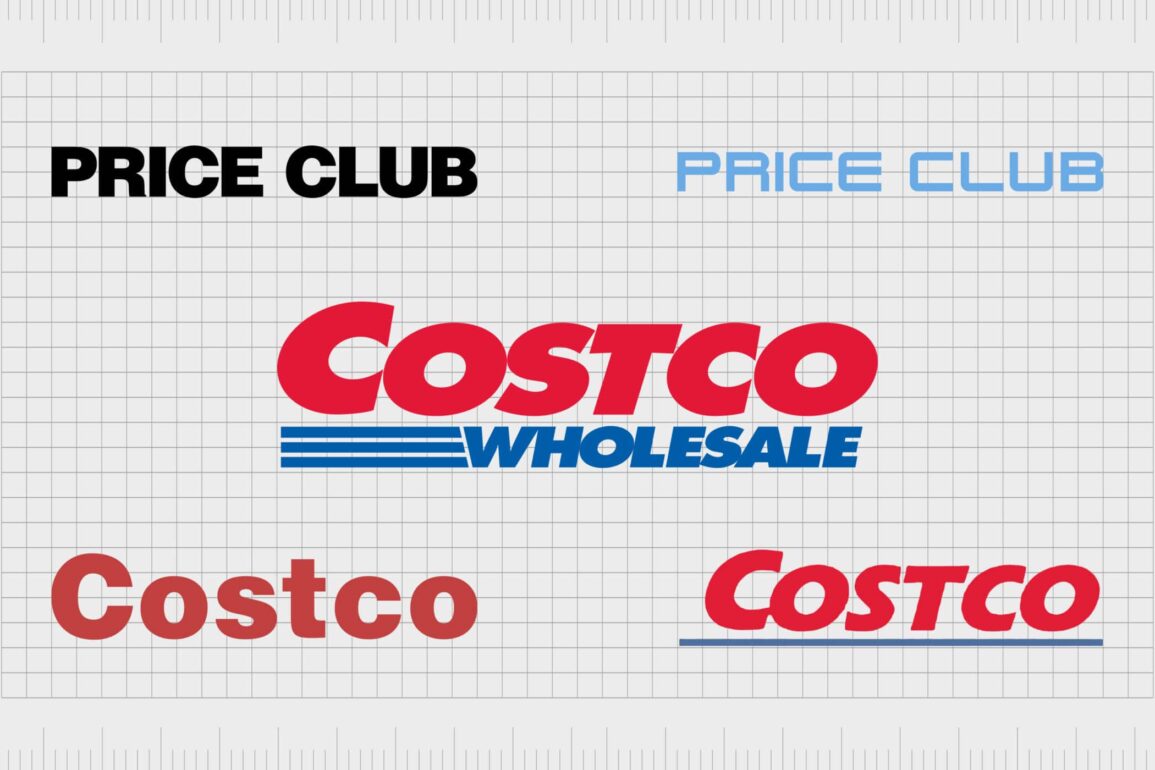
Previous Costco logos were simpler than today’s one. The first Costco symbol was pretty straightforward, as you can see above. The font was also relatively simple, and the red color made it easy to identify.
That shade also added a sense of alertness, and a member could – if they needed to pick something up quickly – find the store from a considerable distance.
The first logo under the Costco name lasted for 10 years before it was replaced. However, Costco stores did not adopt a new logo until 1997 – and it’s a good thing they didn’t, because the next one didn’t last for too long.

1993
As you can see from the image above, Costco’s second logo represented a significant change from the first. The first “C: stands out a lot more than it did in the first one, and the wording made a shift to become entirely uppercase.
Unlike the first logo, it’s also a little more italicized.
The second Costco logo also features different color scheming. While you still have the red that appeared in the first one, you will also notice a blue line underlining the wording.
It’s a little easier to see compared to the first logo, and we can also imagine that it would be much easier to identify from further afield.

Present
In 1997, Costco refined its 1993 logo and signaled a new step forward for the company. The Costco section is a lot larger than it was on the previous one, and it takes up more of the screen.
You will also notice that it appears in a brighter shade of red, making it easier to identify and also to capture the audience’s attention.
Another new addition to the 1997 logo is the introduction of the word “Wholesale”. You will also notice three stripes added to the Costco logo, rather than the single one in the 1993 version – and these do not span across the entire bottom.
The 1997 Costco logo is still in use today, and you will notice it on its stores throughout the US and the other countries in which it operates.

Price Club: 1976
Of course, we can’t talk about the Costco logo history without looking at some of the previous installations. Everything started under the name of Price Club in 1976, and its logo was pretty simple.
Featuring in all black, the logo is incredibly striking and brings your eyes directly to what you’re looking at. The entire logo is in capital letters, representing a significant change from the first Costco logo.

Price Club: 1993
The second Price Club logo was introduced in the same year as the second one for Costco. And as you can see, it takes much more of a futuristic look than the first Price Club logo had. Rather than black, it has gone for a blue font instead as well.
The second Price Club logo lasted for four years, before it was phased out completely. After that, Costco instead focused on branding itself as Costco in the long run.
What font does the Costco logo use?
The current Costco logo uses what is known as Futura Extra Bold Oblique. This is a relatively old font that has been around since 1987, so it’s not that much younger than Costco itself.
The Costco font isn’t exclusively used by Costco; it’s also extremely common among other major companies. If you’ve ever looked at the Best Buy logo, for example, you will find that it features in that one as well.
Other examples include the news publication USA Today, along with global logistics company FedEx.
The main difference between the companies mentioned and Costco is that, for Costco’s logo, you will see it feature in italics.
What colors does the Costco logo use?
The Costco logo colors are red and blue, both of which are pretty bright. You will also notice that the shade of red Costco uses is not too different from the notification button icons that you see on many social media networks today.
You will find the red and blue color scheme feature on not just the Costco logo, but various others. The soft drinks giant Pepsi is one famous example, and the Major League logos for baseball, soccer, hockey, and football all use a similar color scheme.
The fast food company Domino’s Pizza is another example of a business that uses red and blues in its color scheming.
Where to find downloads for the Costco logo
If you want to use the Costco logo in PNG, vector, or transparent, you’ll of course need to remember that it’s a registered trademark.
However, you can contact the company to access the folders you need.
Costco’s logo is one of the most recognizable in the US
The Costco icon is one of the easiest logos to recognize, regardless of where in the world you are. While you will find plenty of warehouses throughout the US, other countries have also embraced the brand.
And over the last nearly 50 years, the company has grown to a multi-billion-dollar entity that serves its members with cheaper prices on multiple items.
Unlike many brands, Costco hasn’t undergone a significant number of changes. However, you will notice that it regularly evolved – before sticking with the current Costco symbol that you see today.
Costco’s logo clearly explains what the company does. And on top of that, it’s easy to notice if you need to pick up something quickly.
Fabrik: A branding agency for our times.
Clarity starts with a conversation.
Thanks—we’ll get back to you shortly.
Whether you're navigating a rebrand, merger, or simply need a clearer identity—we’re here to help. No hard sell, just honest advice from people who know the sector.
Let’s start with a simple question…
Prefer to email? Drop us a line.
Fabrik’s been helping organisations rethink and reshape their brands for over 25 years. We’ve guided companies through mergers, rebrands and new launches. Whatever stage you’re at, we’ll meet you there.


