


Citroën logo history: The Citroën symbol and its meaning
The Citroën logo is something you’re probably familiar with if you’re a fan of French cars. Even if you don’t know much about the automotive world, you may be familiar with Citroën, a brand well-known for scaling the globe with reliable and cost-effective vehicles.
Citroën has come a long way since it was originally launched in France 1919, more than 100 years ago. Today, the company sells cars around the world, in virtually every location, aside from Mexico, the United States, Canada, and North Korea.
Whether you’re a fan of all-things Citroën, or you’d simply like to learn a little more about where those eye-catching arrows in the Citroën logo come from, we’re here to help.
Here’s your complete guide to Citroën logo history…

Citroën: Brand overview
| Founded: | 1919 |
| Founder: | André Citroën |
| Headquarters: | Poissy, France |
| Website: | www.citroen.com |
| Logo downloads: |
Citroën is a French car company currently owned by the larger Stellantis brand. The business originally launched in 1919, with the guidance of André Citroën.
Already experienced in the automotive business, thanks to a stint working with Mors, Citroën decided to switch from armament to vehicle manufacturing in 1916.
Eventually, Citroën began building its reputation as an innovator in the vehicle landscape, by producing the Traction Avant, the first car in the world to be mass-produced using four-wheel drive, as well as a unibody construction.
In 1954, the company also produced the world’s first self-levelling hydropneumatics suspension system.
By 1955, Citroën had introduced the first mass-produced car using disc brakes, and in the 60s, they introduced several models with swivelling headlights to allow for greater visibility on winding roads.
Today, Citroën produces innovative cars for drivers around the world, and the organization has won a number of awards over the years.
Citroën logo history: The Citroën logo evolution
The Citroën car logo has changed a few times over the years, with the most recent of the Citroën logos appearing in 2021.
The original design was launched in 1919, by the company’s original founder, whose family originally ran a manufacturing plant specializing in the design of helical gears.
The herringbone teeth of these gears became the inspiration for the logo.
1919
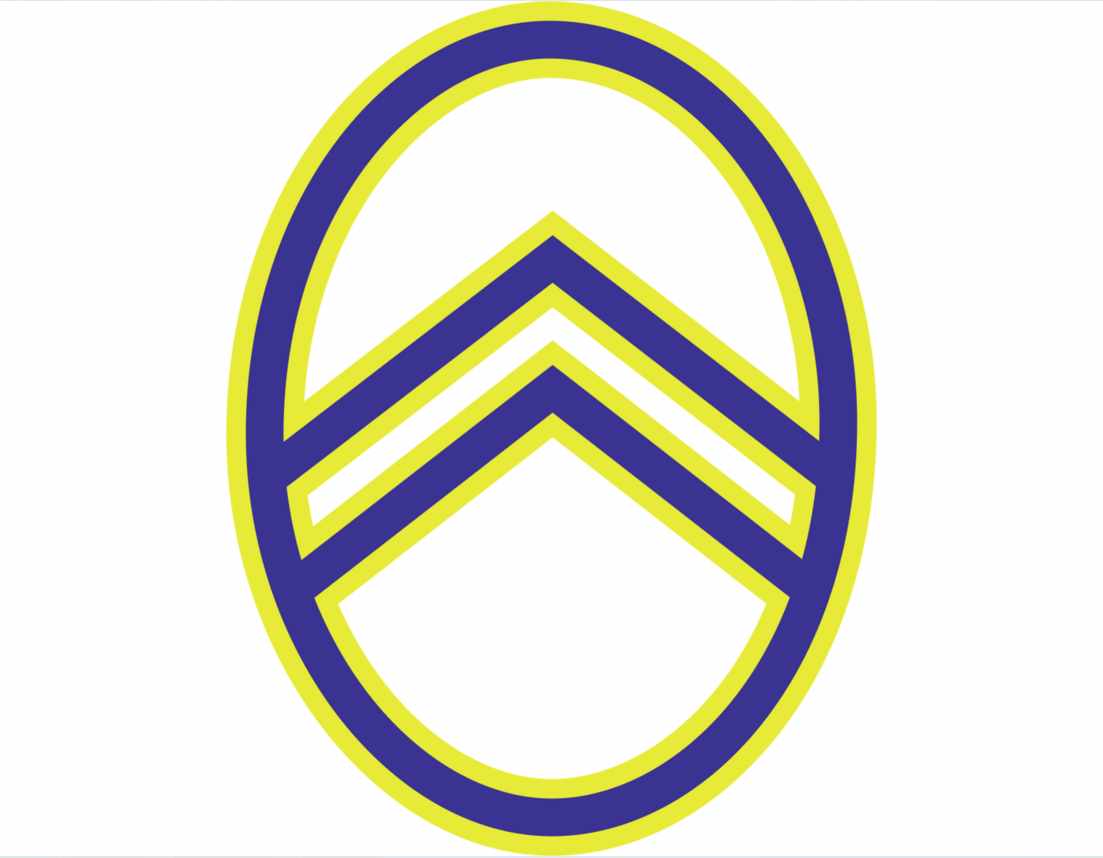
The first of the old Citroën logos included the same double arrow design many of us know today, but it was presented in a different way. The arrows sat within an oval depicted in blue with a yellow outline.
This logo was sophisticated, simple, and quite modern for the time.
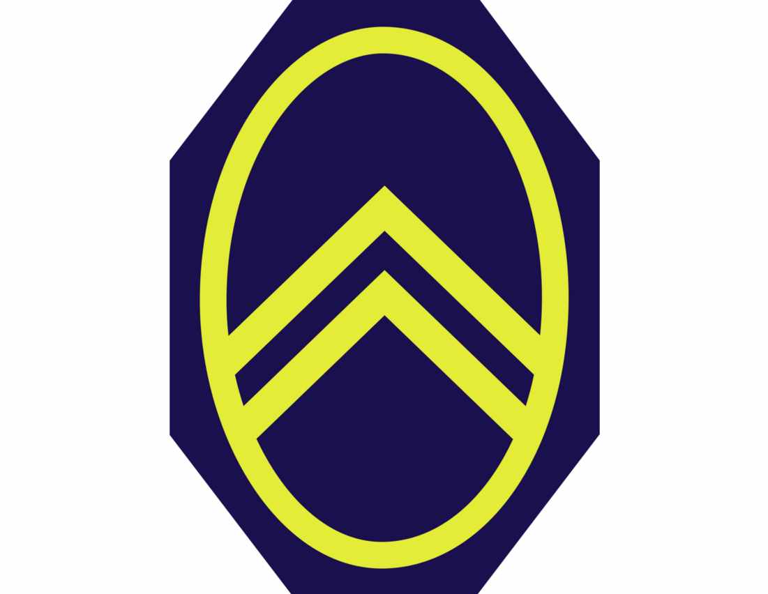
In 1921, the logo was updated slightly, with a darker shade of blue filling out the entire oval, and a surrounding geometric shape. The yellow oval on top of the deep blue octagon makes the colors in the Citroën emblem appear brighter and bolder.
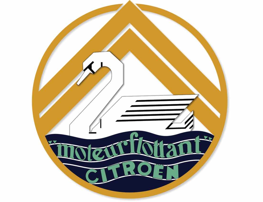
In 1929, the Citroën car symbol was updated to feature a new element – a white swan. The swan is sitting beneath the large double arrows we saw in previous emblems, which have been made bolder and larger for this design.
A larger golden circle surrounds the swan, which faces to the left, sitting on top a set of wavy blue lines intended to look like water. This variation of the logo also included the name of the company, Citroën, written to fit into the waves.
1936
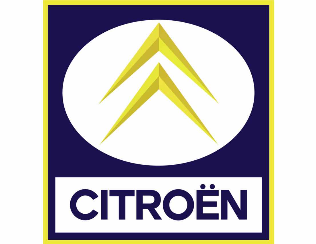
1936 marked a return to the simpler Citroën symbol featuring the yellow oval and double arrow design on a blue octagon. In this design, the octagon also has a very thin yellow frame.
The word Citroën is also evident in this image, depicted in a simple sans-serif font, with all capital letters.
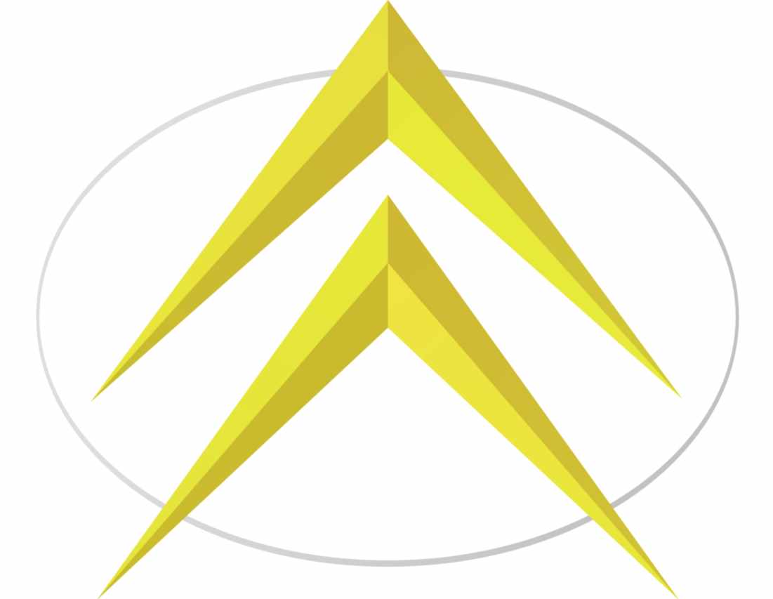
The Citroën emblem in 1959 was redesigned with a focus on modernity. Here, the wordmark has disappeared, and the chevrons (arrows) have become three dimensional. The oval from previous designs appears again, simplified and turned on its side to help highlight the chevrons.
In 1966, Citroën added to this logo, placing the yellow chevrons within the oval, rather than allowing them to extend over it. The entire image is encased in a blue rectangle with a yellow frame, and the wordmark for Citroën appears again.
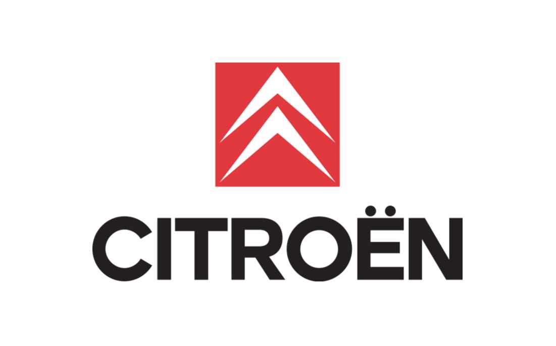
During the 1980s, Citroën changed its color palette and updated its image for a modern audience. This time, the arrows appear in white on a red square background, placed above a much larger wordmark.
The font for the Citroën emblem here is bold and contemporary, written all in black.
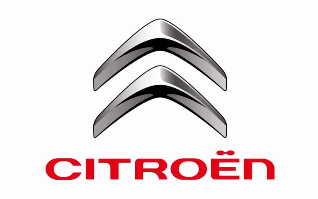
In 2009, Citroën introduced a new variation of its logo with the altered color palette. In this variation, the chevrons are designed in a textured metal shade, with plenty of light and shadow to depict shine.
The wordmark letters are a little more curved in this variation, and designed in bright red.
The sleek and stylish logo became a significant part of the brand’s identity, before it was updated again in 2016, to convey a slightly more minimalist image.
The 2016 logo is a flatter design than the previous, but it maintains many of the same elements. In this Citroën logo, we see the company using a single color (grey) for the first time.
2021
The Citroën logo changed for a final time in 2021, to place the chevrons of the image alongside the wordmark (on the left) rather than above it.
This variation of the Citroën logo refines the elements a little, making the arrows into blocks of color, rather than a textured design. The font is also a little sharper.
Citroën logo meaning and features
The new Citroën logo as it stands today is an excellent insight into the strength and confidence of the brand, which has remained consistent throughout the company’s history.
Although many aspects of the Citroën car symbol have changed in the last few years, the chevron design (the two arrows) has remained a consistent part of the company’s identity.
The meaning behind these arrows is simple. The Citroën logo was designed by the founder of Citroën, who was responsible for patenting helical gears, which looked like little “V’s” turned upside down.
These shapes formed the design basis for all of the Citroën logos.
What font is the Citroën logo?
Citroën hasn’t released any official information about its most recent font update. However, we can see the typeface is a sans-serif design created using all capital letters.
The current variation of the Citroën font is a lot sharper than previous designs, which made the characters more curved, and almost squashed them a little into a flatter, broader image. The font is modern, bold, and easy to read.
Citroën logo colors
The official Citroën logo color today is simply black on a white background. However, over the years, the Citroën company has experimented with a number of different color palettes, including yellow and blue, silver, and red.
Celebrating the Citroën logo today
The Citroën logo is an easily recognizable and bold image for a company with significant impact and heritage in its chosen industry.
One of the most famous automotive brands in the world, and a company constantly associated with innovation and pioneering designs over the years, Citroën has taken the driving landscape by storm.
The brand image we know for Citroën today continues to maintain one of the original elements of the design created by its founder – the iconic Citroën chevrons.
This is a great insight into how companies can carry various elements of a logo design through multiple generations
Fabrik: A branding agency for our times.

Clarity starts with a conversation.
Thanks—we’ll get back to you shortly.
Whether you're navigating a rebrand, merger, or simply need a clearer identity—we’re here to help. No hard sell, just honest advice from people who know the sector.
Let’s start with a simple question…
Prefer to email? Drop us a line.
Fabrik’s been helping organisations rethink and reshape their brands for over 25 years. We’ve guided companies through mergers, rebrands and new launches. Whatever stage you’re at, we’ll meet you there.