The Yahoo logo: A symbol of digital times

The Yahoo logo is one of the more recognizable symbols in the digital world. Bright, eye-catching, and evocative, the emblem has changed over the years to adhere to the trends of the tech industry. Today, we’re going to take a closer look at Yahoo logo history.
The Yahoo symbol, like many technology logos, is relatively simple, without a lot of additional flair or decoration. However, it still sends an important message to its target audience, about the innovative nature of the brand.
Since launching in 1994, Yahoo has updated its logo a number of times, but has often focused on using a wordmark as its core brand asset. Today, we’re going to be exploring the evolution of the Yahoo image, and how the company has changed over the years.
The Yahoo symbol: Introducing Yahoo
Before we start to explore Yahoo logo history, let’s take a moment to examine the core components of the brand in closer detail. Yahoo, better known as “Yahoo!,” is an American web services company. Though it’s best known for its search engine, it also offers a range of different services.
Yahoo customers can access everything from mail products to finance platforms, and even an advertising platform known as Yahoo Native. The company was initially founded in 1994 by David Filo and Jerry Yang, electrical engineering students.
The duo initially created a site named “Jerry and David’s Guide to the World Wide Web”, which provided users with a human-edited directory, rather than a searchable index of pages.
The word “Yahoo” chosen for the new company name, is a backronym for “Yet Another Hierarchical Officious Oracle”. Throughout the 90s, Yahoo grew rapidly, and became a major competitor for solutions like Google. However, usage declined in the late 2000s.
Yahoo logo history: Does Yahoo have a new logo?
As a technology brand, Yahoo is constantly in motion, searching for new ways to serve its audience and evolve with the times. Unsurprisingly, the company’s visual identity has also been updated and transformed of the years, becoming more refined and modern.
Let’s take a closer look at Yahoo logo history.

1994
When Yahoo was first introduced to the public in 1994, it used a relatively simple wordmark as a logo, featuring a sleek serif font in black on a white background. The design was straightforward and classical, ideal for a budding startup, but it only stayed with the brand for a year.

1995
In 1995, the Yahoo team decided to show a little more of their personality in their logo, updating the wordmark with stylized letters. The letters were all positioned on different letters, to make them seem as though they were jumping from the page.
A new color palette was also introduced. While the exclamation mark was black, the rest of the letters were depicted in red with a thin yellow outline.

A little later in 1995, Yahoo introduced a completely different logo, with a purple wordmark, in bold, capital letters, with broad serifs. The image featured a blue circle in the background, with an anthropomorphic figure in yellow and purple.

1996
In 1996, Yahoo changed its logo again, returning to a simpler wordmark and eliminating the jumping man imagery. The letters in this logotype are still dynamic, though they’re jumping around a little less than in the previous wordmark logo.
Yahoo updated its color palette again with this image, choosing a bright shade of red with a shadow background to give the image more depth.

2009
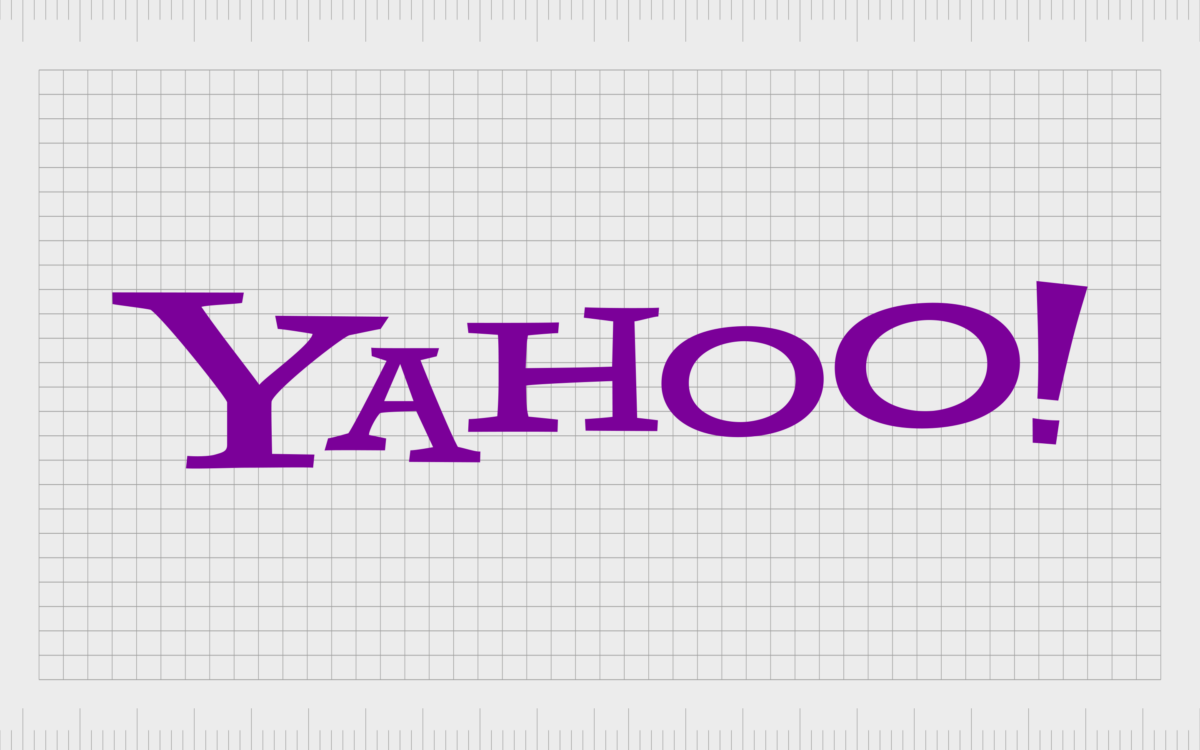
In 2009, Yahoo chose to alter the coloring of its logo, switching from red, to its iconic purple shade. The components of the logotype remained primarily the same, although the shadowing behind the letters was removed. This created a flatter, more streamlined image.

2013
For a while between 2013 and 2019, Yahoo updated its logo to something more three-dimensional. The serifs from the characters were removed, and the lines appeared finer and more delicate.
The color palette stayed purple, although the shade was altered slightly to something darker and a little more vibrant. The gradient on the letters helped to give the wordmark a sense of volume.

2019
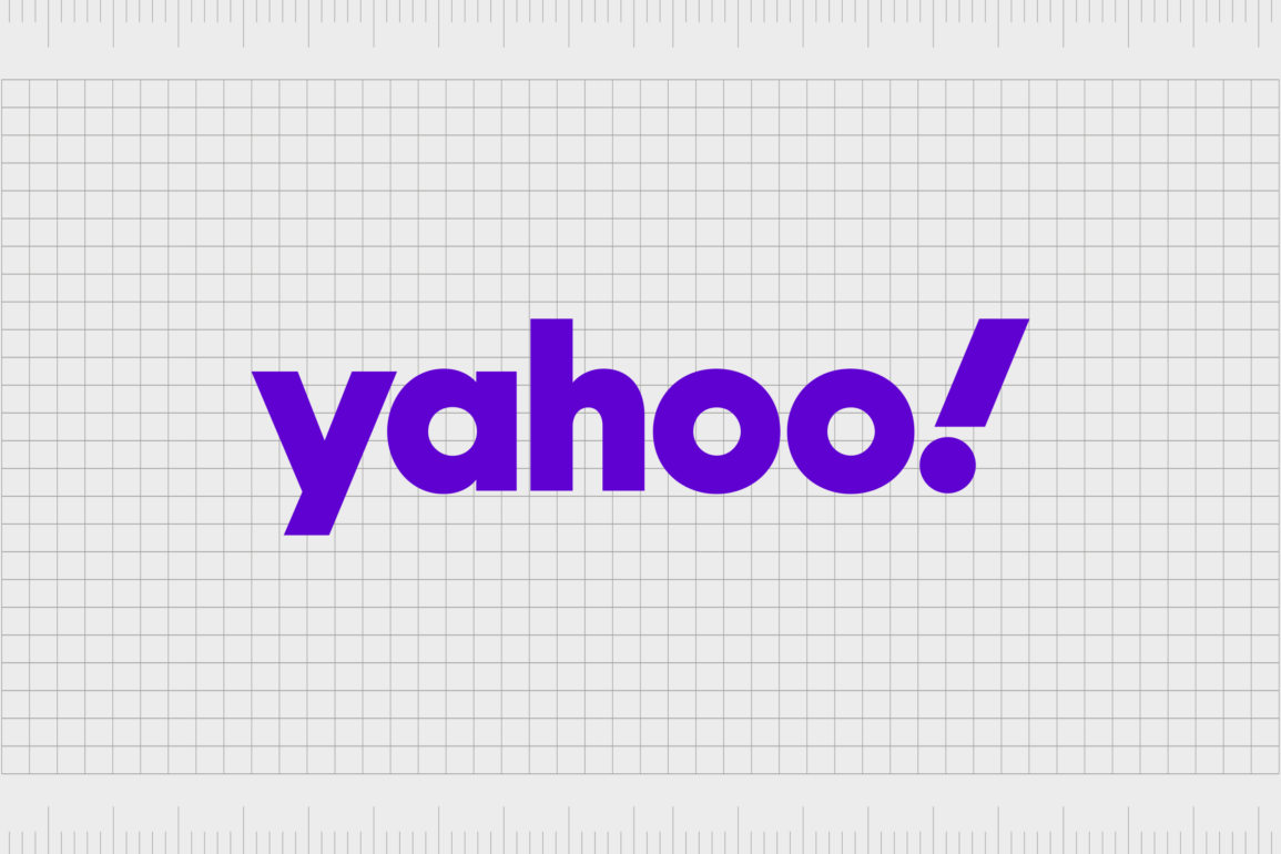
The most recent change to the Yahoo logo brought the company in line with the trends of the digital era. The image was simplified again, removing the three dimensional elements to create a flatter, more streamlined wordmark.
This new logo, created by the Pentagram agency, features a lowercase wordmark, with a bolder, thicker typeface than the previous designs. Once again, the purple color remained, but the shade was made brighter and more vibrant.
The Yahoo icon: Logos for different services
Alongside the official Yahoo logo, there are also a variety of other emblems in use for different services offered by the brand. Yahoo also has a specific version of its logo for its Japanese audience, which is based on the 2009 emblem, but depicted in white and red.
According to the Japanese representative for Yahoo, the company decided to stick with its previous red color palette here, as the shade is more appealing to a Japanese audience.
The Yahoo Finance logo and other emblems
The other logos in the Yahoo product portfolio share the same central emblem as the official Yahoo design. Most simply also include another word, written in a similar sans-serif font, and placed either below, or alongside the main wordmark.
The words, such as “news” “finance” and “mail” are typically shown in a dark shade of black or grey. However, there are instances where users can change the appearance of the Yahoo logo on their service. For instance, Yahoo Mail offers a range of themes to choose from.
The Yahoo logo: Fonts and colors
Though relatively simple in nature, the Yahoo logo is a fresh, bright, and engaging symbol. It demonstrates the progressive nature of the brand, and a commitment from the company to connect with a broad, evolving audience.
Throughout the years, Yahoo has almost consistently used just a wordmark for its emblem, although it has experimented significantly with different font types and positioning options. Additionally, the company has regularly used the color purple in its emblem.
In color psychology, purple is a shade often associated with luxury and wealth, but it can also be aligned with concepts like creativity and discovery.
You can see some examples of the Yahoo logo in the resources here:
What color is the Yahoo logo?
Throughout the years, Yahoo has experimented with a variety of different color palettes. However, since 2009, the main Yahoo logo color has almost consistently been a shade of purple. Of course, the company has experimented with different types of purple.
Today, the Yahoo logo colors are simply white and purple, with the purple depicted in a bright indigo shade to demonstrate creativity and discovery.
What font does the Yahoo logo use?
Font has been one of the most experimental parts of the Yahoo logo over the years. Initially, the company started with a relatively simple serif font. However, as the business evolved, the team began playing with different typeface styles, to showcase its unique personality.
The current Yahoo logo font is specific to the brand. It’s a blocky, sans-serif font with thick lines and a slightly angled exclamation mark. The font is similar to Centra number 2.
The evolving Yahoo brand mark
Looking at Yahoo logo history, we can see the company has gone through a number of significant changes over the years. As the brand has continued to grow and evolve, it has adapted its logo to appeal to a wider audience, and demonstrate the unique components of its identity.
Today, the Yahoo logo is a simple but evocative wordmark, featuring a bright purple color palette often on a white background. The image is fun and fresh, with a modern edge that helps Yahoo to contend with other major market leaders in the tech industry.
The bright and powerful logo reminds us of the creative nature of the company, as well as its commitment to constant exploration and evolution.
Fabrik: A branding agency for our times.
Clarity starts with a conversation.
Thanks—we’ll get back to you shortly.
Whether you're navigating a rebrand, merger, or simply need a clearer identity—we’re here to help. No hard sell, just honest advice from people who know the sector.
Let’s start with a simple question…
Prefer to email? Drop us a line.
Fabrik’s been helping organisations rethink and reshape their brands for over 25 years. We’ve guided companies through mergers, rebrands and new launches. Whatever stage you’re at, we’ll meet you there.


