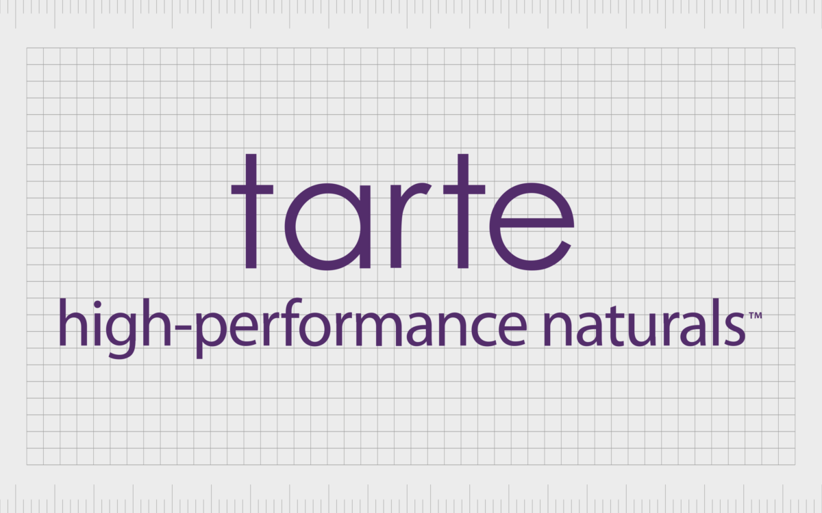
The Tarte Cosmetics logo: Simple but powerful

Compared to other well-known beauty brand emblems, the Tarte Cosmetics logo is a relatively new addition to the industry. The simple symbol has been circulating in the beauty space for just a couple of decades, since launching in the year 2000. What’s more, looking back through Tarte Cosmetics logo history, we can see it hasn’t changed much in that time.
Like most beauty companies, Tarte developed its logo to convey the unique personality and vision of its company to its target audience. However, even as the personal care landscape has developed, Tarte’s visual identity has remained the same, growing and evolving through the years.
Though it might seem simple at a glance, the Tarte Cosmetics logo sends a powerful message. This sleek and simplified symbol highlights the friendly, compassionate nature of the company, with a carefully chosen combination of colors and fonts.
Today, we’re going to be taking a closer look at the Tarte Cosmetics emblem, the brand behind the logo, and why the company’s visual identity has generated so much success.
Is Tarte a Japanese brand? An introduction
Before beginning our adventure into Tarte Cosmetics logo history, it’s worth examining the brand itself and how it has evolved through the decades.
Tarte, or Tarte Cosmetics, is an American beauty company, currently headquartered in New York City. The brand was founded initially by Maureen Kelly in 1999, who entered the market with a cheek stain in the year 2000.
Tarte’s founder came up with the idea for the company when studying for a PHD at the Columbia University. She couldn’t find a makeup she liked, capable of delivering a glamorous, but natural look, and decided to make her own.
Kelly started her organization with a little help from her husband, researching the cosmetics landscape, and working primarily out of her apartment. Her first product, the Tarte Cosmetics cheek stain, caught the attention of beauty writers only a week after it launched in the Henri Bendel store.
After generating excitement among the press, Kelly spent the first two years in her company delivering sample products to magazine publishers, to expand awareness for her brand. Her strategy turned out to be a success, as Tarte launched in Sephora during 2003, and on QVC two years later.
While Tarte is still officially an American cosmetics brand today, a Japanese company named the Kosé Corporation purchased a 93.5% stake in the organization in 2014. As such, some people today often incorrectly assume Tarte is a Japanese company.
What kind of brand is Tarte? An introduction
The Tarte Cosmetics brand was designed primarily to focus on the production of high-quality, natural-looking makeup products. Tarte’s focus on developing pure, natural products is part of what sets the company apart in its industry.
It’s simple approach to ingredients in makeup also shines through in the Tarte Cosmetics logo, which is a highly minimalistic wordmark.
Tarte Cosmetics doesn’t use synthetic fragrances, parabens, or mineral oils in their products, as they believe these substances can clog pores and disrupt hormones.
Tarte is also established as a cruelty-free makeup company. The brand doesn’t test on animals or sell products in regions where such testing is legal, and Tarte has been certified by PETA.
Alongside fighting against animal cruelty, Tarte Cosmetics also differentiates itself from its competitors with a strong approach to philanthropy. Founder, Maureen Kelly, has partnered with the Sustainable Amazon Partnership, and the Tyler Clementi Foundation.
Is Tarte a high-end brand?
While Tarte products are made with high-quality ingredients, it’s difficult to determine whether it can be defined as a “high-end” brand. Most high-end beauty companies sell their products at a premium, whereas Tarte items are generally considered quite affordable.
However, Tarte isn’t necessarily considered a “budget” brand either. The pricing structure chosen for the company is somewhere in the middle.
Tarte Cosmetics logo history: The iconic Tarte emblem
As mentioned above, if you look through Tarte Cosmetics logo history, you’ll notice there have only been a handful of emblems used by the company. In fact, there’s only one official Tarte logo, although it has been presented in a number of different variations over the years.
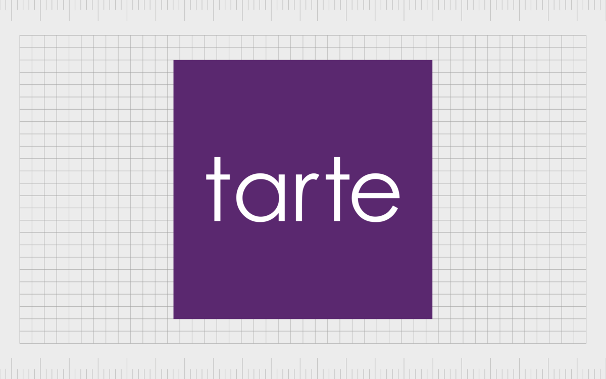
The official Tarte Cosmetics logo features a simple wordmark, written in all lowercase sans-serif letters. The rounded characters look friendly and accessible, particularly with plenty of balanced spacing between each letter.
Typically, the official Tarte logo is set on a square background, symbolizing stability, balance, and strength.
Perhaps the most recognized version of the Tarte Cosmetics emblem positions a purple wordmark on a white background. However, it’s common to see this color palette inverted too. The exact shade of purple used in the Tarte logo can also vary.
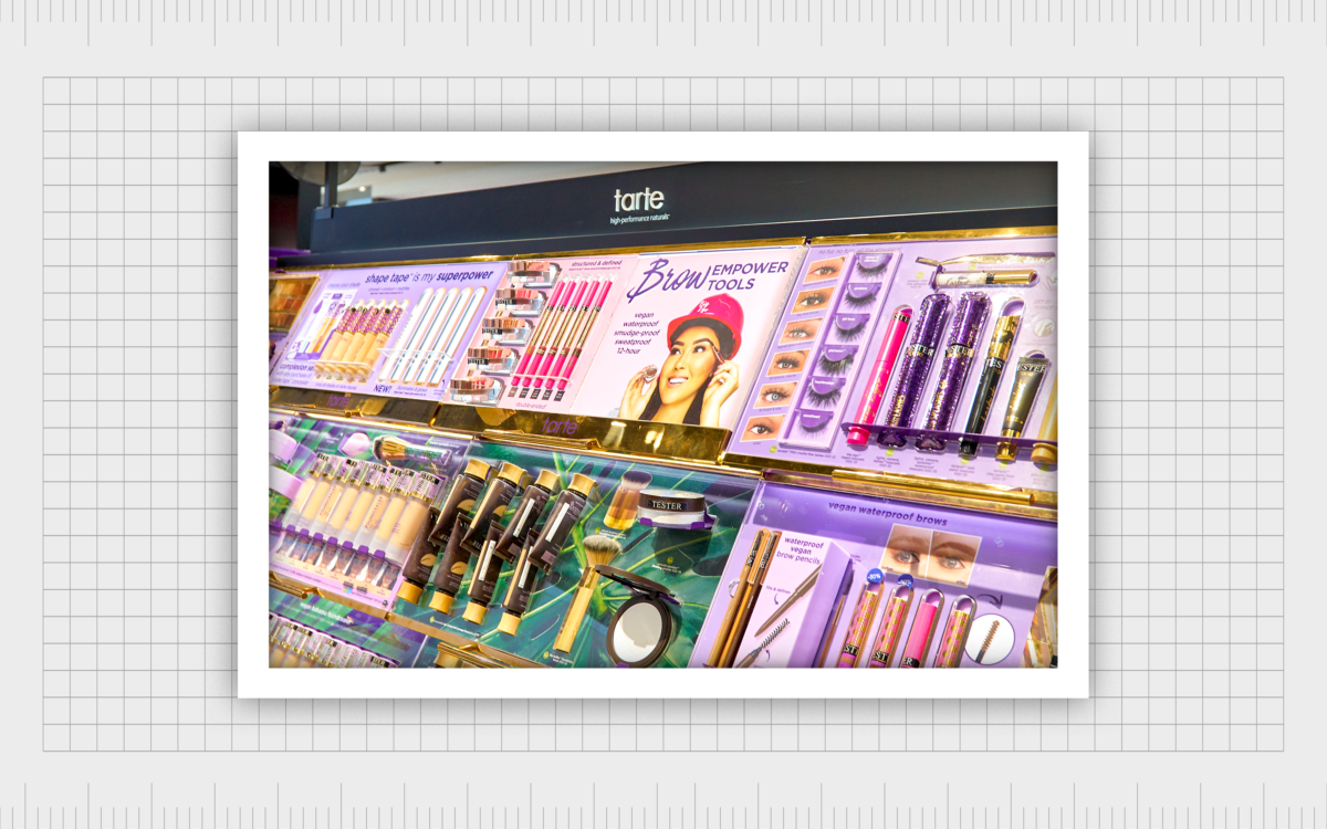
Alongside a simple wordmark logo, Tarte also occasionally uses an emblem which includes a tagline or slogan, underneath the name of the company. Usually, this tagline is presented in a matching font to the Tarte name itself, and reads “high-performance naturals”.
The tagline draws attention to the company’s focus on creating high-quality products, free from any additives or chemicals. It balances well with the wordmark above, creating a sleek and simplistic two-line emblem. Overall, the Tarte logo looks crisp, modern, and fresh.
The Tarte logo: Fonts and colors
At a glance, the Tarte Cosmetics logo is a relatively simple symbol, with no decorative elements or shapes to speak of. However, this eye-catching design is powerful for a number of reasons.
The Tarte logo screams simplicity, drawing attention to the company’s commitment to deliver highly natural products to its customers, with no added chemicals and components.
The soft, rounded font choice used in the wordmark makes the company seem accessible and friendly, particularly when combined with the color palette of white and purple. In the world of color psychology, purple is often associated with luxury, compassion, and femininity.
If you want to see the Tarte logo in closer detail, you can find some useful resources here:
What color is the Tarte Cosmetics logo?
The Tarte Cosmetics logo color palette has remained mostly consistent for the life of the brand. Although some variations of the Tarte emblem have appeared in different shades throughout the years, the most common colors in use are purple and white.
In some cases, the Tarte wordmark appears in white on a purple background, where in others the color palette is inverted. The most eye-catching Tarte Cosmetics logo color is its sophisticated purple shade, which demonstrates a combination of luxury and compassion:
HEX: 522d6d
RGB: 82 45 109
CMYK: 25% 59% 0% 57%
What font does the Tarte Cosmetics logo use?
The Tarte Cosmetics logo font is unique to the brand. It’s a simple and straightforward typography, written in all lowercase letters. This minimalistic sans-serif font features short lines, and large curves, highlighting inclusion, and improving legibility.
While Tarte has not released the official name of their font it’s similar in some ways to the Futura font, Public Sans, and other popular sans-serif options.
The simple Tarte Cosmetics symbol
Looking at Tarte Cosmetics logo history, it’s easy to see why the company chose to retain a consistent visual identity over the years. While the Tarte emblem is simplistic, it’s engaging and meaningful in its own way.
The simplistic logo highlights the natural focus of the company, and their commitment to creating equally simple products, capable of doing incredible things.
The elegant and modern font choice showcases the forward-thinking nature of the brand. Plus, the lowercase inscription makes the company appear more welcoming and friendly. Even the color palette of white and purple showcase a commitment to purity, compassion, and luxury.
Fabrik: A branding agency for our times.
Clarity starts with a conversation.
Thanks—we’ll get back to you shortly.
Whether you're navigating a rebrand, merger, or simply need a clearer identity—we’re here to help. No hard sell, just honest advice from people who know the sector.
Let’s start with a simple question…
Prefer to email? Drop us a line.
Fabrik’s been helping organisations rethink and reshape their brands for over 25 years. We’ve guided companies through mergers, rebrands and new launches. Whatever stage you’re at, we’ll meet you there.


