Star Wars logo history and evolution

A long time ago, in a galaxy far, far away, Star Wars logo history began. Well, not really. The first Star Wars logo was introduced with the brand in 1977, by creator George Lucas. The concept quickly caught on as one of the most exciting epics of all time, and a pop-culture phenomenon.
Over the years, the Star Wars logo has evolved to find its way into various films and other media, including video games, comic books, television series, and even theme park attractions.
In 2020, the value of the brand reached a massive $70 billion, making Star Wars the fifth-highest-grossing media franchise ever created.
Across the globe, the Star Wars logo is an easily-recognizable and adored emblem from the franchise. Like any brand symbol, the Star Wars logo also helps the venture to connect with its target audience and earn recognition in a host of environments.
Here’s your guide to Star Wars logo history.
The original 1977 Star Wars logo
Since its original inception in the 1970s, the Star Wars logo has become more than just a brand icon – it’s a symbol of pop culture mastery. Though the logo is somewhat simple, it has always had a meaningful impact on its target audience.
When the original Star Wars logo appeared in 1976, it was only for a handful of people. This version of the logo, created by Ralph McQuarrie, featuring a black logotype on a white background.
Most people aren’t familiar with this design, as it didn’t appear on the majority of film posters and merchandise. The brand felt though that while the design was modern, it was too soft for the plot of the franchise.

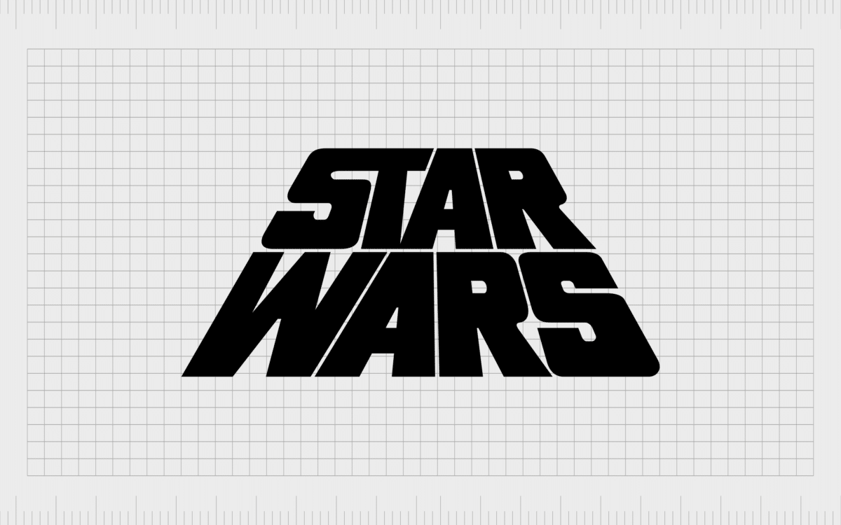
The old Star Wars logo which arrived after the first is a simple, bold, and engaging design, with much thicker, block letters.
While there were multiple designs of the Star Wars logo used for posters and other marketing materials, many people were familiar with either a black, or yellow wordmark, designed to appear as though it was disappearing into the distance.
The design is a lot like the scripting most filmgoers saw at the beginning of the movie.
Most versions the “New Hope” movie poster even placed stars (in the form of white dots) through the design. This helped to highlight the theme of the movie, although many brand assets were still depicted in simple black or yellow coloring.
The extra bold lettering on the original Star Wars logo (as most people know it today), helped to make the design stand out in any media.
The decision to place the words one on top of the other was also ingenious, and deliberate, as it allowed the company to remind viewers of the experience, they get at the start of the Star Wars movie.
Star Wars logo history: Star Wars logos through the years
Star Wars symbols have come a long way over the years. Although the old Star Wars logos and the one we know today both use the same focus on word marks, they each have a unique personality and appeal to them.
The 1977 Star Wars logo most people know best today didn’t exist when “A New Hope” was first introduced. This was why the designers had to create something using the scripting typography from the start of the movie.
It wasn’t until later in 1977 when this iconic image appeared:

The white sans-serif inscription in smooth, elongated lines was outlined in black, with an extra tail added to the “R” and the “S” at both sides. The futuristic emblem was intended to highlight the otherworldly nature of the plot in the Star Wars franchise.
The official 1977 logo became the “Star Wars trilogy” logo, staying with the brand for all three of the initial movies. However, it’s worth noting the Star Wars logo designer did make some changes throughout the course of the franchise’s history.
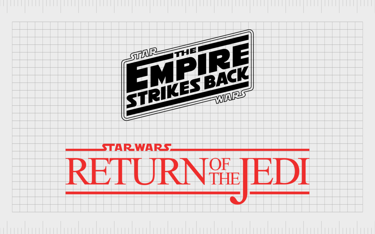
If we look at the first three logos for the Star Wars movies, all three designs are almost identical. Each uses the main Star Wars logo at the top of the Star Wars symbol, followed by the episode number, and the name of the title underneath.
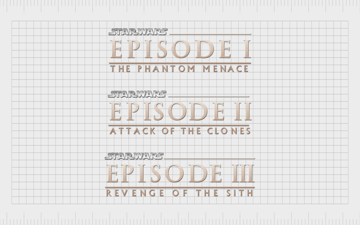
When the Star Wars series was introduced for a second time, this time with a series of prequels to help explain the story behind the iconic franchise, the group experimented with a slightly different set of designs.
While “Return of the Jedi” followed a similar style to the first three star wars movie, the initial “Star Wars” logo was a much simpler design, intended to replicate the 1977 logo many people once knew.
The “Empire Strikes Back” took an entirely different approach to logo design, using a kind of angled banner to highlight the name of the movie as the largest point in the image.
Each piece of the trilogy here also had its own color scheme.
When the final three Star Wars movies were released (at a much later stage), the design of the logos was updated again. This time, the “Star Wars” symbol was split in the middle to make way for the name of each individual movie.
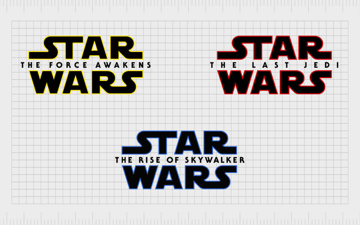
Similar to the prequel series, this selection of logos each had its own color scheme, focusing primarily on yellow, blue, and red.
The Star Wars symbol: The new Star Wars logo
The unique wordmark for “Star Wars” is the primary symbol of the brand, and something which has remained a consistent part of the franchise identity over the years.
Throughout the years, we saw a number of changes to the colors and additional elements added to the movie titles of each Star Wars creation. However, in virtually every movie, you would still be able to see the secondary 1977 logo most filmgoers had become so accustomed with.

According to George Lucas and the Star Wars branding team, the choice of the wordmark was intended to represent the future, the possibilities of space, and the vast world created and inhabited by the Star Wars characters.
The use of certain colors has also taken on various meanings for both the brand and its fans. For instance, yellow is often associated with the stars, particularly when presented on a black background, intended to highlight the eternal abyss of space.
What color is the Star Wars logo?
As mentioned above, the Star Wars color schemes have changed a number of times over the years, often to represent certain elements of the movies they’re used to depict.
For instance, in “The Rise of Skywalker”, a new Star Wars logo in blue, white and black was chosen due to the color of Luke Skywalker’s iconic blue lightsaber.
In the “Last Jedi” which focuses heavily on Rylo Ken and the Sith, the decision to use a deep red helped to highlight the focus on the darker side of the Star Wars characters. Red in the franchise is often associated with the color of the Sith (the villains) and their lightsabers.
The official colors of the Star Wars logo colors, according to the franchise, however, are yellow and black. The most definitive Star Wars logo color is definitely the bright banana yellow, often associated with the shimmering stars of space.
Banana yellow:
PANTONE: PMS 107 C
HEX COLOR: #FFE81F
RGB: (255, 232, 31)
Black:
PANTONE: PMS BLACK 6 C
HEX COLOR: #000000
RGB: (0, 0, 0)
What font does the Star Wars logo use?
The Star Wars logo font is probably the most memorable part about the symbol. After all, the unique font of the symbol is present on every version of the Star Wars logos over the years.
Perhaps unsurprisingly, like most iconic logos, the font for the Star Wars logo wasn’t an existing typography but created from scratch for the franchise. The design, intended to be sleek and futuristic, helps to draw attention in the use of elongated elements within certain letters.
The “S” and “T” of “Star” seem to merge into each other, while the “S” and “R” both have elongated elements which seem to expand into the distance. The “R” and “S” of “Wars” also connect on the bottom line of the image.
Overall, the Star Wars logo was successful in creating a unique, modern image capable of standing the test of time. Eventually, a version of the font was created for mass use, which is called “Star Jedi”.
This allows people from all backgrounds to experiment with the Star Wars type to create their own memorable headlines.
Star Wars logo resources:
Remember, you can always learn more about the logos of some of the world’s most famous brands by checking out other Logofiles here on Brand Fabrik.
Fabrik: A branding agency for our times.
Clarity starts with a conversation.
Thanks—we’ll get back to you shortly.
Whether you're navigating a rebrand, merger, or simply need a clearer identity—we’re here to help. No hard sell, just honest advice from people who know the sector.
Let’s start with a simple question…
Prefer to email? Drop us a line.
Fabrik’s been helping organisations rethink and reshape their brands for over 25 years. We’ve guided companies through mergers, rebrands and new launches. Whatever stage you’re at, we’ll meet you there.


