SAP logo history: Evolving through the ages

If you’re familiar with the software industry, you’ve probably encountered the memorable SAP logo once or twice. However, SAP logo history reveals the company’s quest for a powerful brand identity took the image through a variety of changes.
Like many leading software and technology brands, SAP has altered its symbol throughout the years, based on evolutions in its brand strategy, and changes in design trends. Experimenting with geometric designs, and color palettes, SAP eventually found a compelling visual identity.
Today, the company’s logo might seem somewhat simple, but it’s a testament to the company’s strength, stability, and continued focus on shaping the future. Today, we’re taking a closer look at SAP logo history, and the evolution of the SAP brand.
The SAP symbol: Introducing the SAP brand
Before we begin discussing SAP logo history, it’s worth taking a moment to introduce the SAP company on a broader basis. SAP, or SAP SE was first introduced in 1972, under the name Systemanalyse und Programmentwicklung.
Initially, the company was created as a private partnership, and its moniker grew a little more complex before SAP decided to simplify its title. In 1981, SAP was known as Systeme, Anwendungen und Produkte in der Datenverarbeitung.
It wasn’t until 2005 that SAP became “SAP AG”, followed by SAP SE in 2014. SAP is a multinational software company, based in Germany, and known for developing enterprise software for customer relations and business operations.
Today, SAP stands as the world’s third-largest non-American software brand by revenue. Alongside state-of-the-art ERP software, SAP also produces database technology and software, cloud-engineered systems, and a range of other products, including customer relationship management tools.
It’s worth noting SAP has made a huge number of strategic acquisitions over the years, helping to facilitate its growth and the development of new products. What’s more, SAP partners with a huge range of Global Service Partners, in a multitude of industries.
SAP logo history: Changes through the years
At a glance, SAP logo history seems relatively consistent. Various aspects of the company’s brand identity have remained the same through the decades. For instance, the brand has always used the “SAP” acronym in its branding, alongside geometric shapes.
Of course, there have been some alterations to the SAP logo too. Let’s take a closer look at the changes to the SAP identity through the decades.

1972
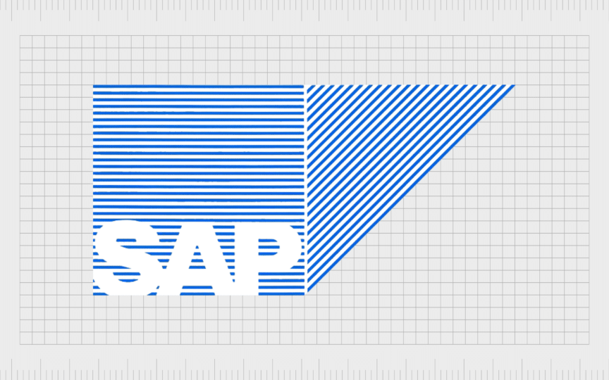
One of SAP’s most complex logos was initially introduced in 1972, when the brand was initially formed. Though this design is similar in some ways to the emblem we know today, it’s a little more visually jarring, thanks to the use of concentric blue and white lines in the background shapes.
The image featured the letters “SAP” in white, blacked on a striped blue and white square. Alongside the block shape, a triangle sits on the right hand side, apparently pointing towards the right. This may be SAP’s version of an arrow, pointing towards the future.

1995
Although SAP’s initial logo was quite successful, the company thankfully made some changes in 1995, to make the image a little easier on the eyes. The striped square and triangle were replaced with solid, dark blue shapes, helping the acronym to stand out.

SAP made a very slight alteration to this logo in 1999, maintaining the overall image, but adjusting the “SAP” typeface. The letters remained mostly the same, but the line in the “A” was curved, to create an image similar to a smiling mouth.
The inscription was also stretched vertically, allowing the acronym to take up more of the available space in the blue square.

2000
In the year 2000, after introducing its new “smiling” A, SAP made one major change to its emblem. The previously disconnected square and triangle were combined, creating a unique new shape. Though the update may seem basic, it had a significant impact on the company’s brand.
The new SAP logo appeared more professional, authoritative, and robust. Additionally, it ensured SAP could increase the size of its inscription significantly, allowing it to take up more space.

2011
SAP introduced the logo most of us know today for the first time in 2011. This design was based heavily on the previous emblem, retaining the same geometric shape, and typography. The most significant change was to the color palette.
The dark blue background was replaced with a brighter shade of blue, in a gradient format, which started darker at the bottom and became lighter towards the top.

2014
For a brief period in 2014, SAP made quite a bold change to its logo. The company abandoned its blue and white color palette, to introduce a vibrant shade of golden yellow. The new color was intended to symbolize a sunny and optimistic disposition.
The new coloring wasn’t the only major change to the emblem. SAP also removed the familiar square and triangle shapes, creating a more simplistic design overall. A version of this logo was also created in inverted colors, with “SAP” in white on a golden background.
Though the new coloring was eye-catching, SAP soon eliminated it, returning to the previous design introduced in 2011. The company felt its blue coloring and unique use of shapes helped to distinguish it from other software companies in the evolving market.
What does the SAP logo mean?
The SAP logo might seem like a relatively simplistic mark at a glance, but it has a lot of deeper meaning ascribed to it. For instance, each shape present in the logo has its own psychological connotations. Triangles are often associated with progress and innovation.
Squares, on the other hand, give viewers a sense of stability and strength, helping to establish SAP as an authoritative brand. The two shapes combined together aimed to highlight the company’s progressive thinking, intelligence, and professional nature.
The blue color palette is also meaningful. Blue in color psychology is frequently connected with concepts like reliability and trust. Combined with white, often associated with excellence and professionalism, the color palette gives SAP a strong corporate image.
Finally, the typography used in the SAP inscription is quite compelling. The bold sans serif letters add to the company’s strong and authentic image. However, the curved line in the A, representing a smile, is intended to highlight the brand’s approach to excellent customer service.
The SAP logo: Fonts and colors
Combining components of color and shape psychology, with unique typography, the SAP logo is a simple design with an evocative appeal. The emblem helps to demonstrate the power of the company in the software space, as well as its focus on innovation and customer-centric service.
SAP’s logo may have gone through a number of changes over the years, but the company has also preserved a lot of its roots. Throughout the decades, the brand has rarely veered too far from its use of specific colors, shapes, and fonts.
You can find examples of the SAP logo here:
What color is the SAP logo
Despite a brief adventure into a golden yellow color palette, SAP logo colors have remained relatively consistent over the years. The color blue is common in the professional world, particularly in the technology industry, where it can be connected with fresh ideas and perspectives.
The exact shade of the SAP logo has varied throughout the decades. Today, the color palette generally includes a white wordmark placed on a gradient blue background, made from a combined square and triangle. The shades range from deep sky blue to a denim shade.
What font does the SAP logo use?
Just as the SAP logo color hasn’t changed much over the years, the SAP font has only gone through a handful of basic changes. The brand has always used a bold sans-serif typeface for its inscription, similar to popular fonts like Calibri.
However, the SAP logo font does have a few distinguishing characteristics. The brand modified some of the strokes, making the arc of the S smoother, and adjusting the horizontal line in the “A”. The curved line in the A represents a smile.
What is the trademark symbol for SAP?
Throughout SAP logo history, the trademark symbol for the company hasn’t changed much. The company has consistently used an acronym inscription, often placed on a background which consists of a square and a triangle, placed closely together, or combined.
Though the logo might seem basic, it leverages a number of psychological concepts. The square and triangle symbolize stability and forward motion. The blue color palette highlights innovation, as well as reliability and trust.
Even the unique SAP font helps to convey the brand’s robust and professional nature, as well as its commitment to excellent customer service.
Fabrik: A branding agency for our times.
Clarity starts with a conversation.
Thanks—we’ll get back to you shortly.
Whether you're navigating a rebrand, merger, or simply need a clearer identity—we’re here to help. No hard sell, just honest advice from people who know the sector.
Let’s start with a simple question…
Prefer to email? Drop us a line.
Fabrik’s been helping organisations rethink and reshape their brands for over 25 years. We’ve guided companies through mergers, rebrands and new launches. Whatever stage you’re at, we’ll meet you there.


