Pizza Hut logo history – is the Pizza Hut logo a hat?

Are you familiar with Pizza Hut logo history? Around the world today, most people can’t see a red hat-like shape on a building without immediately thinking of Pizza Hut. The iconic Pizza Hut logo has become one of the most recognized symbols in the world for over 60 years.
First introduced in 1958, the Pizza Hut logo has undergone several changes inspired by the evolution of the organization’s brand identity and personality. Today, the symbol is a relatively simplistic, with roots that date back to some of the company’s earliest brand assets.
Pizza Hut is well worth exploring for anyone interested in the evolution of pizza company logos. Today, we will look closer at the origins and evolution of the Pizza Hut logo to show you how the design has changed over the years.
The Pizza Hut logo: Introducing Pizza Hut
Pizza Hut is a multinational restaurant chain and franchise founded in Wichita, Kansas, in 1958. Two brothers studying at University decided to open an Italian pizzeria in their hometown within a small red brick building.
Within only six months, the company expanded into a second outlet, and within a year, there were 6 Pizza Hut restaurants operating around the US.
Today, Pizza Hut is the world’s largest pizza chain, according to the number of locations, and it’s one of the world’s largest fast-food restaurants. Although PepsiCo originally purchased it in 1977, the company has now changed hands and is owned by Yum! Brands.
Over the years, Pizza Hut invested in a number of branding strategies to make their company stand out in the evolving fast food market. In 1963, an iconic building structure was designed specifically for Pizza Hut restaurants, created by George Lindstrom.
Pizza Hut has also made a number of updates to its brands across the years, including a major change that took place in 2014 to increase sales. Despite numerous alterations to its visual identity, Pizza Hut has maintained a highly recognizable image.
What is the Pizza Hut slogan?
As part of its comprehensive marketing and branding strategy, Pizza Hut introduced a number of different logos intended to enhance brand recognition and awareness. Until 2007, the main advertising slogan used by the brand was “Gather ’round the good stuff.”
Between 2008 and 2009, this slogan was updated to “Now You’re Eating,” and between 2009 and 2012, the company used “Your Favorites: Your Pizza Hut.”
For a period between 2012 and 2018, the company’s slogan evolved to “Make it Great,” based on the “Makin’ it Great” slogan used in previous years. Currently, the advertising slogan is simply: “No one Out-Pizzas the hut.”
Pizza Hut logo history: When did Pizza Hut change its logo?
There have been a handful of changes to Pizza Hut visual identity over the years as the company has expanded, grown, and built on its brand identity. The logo’s most recent variation is a symbol of the company’s return to its earlier roots.
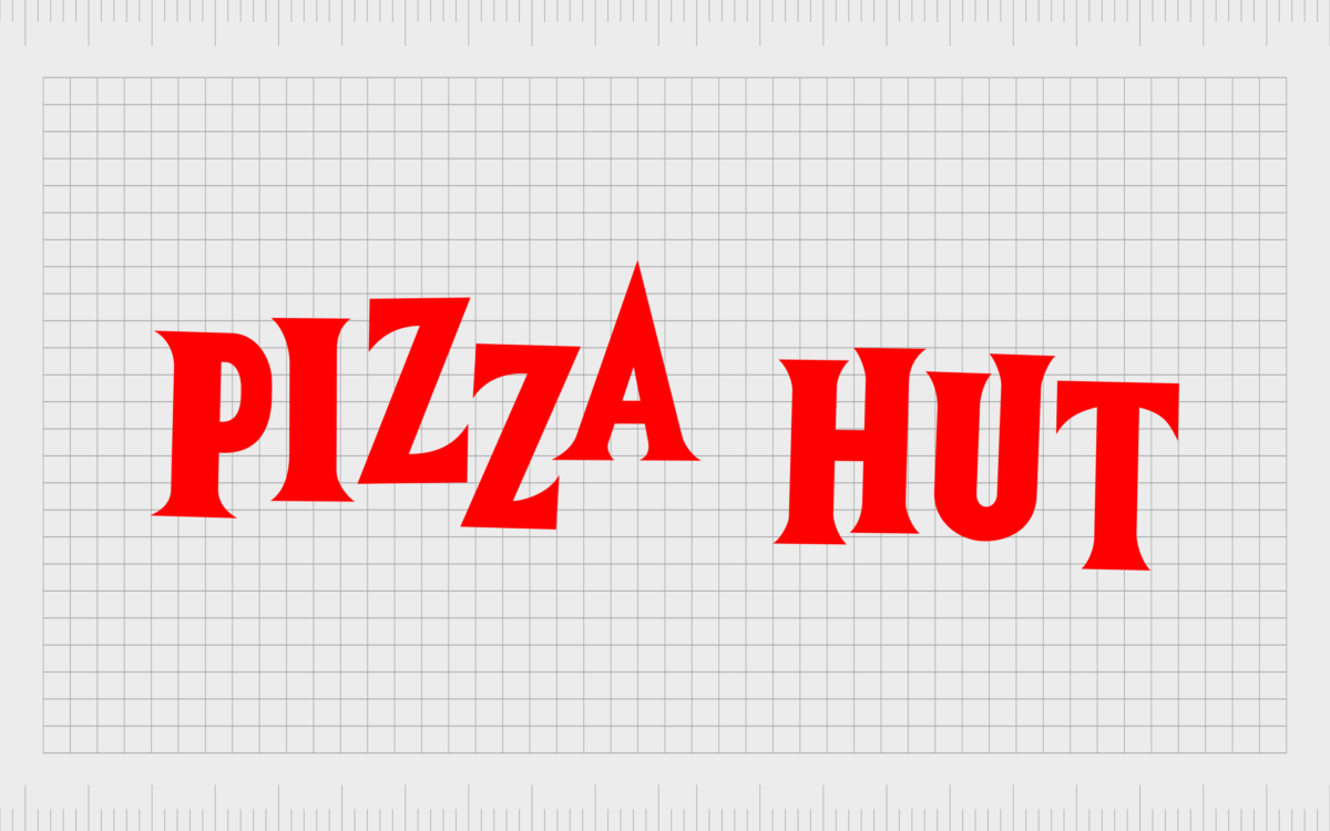
1958
When the first Pizza Hut restaurant opened in 1958, the initial logo was relatively simple, consisting of a bright red wordmark written in all uppercase letters. The serif font appeared to jump off the page, with each letter placed in an almost random location.
The design was intended to exude ideas of activity, fun, and playfulness.
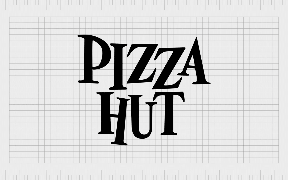
In 1962, the wordmark version of the logo was simplified. The colors changed from bright red to black, with a much slimmer serif font style. The letters were placed within the same horizontal lines for a more consistent appearance, though the characters aren’t entirely level.
The right leg of the “A” is a little longer than the others, and the letters “U” and “T” seem to hover above the rest.
1970
A redesign in the 1970s brought various elements from the two previous logos together. The color palette was still black and white, but the overall image appeared more fun and light-hearted. The words here are arranged one on top of the other for a more compact appearance.
1974
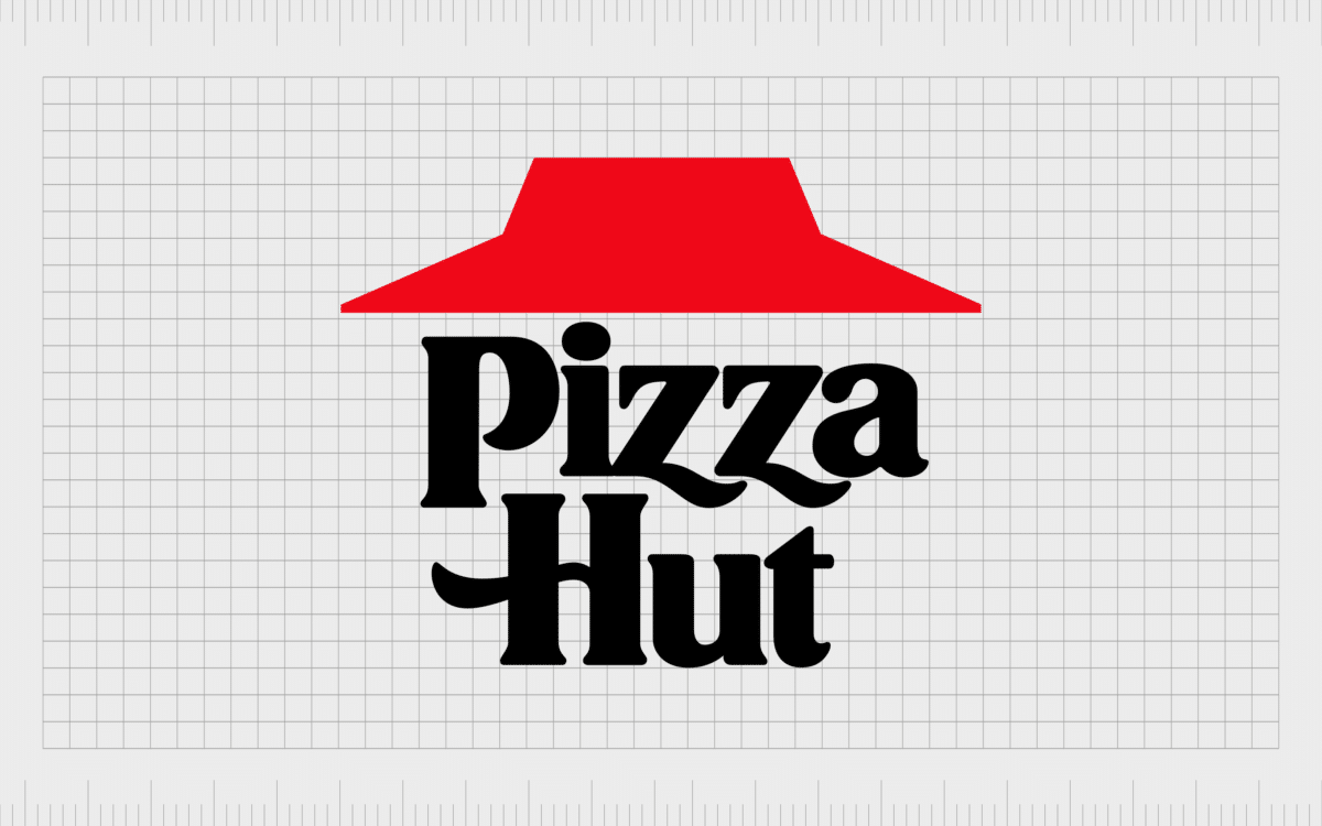
The Pizza Hut logo introduced in 1974 is similar to the one we know today. Lippincott in collaboration with Sam Moyers, a senior Marketing Manager designed it. The design highlighted the legendary red roof, which appeared on the branded buildings in the restaurant chain.
Underneath the roof, we still see the two-level inscription of the brand name, though the font has changed slightly. The lines in the Z’s and H’s are slightly wavy to convey the sense of fun the company initially wanted to capture with their first design.
1999
In 1999, a more colorful and artistic version of the Pizza Hut logo appeared. This design featured slightly looser lines, making them look like they were painted with a brush. The graphics and the text shared a similar style, creating a uniquely playful image.
The inscription is also positioned at a slight tilt, as though it’s rising up toward the right. In this Pizza Hut symbol, we also see a swipe of yellow on the bottom of the design and a green dot over the “I” in pizza.
The compelling design is unique, eye-catching, and brimming with the colors we typically associate with the fast food industry.
2010
A slightly more refined and modernized version of thePizza Hut logo was introduced in 2010. The thick black lines around the red roof shape have been eliminated, though gradients appear to give the design an almost 3D texture.
The roof is also slightly straightened, while all of the other elements remain in their original places.
This design was simplified again in 2014 for the North American market. The yellow and green coloring was removed, and the typeface was refined slightly for a bolder, more contemporary feel.
2014
2014 marked a major moment in Pizza Hut branding history. The company was designed to completely change its image in an attempt to lift its falling revenue.
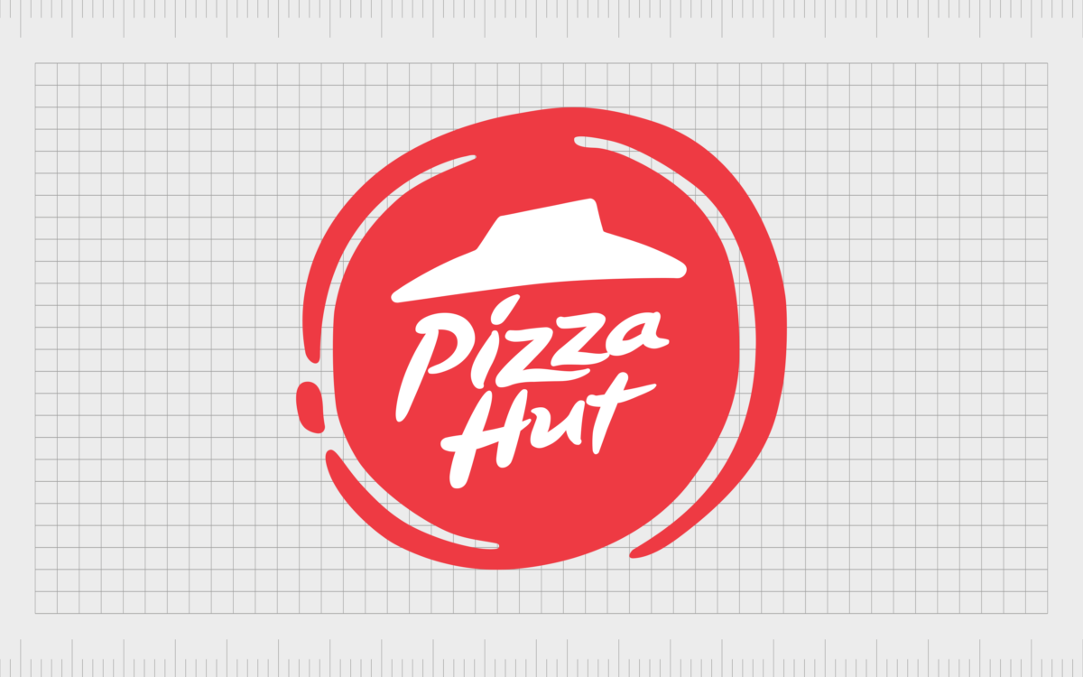
While many aspects of the previous logo remain similar, including the font choice and the hut roof, everything has been placed on a red circle, similar to the shape of a pizza.
The name of the company and the roofing element are placed in the center of the circle, with a white dashed outline
2019
In 2019, Pizza Hut re-introduced a version of its previous logo, in use between the years 1974 and 1999. While most of the components are the same as the previous design, the roof shape is slightly brighter and more refined.
Additionally, the two parts of the company’s name are placed side-by-side rather than being stacked on top of each other.
Pizza Hut symbol colors and fonts
The Pizza Hut logo is a simple but effective emblem, ideal for a company with a significant heritage and presence around the world. The Pizza Hut symbol shows us that sometimes, in order to grow your brand and take your company forward, you may need to look into your past.
Today, the unique emblem symbolizes passion and strength, as well as quality and elegance, thanks to the use of its powerful typeface. If you want to look at the Pizza Hut logo in a little more detail, you can find some useful resources here:
What color is the Pizza Hut logo?
The Pizza Hut logo colors have changed a few times throughout the company’s history. For a time, the brand used a simple black-and-white emblem in most of its branding. There were also moments when the colors yellow and green were an important component of the Pizza Hut symbol.
However, the most recent Pizza Hut logo color palette simply includes the colors red and black, often placed on a white background.
Red
Hex: #C90014
RGB: (201, 0, 20)
CMYK: (14, 100, 100, 5)
PANTONE: PMS 485 C
Black
Hex: #000000
RGB: (0, 0, 0)
CMYK: (60, 40, 40, 100)
PANTONE: PMS BLACK 6 C
What font does the Pizza Hut logo use?
Although the red hut shape may be the first thing you notice about the Pizza Hut logo, the company’s font choice is significant too. It helps to convey the personality of the brand, as well as its elegant Italian roots. The typeface is unique to the company and is often referred to as “Hot Pizza.”
The deep dish: Why is the Pizza Hut logo a hat?
While the Pizza Hut logo might be iconic, it has been subject to some confusion and controversy. Many people believe the design makes the red roof look a lot like a wide-brimmed hat. However, it’s intended to reference the architecture created for the Pizza Hut franchise.
The red coloring may represent the tomato sauce in most pizza dishes. It’s also a symbolic shade, frequently associated with confidence and passion. The wavy lines in the “Z” and the “H” show the fun personality of the company while also connecting it with Italian elegance.
Today, even if it’s sometimes confused with a hat, the roof symbol is one of the most recognizable elements of the Pizza Hut logo.
Fabrik: A branding agency for our times.
Clarity starts with a conversation.
Thanks—we’ll get back to you shortly.
Whether you're navigating a rebrand, merger, or simply need a clearer identity—we’re here to help. No hard sell, just honest advice from people who know the sector.
Let’s start with a simple question…
Prefer to email? Drop us a line.
Fabrik’s been helping organisations rethink and reshape their brands for over 25 years. We’ve guided companies through mergers, rebrands and new launches. Whatever stage you’re at, we’ll meet you there.


