Papa John’s logo history: Exploring the Papa John’s sign

There’s a good chance you’re familiar with the Papa John’s logo. It’s one of the most recognizable images in the world, thanks to the brand’s global reach. However, how much could you say about the history and evolution of the emblem? The Papa John’s logo history goes back quite a while.
Like most famous pizza company logos, the Papa John’s sign has always attempted to convey the identity and personality of the brand to its audience while differentiating it from its competition.
Today, the symbol appears relatively simplistic.
Like many modern brands have reduced and refined their logos over the years, Papa John’s has followed suit.
Not all logos created by Papa John’s have been met with the same approval. Many find the new Papa John’s logo to be more confusing than its predecessors. Today, we will take a closer look at the brand, and its evolving symbol, to help you better understand the design.
Who owns Papa John’s? An introduction to Papa John’s
Papa John’s International, also known as “Papa John’s” in the modern market, is an American pizza restaurant chain. It stands as the fourth largest pizza delivery company in the US, following behind well-known brands like Domino’s and Pizza Hut.
Since launching in 1984, Papa John’s has developed a strong presence in its industry. The company has spread to over 5,500 locations in 49 countries. It’s also the world’s third-largest company for pizza delivery. However, the organization has faced some controversies over the years.
Originally, Papa John’s was founded in 1984, when a man named John Schnatter, known as “Papa,” installed an oven in a broom closet inside his father’s tavern.
Eventually, John sold his car to purchase various pieces of used pizza equipment to start selling pizzas to customers. The pizzas proved popular enough to allow the founder to move to his own space a year later.
Papa John’s went public in 1993, and it had 500 stores only a year later. Interestingly, Shaquille O’Neil currently owns an ownership share of nine of the Papa John’s pizza restaurants in Atlanta, and he’s also a member of the board of directors for the brand.
What is the Papa John’s slogan?
The slogan for Papa John’s is “Better Ingredients. Better Pizza, Papa John’s”. However, the brand has used a number of different slogans and taglines in its marketing campaigns over the years. This particular statement is the most well-known.
Papa John’s logo history: Does Papa Johns have a new logo?
Over the years, Papa John’s has made various changes to its visual identity, similar to many pizza chains and restaurants. The company’s most significant change took place relatively recently when it refined and reduced its logo, removing the apostrophe from “John’s.”
The original design for the Papa John’s logo was relatively simple. The image included a picture of an “upside down” pizza slice, used for removing pizzas from large ovens. The geometric shape has also been described as a plate with a rectangle placed on top.
The name of the company is written in blue, arched font, which narrows towards the edges. Both aspects of the wordmark on this design are in all uppercase.
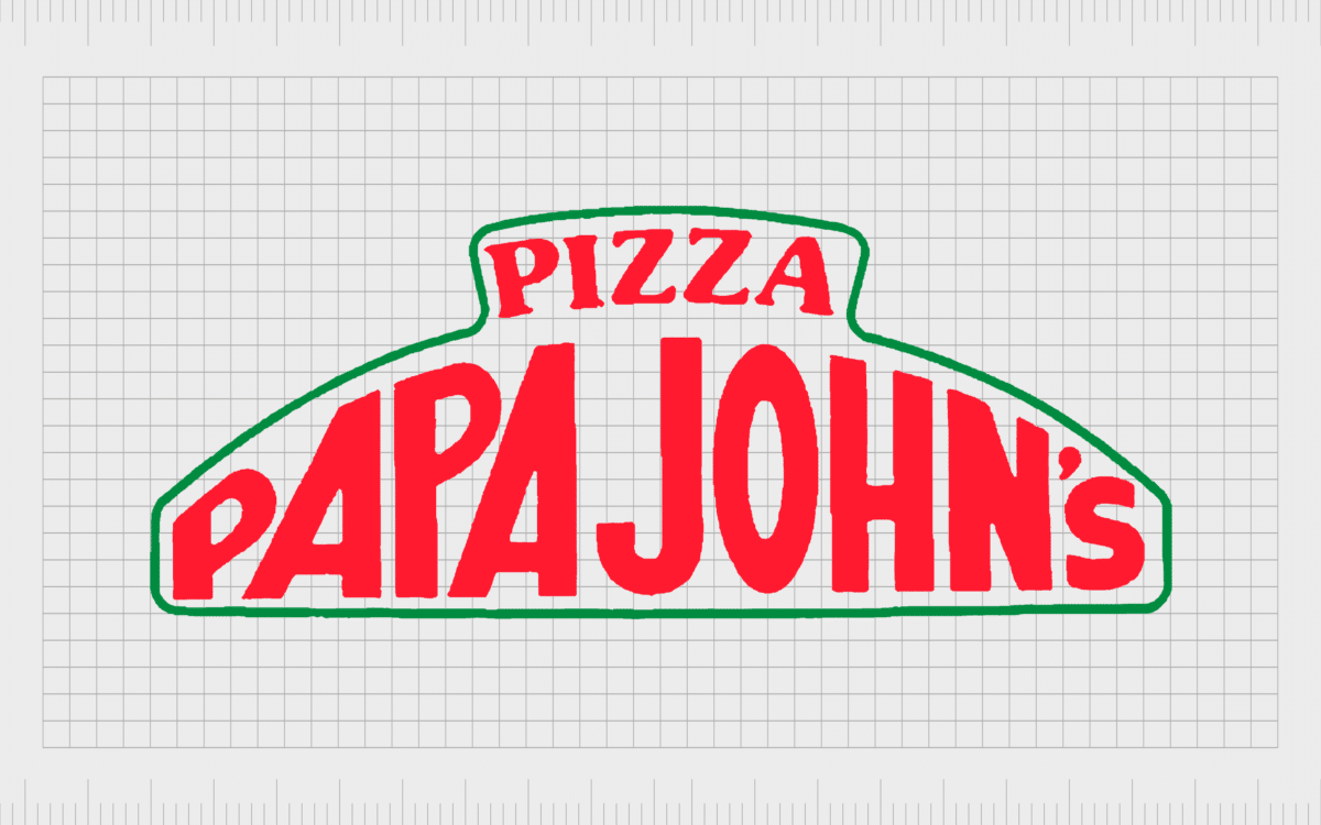
The next Papa John’s logo, also introduced in 1984, is similar in a lot of ways to the well-known design many people are familiar with today. The designers kept the shape of the arch and surrounded the full wordmark with a thin green line.
The colors of the emblem: red, white, and green, are a reference to the Italian flag and the origins of pizza.
The font in this version of the design is written in bright red. However, the bold characters are similar to those in the original logo.
In 1995, Papa John’s refined and enhanced its image with a focus on modernity. The arched font and overall shape of the emblem remained largely the same. However, wide serifs were added to the font in “Papa John’s,” and the typography for “Pizza” was changed too.
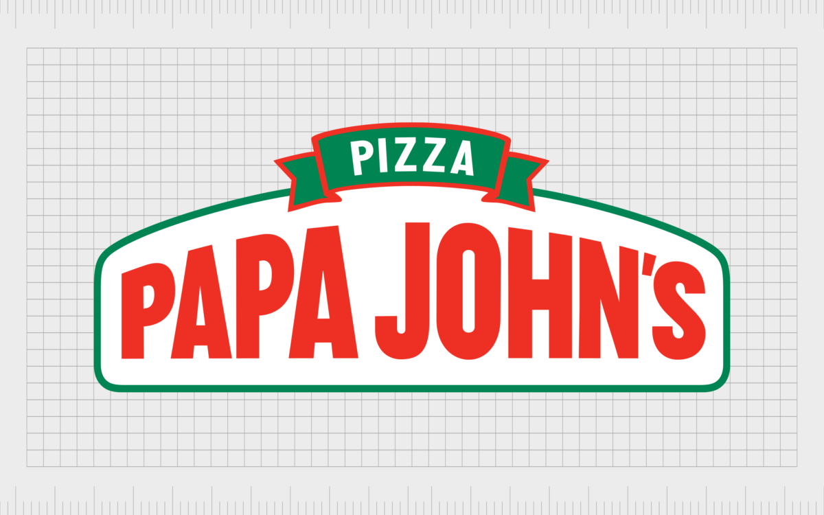
The “Pizza” part of the design is now placed in a separate ribbon-style banner. This aspect is written in white font on a green background with a red outline.
For a short time between 2018 and 2019, Papa John’s changed its visual identity entirely. The colors red, white, and green became more prominent in this simplistic design. The “Pizza” aspect has been removed, and the name of the company appears in two rectangles, one red and the other green.
The apostrophe has been removed from the name. However, there is a line underneath the “s” which appears a lot smaller than the rest of the characters.
The Papa John’s Pizza logo introduced in 2019 was very similar to the 1995 version, though more modernized and refined. This sign included the infamous curved shape most people were familiar with regarding Papa John’s emblems.
The “Pizza” aspect of the logo was re-introduced in its ribbon banner. The design was intended to reference the company’s heritage, drawing attention back to some of the previous aspects of its visual identity.
The letters were painted in scarlet instead of a rich red to make them easier on the eyes. This remains one of the best-known versions of the Papa John’s logo to this date.
Learning from Papa John’s new logo
At the end of 2021, Papa John’s introduced a new rebranding strategy, which completely transformed its logo, as well as how the name of the company was represented. The “Pizza” aspect of the ribbon was removed once again to create a more simplistic design.
The name maintained the curved shape, however, taking inspiration from some of the previous emblems.
The new logo was criticized, as many people were confused by the decision to remove the apostrophe and the other colors and decorative elements from the emblem. The block, bright red font is definitely eye-catching, and it fits well with the modern trend of oversimplification in logo design.
Some people believe the removal of the apostrophe in the new Papa John’s logo was an effort by the company to further distance itself from its original founder. The missing apostrophe suggests that the company no longer belongs to “Papa John” himself.
The Papa John’s pizza logo: Colors and fonts
Though the new Papa John’s logo hasn’t received the most positive reception from some of the company’s fans, it’s still a relatively effective representation of the brand’s identity.
The simplified and modern logo draws attention to the name of the company while allowing the brand to distance itself from its past and its original founder.
The Papa John’s logo as it stands today is a bright and bold wordmark, curved to look as though the middle letters are almost extruding from the page. The curved design has long been a component of the Papa John’s visual identity and appeared in some of its earliest logo creations.
The bright red coloring connects the company with ingredients like tomato, common in pizza, as well as concepts such as power and passion.
If you want to take a closer look at the most recent Papa John’s logo, you can find some useful resources here:
What color is the Papa John’s logo?
The colors of the Papa John’s logo have evolved a few times over the years. While red has always been a core color in the company’s palette, it has also experimented with other shades.
For the most part, the Papa John’s logo color palette included red, white, and green, in reference to the Italian flag and the origins of pizza. Today, however, it only features bright red.
The Papa John’s logo color today is:
Vivid Red
Hex: #FF0017
RGB: (255, 0, 23)
CMYK: 0, 1, 0.909, 0
What font does the Papa John’s logo use?
The Papa John’s logo font is unique to the company. The most compelling part of the wordmark is how it arches up in the middle, giving the design the shape of an inverted plate or pizza slice. Currently, the logo font is similar in style to Italian Plate No2 by the Playtype company.
The controversial Papa John’s pizza logo
Papa John’s logo history reveals some interesting insights into the company’s brand identity evolution. In recent years, the company has attempted to separate itself from its origins in some ways while maintaining its heritage in others. While the current design eliminates the apostrophe in “Papa John’s,” the original logos’s shape remains.
However you might feel about the Papa John’s pizza logo today, it’s difficult to deny that the design is eye-catching and modern.
Fabrik: A branding agency for our times.
Clarity starts with a conversation.
Thanks—we’ll get back to you shortly.
Whether you're navigating a rebrand, merger, or simply need a clearer identity—we’re here to help. No hard sell, just honest advice from people who know the sector.
Let’s start with a simple question…
Prefer to email? Drop us a line.
Fabrik’s been helping organisations rethink and reshape their brands for over 25 years. We’ve guided companies through mergers, rebrands and new launches. Whatever stage you’re at, we’ll meet you there.


