The Origins logo history and its impact on the cosmetics industry

For many lovers of the beauty and cosmetics landscape, the Origins logo is more than just an eye-catching emblem. This famous design symbolizes environmental protection, ethical production processes, and the quest to create a more sustainable world.
But how much do you know about Origins logo history and where the emblem began?
The Origins logo is a niche emblem compared to many other well-known beauty and cosmetics logos. Though it might not have the same reach as some other iconic designs, the Origins logo stands out for its emotional impact on its audience.
Despite launching a couple of decades again, in 1990, the Origins company hasn’t made many significant changes to its visual identity. The somewhat complex logo used by the brand was first introduced with the organization’s launch and has remained the same ever since.
Today, we will share everything you need to know about the compelling Origins brand and how it has transformed through the years.

What is Origins famous for? An introduction to Origins
Before we begin our evaluation of the Origins logo history, it’s worth taking a moment to identify the brand and its impact on the beauty landscape. Otherwise known as “Origins Natural Resources Inc,” the Origins company is an American cosmetics brand, first founded in 1990.
The organization was founded by the son of famous beauty innovator Estee Lauder. Leonard Lauder created Origins as one of the first original brands owned by the Estee Lauder Corporation. Primarily, the company is best known for producing natural, sustainable skincare products.
One of the most well-known lines produced by the company is the “Perfect World” product collection.
Origins is also well-known for collaborating with scientists and innovators on the development of specialist products intended to address the concerns of those with sensitive skin.
After operating for more than 25 years in the competitive cosmetics landscape, Origins has grown on a global scale, with more than 1,400 stores around the world.
Part of what makes Origins stand out in the current cosmetics and beauty industry is its commitment to developing highly ethical and sustainable products. The company had helped to plant more than 600,000 trees by age 25.
Additionally, the brand was one of the first in the prestige cosmetics space to use advanced recycled resin in its packaging and products.
Origins logo history: The memorable Origins emblem
As mentioned above, there aren’t a lot of significant changes to draw attention to as we look back through Origins logo history. While other organizations have experimented with a host of different designs, styles, and typeface choices over the years, Origins has maintained a consistent image.
The Origins emblem draws attention to the positioning of the brand as a provider of natural, sustainable, and earth-friendly products.
Since its inception, Origins has leveraged a combination mark as its logo, featuring two overlapping trees depicted in black on a white background. The trees are positioned atop two lines, meant to represent a field or hill.

Beneath the tree design, we see the name of the company, depicted in an interesting sans-serif font. The letters are evenly spaced, though each character seems to slant slightly in its own direction, giving the wordmark a sense of movement.
The friendly and natural font choice further highlights the company’s commitment to connecting emotionally with its target audience.
While the official Origins logo has always remained consistent, there have been numerous variations of the design used across different products and marketing campaigns.
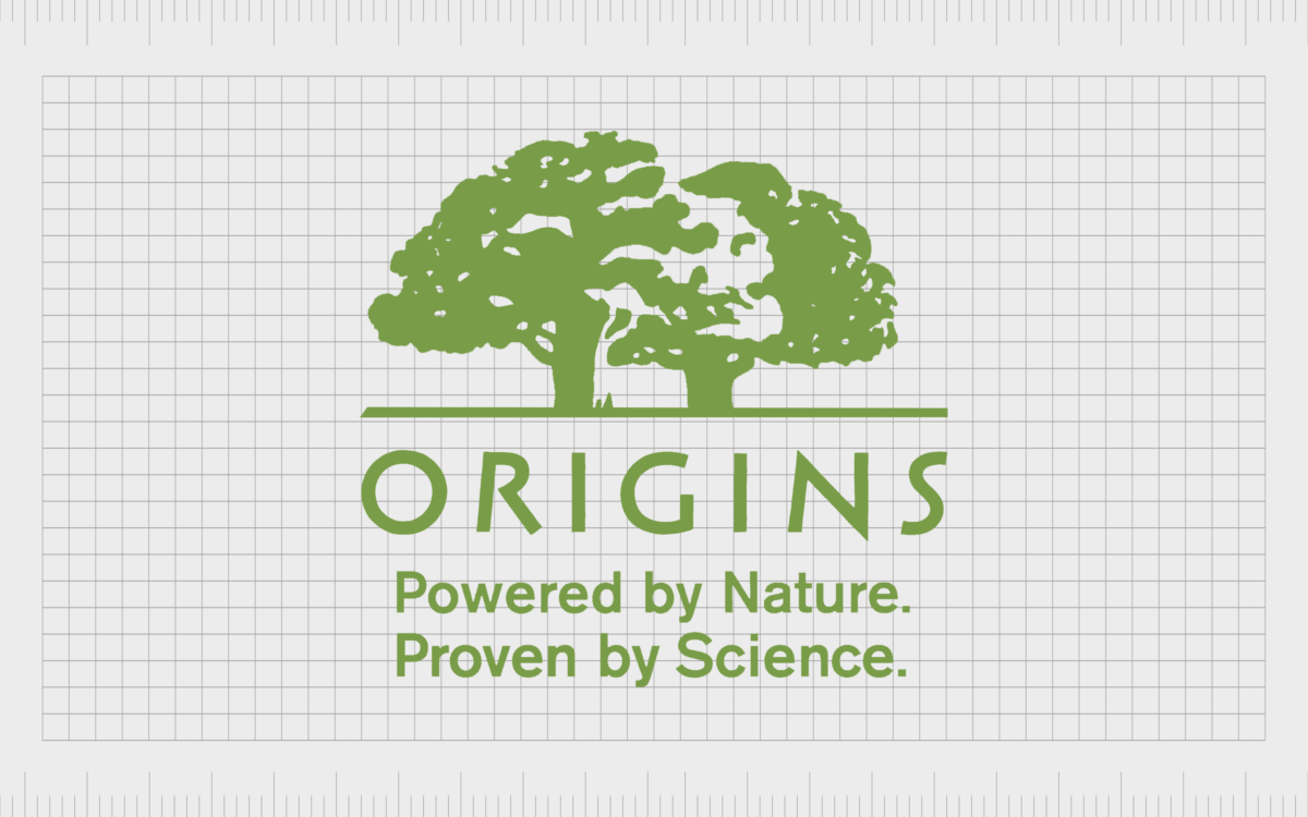
For instance, in some cases, the Origins logo has appeared in a green color palette instead of black and white.

Occasionally, the size of the elements in the emblem can vary too. For instance, on the Origins website, the wordmark for the company is a lot larger than the image of the trees.
In some instances, the company also uses a tagline on its logo, which usually reads “Powered by Nature, Proven by Science.”
Interestingly, if we look closely at the two overlapping trees in the Origins symbol, we can see what appears to be the shape of a skull in the white space.
This might seem like a morbid addition to a cosmetics logo, but some people believe it’s a reference to the natural circle of life.
The Origins cosmetics logo: Fonts and colors
Compared to many of the sleek and simplistic logos used in the beauty and cosmetics landscape, the Origins cosmetics logo appears quite complex.
There’s a significant amount of detail in the two overlapping trees in the emblem. It’s even possible to see shapes within the white space between the leaves, although the designers have never confirmed whether the image is meant to look like a skull.
The Origins logo is intended to be an impactful and emotional symbol, highlighting the company’s commitment to preserving the planet and producing natural products for its audience.
Whether depicted in black and white or green, this eye-catching emblem certainly leaves a lasting impression.
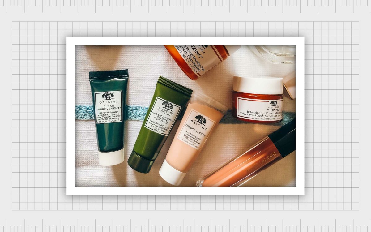
You can find some great examples of the Origins cosmetics logo here:
What color is the Origins logo?
As noted above, the Origins logo colors can vary depending on the packaging chosen for each product and the design of various marketing assets. Primarily, the core colors of the logo are generally black and white.
The trees and wordmark tend to appear in black on a white background, although there are instances where this color palette has been inverted.
The Origins logo color can sometimes include a soft shade of sage green too. The pale shade of green is typically used in Origins product packaging and rarely appears on the marketing campaigns and online assets created for the company.
What font does the Origins logo use?
The Origins logo font is one of the most interesting components of the emblem. It appears relatively simplistic at first, but each character seems to convey a sense of movement, with the slight angling of the carefully positioned lines.
The unique font type was chosen specifically for the brand and is a sans-serif typeface with sharp edges on some of the letters.
The impactful Origins symbol
Looking at the Origins logo history, we can see the cosmetics company has retained a relatively consistent visual identity over the years. Though the Origins cosmetics logo is a little more complex than some emblems in the beauty industry today, it has a significant emotional impact.
The carefully positioned trees in the logo aim to draw attention to the company’s commitment to creating natural and sustainable products, good for both their consumers and the earth. The unique font choice also highlights the friendly and authentic nature of the company.
Origins cosmetics logo FAQs
What is the Origins cosmetics slogan?
While the Origins cosmetics brand doesn’t have a specific slogan used in all of its advertising and promotional campaigns, it’s often associated with a specific phrase. The tagline “Powered by Nature, Proven by Science” appears in some variations of the Origins emblem.
Is Origins being discontinued?
The Origins cosmetics company is still going strong as of 2023. However, another “Origins” company, created by Electronic Arts, did announce it was ceasing its operations for the Windows platform in 2022, which may be the reason for some confusion in the marketplace.
What company makes Origins?
The Origins cosmetics company was one of the original lines produced for the Estee Lauder company. The organization was founded by Estee Lauder’s son and continues to operate under the Estee Lauder Corporation today.
Fabrik: A branding agency for our times.
Clarity starts with a conversation.
Thanks—we’ll get back to you shortly.
Whether you're navigating a rebrand, merger, or simply need a clearer identity—we’re here to help. No hard sell, just honest advice from people who know the sector.
Let’s start with a simple question…
Prefer to email? Drop us a line.
Fabrik’s been helping organisations rethink and reshape their brands for over 25 years. We’ve guided companies through mergers, rebrands and new launches. Whatever stage you’re at, we’ll meet you there.


