Mitsubishi logo history; symbol, meaning and evolution

Are you familiar with Mitsubishi logo history? Even if you’re not a huge fan of the automotive industry, you probably recognize the current Mitsubishi symbol. The three red diamonds of the Mitsubishi logo have become a common part of the modern landscape in recent years.
However, many people still don’t know where Mitsubishi’s logo comes from, or what it means. Like many famous automotive logos, the Mitsubishi car logo isn’t just an abstract design. It holds a deeper meaning, providing insights into the Mitsubishi brand and its origins.
If you’ve ever wondered where the Mitsubishi motor corporation got its logo, or why it’s so powerful, you’re in the right place. Here’s your complete guide to the evolution of the Mitsubishi emblem.
Introducing Mitsubishi: When was Mitsubishi founded?
Before we dive into our exploration of Mitsubishi logo history, let’s take a closer look at the brand itself. The Mitsubishi Group is a collection of Japanese multinational companies, serving a variety of industries. It doesn’t just produce cars; it also creates a variety of different technologies.
Mitsubishi was founded in 1870, by Yatarō Iwasaki. It descended from the Mitsubishi Zaibatssu unified company, which previously existed from 1870 to 1946. When the Mitsubishi company we know today was initially created, it used the name “Tsukumo Shokai”.
Initially, the company operated as a shipping business, before branching out into the automotive industry, creating passenger cars and larger vehicles for a range of consumers.
Mitsubishi Motors, the automotive subsidiary of the company, is now one of the largest Japanese automakers in the world. It’s owned in part by Nissan, and features within the Renault-Nissan-Mitsubishi alliance.
What does Mitsubishi mean?
To understand the Mitsubishi brand mark, it’s important to take a deeper dive into the company’s roots. The company’s name is a derivative of two Japanese words. The word “Mitsu” means three, which is the reason for the three-shaped pattern in the company’s visual identity.
Hishi, means “water chestnut”, or “water caltrop”, also reflected in the diamond or rhombus shapes in the company’s logo. Some experts also say the name can translate to “three diamonds”.
What is the Mitsubishi slogan?
While different aspects of the Mitsubishi business use their own slogans, the automotive sector currently uses the term “Drive your ambition”. This emotional and powerful slogan draws attention to the company’s focus on forward movement.
Mitsubishi logo history: The Mitsubishi car logo
While the Mitsubishi logo hasn’t changed much over the years, there have been substantial alterations to the brand’s image since it first began, decades ago. Let’s take a closer look at Mitsubishi logo history, and the meaning attributed to the symbol.

1870
The use of three specific symbols in the Mitsubishi logo dates back to the company’s origins. In the early years after the company was established, it was inspired by the family names and crests of the people that inspired the development of the brand.
The initial logo used the Tosa and Iwasaki crests, without a wordmark, highlighting Japanese culture, and the creative nature of the brand.

1873
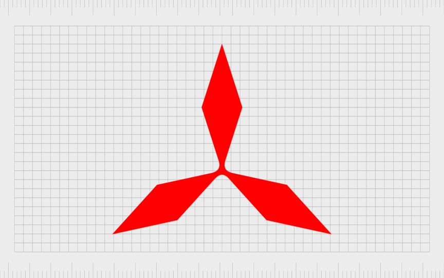
Mitsubishi first introduced the red color palette to its emblem in 1873. This is a popular shade in Japan, and the United States, often associated with vitality and passion. The Mitsubishi emblem at this point featured three thin rhomboids, connected by a small circle in the center.
There’s some clear overlap between this initial logo, and the three-diamond mark many consumers are familiar with today.

1914
In the early 1900s, the Mitsubishi symbol was refined, though many of the core elements remained the same. The red diamonds still make up the core of the logo design, though the circle in the middle became a solid point, making the iconic logo more powerful.
A wordmark was also added to this logo in some cases, written in Japanese characters, using an elegant and modern font.

1964
In the 1960s, the Mitsubishi logo, still inspired by the name, Mitsubishi, began to find its iconic shape. Placed on a white background, we see three red rhomboids, thicker and more solid than before. This highlights Mitsubishi’s growing presence in the automotive space.
In some variations of the logo throughout the company’s history, a motto was added to the emblem, which translated to “with you today and tomorrow”.

1985
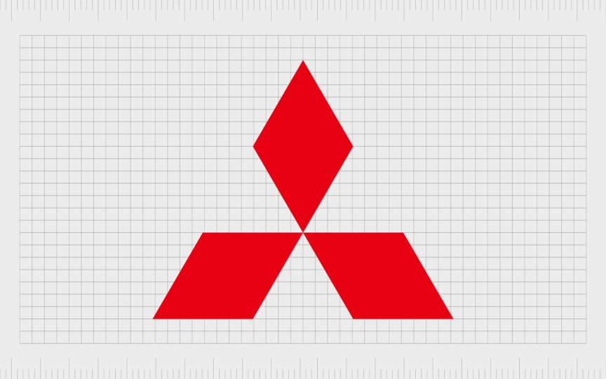
Now famous around the world, the new Mitsubishi logo was introduced in 1985. Once again, we see the iconic three-leaf crest of the Tosa clan, adapted into three bold, red rhomboid shapes. The red coloring has been refined a little hear, becoming brighter and more vibrant.
Each diamond shape in the logo is separated by a white triangle, which has led to some people calling Mitsubishi the “car brand with 3 triangles”. The wordmark for the company was updated here, becoming bolder and more refined.
The logotype, depicted in a simple black color, features a sans-serif font in uppercase letters. The black and red combination in the corporate logo conveys the energy, strength, and professionalism of the growing brand.
Mitsubishi logo meaning: the car brand with 3 triangles
As mentioned above, the Mitsubishi logo is steeped in meaning. The company’s emblem is a celebration of the brand’s heritage and history in the Japanese landscape. The composition of three red rhomboids or diamonds comes from the name of the company.
As mentioned above, Mitsu, stands for 3, and “hishi” stands for water-chestnut. Notably, the design was also inspired by the family crests of Yatoro Iwasaki, and the Tosa Clan. The Iwasaki family crest featured three rhombuses, while the Tosa clan used three oak leaves.
According to Mitsubishi, each diamond or rhomboid in the logo is also reflective of the company’s primary values: integrity, success, and reliability.
Even the color palette has its own deeper meaning. The color red, associated with passion, power, and vitality around the globe, helps the business to stand out from its competitors. The brand name, depicted in a black color, showcases strength and professionalism.
Though relatively simple, the evocative Mitsubishi symbol is a celebration of the origins of Mitsubishi, and Japanese culture.
The Mitsubishi symbol: Fonts and colors
For a long time, the Mitsubishi logo has separated the Mitsubishi Motors corporation from a host of different vendors in the automotive landscape. The company used insights into its origins and history to create a symbol of strength, heritage, and passion.
Today, the design elements of the Mitsubishi logo provide an insight into the origins of the organization, while also allowing Mitsubishi to compete in a modern world. The symbol is sleek and contemporary, without any complex components.
You can see some examples of the Mitsubishi logo linked below:
What is the Mitsubishi logo font?
The Mitsubishi name appears in black lettering beneath the rhombus shape logo. Although it’s not always present in the company’s emblem, when it is, it features bold, uppercase lettering, consisting of a strong sans-serif typeface with clean lines.
The now-famous Mitsubishi logotype is specific to the brand, but there are similar typefaces out there, such as the Neo Sans Std Bold or ED Northridge Sans Extra Bold fonts.
What is the Mitsubishi color palette?
Very few changes have been made to the color palette of the Mitsubishi logo over the decades. Initially, the company simply used a black design. Now, the three-diamond emblem features a bright shade of red, associated with fortune and vitality.
The accompanying Mitsubishi colors include white (for the background of the image), and black, for the inscription beneath the Mitsubishi symbol.
The historical Mitsubishi car logo
Exploring Mitsubishi logo history, we can see the Mitsubishi corporation, and Mitsubishi Motors have always embraced deeper meaning in their brand image. The Japanese company draws attention to its history and heritage, building its image from the family crests of powerful figures.
Though the design elements of the Mitsubishi logo are somewhat simple, they highlight the incredible origins of the brand, and the pride the company has for its roots.
Today, the Mitsubishi three-diamond emblem is a powerful symbol of strength, helping to distinguish Mitsubishi from the various other vendors in the automotive space.
Fabrik: A branding agency for our times.
Clarity starts with a conversation.
Thanks—we’ll get back to you shortly.
Whether you're navigating a rebrand, merger, or simply need a clearer identity—we’re here to help. No hard sell, just honest advice from people who know the sector.
Let’s start with a simple question…
Prefer to email? Drop us a line.
Fabrik’s been helping organisations rethink and reshape their brands for over 25 years. We’ve guided companies through mergers, rebrands and new launches. Whatever stage you’re at, we’ll meet you there.


