Mazzio’s logo history: A brief history of Mazzio’s and its visual identity
Are you familiar with Mazzio’s logo history? If you’re a casual dining and fast-food fan, then you’ve probably seen the Mazzio’s logo before today. The company’s visual identity has been around for more than 60 years, making it one of the staples of the pizza industry.
Like many famous pizza brand logos, the Mazzio’s emblem is relatively straightforward.
But it’s brimming with personality, helping to set the company apart from the various other competitors in its field. Mazzio’s logo is fun, fresh, and eye-catching, great for capturing the attention of hungry customers across the United States.
The streamlined and contemporary nature of the emblem may be why the company has chosen to stick to the same visual identity for more than six decades. Look closer at the Mazzio’s Pizza brand and the organization’s impressive logo.
Where did Mazzio’s originate? An introduction
Like many competing brands, Mazzio’s started life as a simple but popular pizza parlor. It was founded by a school teacher called Ken Selby in 1961, who ran his new business almost entirely by himself, despite also teaching children in class every day.
Originally, the company was named “The Pizza Parlor” and was located in Tulsa, Oklahoma.
After four years of managing two full-time jobs in tandem, Selby left the teaching industry to focus fully on his brand. He opened a secondary location, which became even more successful than his first, and decided to change the name of the brand to “Ken’s Pizza.”
By 1975, Ken had expanded his business drastically across over 100 company and franchise locations, both within and outside of Oklahoma. Later in the 70s, Selby decided to take a new approach to run his company, exploring an expanded menu with sub sandwiches and a salad bar.
The new concept morphed into “Mazzio’s Pizza,” which quickly captured the attention of diners around the US. Today, there are more than 165 locations situated in 10 states.
How do you pronounce Mazzio’s?
Originally, when coming up with the new name for his Pizza franchise, Selby planned on using the moniker “Maggio’s.” He said he felt “Ken’s” didn’t sound right for the atmosphere he was trying to create.
He recalled an Italian American character from the book “From Here to Eternity” during college and wanted to name the company after them. However, the name was already taken.
Fortunately, Selby switched his strategy and chose the name “Mazzio’s” instead.
The Italian name, Mazzio, is pronounced: “Mah-zyo.”
Who owns Mazzio’s?
Mazzio’s is an American Pizza company owned by the Mazzio’s Corporation parent company. Prior to 2007, the Corporation was also the owner of the “Zio’s Italian Kitchen” brand. However, this sub-brand has since been sold to a private organization.
Who is the CEO of Mazzio’s?
The current CEO of Mazzio’s is Lori Carver. She took over the mantel in 2018 and was previously the company’s Chief Financial Officer.
Mazzio’s logo history: The only Mazzio’s logo
While most pizza companies eventually make changes to their company’s visual identity over time, Mazzio’s has strayed from the norm. The company has maintained the exact same logo since changing its name to “Mazzio’s.”
However, before the new name was chosen, there were a few other visual identities for the brand. For instance, the first “Pizza Parlor” store, created by Ken Selby, had a fun and jazzy wordmark for a logo, with lettering very similar in style to the Mazzio’s logo we know today.
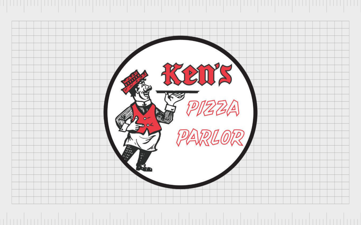
When the name of the brand was updated to “Ken’s Pizza,” a new logo was also introduced, although few official references to this emblem remain today.
In versions of the emblem still available online, we see an image for “Ken’s Pizza Parlor,” which presents a man with a mustache holding a pizza tray. The words “Ken’s Pizza Parlor” are depicted in decorative font with sharp serifs and edges.
The official Mazzio’s logo history started in 1979 when the new name was chosen for the brand. Since then, the company has maintained the same logo.
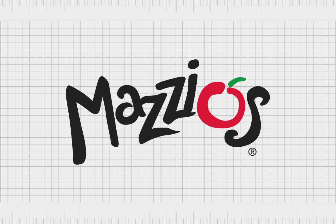
The design features a fun sans-serif font style with plenty of unique flourishes and curves, making it look a little like human handwriting.
The letters are all positioned in different spaces rather than following a straight line, which gives the logo a sense of movement and fun. The glyphs appear to be bouncing with energy.
The majority of the wordmark is depicted in a simple black font, while the “o” is red, with a green apostrophe placed just above it. This combination of elements was chosen to transform the “o” into a simplistic tomato – one of the key ingredients in pizza.
Notably, there are variations of this logo available in the digital world. For example, on the Mazzio’s website, the logo features a white font on a red background. It also includes the slogan “Get Ready for Great” underneath, depicted in a simple handwritten style in yellow font.
The Mazzio’s pizza logo: Colors and fonts
Since the company embraced its new name in the late 1970s, the Mazzio’s pizza logo has never been significantly changed. The official logo is still the same as the one introduced with the opening of the newly branded franchise.
Although different variations of the logo have been produced since to accommodate the addition of taglines and slogans and adhere to different media, the components are the same.
Even on the Mazzio’s website, there aren’t many significant differences between the original Mazzio’s logo and the one currently used by the brand.
If you’d like to take a closer look at the Mazzio’s logo in closer detail, you can find some useful resources here:
What color is the Mazzio’s logo?
The official Mazzio’s logo colors are still the same today as they were when the logo was introduced at the end of the 1970s. The official logo features the colors bright red, green, and black, often presented on a white background.
However, variations of the logo do appear with the black font changed to white, so it can show up better on a red background.
The bright coloring of the tomato in the Mazzio’s logo can vary slightly depending on where you see the emblem. On the website, for instance, the red coloring appears to be a little brighter, and the green is slightly darker, perhaps for the sake of contrast.
It’s worth noting the website logo also includes a strapline in a golden-yellow font.
What font does the Mazzio’s logo use?
The official name of the Mazzio’s logo font hasn’t been revealed by the brand. However, it appears to be unique to the company. There’s a chance it was designed entirely for the creation of the new brand identity when Selby decided to change the name of Ken’s Pizza to “Mazzio’s.”
The font style is simple but effective, with no extra serifs but plenty of curves and decorative components. The letters have been made to look almost handwritten, with a bouncy style that positions each glyph in its own unique location.
The “o” in the wordmark is particularly large to draw attention to the tomato shape it has morphed into.
The infinitely fresh Mazzio’s logo
The Mazzio’s pizza logo proves that the right image can stand the test of time. With virtually no changes made to the company’s visual identity over the years, Mazzio’s has made a name for itself as a unique competitor in the fast-food landscape.
However, while the Mazzio’s pizza logo might not have changed, the company itself has. The brand has gone through two major name changes and “rebranding” strategies over the years, as Ken Selby has worked on building his vision of the ideal pizza brand.
Today, Mazzio’s logo presents a fun and bubbly image for the company, designed to grab the audience’s attention and deliver a modern yet friendly aesthetic.
Fabrik: A branding agency for our times.
Clarity starts with a conversation.
Thanks—we’ll get back to you shortly.
Whether you're navigating a rebrand, merger, or simply need a clearer identity—we’re here to help. No hard sell, just honest advice from people who know the sector.
Let’s start with a simple question…
Prefer to email? Drop us a line.
Fabrik’s been helping organisations rethink and reshape their brands for over 25 years. We’ve guided companies through mergers, rebrands and new launches. Whatever stage you’re at, we’ll meet you there.


