Maybelline logo history: The story behind the beauty brand and its logo

Even if you don’t know much about the makeup and cosmetics industry, you’re probably familiar with the Maybelline logo history.
One of the most famous emblems in the beauty sector, the Maybelline New York logo is an excellent example of how a simple wordmark can transform a brand’s image. But where did Maybelline logo history begin, and how has the emblem changed over the years?
With more than 100 years of history in the beauty space, the Maybelline company has produced a number of iconic logos over the years. Like many famous beauty brands, Maybelline has updated its visual identity to ensure it can consistently connect with its target audience.
Throughout the decades, the organization has experimented with various different typefaces and fonts, all chosen to highlight specific parts of the Maybelline brand identity.
Today, we’re going to take a look back through various examples of the Maybelline logo to determine how the company ended up with the iconic image consumers know today.
Is Maybelline owned by L’Oréal? Introducing Maybelline
Before we dive into our exploration of Maybelline logo history, let’s get to know the beauty brand a little better. Formerly known as both “Maybelline and Co” and the “Maybelline Company,” Maybelline New York is a multinational cosmetic brand based in America.
The business was originally founded in 1914, more than 100 years ago.
The world-renowned organization began when a pharmacist named Thomas Lyle Williams saw his sister, Mabel, would apply a mixture of coal dust and Vaseline to her eyelashes to make them appear darker and fuller.
Thomas adapted this formula with a chemistry set to create one of the first-known examples of commercial mascara. Williams named his eye product “Maybelline” in honor of his sister and quickly captured consumers throughout America.
Over the years, the Maybelline brands produced a variety of new products before eventually handing ownership over to the “Plough Inc” organization, which continued to expand on the available items in the company’s cosmetics, skincare, and fragrance portfolio.
Eventually, the Maybelline company was sold to the L’Oréal brand, another well-known organization in the cosmetics industry. However, the company continues to retain its own image and branding as a L’Oréal subsidiary.
Maybelline logo history: The Maybelline New York logo
At a glance, the Maybelline logo most people know today may appear to be relatively simplistic.
However, the design of the company’s iconic wordmark has come a long way over the years. To produce the sophisticated inscription known throughout the beauty landscape today, Maybelline experimented with a host of different font and typography styles.
Here’s a closer look at Maybelline logo history.

1920
The Maybelline New York logo has always focused heavily on displaying the iconic name of the company. In the early years, the organization used a script-style inscription as its primary logo, featuring an elegant, handwritten typeface.
The letters of the emblem were mainly presented in black, with some green highlights.
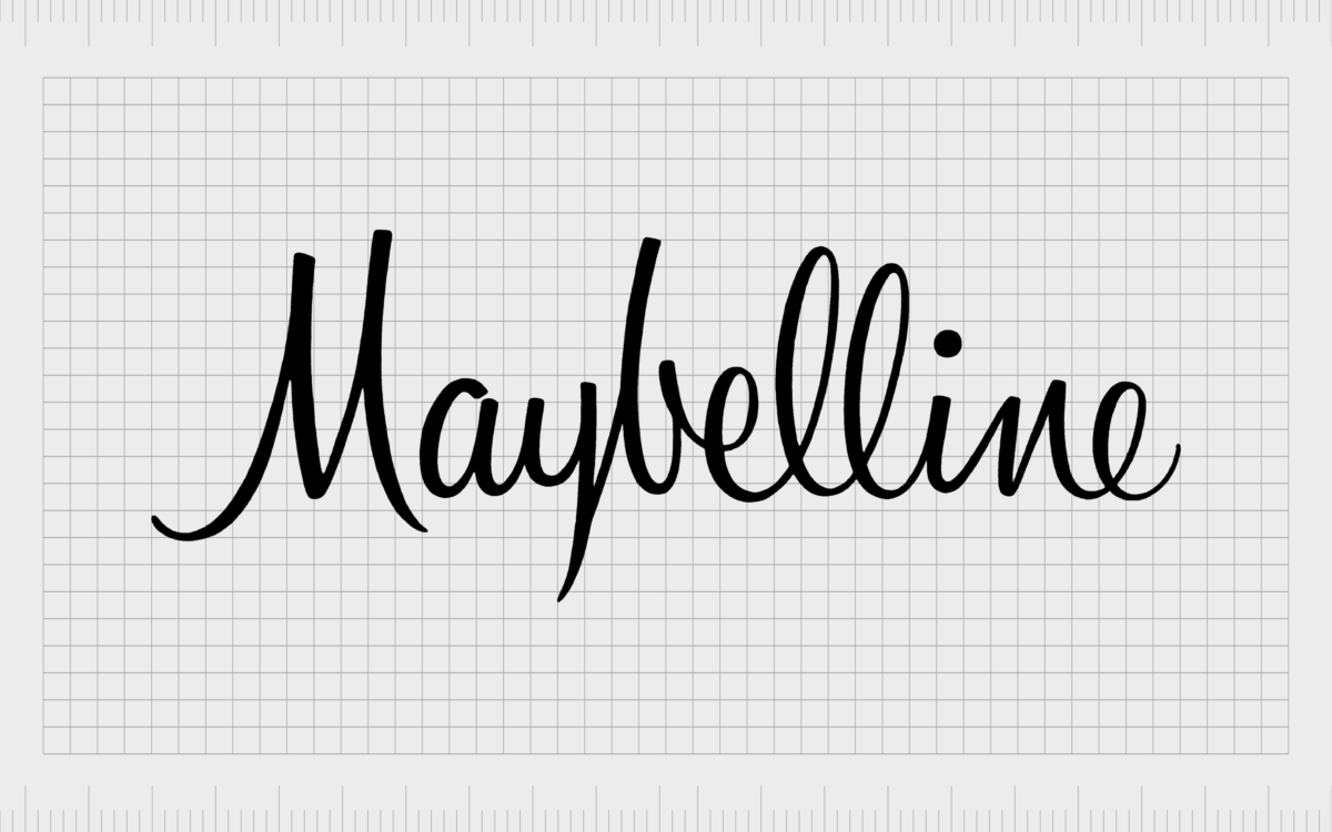
After several years of using the same cursive font in their emblem, Maybelline eventually updated its logo to feature a more modern typeface. The stylish and elegant nature of the typeface remained, but the letters were refined, becoming taller and more “upright” in style.
Although the typeface appeared to be more sophisticated than the font used in the previous design, it maintained its authentic, handwritten aesthetic.
1979
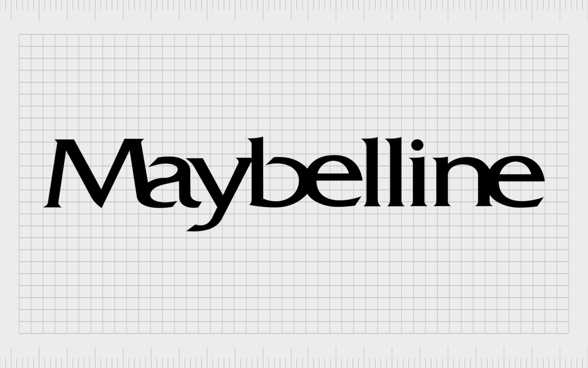
During the late 1970s, Maybelline decided to move away from the script, and cursive font choices, exploring more simplistic sans-serif typefaces. The new emblem focused on minimalism, highlighting the professional nature of the company.
The most interesting element of this logo was the way the letters were placed very close together, making it appear as though certain characters were almost merging into one.
1992
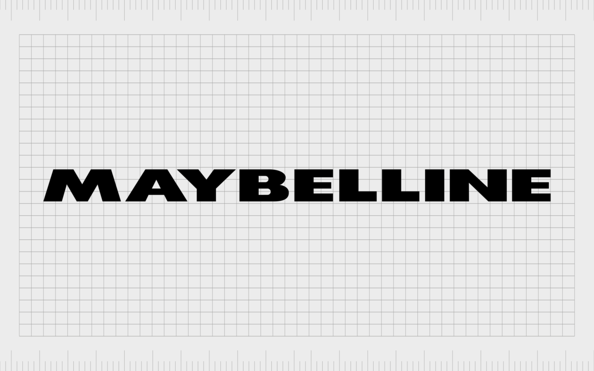
Several years later, in the early 90s, Maybelline refined its wordmark logo again, choosing another simplistic font. In this variation of the design, the company utilized all uppercase letters, showcasing the growing strength and confidence of the brand.
1996
Soon after, in 1996, Maybelline decided to reduce the weight of the characters in the wordmark, using a similar font with much slimmer letters. In this design, the white space between the characters was enhanced, and the words “New York” were added to the second line of the emblem.

In 2002, Maybelline refined this logo very slightly, reducing the weight of the characters even further to create a sleeker, more modernized look. The spacing between the letters in “New York” was also enhanced to create more balance within the emblem.

2019
During 2019, the Maybelline New York logo regained some of its boldness, with extra thickness added to the lines of each letter in the wordmark. The words “New York” underneath the Maybelline name have been carefully spaced to align perfectly with the “Line” aspect of the wordmark.
The Maybelline logo: Fonts and colors
Though relatively simple in its design, the Maybelline logo has been carefully refined and enhanced over the years to highlight the professional and elegant nature of the brand.
The evolution of the company’s logo took the organization through a multitude of different font styles, each chosen to represent certain aspects of the company’s identity.
Today, the Maybelline logo is a symbol of strength, modernity, and confidence in the beauty world.
The bold, eye-catching letters demonstrate the stability of the brand and its focus on serving endless generations of consumers. This timeless logo is characterized by clarity, beautiful balance, and fantastic legibility.
You can find some useful examples of the Maybelline logo here:
What color is the Maybelline logo?
While numerous aspects of the Maybelline New York logo may have changed across the decades, the color palette chosen by the brand has remained relatively consistent. Almost since the inception of the brand, the Maybelline logo colors have been primarily a combination of black and white.
However, it’s worth noting the Maybelline logo color can occasionally change for certain marketing assets.
In some instances, you may see versions of this logo depicted in blue and other shades to match the packaging choices for each product.
What font does the Maybelline logo use?
Like many organizations through the years, Maybelline has experimented a number of times with its font choices in logo designs. The company started its adventure into the logo design world with script and cursive style typefaces intended to appear both feminine and elegant.
In recent years, the company transitioned to more minimalistic font choices, leveraging simple sans-serif typefaces to demonstrate confidence and stability. The current font used by the company is similar to the Sansettica 3 Regular extended typeface, which offers excellent legibility and clarity.
The powerful Maybelline logo
Ultimately, looking back through the Maybelline logo history, we can see the company has taken a minimalistic approach to showcasing the key characteristics of its brand.
While other organizations have attempted to add hidden meanings to their logos through the use of various decorative elements, Maybelline has kept things simple with a straightforward wordmark.
The Maybelline logo today is an eye-catching and contemporary design, built to deliver excellent legibility and convey the strength and sophistication of the company.
The uppercase letters, with their beautifully balanced positioning, show us we’re dealing with a professional, authoritative organization with years of experience in the beauty landscape.
Fabrik: A branding agency for our times.
Clarity starts with a conversation.
Thanks—we’ll get back to you shortly.
Whether you're navigating a rebrand, merger, or simply need a clearer identity—we’re here to help. No hard sell, just honest advice from people who know the sector.
Let’s start with a simple question…
Prefer to email? Drop us a line.
Fabrik’s been helping organisations rethink and reshape their brands for over 25 years. We’ve guided companies through mergers, rebrands and new launches. Whatever stage you’re at, we’ll meet you there.


