Lululemon logo history, symbol, meaning and evolution

If you’re familiar with the ever-evolving world of activewear, then you’re probably aware of the Lululemon logo and brand. But how much do you know about Lululemon logo history? Unlike many fashion companies, Lululemon hasn’t experimented much with its brand emblem.
From the start, the technical athletic apparel company has retained a relatively simplistic logo. Although there are multiple versions of the emblem, from the simple Lululemon icon to the full brand mark, featuring the company’s name.
If you’ve ever wondered about the origins of Lululemon’s logo, or how the yoga wear company chose its name and brand identity, you’re in the right place. Today, we’re going to take a closer look at the Lululemon brand image, and its hidden meaning.
Introducing Lululemon: What was Lululemon originally called?
Before we dive into an overview of Lululemon logo history, it’s worth learning a little more about the brand itself. Lululemon Athletica, often referred to simply as “Lululemon” was originally launched in 1998, by Chip Wilson, a Vancouver-based entrepreneur.
The Canadian multinational company specializes in apparel for the athletics space, specifically focusing on yoga pants and yoga wear. However, it has expanded in recent years. Today’s Lululemon stores feature an expanding product line, with multiple items to choose from.
Lululemon now sells everything from hair accessories to yoga mats, and water bottles. Chip Wilson opened his first store for the Lululemon brand in 2000. Interestingly, when he was first getting started, he wasn’t entirely sure which name to choose for his new company.
Wilson decided to conduct a survey, asking people of the public to suggest brand names. Eventually, the brand name “Lululemon” was chosen because Wilson believed the multiple “l’s” would help his company appeal to Japanese consumers.
Over the years, despite a few controversies, the company became a worldwide phenomenon, appealing to female and male customers alike. The yoga brand now has more than 574 stores worldwide, and also sells its products online.
Lululemon logo history: The enduring Lululemon symbol

Unlike many clothing and athletic companies, the Lululemon Athletica Inc. brand hasn’t made many chances to its logo throughout the years. Looking back through Lululemon logo history, we can see the same logo has remained with the brand since its inception.
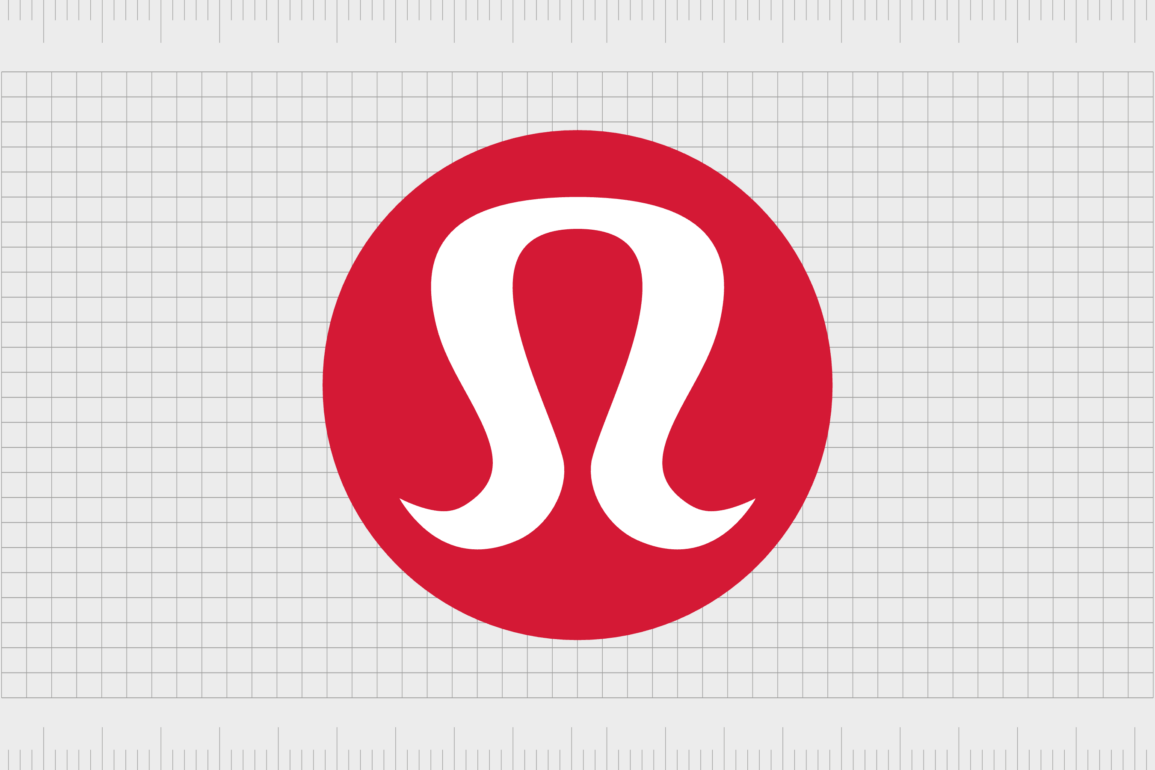
However, Lululemon founder Chip Wilson did create variations of this logo with the help of his design studio. Most of the time, the full Lululemon logo doesn’t appear on social media channels and websites. Instead, we just see the “Omega” style symbol.

The full Lululemon logo is made up of two components, the company’s wordmark, and the red and white icon. The font, when visible, is a simple sans-serif typeface, depicted in black. It features only lowercase letters, making the athletic apparel retailer seem modern and stylish.
The icon looks a little like a stylized letter “A”, however, it’s actually inspired by the omega sign.
According to the founder, Lululemon took a unique approach to choosing its visual identity. Just as Wilson struggled to choose an initial name for his company, he also didn’t have a logo in mind before launching the first Lululemon store.
Sourcing insights from fans of the active lifestyle, he eventually encountered the Omega symbol, which he incorporated into the company’s logo. Interestingly, the design was actually suggested to accompany another name, which wasn’t chosen for the brand.
What does the Lululemon logo mean?
Both the iconic Lululemon name, and the white symbol on the red circular background were inspired by the wider athletic wear community – Lululemon’s customer base. If you’re wondering why the Lululemon symbol looks a little like a stylized “A”, you’re not alone.
According to the founder of the company, the red circle logo was submitted to accompany another potential name for the emerging brand “Athletically Hip”. Though this name didn’t appeal to the company, they did like the design.
Many graphic designers and Lululemon customers also believe the “A” shape may refer to the “Athletica” component of the full Lululemon brand name.
As well as looking similar to the letter A, the Lululemon logo icon is also a lot like the Greek letter “Omega”, This gives the company a more sophisticated appearance, allowing it to appeal to wealthy woman in search of a high-quality lifestyle brand.
Some customers also say the logo resembles a woman’s hair and face, depicted in a stylistic outline. The coloring for the company’s logo, featuring red, white, and black, also have a symbolic meaning.
The white color is often associated with purity and excellence. Black is aligned with concepts like power and sophistication, while red is symbolic of vitality and passion.
The Lululemon logo: Fonts and colors
The Lululemon logo is an interesting brand mark. It’s intended to convey components of the company’s core values, such as a focus on passion and a healthy lifestyle (symbolized by the red coloring). The stylized icon is deliberately curvaceous.
It reminds us of flexibility, which aligns with Lululemon’s product portfolio, focusing on the athletic and yoga landscapes. The simple font choice included with the logo, depicted in lowercase, makes the company seem modern and approachable.
Although the Lululemon wordmark occasionally appears in the company’s brand assets, it’s the unique symbol that captures the most attention. This image appears on virtually every Lululemon product, from its yoga pants to personal care products.
You can see the Lululemon logo yourself with the following resources:
What is the Lululemon font?
As mentioned above, Lululemon doesn’t always use its wordmark on its brand assets. The full name of the company, “Lululemon Athletica” is relatively long, so the company often prefers to use the icon as a standalone marker of its identity.
However, when the wordmark is used, it’s written in lowercase, which makes it appear friendly, welcoming and modern. The traditional sans-serif typeface is similar to Brasley Bold, featuring neat contours and elegant lines.
The Lululemon logo font appears on Lululemon signage for the company’s stores, as well as in department stores. The inscription is minimalist and stylish, with excellent balance.
Lululemon colors
The Lululemon color palette consists of red, white, and black. While the wordmark for the company is often depicted in black, the round logo used by the team can feature black and white, and red and white in different variations.
In some instances, a white symbol appears on a red background, while in others, the symbol is depicted in red on a white background. The color choices all have an underlying meaning connected with color psychology.
White is a symbol of excellence and purity, while red symbolizes passion and power. The black typeface chosen by the healthy lifestyle brand adds professionalism and expertise to the image.
The powerful identity of Lululemon Athletica
Throughout Lululemon logo history, there haven’t been any significant changes to the company’s visual identity. The company’s founder took inspiration from his target audience to choose both the name and the icon for the brand, helping to create a timeless identity.
The athletic apparel retailer is often recognized today for the unique icon in its logo, which appears on all Lululemon goods, as well as the company’s marketing materials. The symbol is stylish and elegant, with a feminine edge, helping Lululemon appeal to a specific target audience.
Additionally, the company’s color palette helps to remind consumers of the brand’s vision and values. It evokes ideas of passion, stability, and excellence.
Though somewhat unusual, the Lululemon logo is a memorable icon, recognized by consumers all over the world.
Fabrik: A branding agency for our times.
Clarity starts with a conversation.
Thanks—we’ll get back to you shortly.
Whether you're navigating a rebrand, merger, or simply need a clearer identity—we’re here to help. No hard sell, just honest advice from people who know the sector.
Let’s start with a simple question…
Prefer to email? Drop us a line.
Fabrik’s been helping organisations rethink and reshape their brands for over 25 years. We’ve guided companies through mergers, rebrands and new launches. Whatever stage you’re at, we’ll meet you there.


