LaRosa’s Pizzeria logo history: The making of a legend

How much do you know about the LaRosa’s Pizzeria logo? Although this brand may not be as well-known as some of the most significant pizza chains, it has still captured significant attention.
With a focus on attracting and catering to families, LaRosa’s has earned the love and respect of endless consumers across the United States.
Like many of the most famous pizza logos to emerge throughout the decades, the LaRosa’s emblem strives to convey meaning and personality for the brand. However, unlike many major companies, this organization hasn’t made many changes to its visual identity over the years.
The LaRosa’s pizza logo most people are familiar with today is very similar to the one introduced when the company was first launched in the 1950s. Today, we will be taking a closer look at the LaRosa’s Pizzeria brand and how it has evolved.

Who owns LaRosa’s Pizza?
LaRosa’s Pizzeria is a relatively small pizza chain, first launched in 1954. The company primarily serves neighborhoods throughout Indiana, Kentucky, and Ohio.
The brand was created by Donald “Buddy” LaRosa, who joined forces with his friends Mile Soldano, Richard Minella, and Frank Serraino on a new venture, first known as “Papa Gino’s.”
Outside of serving guests in its own dedicated pizzerias, LaRosa is also the exclusive pizza restaurant for a range of locations throughout the US. For instance, consumers can buy LaRosa’s pizza at Coney Island and Kings Island amusement parks, as well as at the Cincinnati Zoo.
LaRosa’s signature pizza features a thick crust made with a distinctive sauce created by Buddy’s aunt. It’s also topped with provolone cheese. The menu includes various sandwiches, calzones, pastas, and salads, all using high-quality ingredients and family recipes.
Who is Buddy LaRosa?
Buddy LaRosa is the founder and chairman of LaRosa’s Pizzeria. Growing up, he agreed to help his mother and aunts sell their pizzas during church festivals in 1953. Thanks to his Sicilian heritage, Buddy already had a deep love and knowledge of pizza long before he began his own venture.
The pizza sold by the LaRosa family was a massive hit, prompting Buddy to cash in his life insurance policy and rent his first restaurant. The La Rosa’s pizza company started with a single location in Cincinnati.
In 1967, the first franchise for the company was sold, launching a period of rapid expansion. Throughout the early 2000s, LaRosa’s continued to expand carefully and strategically throughout the US. Now, there are 66 pizzerias in operation.
While many people throughout America are familiar with LaRosa’s pizza, the company is most popular in greater Cincinnati, where it holds a 25% share of the local pizza market. It also boasts one of the highest sales volumes for any pizzeria in the nation.
Where is Buddy LaRosa from?
Buddy LaRosa was born and raised in Cincinnati. However, his family came from Sicily, which may be one of the reasons why they chose to start making and selling their own pizza. Buddy LaRosa still stands as the chairman of LaRosa’s Pizzeria today.
However, Michael LaRosa and Mark LaRosa are currently responsible for running the brand.
When did Buddy LaRosa open his first Pizzeria?
As mentioned above, Buddy LaRosa opened his first restaurant shortly after helping his mother and aunts with a pizza sale for his local church. The first Pizzeria was opened in 1954 after Buddy sold a life insurance policy to rent the first building.
The first franchise for the company was sold in Finneytown, Ohio, in 1967.
LaRosa’s Pizzeria logo history: The long-standing logo
LaRosa’s visual identity has remained relatively consistent throughout the years. While the majority of pizza stores throughout the years have updated their branding to match the changing preferences of their audience, LaRosa’s has only made very basic changes.

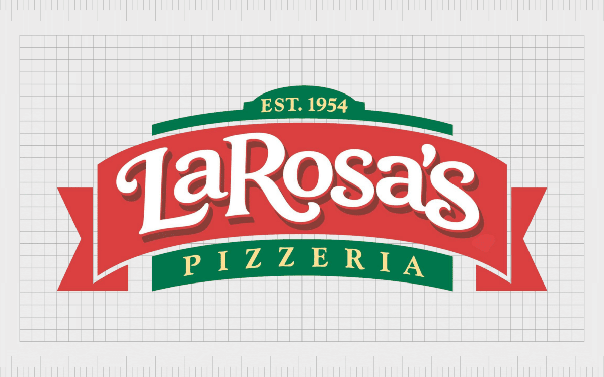
The earliest LaRosa’s Pizza restaurant logo is a variation of the design most people are familiar with today. The image features a banner-style graphic, with the name of the company depicted in the decorative serif-style font.
The colors red, white, and green are evident, drawing attention to the Italian pizza landscape and Buddy’s Sicilian heritage.
In this variation of the logo, the founding date of the company is depicted on a green background, just behind the banner-style graphic. The same green component also showcases the word “Pizzeria” written in all uppercase font. All of the typography in the logo is white.

Today’s LaRosa’s Pizzeria logo is a slightly simplified version of this design. The ribbon elements on either side of the banner have been removed to make the design appear more modern.
The word “Pizzeria” has been expanded on the bottom of the logo, so it now reads “Family Pizzeria.” The font style for the main wordmark remains almost exactly the same.
Today, the updated logo still features the colors red, white, and green. However, the red and green shades are a little darker, perhaps to deliver a greater level of contrast.
The LaRosa’s Pizzeria logo: Fonts and colors
The LaRosa’s Pizzeria logo is an excellent insight into the enduring power of the right emblem. The design of the brand’s visual identity has remained almost untouched for more than 60 years, featuring the same core colors and font choices for the most part.
The LaRosa family has built the identity of their organization around a focus on family life. The decision to take a family-based approach to sell pizza has helped the company to differentiate itself from its competition.
In fact, La Rosa’s Pizzeria is so popular in the areas where it operates, it has even been known to outsell some major pizza brands in terms of volume per pizzeria. La Rosa has better store sales, on average, than major companies like Domino’s, Little Caesars, and Papa John’s.
If you’d like to take a closer look at the LaRosa’s Pizzeria logo, you can find some helpful resources here:
What color is the LaRosa’s Pizzeria logo?
The LaRosa’s Pizzeria logo colors have remained almost entirely consistent since the launch of the original brand in the 1950s. The company has always drawn attention to its Italian heritage, with the colors green, white, and red.
However, the exact shades used in the LaRosa’s Pizzeria logo color palette can vary slightly.
Although the exact hex colors and codes have not been revealed by the brand so far, it’s worth noting the company does use a slightly darker shade of red than most alternatives. This could be an attempt to convey the brand as being both passionate and sophisticated.
The use of a deep green shade for the accompanying decorative elements and white for the font creates a fantastic contrast.
What font does the LaRosa’s Pizzeria logo use?
Although the LaRosa’s Pizzeria logo font choices for some of the accompanying taglines and information on the emblem have changed over the years, the main typeface has remained the same.
The logotype for the company’s name has consistently used a decorative, serif-style font, depicted in white on a red background. The font is elegant and sophisticated, with numerous curves and compelling elements designed to draw attention.
One point worth noting is the “S’s” in the logo are a little larger than the accompanying letters. This is particularly evident in the “S” at the end of the wordmark.
LaRosa’s Pizza: A delicious branding tale
The LaRosa’s Pizzeria logo hasn’t gone through many changes over the years. The company’s long-standing emblem remains a powerful symbol of history and heritage for the brand. However, it has been refined slightly to make it more compelling in today’s modern world.
The compelling and colorful logo highlights the family’s history behind the famous pizzeria. It also draws attention to the values of the organization. LaRosa has focused on building an image as a family-first pizza restaurant for years.
Today, the emblem is an eye-catching, sophisticated banner ideal for capturing the attention of a wide audience.
Fabrik: A branding agency for our times.
Clarity starts with a conversation.
Thanks—we’ll get back to you shortly.
Whether you're navigating a rebrand, merger, or simply need a clearer identity—we’re here to help. No hard sell, just honest advice from people who know the sector.
Let’s start with a simple question…
Prefer to email? Drop us a line.
Fabrik’s been helping organisations rethink and reshape their brands for over 25 years. We’ve guided companies through mergers, rebrands and new launches. Whatever stage you’re at, we’ll meet you there.


