Hoka One One logo history: A reflection of the brand’s values and vision

Most footwear and sporting fans today are familiar with the Hoka One One logo. Created to represent one of the most unique athletic companies, the Hoka emblem has become an iconic symbol over the years. But, how much do you know about Hoka One One logo history?
A world apart from many of the sneaker logos most of us are familiar with today, the Hoka One One logo is bold, eye-catching, and brimming with meaning. It might seem simple on the surface, but it provides a unique insight into the history and values of an incredible company.
Using its powerful logo, and a unique approach to product design, Hoka has captured the attention of a broad modern audience. Today, we’re going to take a closer look at the origins of the Hoka logo, and the evolution of the memorable brand.
Hoka One One meaning: Behind the brand
Before we dive into Hoka One One logo history, let’s start by discussing the origins of the company itself. Hoka One One, is a sportswear company from France, best-known for designing running shoes. It was launched in 2009, by Jean-Luc Diard and Nicolas Mermoud.
Both founders were originally employees of the Salomon company, before they decided to branch out and create their own running shoe. Their focus was on creating footwear that allowed them to run down hill faster, providing more cushioning to the foot.
The shoes, and the company were named after a Māori phrase, which loosely translates to “fly over the earth”. Hoka’s shoes were immediately embraced by marathon runners, due to their fantastic stability. However, they gained popularity among other runners too.
The brand earned a reputation for producing exceptional comfort and minimal weight, helping to elevate the performance of modern runners.
Today, Hoka is a pioneer in “maximalist” shoes, popular for bucking the trend for minimalist running shoes that emerged during the time when the company was first founded.
Hoka One One logo history: The evolution
Since launching in 2009, Hoka has only created two versions of its logo, both designed to represent the name of the brand, with a combination of bold typography, and a memorable graphic. Both versions of the logo have featured the “Hoka” title.
Additionally, they both include the simplified silhouette of a bird in flight, intended to represent the meaning behind the somewhat unusual name.

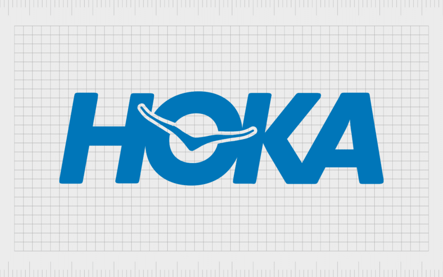
The original Hoka One One logo, still present in some circles today, featured the entire name of the brand, occasionally accompanied by a tagline. The top line of the logo showed the “Hoka” inscription, in bold letters, placed close together, so the characters seemed to blend into one shape.
In the center of the “O”, we see the iconic Hoka bird, stretching its wings across the accompanying letters. Next to the word “Hoka”, “One One” is set across two lines, in a slightly smaller font, to balance against the larger “Hoka” name.
When present, the Hoka tagline, “Time to Fly” was presented in a slimmer sans-serif font, with more spacing between each of the letters. Like the word “Hoka,” these characters were slightly italicized, moving towards the right to symbolize progression.

In 2021, Hoka went through a slight brand refresh, changing its name to simply “Hoka”. According to the company, many consumers had a hard time pronouncing the official name as it was meant to be said, which convinced them to simplify the moniker.
The decision to alter the Hoka name led to the need for a new, more straightforward logo. The image is very similar to the original Hoka logo, though the “One One” component has been removed, and the tagline is rarely present alongside the design.
In this version of the logo, the lettering used for the “Hoka” name is also slightly slimmer and more refined, giving the company a more streamlined and modern appearance.
What does the Hoka shoes logo mean?
Primarily, the Hoka logo draws attention to the meaning behind the company’s iconic name. The words “Hoka One One” stand for “Fly over earth”. This highlights the focus of the company, on creating running shoes that would allow runners to achieve new levels of speed.
The bold, blocky font choice is also significant. It reminds consumers of Hoka’s maximalist approach to shoe design, which involved creating more cushioned soles, with larger, chunkier elements.
What’s more, the bird in the logo symbolizes flight, as well as speed, elegance, and accuracy. With its outspread wings, the simple silhouette creates an inspirational image, reminding us of the call of ambition, and the desire to reach new heights, and unlock new achievements.
Even the coloring for the logo, a vibrant shade of blue, reminds us of the sky, as well as symbolizing important brand traits, such as reliability, dependability, and trust.
The Hoka One One logo: Fonts and colors
At a glance, the Hoka One One logo might seem relatively simple, but it’s a powerful and evocative image. Every aspect of the logo design has been chosen to represent the core values of the brand, and remind customers of its quest to constantly push the boundaries in the running industry.
The Hoka logo is confident and inspirational. The bold letters, slanted to the right, are perfect for representing the company’s unique approach to product design. Although Hoka has made some slight changes to its logo over the years, the essence of the brand has remained consistent.
If you want to take a closer look at the unique lines and contours of the Hoka logo, you can find some useful resources linked here:
What color is the Hoka One One logo?
The Hoka One One logo color palette has remained relatively consistent through the years. Like many footwear and fashion companies, the Hoka brand does occasionally alter the color and positioning of its logo for its products, as well as different marketing campaigns.
However, the official Hoka One One logo colors are white and blue. These colors symbolize the sky, and remind us of the company’s flight-focused name, as well as its brand mission.
In color psychology, blue is also a color commonly associated with concepts like trust, reliability, and honesty. This helps to boost the credibility of the Hoka brand among consumers.
What font does the Hoka One One logo use?
The Hoka One One logo font hasn’t changed much over the years, The initial font style was a little bubblier and bolder than the one used in the emblem today. However, the company has retained its focus on sans-serif typography, as well as its decision to use all uppercase letters.
The Hoka inscription features a thick font with bold lines, similar in some ways to popular sans-serif fonts like Arial. However, the typeface has been slightly refined and enhanced for the brand. The letters are placed very close together, so they almost blend into a single shape.
Celebrating the Hoka logo
Though there haven’t been many major changes to mention throughout Hoka One One logo history, examining the growth of the brand provides some useful insights. Looking at the Hoka logo over the years, we can see the company’s commitment to creating a consistent visual identity.
While the name of the company has changed slightly, helping the company to appeal to a broader range of consumers, the logo has remained bold, strong, and confident year after year.
The Hoka logo today is a symbol of ambition and forward motion. It reminds us of the grit and determination of runners, as well as of the unique values and mission of the Hoka brand.
This iconic logo has become a fantastic example of the power the right typography, color palette, and imagery can bring to a brand identity.
Fabrik: A branding agency for our times.
Clarity starts with a conversation.
Thanks—we’ll get back to you shortly.
Whether you're navigating a rebrand, merger, or simply need a clearer identity—we’re here to help. No hard sell, just honest advice from people who know the sector.
Let’s start with a simple question…
Prefer to email? Drop us a line.
Fabrik’s been helping organisations rethink and reshape their brands for over 25 years. We’ve guided companies through mergers, rebrands and new launches. Whatever stage you’re at, we’ll meet you there.


