Grand Theft Auto logo history: The power of the GTA logo in gaming culture
For fans of the gaming industry, the Grand Theft Auto logo is likely to be a familiar icon. Simple but effective, the design has remained relatively consistent throughout the years, even as the franchise has evolved, introducing new game variations. But where did this amazing symbol come from?
Grand Theft Auto, though relatively controversial in the gaming landscape, has achieved phenomenal success over the years. First released in the late 1990s, the series captured the attention of young gamers with a unique approach to gameplay.
With open-world environments and unique story missions, the title quickly became one of the best-known games of all time.
However, while many people are familiar with the fun experiences Grand Theft Auto has to offer, many don’t know much about how the franchise found its visual identity.
If you’ve ever been interested in the evolution of famous video game logos, you’re in the right place. Here’s your complete guide to the GTA logo.
The GTA logo: Introducing Grand Theft Auto
Before we begin exploring Grand Theft Auto logo history, let’s start with an introduction to the game title itself.
Easily one of the most successful franchises ever introduced by Rockstar Games, Grand Theft Auto (GTA) changed the world of gaming forever when it was introduced in 1997.
The action-adventure series introduced players to an open-world environment where they could complete missions to progress through an interesting story.
Much of the gameplay in the series revolves around shooting, driving, and fighting, with occasional steal elements. The games in the franchise include environments based on real-world cities.
However, unlike most video games at the time, this title provided players with an opportunity to act as a criminal or a villain rather than a conventional hero.
DMA Design was responsible for starting the series in 1997, with the release of the very first Grand Theft Auto title. However, by 2020, there were seven standalone titles in the franchise, as well as four expansion packs.
The third game in the collection is considered a landmark game, as it helped transition the series into a three-dimensional setting.
Today, Grand Theft Auto is a critically acclaimed series of games, with all of the main entries produced in three dimensions ranked among the greatest and best-selling titles of all time. In fact, GTA is the fifth best-selling video game franchise ever created.
Grand Theft Auto logo history: The evolving emblem
The Grand Theft Auto logo history began in 1997, with the development of the first title in the long-standing series. Although the initial or original logo was quite different from the one that we know today, many aspects of the company’s design choices since then have remained relatively consistent.
Throughout the decades, the GTA logo has relied heavily on the use of a stylized wordmark, removing any extra decorative components and elements.
Let’s take a closer look.
1997
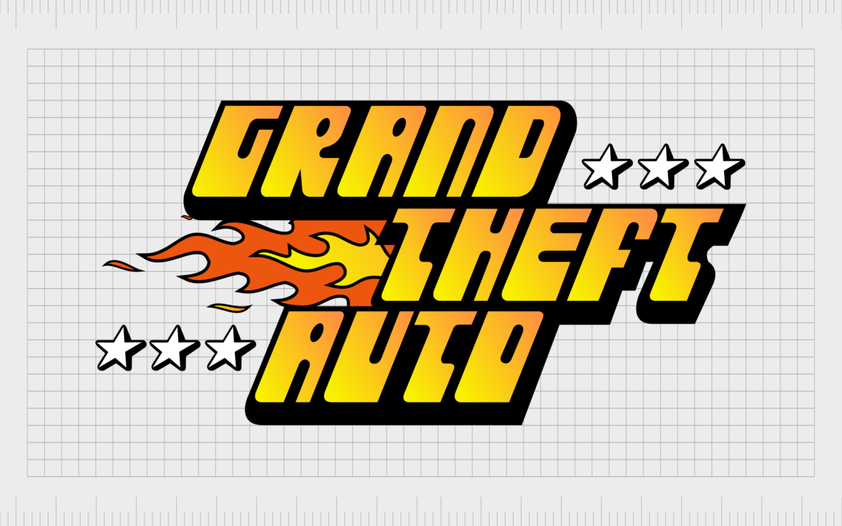
The original logo created for the Grand Theft Auto franchise was the most vivid and detailed option ever produced by the brand. The image featured a wordmark on three levels, similar to the design we know today. However, the font choice was very different, with almost graffiti-style letters.
The coloring of the logo relied heavily on warm colors like red and orange, created in a gradient. To the left of the word “Theft,” we see a simple flame graphic, depicted in yellow and orange to match the wordmark.
Three white stars with black outlines also appear both to the right of “Grand” and to the left of the “Auto” components.
1999
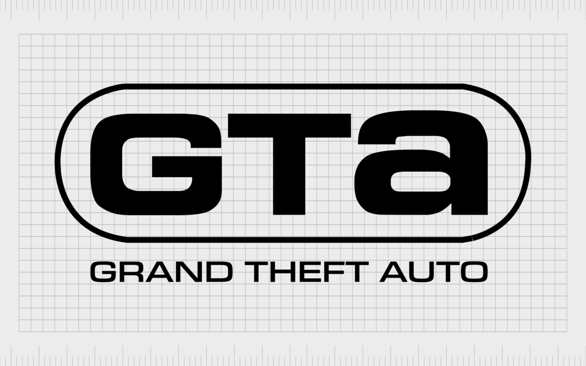
Two years after the introduction of the original Grand Theft Auto logo, a brand-new, much simpler design was introduced. This GTA logo removed all of the extra colors, focusing exclusively on black and white.
The main component of the emblem was an oval panner with the letters “GTA” in the middle. The first two letters were in uppercase, while the last was in lowercase.
Underneath the badge-style emblem, we see the full name of the game inscribed in a simple sans-serif font. This design was an interesting change for the brand and marked a transition to a monochrome color palette, which stayed with the franchise for the rest of its lifetime.
2001
In 2001, a new version of the GTA logo was introduced, featuring a lot of the elements most people will be familiar with today. The words in the logo were split across three levels, with a fun, stylistic font depicted in white with a strong black outline.
The letters in some parts of the emblem appear to merge almost together, creating a strong, professional aesthetic.
Interestingly, certain letters in the emblem have been depicted in uppercase, while others remain in lowercase. In this case, the “R” is uppercase in Grand, while the “g” is lowercase.
2008
Making only the slightest change to the logo design in 2008, Grand Theft Auto refined its emblem with an additional grey/silver outline around the white letters. This gave the wordmark a little extra depth and dynamism, making it appear almost three-dimensional.
The rest of the logo remained almost exactly the same as the previous variation.
2013
In 2013, the Grand Theft Auto logo designers decided to change the emblem once again, removing the grey/silver outline to return to the simpler wordmark. In this logo, the contours and lines were refined slightly to make the overall emblem look crisper and clearer.
The Grand Theft Auto logo: Colors and fonts
At a glance, the Grand Theft Auto logo might look relatively simplistic. The color palette is relatively straightforward, with no bright colors or vivid components. Additionally, there aren’t any graphical elements to add clutter to the design.
The Grand Theft Auto is minimalistic but effective, with a bold presence capable of standing out in any medium.
For years, the company has relied on its unique typography choice to capture the attention of consumers without providing much insight into what the game actually has to offer.
However, components like the unique “R” do suggest this is a game where you won’t be expected to play by the rules. If you want to take a closer look at the GTA logo, you can find some useful resources here:
What color is the Grand Theft Auto logo?
Aside from the first emblem, every version of the Grand Theft Auto wordmark over the years has been produced in the same color palette. The Grand Theft Auto logo colors of white and black ensure the design can stand out beautifully in any environment.
Notably, while the Grand Theft Auto logo color palette may be relatively consistent for the core design of the emblem, different colors and elements have been introduced for various games in the franchise.
Grand Theft Auto “Vice City” includes a pink wordmark in a neon-style design. The fifth game in the franchise has a green “V” with the word “Five” written over it on a banner. Each additional element represents the core theme of the game.
What font does the Grand Theft Auto logo use?
As mentioned above, the Grand Theft Auto logo font is unique to the franchise and the game series.
It’s similar in some ways to the Pricedown black typeface. However, there are various stylized elements to the design which help it to stand out, such as the capital “R” in Grand and the connected components of some of the letters.
Notably, different font styles have also been introduced for each game in the franchise:
What is the Grand Theft Auto font for Vice City?
The font style chosen for Vice City is similar to Rage Italic, depicted in pink and white, with an almost neon glow.
What font is the GTA San Andreas logo?
The San Andreas logo font is similar to the Diploma typeface. It features a lot of decorative elements and a bold white and black outline.
The compelling Grand Theft Auto logo
The Grand Theft Auto logo is a simple but compelling design intended to capture the audience attention with bold, funky letters and unique components. The emblem, though minimalistic, is versatile and eye-catching.
The typography choice helps to highlight the playful nature of the creators, as well as their approach to out-of-the-box thinking.
The simplicity of the GTA logo has also made it an incredibly versatile emblem, capable of evolving and adapting to different title cards throughout the GTA series.
Fabrik: A branding agency for our times.
Clarity starts with a conversation.
Thanks—we’ll get back to you shortly.
Whether you're navigating a rebrand, merger, or simply need a clearer identity—we’re here to help. No hard sell, just honest advice from people who know the sector.
Let’s start with a simple question…
Prefer to email? Drop us a line.
Fabrik’s been helping organisations rethink and reshape their brands for over 25 years. We’ve guided companies through mergers, rebrands and new launches. Whatever stage you’re at, we’ll meet you there.


