Doctor Strange logo history: The meaning behind the Doctor Strange symbol
If you’re a comic book or movie buff, you’re probably familiar with the Doctor Strange logo. One of the most popular characters created by Marvel, Doctor Strange has become quite a pop culture icon over the years. But how much do you know about Doctor Strange logo history?
While most famous comic book and movie superheroes don’t have traditional logos, they have a clear brand identity. Often, these characters are connected with specific symbols, fonts, and colors, which provide an insight into their unique powers and capabilities.
Doctor Strange is no exception. Well-known for his magical cape and incredible powers, Doctor Strange has a unique visual identity.
Today, we’re taking a closer look at the branding elements surrounding Doctor Strange, from the typefaces used in movie and comic book title pages to the symbols he’s often associated with.
An introduction to (Marvel) Doctor Strange
Doctor Stephen Strange is a fictional character created by Marvel Comics. He was introduced by Steve Ditko in the “Strange Tales” series in 1963. Doctor Strange is a magical being who serves as Sorcerer Supreme, the individual responsible for protecting Earth against magical threats.
Introduced during the “silver age” of comic books, Doctor Strange was intended to bring new themes and mysticism into the Marvel landscape. The character starts as an arrogant but brilliant neurosurgeon who is terribly injured in a car accident.
Nerve damage to his hands makes it impossible for him to continue practicing as a surgeon.
Unwilling to accept his prognosis, Strange begins to travel the world in search of the “Ancient One.” Strange becomes a student, learning how to master both martial arts and magic. Over the years, he acquires a variety of mystical objects, including the Eye of Agamotto.
Is Doctor Strange based on Hinduism?
Some people believe many of the inspirations for Doctor Strange come from Hinduism. Spells are depicted in Sanskrit, and the character receives his training in Nepal. Additionally, the spells and powers acquired by Doctor Strange have references to Hindu mythology.
However, Marvel has not confirmed whether the character has Hindu roots.
What is Dr. Strange’s outfit called?
While much of Doctor Strange’s outfit is variable in both the movie and comic book series, one of the core elements he always wears is the Cloak of Levitation. There are two versions of this cloak, one in blue and the other in red. The blue cloak is eventually gifted to Strange’s apprentice.
What is Doctor Strange’s logo?
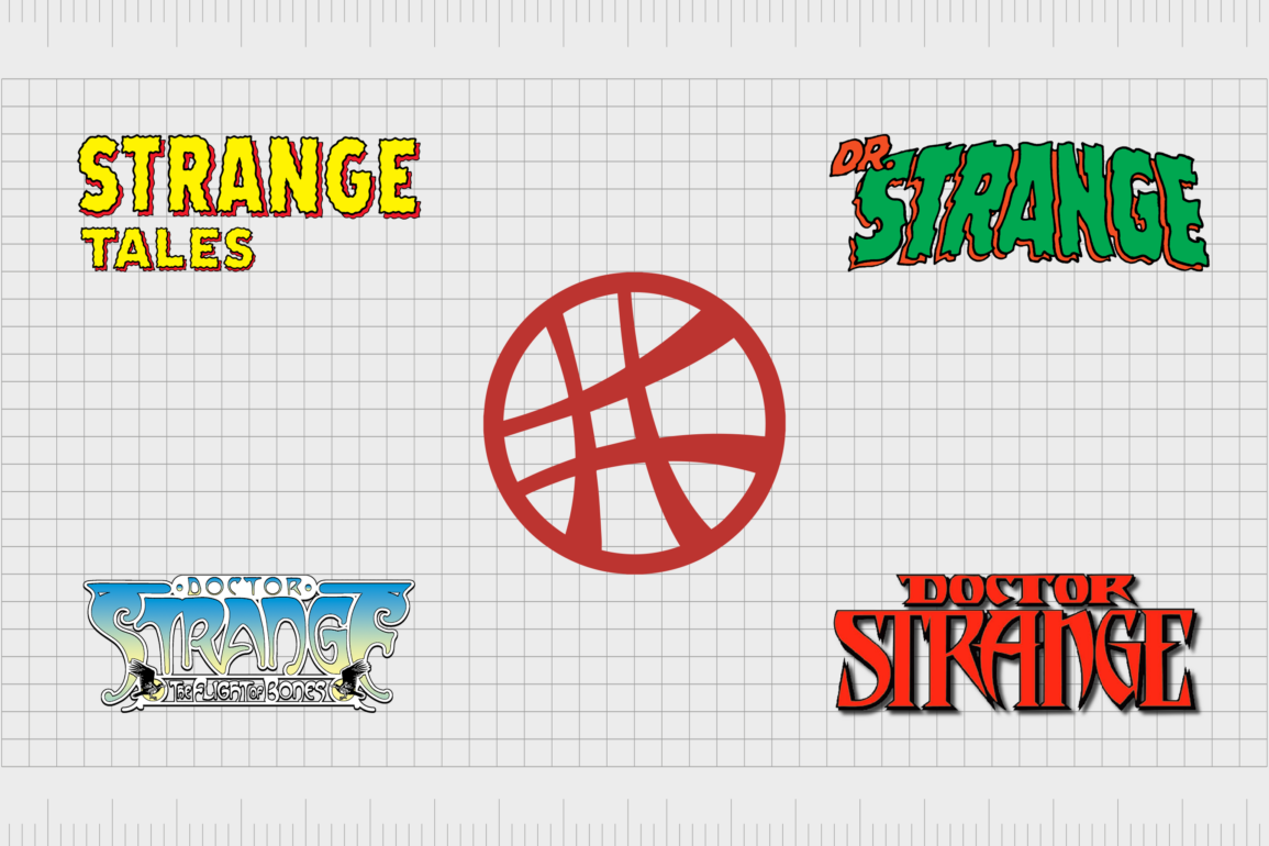
Similar to many superhero characters, Doctor Strange doesn’t have much of a specific logo associated with him. The character doesn’t have a specific emblem included in his costume beyond the cloak of levitation. However, in recent years, he has become associated with the “Seal of Vishanti.”
This is a unique design featuring a number of curved lines in a circle.
Also known as the Window of the Worlds, the symbol appears within an artist’s rendition of the Sanctum Sanctorum, where Doctor Strange resides.
Outside of this symbol, Doctor Strange is commonly depicted with wordmarks, used in the title cards for his movies, as well as on the covers of various comic books over the years.
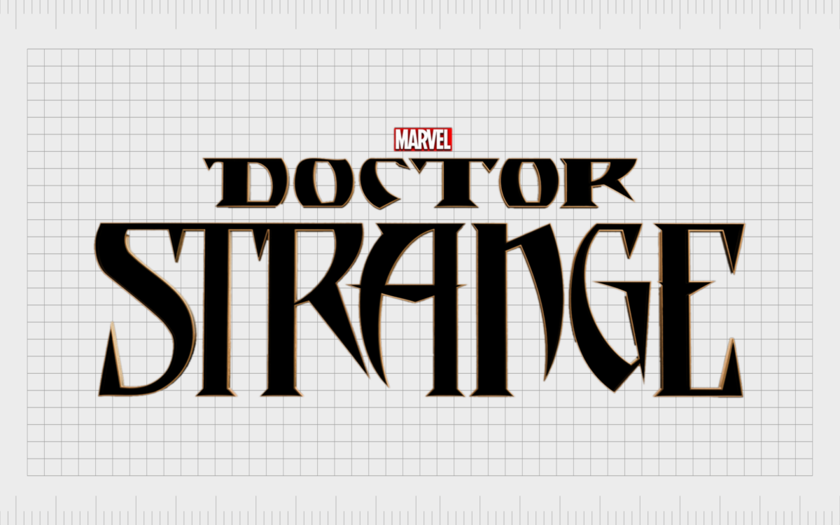
One of the first versions of the Doctor Strange wordmarks introduced into the Marvel Cinematic Universe appeared in 2014. This design was introduced for the character’s first movie.
As you’ll see below, the design takes some inspiration from prior wordmarks used on the cover of Doctor Strange comic books. The font choice is exotic and intriguing. It’s a serif-style font, depicted in black and Gold, with sharp, pointed edges.
Doctor Strange logo history
The best way to get a behind-the-scenes look into the Doctor Strange brand identity over the years is to examine some of the wordmarks used in the comic books where he was featured.
1968
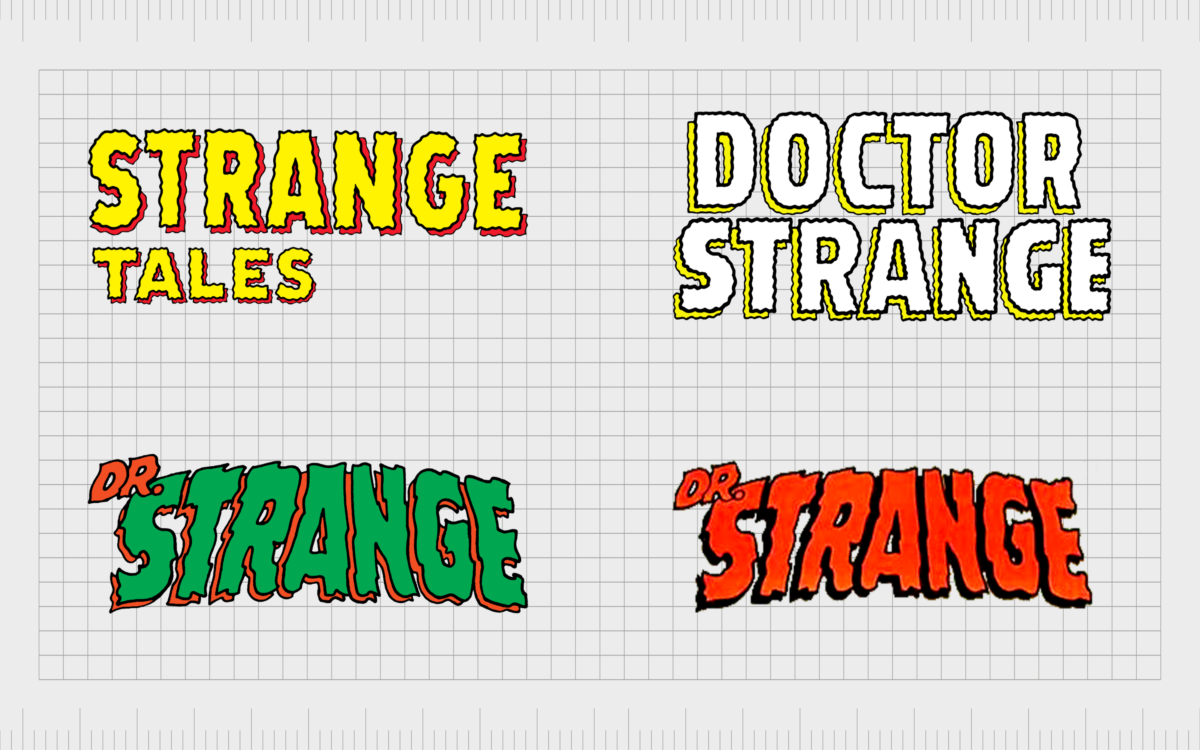
Initially, Doctor Strange was introduced in the “Strange Tales” comic, which ran from 1951 to 1968. The first volume of the official “Doctor Strange” comic uses a similar typeface to that of the “Strange Tales” book.
Both are multi-layered fonts with a shadow background. They also include wobbly lines intended to demonstrate strangeness.
In 1969, the font style was updated slightly. It still appears to be 3-dimensional, with a strong background shadow behind each glyph. The font style is also textured, but the curvy lines are a little longer in this variation.
1974
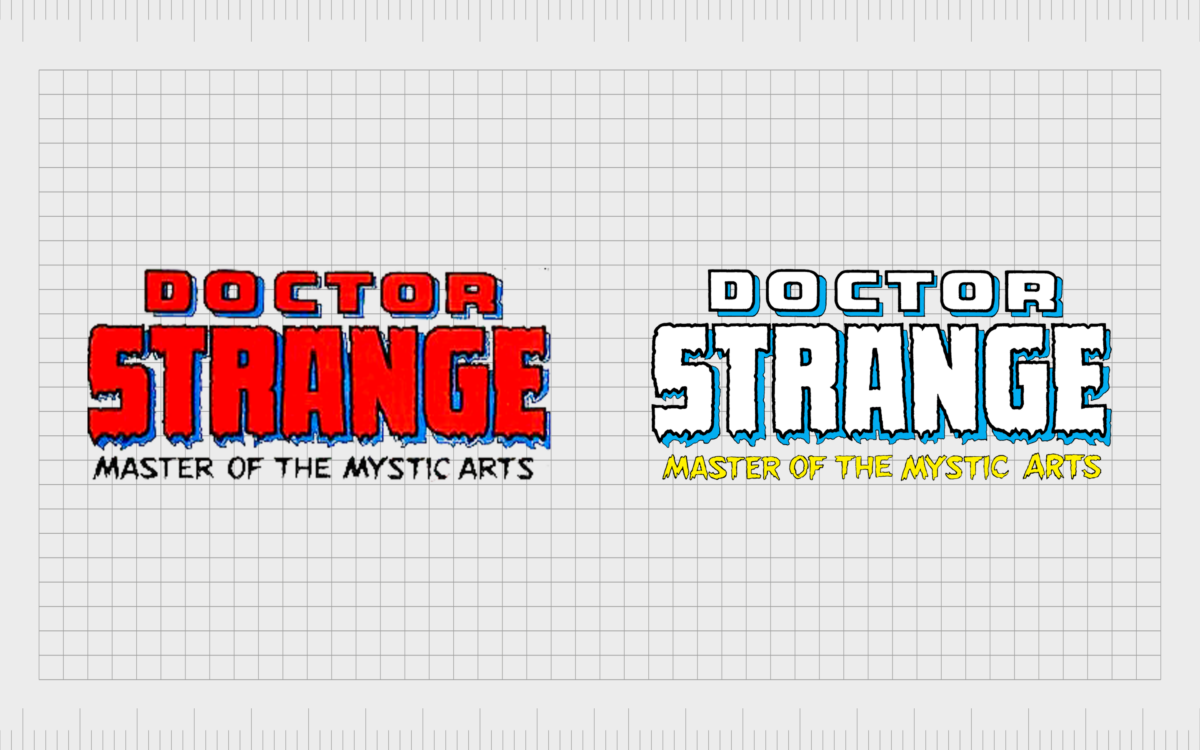
In 1974, a version of the Doctor Strange logo was introduced, which featured the tagline “Master of the Mystic Arts.” Here, we can see an updated version of the previous typeface, with the same jagged edges and slightly softer wobbly lines. The word “Doctor” appears to be more solid.
1999
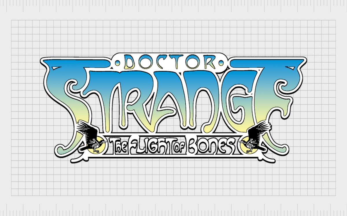
In 1999, a very different typeface was introduced, eliminating the wobbly lines with more curves and decorative elements. These designs were far more complex and a little harder to read.
2015+
In 2015 and 2016, Marvel began experimenting with a much sharper font for Doctor strange. This appears to be where the inspiration for the movie title card came from. The sharp serifs seem exotic and unusual, with shortened components on some of the letters.
There was also a brief time when the company played with a slightly more curvaceous font, featuring longer lines alongside the pointed serifs.
Doctor Strange in the Multiverse of Madness logo
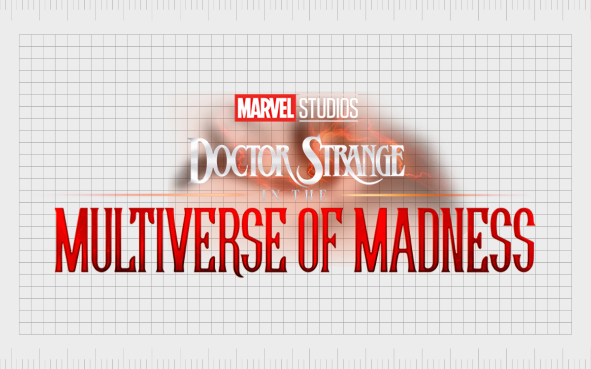
The most recent Doctor Strange logo in circulation today comes from the Multiverse of Madness movie. The design is based on the previous Doctor Strange film title card, with a number of sharp serifs.
However, while the first Doctor Strange movie appeared to use the font from 2015, the secondary movie has a font closer in style to the typefaces introduced in the later 2000s.
We can see a number of longer curves and embellishments in this design, which is depicted in white and red, some of the core colors associated with the character. The “Multiverse of Madness” phrase is depicted in a slightly different type of font from the “Doctor Strange” component.
However, the two typefaces seem to blend together quite well.
In the background of the image, we see a mystical-looking cloud of red, orange, and black, which may be a reference to Doctor Strange’s unique powers. The Marvel Studios logo also appears on this logo in its classic white and red colors.
The Doctor Strange logo: Colors and fonts
Similar to many superhero logos, the Doctor Strange logo has gone through a number of changes over the years as the designers and creators have experimented with the character. The most recent variations of the Doctor Strange logo, in both the comics and the movies, have similar elements.
They both feature strong, sharp serifs with none of the wobbly fonts of previous comic designs.
In most cases, the Doctor Strange logo is depicted in the colors red and black, with some white elements. This coincides with the Marvel color palette. It also could be a reference to the color of Doctor Strange’s powers, as well as his unique cloak.
If you’d like to take a closer look at some of the Doctor Strange branding elements, you can find some useful resources here:
What color is the Doctor Strange logo?
Looking back through Doctor Strange logo history, we can see a number of different colors associated with the character. Unlike many superheroes, Doctor Strange doesn’t seem to have a particularly consistent color palette.
However, he is often depicted with his red cloak, which may be why the core color used in the Marvel Cinematic logos is red.
The most common Doctor Strange logo colors in use as of late are red, white, and black. These shades are often depicted in gradients, with a decent amount of shadowing and highlights.
What font does the Doctor Strange logo use?
A few different fonts have been associated with the Doctor Strange logo over the years, starting with a rather unusual, textured, and wobbly font. Today, the most common typeface used as the Doctor Strange font is similar to ICT Benguiat.
Usually, the designers use serif fonts with sharp elements and exotic-looking glyphs. This may be an attempt to highlight Strange’s origins and power.
The magic of the Doctor Strange logo
Glancing at Doctor Strange logo history, we can see how the character’s visual identity has evolved over the years. The designers responsible for creating the title cards and logos for the comic book character frequently use sharp serifs and unusual, decorative fonts for the hero.
Aside from the wordmarks associated with Doctor Strange, we can also connect the character to the circular emblem often used to portray him. In almost all cases, Doctor Strange’s brand identity includes many bold lines, curves, and red elements.
Fabrik: A branding agency for our times.
Clarity starts with a conversation.
Thanks—we’ll get back to you shortly.
Whether you're navigating a rebrand, merger, or simply need a clearer identity—we’re here to help. No hard sell, just honest advice from people who know the sector.
Let’s start with a simple question…
Prefer to email? Drop us a line.
Fabrik’s been helping organisations rethink and reshape their brands for over 25 years. We’ve guided companies through mergers, rebrands and new launches. Whatever stage you’re at, we’ll meet you there.


