Brushing up on the Clinique logo

If you’re a fan of high-end beauty products, you’re probably familiar with the Clinique logo. Regarded by many to be a symbol of class and elegance, the Clinique Cosmetics logo symbolizes quality and reliability around the world.
Originally launched in 1967, Clinique has gained a sterling reputation throughout the years, appearing in beauty counters and stores all throughout the world.
With a headquarters in New York City, the Clinique brand focuses primarily on the sale of premium beauty products, for a slightly higher price tag than you might expect from some brands.
Clinique currently belongs to the Estée Lauder Companies parent brand, and it’s easy to see the similarities between the organizations in their choice of brand images.
Let’s take a closer look at Clinique logo history, and the background of the brand.
Clinique background: A history of Clinique
The Clinique Company was created in 1968, more than 54 years ago at the time of writing. The year prior, in 1967, American Vogue published an iconic article asking whether it was possible to “create” great skin.
The article, written by beauty editor Carol Philips, discussed the significant of an effective skincare routine in maintaining beauty.
Daughter of Estée Lauder, Evelyn Lauder brought the article to Estee’s attention, and Carol Phillips was recruited alongside Norman Orentreich to help create a new brand committed to good skin.
The “Clinique” business premiered in 1968 as the world’s first dermatologist-driven, allergy-tested line.
Sold initially at Saks Fifth Avenue in New York, Clinique launched with a total of 117 products to choose from. Clinique became the third brand officially “born” from the Lauder Group, after both Aramis and Estée Lauder.
Who owns Clinique?
Clinique was conceived and created by the Estée Lauder Company, with help from Evelyn Lauder, Carol Phillips, and Norman Orentreich. The company continues to belong to the Estée Lauder Brand today and is headquartered in New York.
Who makes Clinique?
The Estée Lauder brand was responsible for funding the laboratories and research which went into the creation of Clinique products. Over the years, Clinique has also partnered with a range of other companies to assist with development.
In 2008, the brand announced a partnership with Allergan, the maker of Botox, and the former partner of the Elizabeth Arden brand.
Where is Clinique made?
There isn’t a great deal of information available about the locations of all the Clinique laboratories. However, the company claims its products are made in the United States, Canada, and in various other locations around the world.
Why is Clinique named Clinique? Clinique meaning
The Clinique name is one of the most memorable elements of the branding for this company. The title is perfect for conveying a sense of medical expertise, alongside an appealing, luxury image.
Evelyn Lauder, the executive of Estée Lauder and Estee’s daughter, was the person responsible for bringing the article which inspired the Clinique brand to her mother’s attention.
She was also the person who came up with the name for the company and worked to support the development of the brand’s first line of products.
The name “Clinique” was inspired by trips to Paris taken by Evelyn. According to Lauder, she noticed a number of signs throughout the city for Clinique Esthétiques where Pariasian women would go to get treatments and facials.
She liked the word’s ability to convey a fresh and clinical approach to skincare, with a hint of glamour.
The name was matched to an equally chic packaging strategy, with celadon green shades chosen for a “soothing” appeal.

The Clinique logo: Clinique brand image
Unlike many cosmetics companies known for experimenting with their brand images over the years, Clinique has maintained a relatively consistence appearance throughout its lifespan. The company wanted a simple but elegant looking wordmark, similar to the Estée Lauder logo.
The Clinique logo today can appear in either black on a white background, or white on a black background. At first glance, the typeface may look somewhat generic. However, on closer inspection, we see a subtle serif font with a unique artistic flourish to the glyphs.
The lines above and below the Clinique wordmark help to strengthen the credibility of the brand, demonstrating a company with stability and knowledge.
This somewhat creative, but highly respectable logo combines the values of the Clinique company: medical precision and innovation.
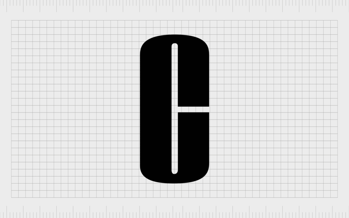
On some branding and packaging assets, Clinique makeup products simply use a large “C” as a secondary emblem for the brand. This image is much bolder than the “C” in the traditional Clinique wordmark and is intended to convey the strength of the company once again.

Clinique Cosmetics branding: Logo elements
Clinique products are distinguished by their focus on scientific discovery, medical expertise, and quality. More than just a standard cosmetics brand, Clinique stands out as a company committed to helping women find proven and tested solutions to their beauty issues.
With the Clinique logo, the company wanted to create an image capable of imbuing its audience with a sense of trust. The image we see today is bold and sophisticated, something you would expect to see on the products of a professional cosmetics company.
The Clinique logo also combines its prestigious image with subtle hints of creativity. Slight curves and unique flourishes within the Clinique brandmark remind us this is a company with an eye for innovation and discovery.
You can find some additional Clinique logo resources here:

What color is the Clinique logo
According to the official history of the Clinique brand, the Clinique logo colors were officially black and celadon green. This was intended to convey the bold and confident nature of the brand, as well as creating a soothing and reliable image.
Some Clinique products still feature the green coloring today within their packaging.
The celadon green color is also present in various aspects of the Clinique brand image online. There’s an image of the bold “C” for Clinique on a green background on the company’s Facebook page today.
The hex color for celadon green is #ACE1AF.
Outside of the famous green shade, Clinique is best known for its black and white color scheme. The official brand logo is written in black on a white background. The full logo can also be seen in white and black on the company’s website.
What font does the Clinique logo use?
The Clinique logo font is similar to the Jorvik Informal font. However, Clinique has added its own flourishes to the design over the years to help convey a specific personality.
The combination of the font and the soft pastel colors used in the background of Clinique product packaging makes the company stand out on the shelves in beauty stores.
What is the Clinique slogan?
You may notice the tagline of the company occasionally written in Helvetica on some of Clinique’s products and branding. This tagline is “No parabens. No phthalates. No fragrance. Just happy skin.”
Celebrating the Clinique logo today
The Clinique logo today is a beautiful insight into the timelessness of an elegant, well-chosen wordmark. Over the years, Clinique has preserved the same logo, with only a handful of changes to color schemes and packaging choices.
Clinique uses a combination of logo marks to convey the unique values of its brand today, including the official Clinique logo we mentioned above and the unforgettable Clinique “C”, depicted in a much bolder font, designed to capture the eye of customers browsing in a beauty store.
Clinique’s logo manages to connect the business to its parent brand while still allowing it to maintain its own unique image.
Fabrik: A branding agency for our times.
Clarity starts with a conversation.
Thanks—we’ll get back to you shortly.
Whether you're navigating a rebrand, merger, or simply need a clearer identity—we’re here to help. No hard sell, just honest advice from people who know the sector.
Let’s start with a simple question…
Prefer to email? Drop us a line.
Fabrik’s been helping organisations rethink and reshape their brands for over 25 years. We’ve guided companies through mergers, rebrands and new launches. Whatever stage you’re at, we’ll meet you there.


