The Centene logo history, design and meaning

Simple, sophisticated, and memorable, the Centene logo makes an immediate impact on all those who see it. Intended to convey ideas of professionalism and reliability, this enduring healthcare emblem has strengthened the brand positioning of the Centene brand for decades.
But, how much do you know about Centene logo history?
Compared to many other logos from the healthcare sector, the Centene emblem hasn’t changed much since the organization was first created in 1984. This straightforward wordmark has stood the test of time, connecting with patients and clients year after year.
Today, we’re going to take a closer look at the emblem of the Centene corporation, the origins of the brand, and what makes the current logo so valuable and effective.
Here’s your complete guide to Centene logo history, and the Centene corporation.
What kind of corporation is Centene? An introduction
Before we start looking at Centene logo history, and the long-lasting emblem of the brand, it’s worth examining the origins of the company. Though you may be familiar with the company’s brand image, you may have asked once or twice “What exactly does Centene do?”
The Centene Corporation, first founded in 1984, is a popular managed care company, located in St Louis Missouri.
Serving as an intermediary group for private and government-sponsored healthcare programs, Centene has earned a significant presence in the health space over the years. In 2021, it ranks at number 26 on the Fortune 500 list.
Initially, the Centene Corporation was founded by Elizabeth (Betty) Brinn, under the name the “Family Hospital Physician Associates”. When Brinn passed away, the non-profit organization was passed over to investors, with proceeds directly going towards the Betty Brinn foundation.
Centene entered the public market in 2001, and began acquiring other organizations soon after. In 2006, the business purchased the US Script benefits manager company, before eventually forming “Centurion”, a provider of correctional health care solutions.
In 2015, Centene also acquired Health Net, followed by Fidelis Care in 2017. Later, Centene took ownership of WellCare in 2019, and Magellan Health in 2021.
Today, the company acts as a major provider of both healthcare and health insurance services, with a massive presence across the US, as well as various regions throughout the world.
What is the Centene company motto?
The Centene Corporation is highly transparent when it comes to sharing its brand values, vision, and mission with its customers. The company claims its committed to helping people live healthier lives, and follows the motto “Transforming the health of the community, one person at a time.”

Centene logo history: The enduring Centene logo
Initially, the Centene Corporation was founded as the “Family Hospital Physician Associates”, by a hospital bookkeeper named Elizabeth Brinn, during 1984. Unfortunately, it’s difficult to find any initial emblems created for the non-profit organization during this time.
In 1995, a new healthcare executive named Michael Neidorff took over as CEO and president of the organization, and began expanding the business into new environments.
In 1997, the company took on its new name, the “Centene Corporation”. The word “Centene” comes from the Latin for “hundred”. The name may have been chosen to highlight the reach and overall scope of the evolving organization.
When the venture was renamed, it introduced its first official logo, an emblem that would prove to be a long-standing and enduring asset for the brand.
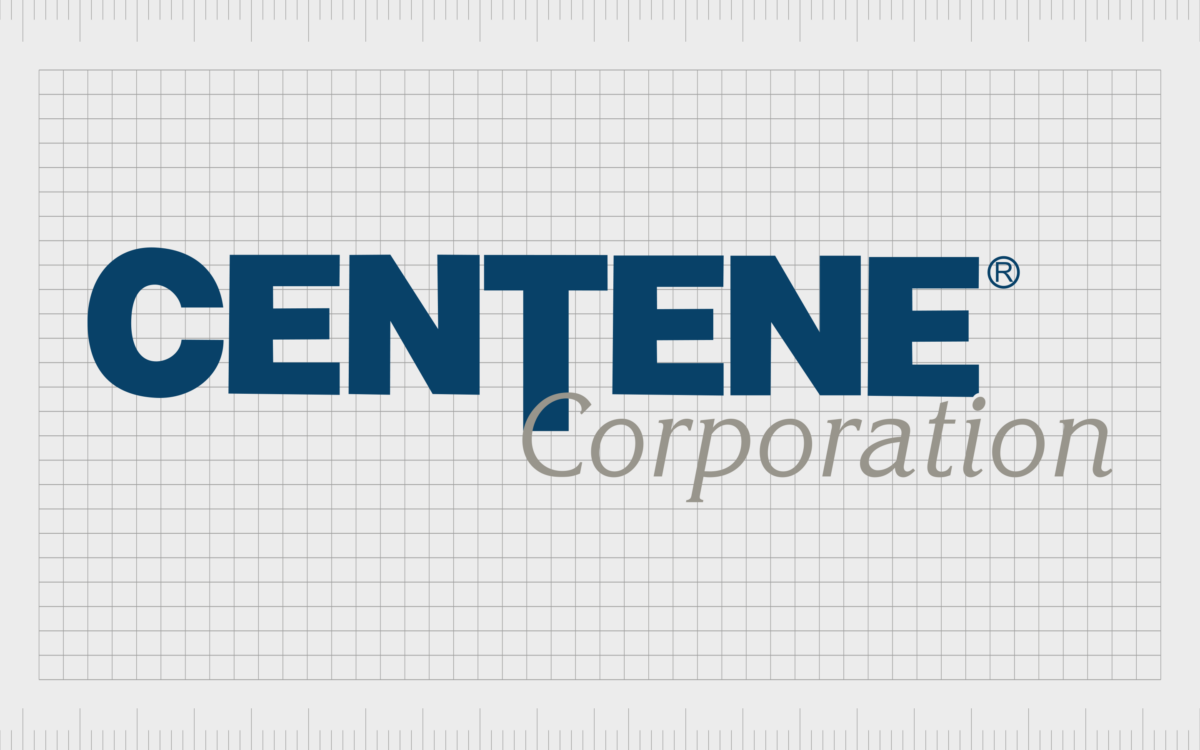
The official Centene Corporation logo hasn’t changed at all since 1997. The simplistic wordmark, chosen to highlight the strength and reliability of the brand, features a wordmark set across two levels. The first section of the logo worth noting is the “Centene” inscription.
Produced in all uppercase letters, this eye-catching wordmark demonstrates strength and trustworthiness, through the use of bold letters, and a sophisticated dark blue color palette.
Perhaps the most interesting element of this part of the emblem is the extended line of the “T” character, which stretches below the lower line of the rest of the letters, overlapping with the second inscription.
The longer “T” gives the design an innovative appearance, showcasing the company’s commitment to reaching out to its clients and delivering comprehensive service.
The second level of the wordmark features the word “Corporation” in a contrasting typeface. The slightly italicized inscription is depicted in thinner, grey letters, leaning gently towards the right to convey ideas of forward movement and progression.
The elegant second font choice gives an intimate edge to the otherwise business-like emblem.
The Centene corporation logo: Fonts and colors
Looking back at Centene logo history, we can see how a compelling, minimalistic, yet emotive wordmark can strengthen the appearance of a brand for decades. Though relatively straightforward, the Centene logo is meaningful.
It effectively conveys the values and personality of the company, with a carefully chosen combination of typefaces and colors.
The grey and blue color palette combines sophistication and professionalism with ideas of trust, reliability, and credibility.
At the same time, the contrasting typefaces give the image a unique appeal, bringing an intimate and personal touch to an otherwise corporate or “business-like” inscription.
You can take a closer look at the design of the Centene emblem in the links below:
What color is the Centene logo?
Since its inception, the Centene brand has utilized a relatively consistent color palette. The official Centene logo colors have always been a combination of dark blue and soft, silvery grey. However, there are variations of the logo available online which showcase the image in black and white.
Although it may seem relatively basic, the Centene logo color palette aims to highlight the core characteristics of the company. Grey is often chosen as a subtle way to convey ideas of elegance, sophistication, and professionalism.
On the other hand, in color psychology, blue is often used to symbolize trust and reliability.
Name: Ateneo Blue
Hex: #024069
RGB: (2, 64, 105)
CMYK: 0.980, 0.390, 0, 0.588
Name: Spanish Gray
Hex: #98958C
RGB: (152, 149, 140)
CMYK: 0, 0.019, 0.078, 0.403
What font does the Centene logo use?
As mentioned above, part of what makes the Centene Corporation logo so attractive is its careful use of two contrasting fonts. The two-level logo uses a combination of two different typefaces, positioned so the inscriptions overlap slightly at the point where the “T” extends into the second line.
The first Centene logo font is a bold and business-like sans-serif font, depicted in all uppercase letters, with a stylized “T” character.
The glyphs all have balanced components, and strong proportions, highlighting the stability and reliability of the brand. The second font is an italicized serif font, similar in some ways to the popular Times New Roman typeface.
The letters of the secondary inscription are written in sentence case, with significant spacing between each letter, to create balance with the upper line of the emblem.
Simple, but effective: The Centene logo
Though there haven’t been any significant changes to the company’s emblem throughout Centene logo history, looking at the long-standing logo provides some useful insights into the value of effective logo design.
Though simplistic, the Centene logo effectively conveys the characteristics of the brand in a legible, eye-catching format. The beautifully contrasting typefaces in the two-level inscription demonstrate ideas of stability and trust, while giving the company a friendly, intimate edge.
At the same time, the use of blue and grey as the primary colors in the emblem is meaningful. It highlights the commitment of the brand to delivering a trustworthy and reliable service.
The enduring logo of the Centene Corporation effectively positions the company as a leader in the healthcare space, while sending an important message to the brand’s target audience.
Fabrik: A branding agency for our times.
Clarity starts with a conversation.
Thanks—we’ll get back to you shortly.
Whether you're navigating a rebrand, merger, or simply need a clearer identity—we’re here to help. No hard sell, just honest advice from people who know the sector.
Let’s start with a simple question…
Prefer to email? Drop us a line.
Fabrik’s been helping organisations rethink and reshape their brands for over 25 years. We’ve guided companies through mergers, rebrands and new launches. Whatever stage you’re at, we’ll meet you there.


