Beyond a burger and bun: A look at Carl’s Jr’s logo history

The Carl’s Jr logo is probably one of the better-known fast food emblems in the world today. Welcoming and friendly, the attractive design has captured the attention of millions of consumers over the years, ever since Carl’s Jr first opened its doors in 1941.
However, while many people are familiar with the Carl’s Jr visual identity, not everyone knows where this company began its branding journey. Moreover, there’s even a little confusion around why the Carl’s Jr and Hardee’s logos are so similar.
If you’ve ever wondered where the iconic star logo of the Carl’s Jr logo came from, you’re in the right place. Today, we’re going to explore the branding strategy of Carl’s Jr, with a deep dive into the company’s logos from its inception to today.
Introducing Carl’s Jr: A famous fast-food brand
Before we dive into Carl’s Jr logo history, let’s take a closer look at the brand itself. Carl’s Jr is a fast-food restaurant chain, based in America, with franchises in locations across the globe.
Ranked as one of the top 100 franchise restaurants in the world, Carl’s Jr has achieved phenomenal success in its industry over the years, thanks in large part to its branding strategy.
The company was established in 1941 when Carl Karcher, a truck driver, and his wife borrowed around $311 to purchase a hot dog stand in Los Angeles.
Within four years, the pair owned around four hot dog stands throughout the region and eventually decided to purchase their own full-service restaurant. The first “Carl’s Drive-in Barbecue” location was launched in 1946.
Ten years later, in 1956, the Karcher team opened two new Carl’s Jr restaurants, choosing the new name to represent the fact that the locations were smaller than the larger drive-in restaurant. By the end of the 50s, there were four Carl’s Jr restaurants located throughout California.
By 1964, there were 24 Carl’s Jr restaurants, and the company incorporated in 1966 as Carl Karcher Enterprises Inc, launching a major expansion of the chain.
Over the years, the number of restaurants and menu items offered by Carl’s Jr has expanded drastically, with franchises appearing in regions all over the globe. Today, Carl’s Jr stands as one of the most successful franchises in the world.
Carl’s Jr logo history: The brand’s evolution
Carl’s Jr logo history began in 1941, with the development of the first hot dog stands purchased by the Karcher husband and wife team. However, the company only established an official “logo” with the introduction of the Carl’s drive-through in 1946.
Although the company’s visual identity has evolved somewhat over the years, it has almost consistently retained the same core shape in its logo – a five-pointed star.

The first official Carl’s Jr logo appeared in 1946 when the Karcher team opened their first Drive-In Barbecue restaurant. The emblem chosen by the company was quite typical for the time.
It included a vertical banner featuring the word “Carls,” followed by a horizontal banner with the words “Drive in Barbecue” written within it. The design had some art deco styling around each banner.
At the top of the emblem was a monochromatic five-point star featuring two outlines intended to capture customer attention on the road. The large, eye-catching signage was perfectly suited to a drive-through restaurant at the time.
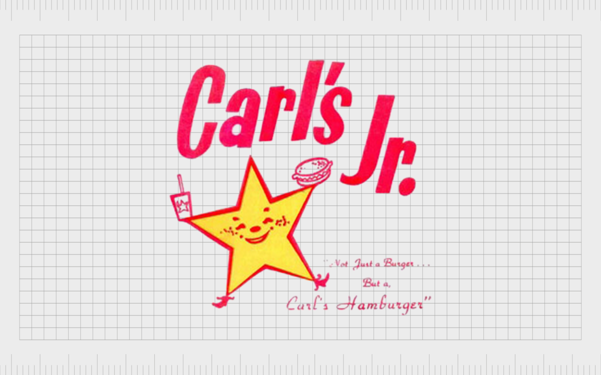
Ten years later, the introduction of the first Carl’s Jr restaurants inspired the creation of a new logo. In this emblem, the “Carl’s Jr” name was depicted in a bright red, sans-serif font. Each of the letters was positioned on different lines to give the emblem a fun and bouncy appearance.
The five-pointed star from the original emblem was updated to take on human elements, such as a smiling face. It also held a soda cup and a burger in each “arm.” The company also introduced a slogan, “Not just a burger, but a Carl’s Hamburger.”
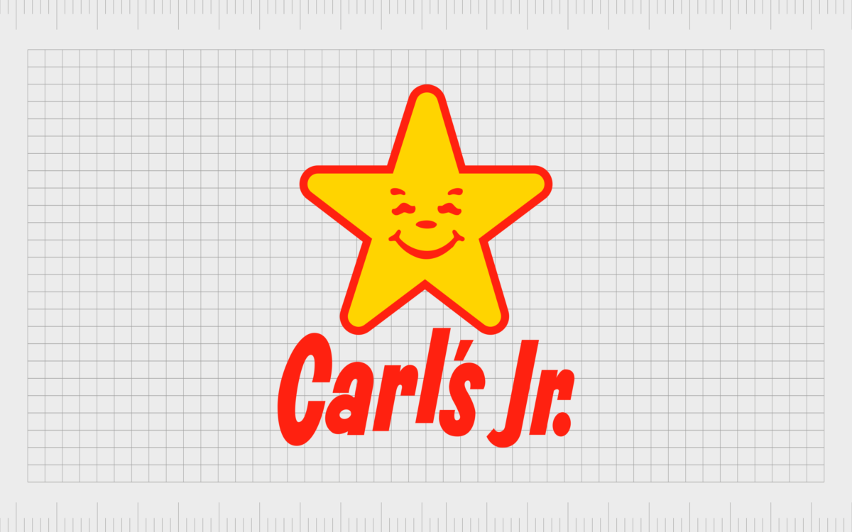
As the company began to rapidly expand during the 70s, Carl’s Jr updated its logo to make it fresher and more eye-catching.
The anthropomorphic star remained, with its characteristic grinning face. The new emblem featured the colors red and yellow and placed the wordmark for the company underneath the star design.

In 1985, another variation of this logo was introduced, repositioning the wordmark to the right-hand side of the star. The font choice was also updated, switching from a bouncy sans-serif font to a more streamlined serif alternative.

In 2006, Carl’s Jr completely redesigned its logo with a new addition to the color palette: white. The Carl’s Jr wordmark was updated with an italicized font, and the whole emblem was surrounded by a red, filled outline.
The yellow star, with its smiling face, still remained, though it was turned a little on its side to create a fun, bouncy effect.
The slogan, “Charbroiled burgers,” was placed underneath the inscription for the company’s name in uppercase yellow letters.

2017 marked the introduction of a more simplified Carl’s Jr logo, featuring the colors of just yellow and black. This new emblem featured a similar style of font to the previous design, but many of the decorative elements were removed.

A year later, in 2018, the company refined this new logo even further, giving the star a soft red outline to demonstrate depth and shadow. The positioning of the star shape also changed slightly, so the right arm of the shape didn’t overlap with the “C” in Carl’s Jr.

2022
The most recent variation of the Carl’s Jr logo is very similar to the previous design, with the same red outline on the yellow star and a consistent smiling face. However, the letters have been straightened slightly, and the star has been repositioned.
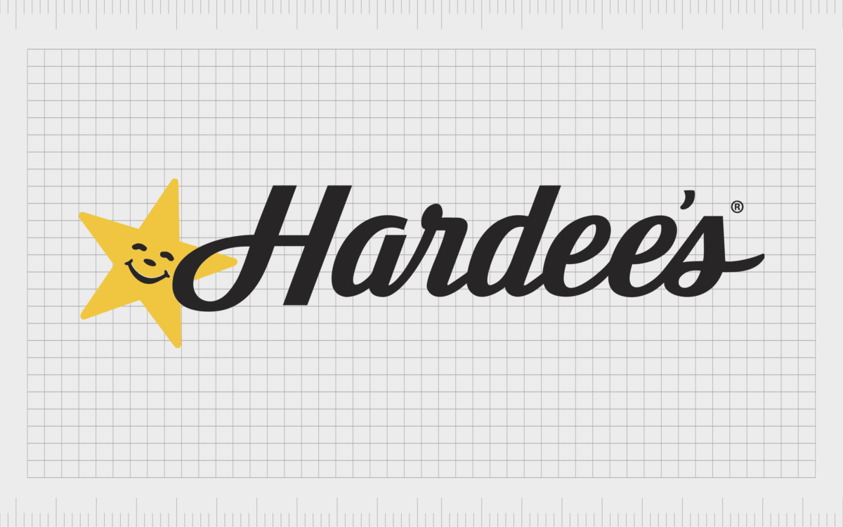
Why are there two names for Carl’s Jr? The Hardee’s logo
One of the most confusing elements about the Carl’s Jr logo is it appears to look almost exactly the same as the Hardee’s logo. This has led customers to question whether the two companies are the same and why they have different names if so.
The two burger chains, Hardee’s and Carl’s Jr, actually started life as two separate entities. Carl’s Jr is the elder of the two companies, founded in 1941, while Hardee’s was initially launched in 1960 by Wilbur Hardee in North Carolina.
Hardee’s was created specifically to serve customers in smaller towns that weren’t already proliferated by bigger names like McDonald’s. By the early 90s, the company had established more than 2500 locations, making it one of the largest restaurant chains in the company.
In 1997, the parent company of Carl’s Jr, CKE Restaurants, acquired the Hardee’s brand, allowing the Carl’s Jr company to expand into the East without damaging Hardee’s relationship with its customers.
The company retained the same name but started updating its logo and changing its menu to feature items from the Carl’s Jr collection.
The Carl’s Jr logo: Colors and fonts
The Carl’s Jr logo is simple but appealing, designed to attract a younger audience with a fun, cheerful aesthetic.
The Carl’s Jr star not only symbolizes excellence but also takes on human characteristics to make the company appear more welcoming and friendly. The yellow star with its red outline captures customer attention in the fast food space and positions Car’s Jr as a reliable brand.
If you’d like to take a closer look at the Carl’s Jr logo, you can find some useful resources here:
What color is the Carl’s Jr logo?
While the Car’s Jr logo colors have changed slightly over the years, certain aspects of the emblem have been relatively consistent, such as the bright yellow star. Today, the Carl’s Jr logo palette combines yellow, red, and black, often on a white background.
The red details exude warmth and energy, while yellow reminds us of joy and excitement.
Sonoran Sand
Hex color: #ffce34
RGB: 255 206 52
CMYK: 0 19 80 0
Pantone: PMS 7501 C
Medium Candy Apple Red
Hex color: #d81f32
RGB: 216 31 50
CMYK: 0 86 77 15
Pantone: PMS 185 C
What font does the Carl’s Jr logo use?
The custom typeface for the Carl’s Jr logo was designed specifically for the brand. Over the years, the Carl’s Jr logo font has grown increasingly more sophisticated, breaking away from a bouncy sans-serif typography to an elegant, italicized wordmark.
The font choice today is similar to options such as TT Polls Script Bold, Ethan Italics, and Kathya Script.
The welcoming Carl’s Jr logo
Warm and welcoming, the Carl’s Jr logo instantly tells customers they will get a fun and friendly experience with the brand. The anthropomorphic star has become something of a mascot for the company over the years, eliciting joy and excitement from customers around the globe.
While the Carl’s Jr logo has evolved somewhat over the years, its consistent star element has helped to position the brand as a leader in its space, focused on excellence and creativity.
Fabrik: A branding agency for our times.
Clarity starts with a conversation.
Thanks—we’ll get back to you shortly.
Whether you're navigating a rebrand, merger, or simply need a clearer identity—we’re here to help. No hard sell, just honest advice from people who know the sector.
Let’s start with a simple question…
Prefer to email? Drop us a line.
Fabrik’s been helping organisations rethink and reshape their brands for over 25 years. We’ve guided companies through mergers, rebrands and new launches. Whatever stage you’re at, we’ll meet you there.


