What’s the ideal placement for your company logo design online?

Your snazzy company logo’s a work of art. It really is. You’re proud of it, the MD’s proud of it, the whole company’s so proud you get goosebumps. The question is, where’s the best place to put it?
The answer is everywhere, obviously. It’s the face of your brand, your most recognisable asset and something you should be brandishing in front of clients and potential clients at every opportunity. It should appear on every communications piece, from your corporate stationery to interior branding. Here, however, we’re specifically referring to where your company logo should go on your website…
The company logo discussion
Believe it or not, there’s been discussion on this topic since the www. big bang, more than two decades ago. And, debate rages to the present day. Which begs the question, where precisely is the best place for your company logo to reside?
Strictly speaking, there are three logical placements that web designers nearly always consider:
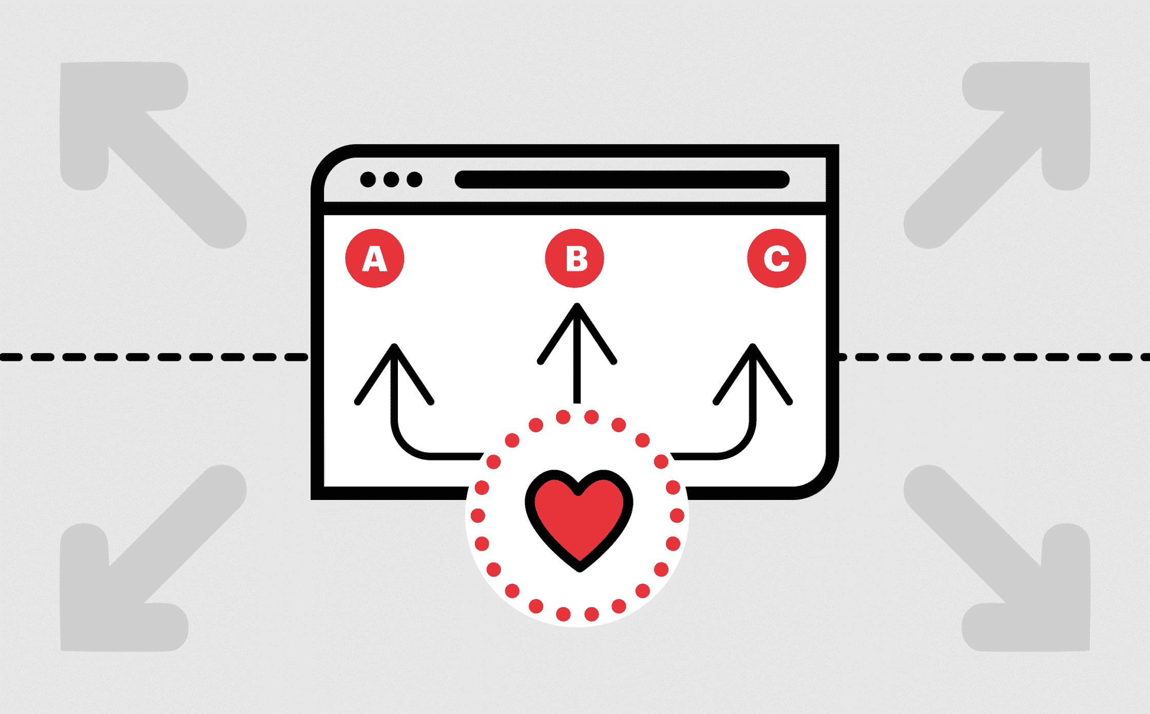
- A: Top left
- B: Top middle
- C: Top right
They’re all pretty similar, right? How could any of the options be wrong when they’re only inches (or pixels) apart? Well, they’re seemingly not pretty similar when it comes to UX logic. And, if you were to ask an astronaut, a surgeon or Leonardo Da Vinci, they’d all tell you the difference a few inches to the left can make to a successful outcome.
The main argument we make when deciding logo placement is based purely around the consideration of UX. As logo designers and web designers, we’re well placed to make this judgement. After all, user experience is at the heart of everything we do and is vital to anyone coming into contact with your website. In this context, your company logo not only makes an impact, it serves a purpose in terms of navigation. Using sacred UX logic, your logo undoubtedly belongs in the top left corner of your website. Without fail.
Why…? Because on this side of the planet, without ever really paying heed to it, we always read from left to right. Every newspaper, book, website, leaflet, poster, label is read left to right. Thanks to this, our eyes naturally look to the left first, regardless of what page we’re looking at, and whether there’s text on it or not. Similarly, in the prehistoric period of web design, company logos were always on the left and thus, that’s where most people still look for them today.
This is a discussion, however, not a requisite. While UX is one way to help decide where your company logo should sit on a web page, there are other things to consider. One such consideration is how to make your logo design stand out from the crowd, while also bearing in mind that logos are not created to be the same – some designs simply don’t work well aligned to the left. If your logo requires space to be appreciated, or if it works better centred or to the right of the page, a balancing act might be all that’s required. For example, a simple logo lock-up device can get around any issues with placement. At the end of the day, your own judgement and gut feeling are often deciding factors.
The science
Yes, there is indeed an actual science to this. Well, sort of!
Studies conducted around the placement of company logos were conclusive, even though it took a fair bit of work to get there. Many factors were involved in this research, including a logo’s purpose, brand recognition and whether or not the ‘ideal place for a logo’ even existed…
The Nielsen Norman Group, a leader in the user experience field, identified three main purposes of company logos on websites:
- They remind visitors where they are (aka ‘who’s website am I on again?!’).
- They serve as an easy click-through back to the homepage.
- They help brand recognition both consciously and subconsciously. The constant brand exposure is a brilliant way to get your logo design recognised without the visitor even knowing – sneaky hey?
With the above in mind, the NNGroup set out on a quest to find the answer to the ever elusive question: ‘where should a company’s logo really go?’
Time to get political
Left vs. right: which is best?
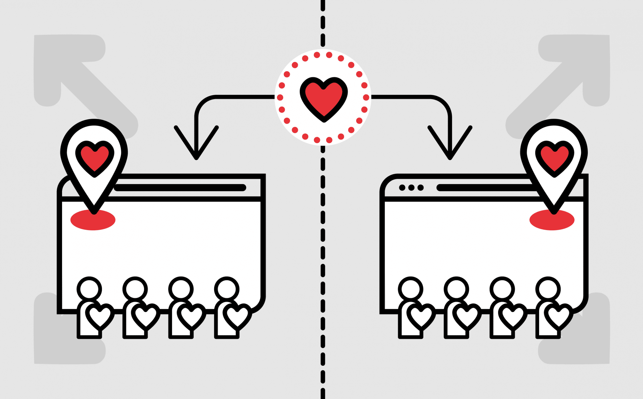
128 users took part in the NNGroup’s study. Participants were shown one version out of a possible two of the same website. Version 1 was the original and had the company’s logo on the left. While version 2 was a manipulation of the site, with the logo and navigation on the right.
Having had a minute to review their particular version of the website, they were subsequently asked a series of follow-up questions and shown ten more websites. The point of this aspect of the study was to establish the effect logo placement had on brand recall.
The findings
So what did science reveal?
The study showed that left-aligned logos are better for brand recall than right alignment logos, with brand recall for left-aligned logos boasting 39% whereas right-aligned logos received only 21% brand recall.
Again, in the corner for left-aligned logos, they were found more likely to be labelled ‘unique’. Even though the traditional and more common placement of a company logo is on the left of a page, respondents still believed that these logos were more distinctive and stylish than those on the right, poor things.
Science continued
With the evidence safely concluding that left is better than right (logo design discussion here only!), it was time for the NNGroup to undertake the next endeavour:
Left vs. centre stage
This additional study aimed to finalise the company logo placement debate – is left really best? Two further tests were conducted to ensure full accuracy of the study, which involved giving 50 new participants a retail website to interact with and navigate. Eight of these websites featured a centralised logo, while six had a trusty left-aligned logo. Users undertook different tasks, each designed to test the ease of navigation and route back to the homepage.
In part two of this test, 128 participants were given five different hotel websites to explore. Four included a mixed-bag of logo placement, either on the left or in the centre, while the fifth site featured a right-aligned logo. At the end, users were asked a series of questions to determine brand recall.
The findings 2.0
Left-aligned company logos are better for navigation, BUT brand recall is unaffected by the difference between a left-aligned or centralised logo.
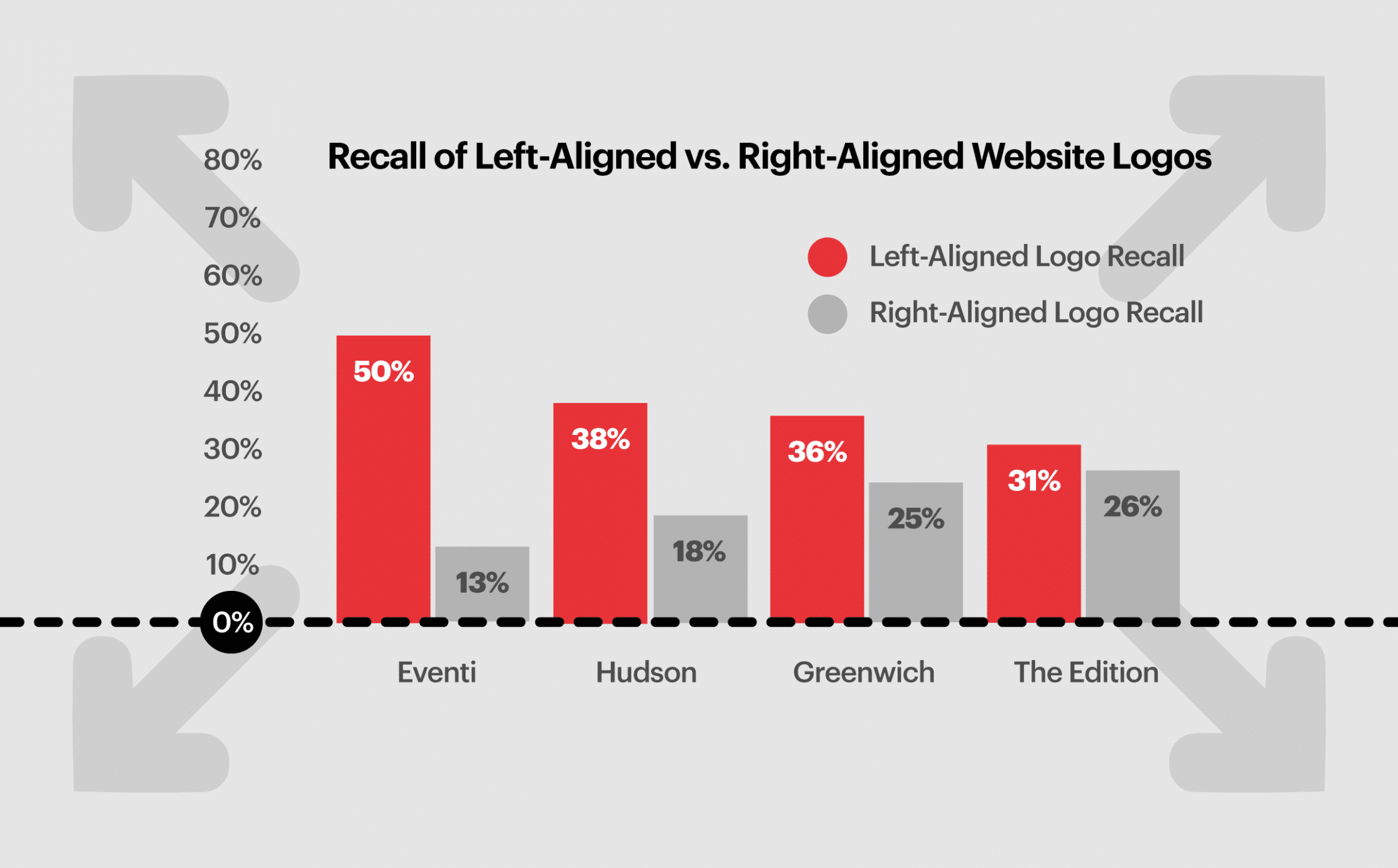
In the first test, only 4% of users didn’t know to click the left-aligned logo to return to the homepage. Whereas 24% of users failed to use the centralised logo to return to the homepage. In the second test, even though users were given variations of the same logo with different placement, brand recall was somewhat inconsistent compared to the left-aligned and centralised logos.
The results
And the overall winner is… (drum roll please) Left aligned logos!
It would seem that UX logic is in fact the ultimate voice of reason when it comes to logo placement… Let’s quickly explore the reasons why…
- Many users will not think to look in the right hand corner for a company logo, which means brand recall can be compromised.
- Similarly, most of us are conditioned to look for a source of navigation in a top corner of a website. When navigation is the middle, it’s unfamiliar and can confuse the process of finding our way around. It’s worth remembering, however, that 88% of participants still remember to use the logo as a means to navigate to the homepage.
In short, left-aligned company logos are in prime position for click-through, and for getting noticed as it’s where the eye is naturally drawn.
What we concluded from the study
It’s clear that UX plays a big part in logo placement, and we can’t ignore the evidence which tells us left is best. Having your company logo in the middle or top right of your website page reduces brand recall and logo appreciation, and can also potentially make your entire site more difficult to navigate.
Ultimately though – even taking into account the stats – it’s your call to either make an informed decision or go with gut feel.
Similarly (and somewhat predictably) it isn’t just your logo’s placement that’s important. Care should be given to how your logo is exported, the font you use and how much ‘breathing’ space it’s given. You’ll want your logo to be pixel-perfect, so a high-quality file format, legible typeface and surrounding space are of paramount importance. This way, you’ll ensure other elements of the page design don’t distract or detract from your company logo.
Make sure your company logo fits in with your site
Now we know the optimal placement for your logo, what else does it take to ensure your website design reflects your concern for UX?
Whether you’re creating a whole new website design, or just revamping your old one, there are a multitude of things to consider. The most fundamental aspect of this is selecting the right content management platform (Fabrik recommends WordPress) and website design theme. Also, consider the feeling you want to radiate from your site, and how it will stand up against the competition. It’s likely that you’ll have a marketing strategy and communications plan in place before starting this work but still, it can be hard to reflect these same intentions online. This is where your logo parachutes in to save the day. Your logo encompasses everything you want people to know about your company from a glance, and it also keeps you grounded when making important, design-related decisions.
What better reason to put your logo design on the radar first and foremost? Specialist logo designers will fine-tune your most valuable brand asset, and work with you to establish your web design brief in the process. Taking an open-minded approach to the design of your website, and advances in web technology, lead to interesting outcomes and serve as a constant point of reference when it comes to your broader communications programme.
With a plethora of different design elements requiring attention during the early stages of web development, it can be difficult to see the wood for the trees. Aspects fundamental to web design, however, include the consistent application of brand / visual assets, aesthetics, fluidity and ease of use. Here’s a quick round-up of the more rudimentary elements you’ll need to consider…
Considerations for your colour scheme
Nail this down early in the process, taking cues from your master brand guidelines. Don’t go crazy with colour, it looks unprofessional and confuses users. And remember, when it comes to web design, content really is king. With this premise, any visual wrapping should be kept to a minimum so as not to distract from the thing that matters most (your content). If your guidelines are not prescriptive about the use of colour, work up a number of static visuals before making a decision. Also, bear in mind legibility and avoid colour ways that are overly vibrant and harsh. Too much contrast will make your content difficult to read for sustained periods, and detract from your beautifully crafted logo. At the end of the day, your colour scheme should be a flawless reflection of your brand identity, and consistently applied.
Play to your logo’s unique characteristics
You’ve put your heart and soul into your logo design, right? You’ve toiled over the aesthetics, ensuring the use of shapes, colours and tone combine to magnificent effect. So, play to these strengths and filter this inspiration down to your web design too. If there’s a unique element to your logo design emphasise it! Employ creative licence and push the boundaries to shape your site, making it feel really bespoke. If your logo is one of the main focal point, place it under the spotlight. At the same time, bear in mind not to detract from your content.
Compare your logo with competitors’
I’m not envisaging that you’ll be redesigning your logo, more that you’ll be redesigning your website around your logo. I’m also assuming that your starting point is a distinctive logo that’s gained tractions in your sector. This being the case, you’ll still want to periodically audit the competition to ensure your logo is keeping pace the times and is inventive, professional and memorable in equal measure. And that it says the right things to the right people. If, however, as a result of your competitor research, you’re overcome with jealousy it might be time for a rethink. If you logo doesn’t tick the right boxes, or if its origins are pre-web, have the conviction to change it. A re-brand can work wonders, and will ensure new brand assets are created specifically for today’s interconnected times. In short, it will be fit for purpose. Does that sound exciting?
At the end of the day, your logo is a graphic representation of your business, its essence and its soul. It’s a tiny, but incredibly powerful piece of visual shorthand. It’s the fine line that can make your website stand out, and function efficiently.
Sometimes, it’s good not to be different
The placement of your company logo can be pivotal to the way users experience and interact with your website. Consider it this way… If your website is an open door to your organisation, your logo is the virtual guide returning them to that door. Because no-one likes being stuck without an exit strategy, even if your website is a fantastic place to be!
And, if you’re still struggling to grapple with the placement of your logo, you are not alone. During a recent revamp of Fabrik’s site design, we encountered precisely the same issues with logo placement. We followed the tried and tested UX formula when deciding to place Fabrik’s logo top left.
It’s important to conclude by saying logo placement is not the only thing that makes for a great online experience. You can create stunning landing pages with push notifications and re-imagine your calls to action, messaging, tone of voice and imagery. But don’t mess with convention, even if it feels like you’re giving your site a unique point of difference. You might just end up damaging usability and brand recall as a result. Sometimes, it’s best not to be different for the sake of being different. Take my word for it!
So there you have it, left is best.
(for logo placement)
If you enjoyed this article, you might enjoy this one too:
Clarity starts with a conversation.
Thanks—we’ll get back to you shortly.
Whether you're navigating a rebrand, merger, or simply need a clearer identity—we’re here to help. No hard sell, just honest advice from people who know the sector.
Let’s start with a simple question…
Prefer to email? Drop us a line.
Fabrik’s been helping organisations rethink and reshape their brands for over 25 years. We’ve guided companies through mergers, rebrands and new launches. Whatever stage you’re at, we’ll meet you there.


