


The Black Widow logo: Your guide to the Black Widow symbol and emblem

The Black Widow logo is a simple yet memorable image in the Marvel Universe. Designed to highlight the unique history of the iconic character, this logo has only recently begun to gain attention in recent years, as Marvel has continued to “brand” its superheroes.
If you’re familiar with the Marvel comic books, you’re probably already aware of Black Widow’s logo, which looks similar to a red hourglass. Like many of the logos chosen to represent the “Avengers” – the crime-fighting Marvel team, this emblem is relatively minimalistic.
However, despite its simple appearance, the Black Widow symbol holds significant meaning and depth. It’s an excellent insight into how something can be deceptively basic and emotionally compelling at the same time in the branding world.
Today, we’re going to take a closer look at the Black Widow logo and provide an insight into what the famous hourglass actually represents.
Where did the idea of Black Widow come from?
Before we dive into the history of the Black Widow logo, it’s worth learning a little more about the story of the Black Widow character. Black Widow is the superhero alias of Natalia (Natasha) Romanova, a fictional character created for the Marvel Comic Book Universe.
There’s little information available about where the inspiration for this character came from, but the persona of the Russian spy was relatively common in the stories of the time.
When Stan Lee, scripter Don Rico, and the artist Don Heck teamed up to create Black Widow, they were initially creating a villain who would fight against Iron Man, another well-known hero.
Initially, Black Widow had no evident logo or specific costume. She first appeared as a non-costumed antagonist in “Tales of Suspense” volume 52. Several issues later, her story aligned with the tale of Hawkeye, who she convinced to help her steal technology from Iron Man.
Eventually, Black Widow defected to the United States, and became an agent of the S.H.I.E.L.D agency.
Soon after joining S.H.I.E.L.D, Black Widow also became a member of the Avengers superhero team, where she fights crime in part to make up for the misdeeds of her past. Today, she’s best recognised by her black outfit, which often features a red hourglass as a kind of makeshift logo.
Black Widow history: What is black widow’s origin story?
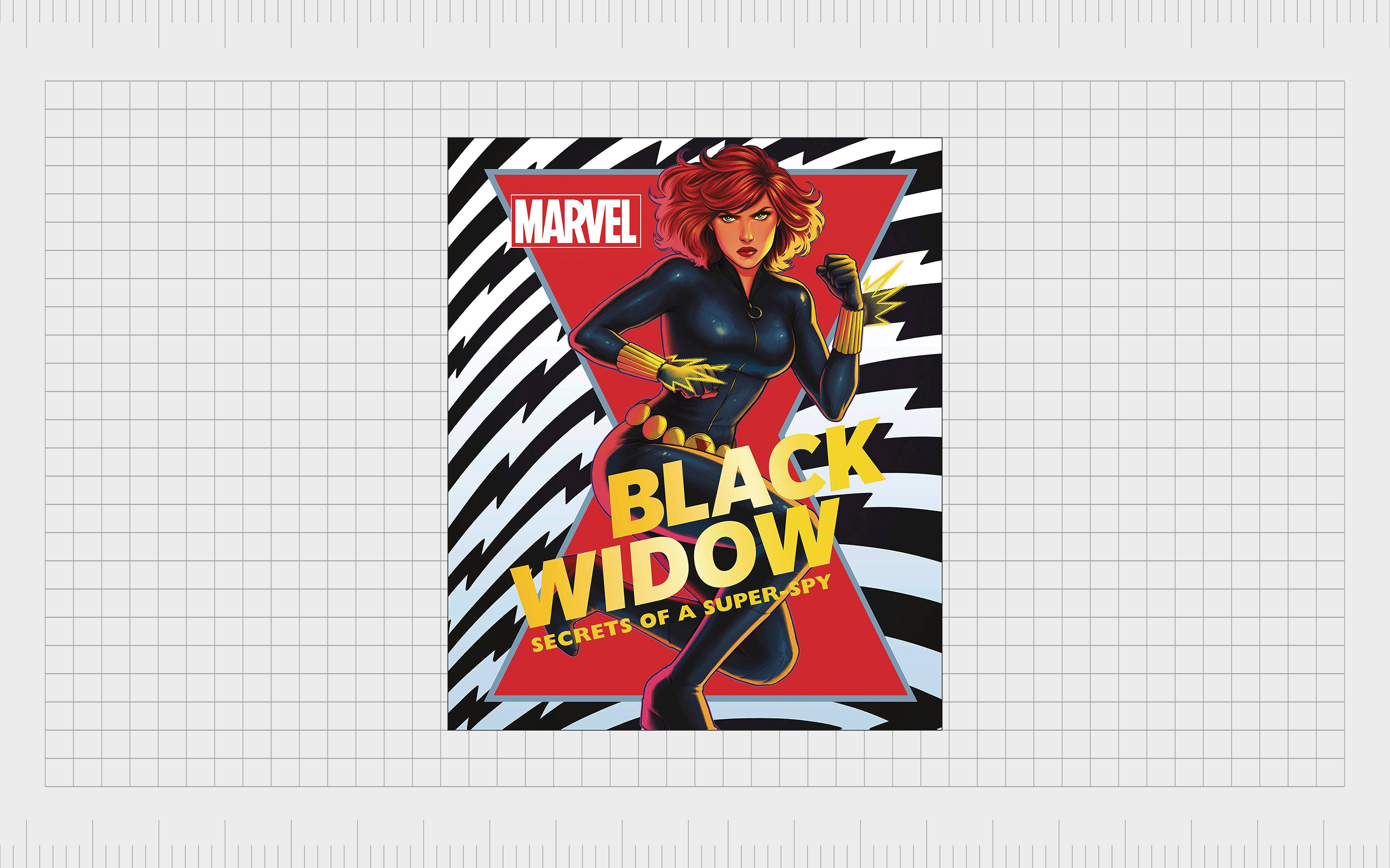
Black Widow has become an iconic superhero character over the years. She’s appeared in various forms of media, including video games, films, and television series.
In the Marvel Cinematic Universe, the persona is adopted by Scarlett Johansson, although other actors have voiced the character for series like “What If…”
Part of what makes Black Widow so interesting is her unique background. According to the hero’s origin story, she was trained as a femme fatale at an early age and assigned to assassinate a wide variety of people over the years.
Assigned to Boris Turgenov, Natasha’s first mission in the United States involved the assassination of Professor Anton Vanko.
Romanova was also involved in various attempts to steal from, and even destroy Iron Man. With the help of Hawkeye, she almost defeated Iron Man during some of her earlier comic book appearances but was severely injured in the process.
After falling in love with Hawkeye, Black Widow attempted to defect from the Soviet Union, which led to her being pursued by the KGB.
After being brainwashed, Romanova once again battled the Avengers, but after breaking free from the hold on her mind, she was able to successfully defect to the US.
Now, she’s best-known for being a significant part of the Avengers team, working alongside countless other superheroes like Spiderman, and even Iron Man.
Black Widow logo history
The Avengers Black Widow logo
As with many Avenger symbols, the Black Widow logo history is somewhat difficult to track down. The character didn’t have much of a specific symbol for a number of years.
When she was first introduced as a costumed character in the comic book world, she had a bouffant hairstyle and a black button with a white “W” on her outfit.
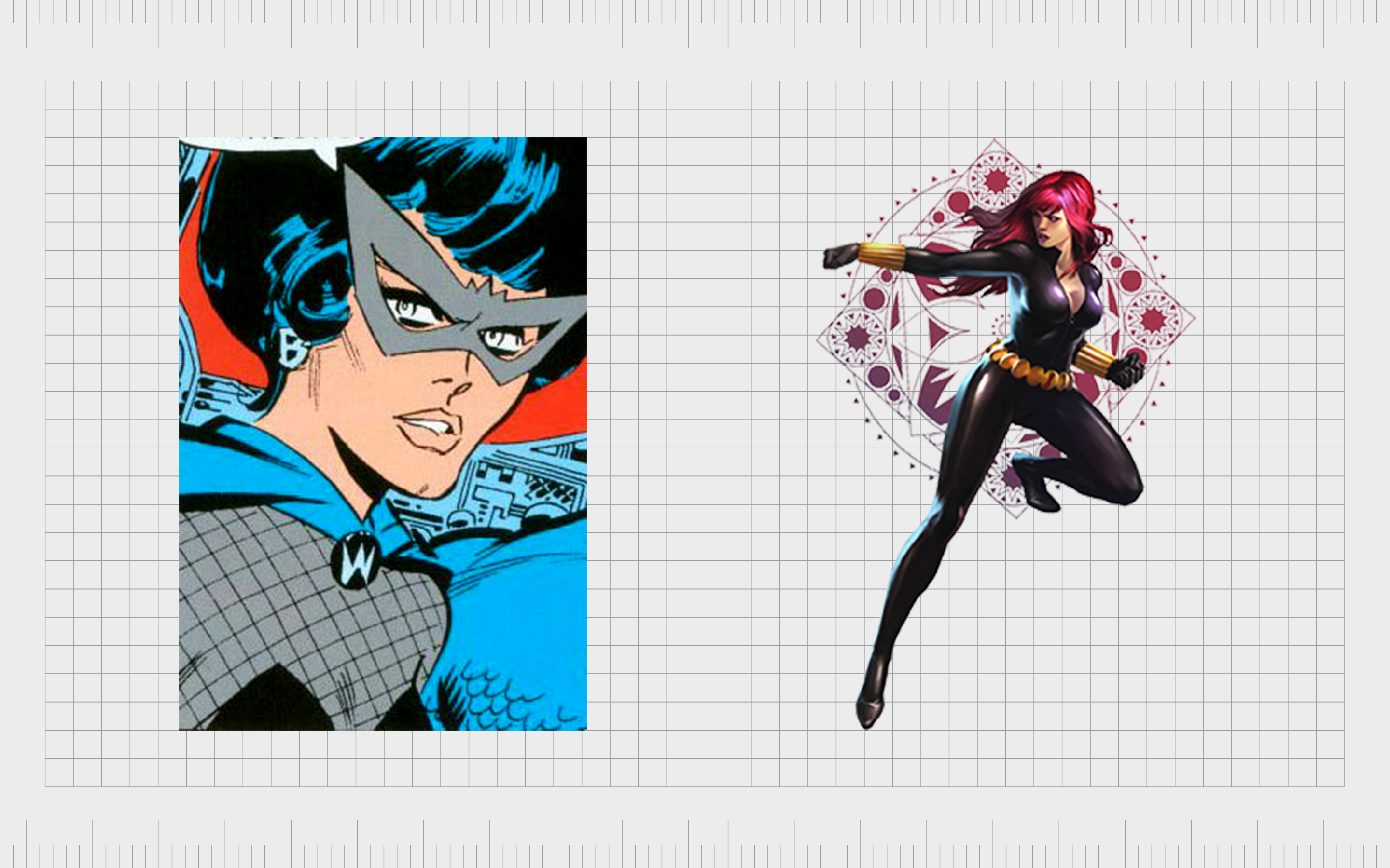
Over the years, Black Widow adopted a new costume style, similar to an all-black catsuit with various tactical capabilities. This suit eventually became adorned with the Black widow logo most people are familiar with today.
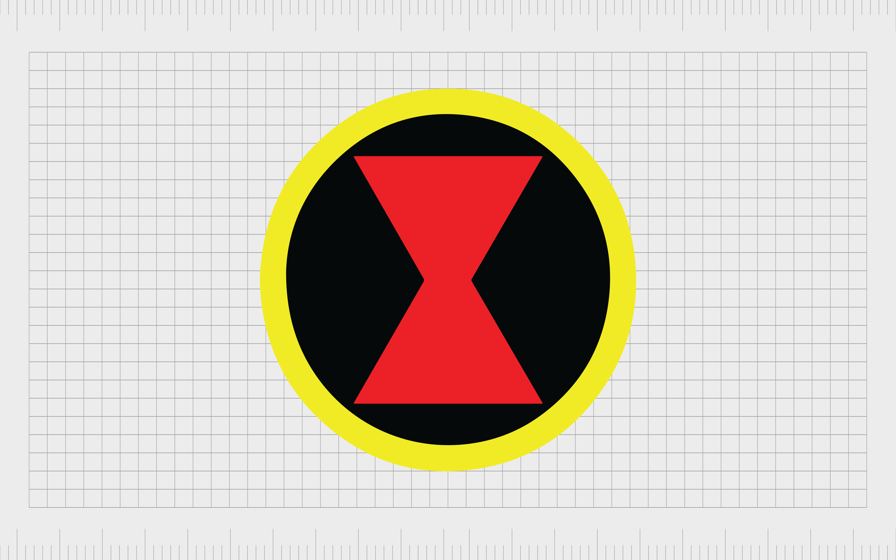
The initial Black Widow logo featured a simple red hourglass design in the center of a black circle. This image would sometimes include a yellow ring around the circle. Over the years, various different styles of this image were introduced.
Many included just the hourglass symbol, or the symbol and a circle outline in black, red, or white.
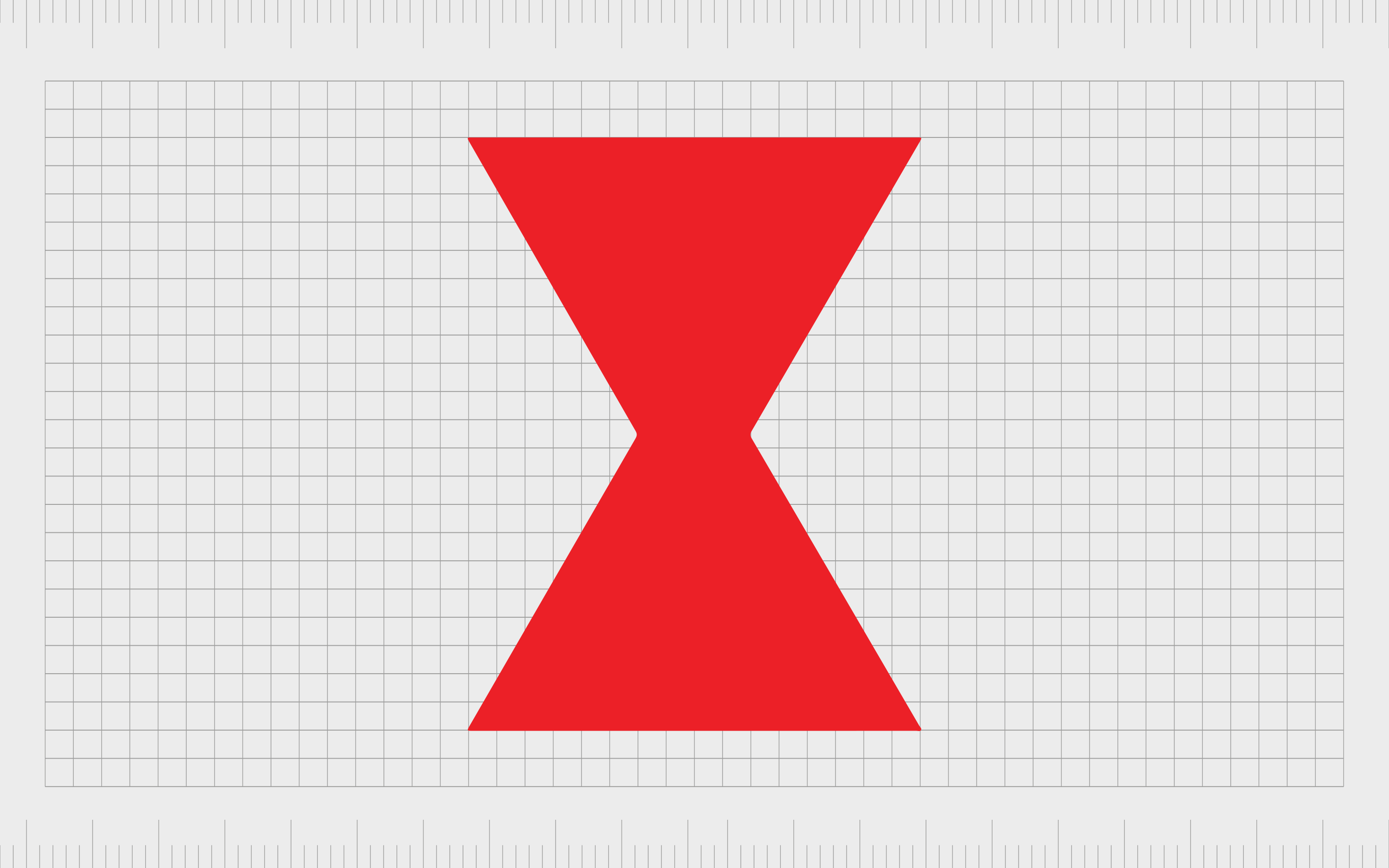
Today, the Black Widow logo generally has no circle or added elements at all. Instead, we just see the red hourglass with it’s pointed edges.
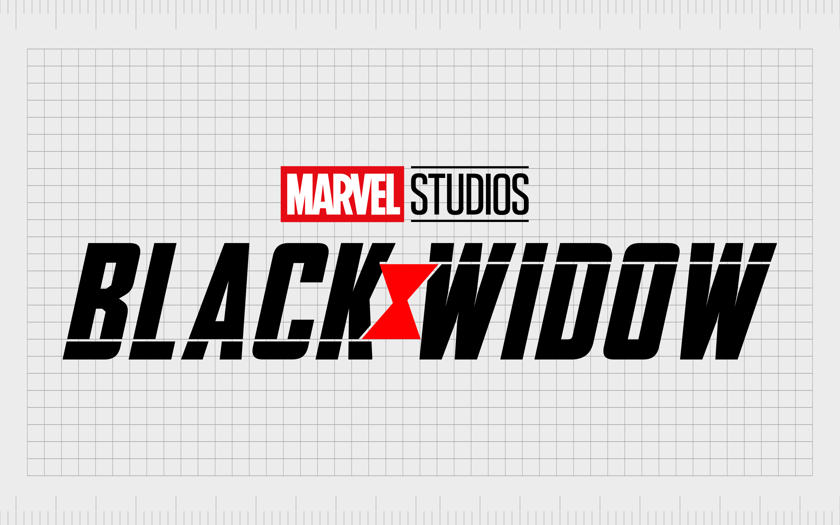
This design appears on the character’s outfit in comic book representations from time-to-time. However, it was also introduced as part of the Black Widow movie title.
Why is the Black Widow logo an hourglass?
If you’re unfamiliar with Black Widow as a character, you’d be forgiven for assuming her logo is a just a stylized version of a red hourglass. The hourglass would potentially make a good symbol for a character associated with assignation, as it could refer to the time limit on a target’s life.
However, the reality is the Black Widow symbol isn’t an hourglass at all. Instead, it’s intended to be a reference to the creature Black Widow is named after. The Latrodectus spider, or the “Black Widow” is a specific genus of spiders best known for their highly venomous bite.
According to a comic published in the Marvel Universe, Black Widow was given this name because she works like a deadly spider. By the time someone realizes they’ve been targeted, it’s already too late.
The Black Widow spider in America has a clearly defined red hourglass on its back, which helps to identify it as a dangerous predator.
Black Widow’s symbol aims to connect her with the dangerous creature which inspired her name.
Black Widow symbol, colors, and fonts
The Black Widow symbol today might seem like a simple image, but it has a great deal of meaning. The image aligns the character with one of the deadliest spiders in the animal kingdom. It’s a reference to her history as an assassin, and how dangerous she can be as a foe.
If you’re interested in getting a closer look at the Black Widow emblem yourself, you can find some useful resources here:
What color is the Black Widow logo?
The Black Widow logo colors have had some variations over the years. Today, the most common version of the Black Widow symbol features a bright red hourglass on a black background. On occasion, this symbol may also be surrounded by a red circle.
The version of the Black Widow logo created for the movie title also has a white wordmark written in all capital letters. This wordmark has streaks of red behind it, and features a distressed texture, making the font look somewhat worn.
What font does the Black Widow logo use?
The official Black Widow symbol has no font associated with it. However, if you’re interested in Black Widow logo fonts, it’s worth taking a look at the wordmark used for the character’s movie. The typography is similar to Agency FB Black Condensed.
This typeface is intended to reference the bold nature of the character, and her connections with the spy industry. The use of all capital letters gives a sense of confidence and strength to the image.
Exploring the Black Widow symbol
The Black Widow logo has emerged as one of the more recognizable images in the Marvel Universe, particularly among fans of the Avengers. While somewhat simple in its design, this symbol has captured the attention of countless comic lovers worldwide.
An excellent example of how a simple shape can convey significant meaning, the Black Widow logo is a testament to how basic creations can sometimes have the biggest impact.
Fabrik: A branding agency for our times.

Clarity starts with a conversation.
Thanks—we’ll get back to you shortly.
Whether you're navigating a rebrand, merger, or simply need a clearer identity—we’re here to help. No hard sell, just honest advice from people who know the sector.
Let’s start with a simple question…
Prefer to email? Drop us a line.
Fabrik’s been helping organisations rethink and reshape their brands for over 25 years. We’ve guided companies through mergers, rebrands and new launches. Whatever stage you’re at, we’ll meet you there.