


From Doom to Skyrim: The Bethesda logo history, meaning and evolution
Are you familiar with the Bethesda logo? Fans of the world’s best-known games, from Skyrim to Doom, will probably have seen this logo on their videogame merchandise. But where did Bethesda logo history begin, and how did the company choose the icon they use today?
Like many famous video game brands, Bethesda has updated and transformed its logo over the years to help it connect with an evolving target audience. The Bethesda symbol has grown simpler and more modern to attract a user base of expanding gamers.
But the brand has taken some time to find its unique visual identity.
If you’ve ever wondered about the meaning behind the Bethesda Softworks logo, or you simply want to learn more about how businesses in the gaming industry choose your emblems, you’re in the right place.
Today, we’re going to be taking a closer look at the history and evolution of the Bethesda emblem, starting from the company’s foundation in 1986.
Bethesda meaning: Why is Bethesda Games called Bethesda?
Bethesda Games, otherwise known as Bethesda Softworks or simply Bethesda, is a leading American video game publisher. The company started life in 1986 and was founded by Christopher Weaver as a division of Media Technology Limited.
The company is named after the location where it was first conceived: Bethesda, Maryland.
Prior to founding Bethesda, Weaver was a communications engineer and technology forecaster in the cable and television industry. Over the years, he developed his interest in the technology landscape and the gaming environment.
Early in his career, he founded the “VideoMagic Laboratories” company with a friend from MIT. Within that company, he was initially working on video games for LaserDisc-based systems until the industry crashed.
According to the Bethesda company, Weaver formed Bethesda Softworks primarily from home to determine whether the PC market was a viable place for game development. The company was initially named “Softwerke”, but this name was already taken by a Virginia-based company.
Although the name “Bethesda Softworks” was intended to last for the brand, it ended up sticking with the company for its entire lifespan. Over the years, Bethesda began creating a range of different games, and in 1994, it published its best-known project at the time: The Elder Scrolls: Arena.
Today, Bethesda is owned by ZeniMax Media, which is, in turn, owned by Microsoft. However, Bethesda continues to operate as a separate entity.
Bethesda logo history: What is the Bethesda logo?
Bethesda logo history began in 1986, at a time when the conceptual company was still experimenting with the viability of the PC gaming market. Initially, the company chose a relatively colorful and eye-catching emblem for its identity before eventually adapting to something more minimalistic.
The first Bethesda Softworks logo was introduced when Bethesda was still a division of Media Technology Limited. The original emblem featured the name of the company in stylized black letters made to look a little like handwriting.
Above this, the letters “B” and “S” were created in a three-dimensional, geometric format. These letters featured a rainbow-style gradient.
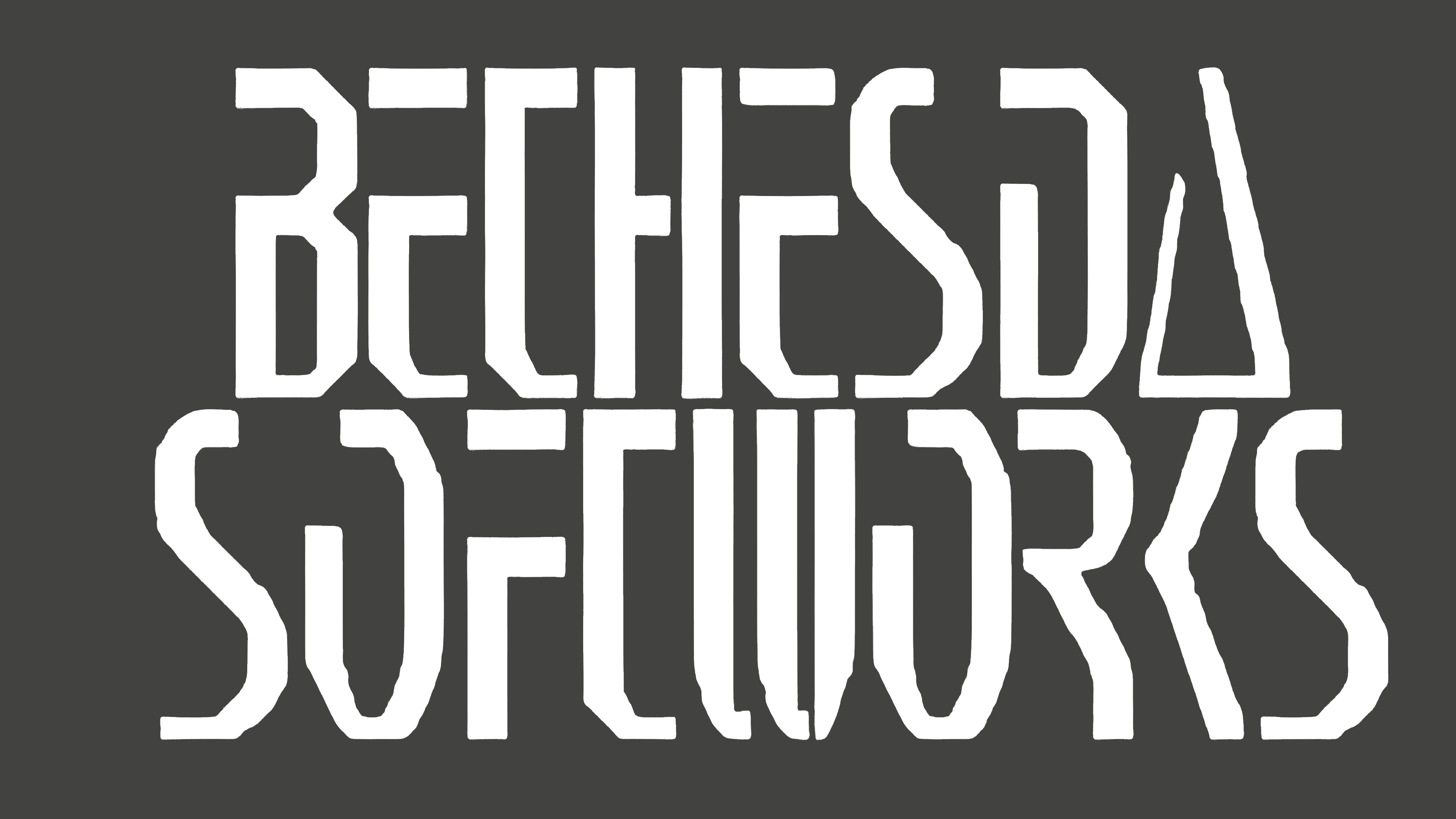
At the same time the initial logo was being tested, the company also introduced a variation, this time in a combination of grey and white. On top of a dark grey rectangle, we see the inscription for “Bethesda Softworks,” written all in uppercase, with highly angular letters.
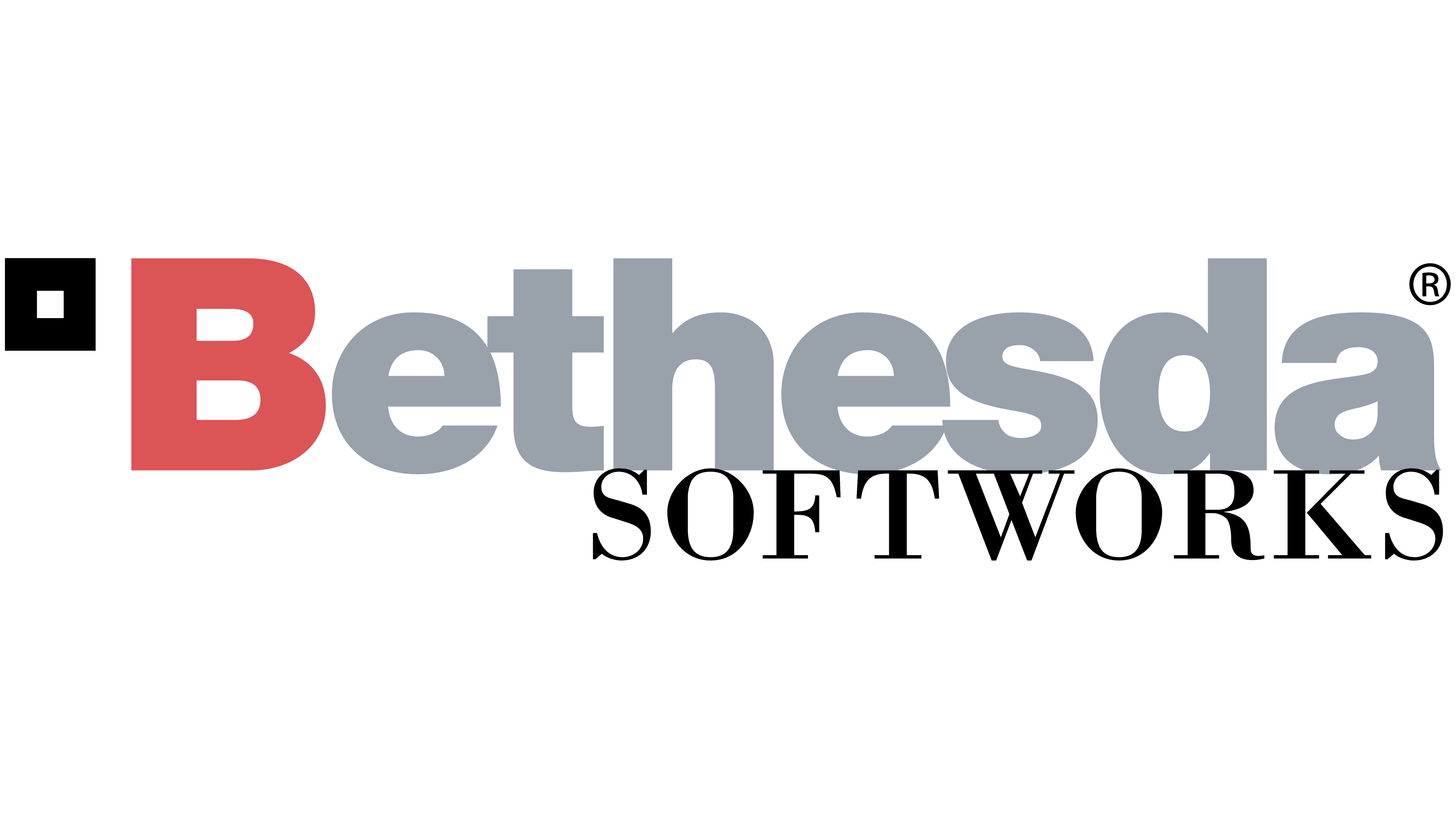
In the early 2000s, Bethesda Softworks was purchased by ZeniMax Media. This prompted the company to create an entirely new logo, in a combination of red, grey, and black shades.
The “B” in the new Bethesda wordmark was highlighted in red, while the rest of the lowercase letters appeared in a soft shade of grey. The font style chosen here was much simpler than those used previously.
In the top left-hand corner of the design, there’s a small, black square, which was also a key symbol used by the ZeniMax media brand at the time.
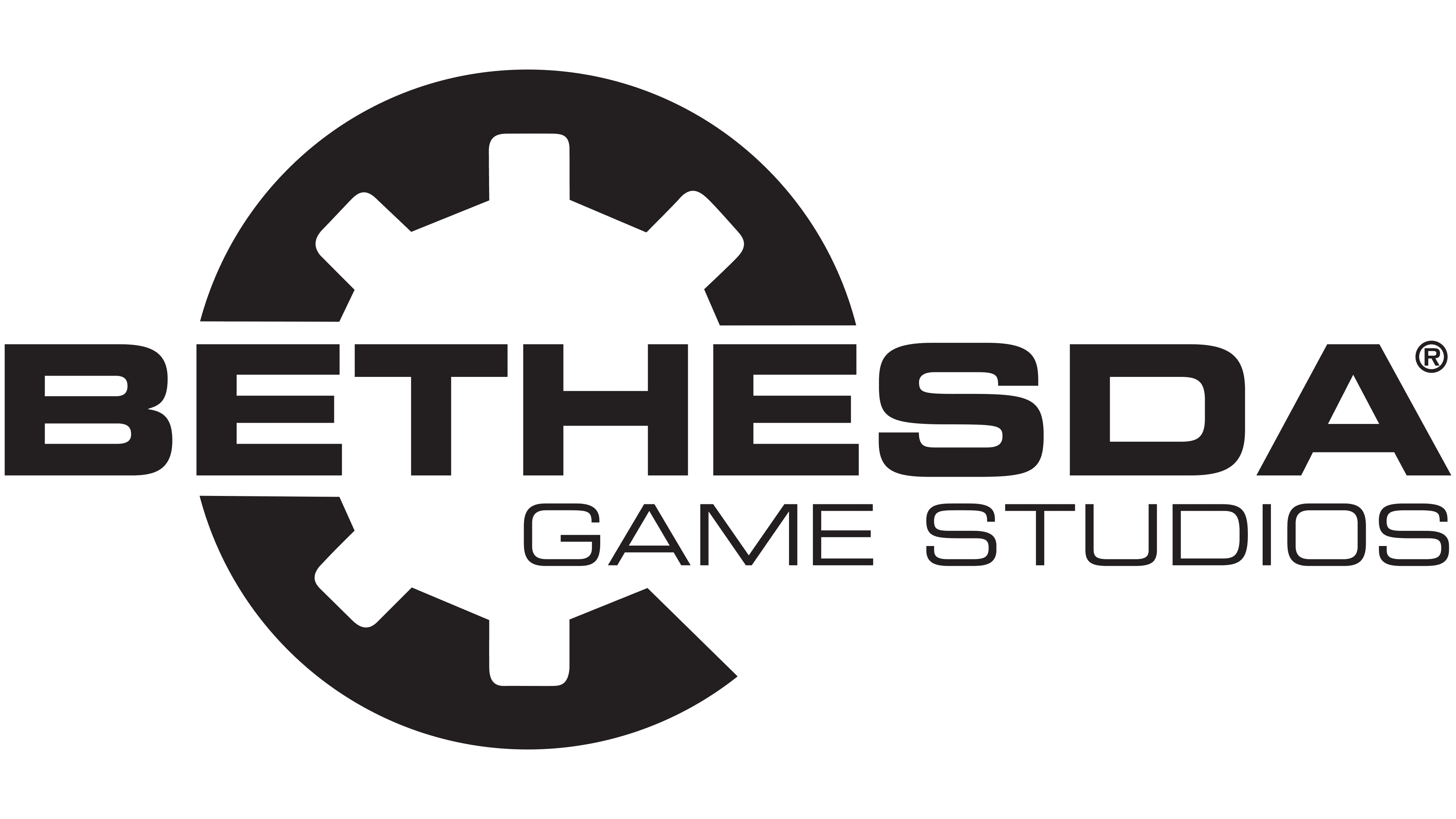
In 2001, Bethesda also introduced an alternative variation of its logo, which removed the reference to ZeniMax media. In this design, a large cogwheel has been placed behind the company’s name, written now in all uppercase, sans-serif font.
Underneath the name, we see the words “Game Studios” in a similar but slimmer typeface.
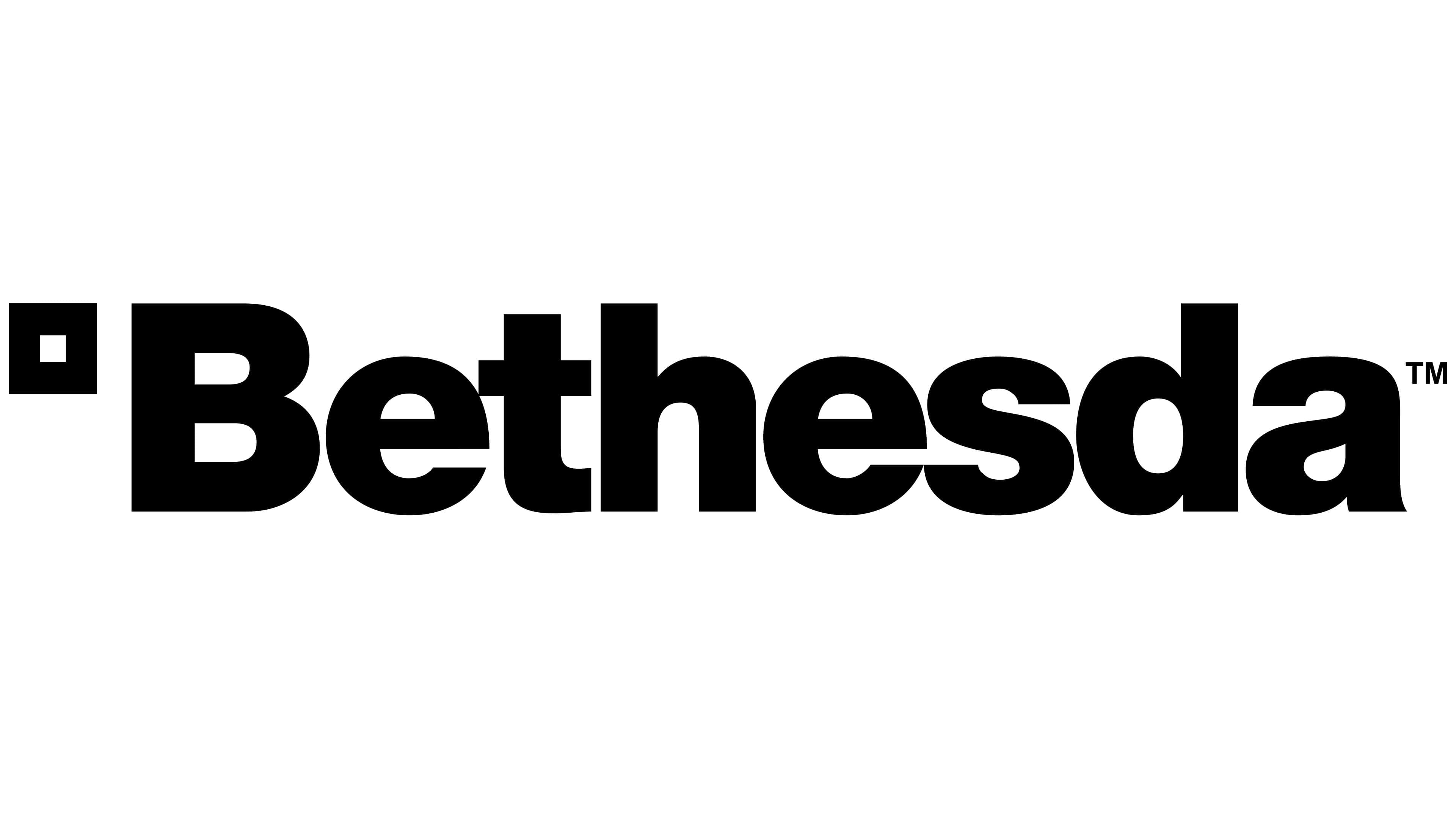
The current Bethesda logo, introduced in 2010, is a variation of the previous design produced in the 2000s. The name “Bethesda” appears in almost the exact same font. However, it’s depicted entirely in black, alongside the iconic square emblem.
Some speculate this version of the logo has been with the brand for quite some time, but it only appeared as the company’s primary symbol in 2010.
The Bethesda Softworks logo: Colors and fonts
Like many of the top video game logos in circulation today, the Bethesda emblem is a relatively simple, straightforward, and eye-catching emblem. Much of the decoration and quirky elements from previous designs have been removed to make way for a more minimalistic design.
The bold font choice for the Bethesda logo helps to convey the brand as strong and confident.
The square component in the Bethesda logo isn’t just a reference to the company’s history with its parent brand. It’s also a symbol of strength and stability.
With this Bethesda Softworks logo, the company wants to tell its audience it’s a reliable, reputable brand.
If you want to look at the design in closer detail, you can find some useful resources here:
What color is the Bethesda logo?
Bethesda has experimented with a few different color palettes over the years. The Bethesda logo colors for the original emblem were perhaps the most eye-catching of all, thanks to the unique rainbow gradient used within the stylized letters.
Today, both the Bethesda Game Studios (developer company) and Bethesda Softworks (the publishing company) work as separate brands. However, they both feature many of the same elements in their logos, including a consistent color palette.
The Bethesda logo color palette today is a simple black-and-white combination. There are no extra shades or tones used, although the company did previously explore the benefits of using grey and red in its emblem.
The colors black and white work together perfectly to portray Bethesda as sophisticated, professional, and reliable.
What font does the Bethesda logo use?
During the early years of the company’s inception, Bethesda explored a range of different font choices, from scratchy handwritten typography to a highly angular design. After being purchased by their new parent company, however, the company switched to a more simplistic, sans-serif type.
The Bethesda Softworks logo font is similar to the Helvetica bold typeface. On the other hand, the Bethesda logo font used for the Game Studio business is slightly different. Although very similar in style, it’s closer to the Square 721 Extended geometric typeface.
In the Game Studios logo, the characters in the wordmark are all uppercase.
Learning from the Bethesda logo
Looking back at the Bethesda logo history, we can see the brand’s identity has undergone a handful of changes over the years. As Bethesda switched parent companies, its identity evolved, focusing more on referencing the brand responsible for its operation.
The square used in the logo today still symbolizes the ZeniMax Media business.
Today, the Bethesda logo is an iconic emblem with exceptional impact. It’s bold and confident, highlighting the core characteristics of the brand. It’s also simple enough to work across various media assets and platforms.
Fabrik: A branding agency for our times.

Clarity starts with a conversation.
Thanks—we’ll get back to you shortly.
Whether you're navigating a rebrand, merger, or simply need a clearer identity—we’re here to help. No hard sell, just honest advice from people who know the sector.
Let’s start with a simple question…
Prefer to email? Drop us a line.
Fabrik’s been helping organisations rethink and reshape their brands for over 25 years. We’ve guided companies through mergers, rebrands and new launches. Whatever stage you’re at, we’ll meet you there.