The Bandai Namco logo history: A timeless representation of gaming culture

If you’re a fan of the gaming landscape, you may already be familiar with the Bandai Namco logo. Looking back through Bandai Namco logo history, we can see only a handful of changes to the company’s iconic emblem.
However, the organization has recently updated its brand identity to celebrate a new era of production and development.
Bandai Namco, otherwise known as Bandai Namco Entertainment, is one of the world’s better-known Japanese video game publishers.
Known for producing a series of multi-million-dollar video gaming franchises, Bandai Namco has been a crucial part of the gaming industry for years, from Pac-Man to Tekken.
Like many famous video gaming logos, the Bandai Namco emblem was designed to capture the attention of a wide audience with a careful combination of fonts and colors. Today, we will take a closer look at how this iconic design has evolved over the years.
What is Bandai Namco’s new name? An introduction
Bandai Namco, launched in 2006, was previously known as “Namco Bandai Games.” However, Bandai Games and the Namco networks were then merged into one environment, and the company updated its name to simply “Bandai Namco Entertainment.”
For the most part, the organization is still referred to primarily as just “Bandai Namco.”
Produced by the merger of both the Bandai and Namco companies, Bandai Namco has quickly become one of the biggest video game organizations in the world.
Responsible for multiple well-known titles, including Dark Souls, Gundam, and Ace Combat, this company has made a long-lasting impact on the entertainment industry over the years.
Pac-man, one of the best-known video game characters of all time, currently serves as the official mascot for Bandai Namco. The company is the third largest video game brand in Japan in terms of revenue, following Nintendo and Sony Interactive Entertainment.
It ranks ahead of other well-known organizations such as Capcom, Konami, and even Sega.
Though Bandai Namco may seem like a relatively new brand compared to other video game entities, its origins date back several decades.
Namco, one of the initial companies which formed the new brand, announced their intent to merge with Bandai in 2005, following their 50-year anniversary. Bandai purchased Namco for approximately $1.7 billion the same year.
What is Bandai Namco’s slogan?
Currently, the slogan for Bandai Namco is “More fun for all into the future.” This slogan and variations of it have appeared on some versions of the Bandai Namco logo in the past, although it’s not always used in the company’s marketing assets.
Bandai Namco logo history: The original logos
As mentioned above, while the official Bandai Namco logo history began in 2006, the company was formed through the merger of two existing organizations, Namco limited and Bandai. The logo created for the new brand didn’t appear to take any inspiration from the previous designs.
However, the overlapping colors in the emblem seem to represent the collaborative merger.
The Namco logo
Namco Limited was a Japanese entertainment and video game company launched in 1955.
The brand was best known for producing a range of different titles for the arcade landscape, including Pac-Man. Namco’s final logo before merging with Bandai was a simple wordmark depicted in blocky, geometric letters. The lowercase logo was designed in a deep red color.
The Bandai logo
Bandai was another manufacturer and distributor of both toys and video games in Japan, launched in 1950. It was one of the better-known companies in Japan before it merged with Namco.
The company’s logo, before the merger, was an interesting red square design, where the name was split into two sections across two levels.
The wordmark was depicted in a white, sans-serif font, with a similar geometric appeal to the Namco emblem. The “A’s” were particularly interesting, with a central line that dropped to the bottom of the character to make a triangle shape.
The Bandai Namco logos
The original Bandai Namco logo was designed for the name “Bandai Namco Games” in 2006.
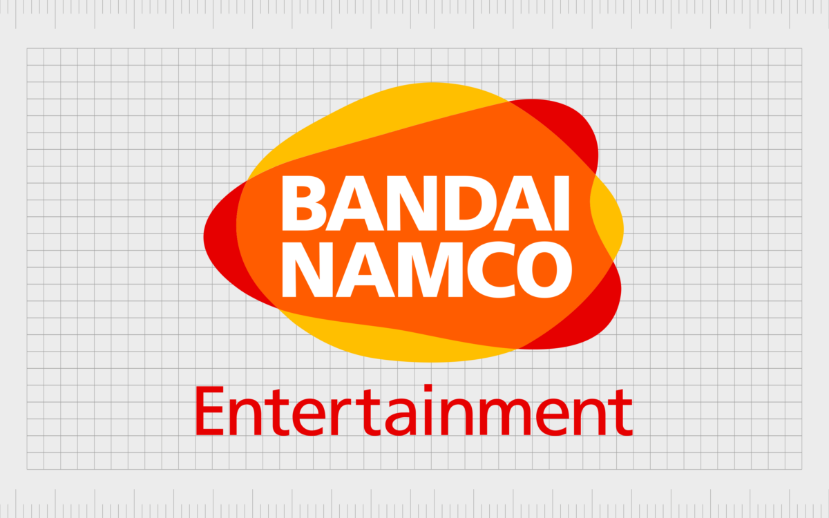
The emblem featured an abstract shape in the background, made up of numerous overlapping blobs of color in orange, red, and yellow. The colors were chosen to showcase the company’s creativity, passion, and commitment to delivering fun, joyful experiences.
On top of the colorful design, we see the Bandai Namco wordmark, written in a simple, sans-serif font with bold contours and lines. The letters are all in uppercase, with no decorative elements, and they’re depicted in white.
Underneath the core design, the word “Games” is written in red, in a slightly thinner sans-serif font.
When Bandai Namco updated its official name to Bandai Namco Entertainment in 2015, the company made a very slight change to its logo design. The word “Games” was replaced with “Entertainment” in the same color and font style. The core emblem remained exactly the same.
The Bandai Namco new logo
For the majority of its life, the Bandai Namco brand didn’t make any significant changes to its logo at all. The only real change between 2006 and 2022 was the decision to switch the word “Games” to “Entertainment.”
However, at the end of 2021, Bandai Namco Holdings announced they would be truly updating their logo for the first time.
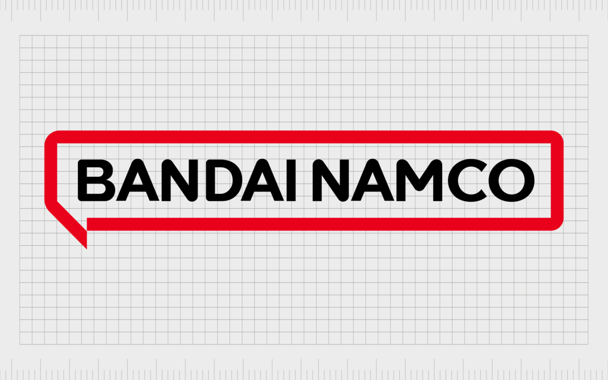
The new design, depicted in a simplified color palette of white, red, and black, showcases the name of the company on a single level inside of a rectangular speech bubble. The speech bubble border was originally conceived in pink, then updated to red.
This simplified logo aims to represent the new direction and focus of the company and helps the brand to compete with other, more simplified designs in the gaming landscape.
Why did Bandai Namco change logo designs?
When Bandai Namco announced its new logo design, the leaders of the company explained the previous emblem represented the fusion of the Bandai and Namco brands. For over 16 years, the company stuck with virtually the exact same logo, with its abstract design.
The new logo moves beyond the focus on this merger to highlight Bandai Namco’s standing as a singular company. The blobs of color have been replaced with a simple wordmark with a speech bubble border to represent collaboration and communication.
Though not everyone has responded well to the update in logo design, the new emblem is a lot clearer, easier to scan, and more refined than the previous iteration. It helps to highlight Bandai Namco as a modern and future-focused brand.
The Bandai Namco logo: Colors and fonts
The current Bandai Namco logo is quite a significant change from the organization’s previous design. For some die-hard fans of the company, the decision to simplify the emblem has caused controversy.
However, the new logo serves an important purpose. It helps to define Bandai Namco as a single, unified company and moves away from the focus on the merger between the two previous brands.
Simple and versatile, the new Bandai Namco logo adheres to the growing trend of logo simplification in the gaming and entertainment landscapes. The careful choice of fonts and colors still highlights the core identity and characteristics of the business in a way that captures the audience’s attention.
If you want to take a closer look at the Bandai Namco logo, you can find some fantastic resources here:
What color is the Bandai Namco logo?
In the past, the Bandai Namco logo colors were a lot more vivid than the ones used today. The company used a “sunset” color palette featuring a range of oranges, yellows, reds, and whites.
Now, the Bandai Namco logo color has been simplified to feature just a black wordmark on a white background, with a red speech bubble border.
The simplified logo demonstrates sophistication, professionalism, and passion. The color red also connects the company to the previous two brands, which merged to form the Bandai Namco company. Both of these organizations used red as their core color.
What font does the Bandai Namco logo use?
Throughout the years, Bandai Namco has kept things relatively simple with its logo choice. Since its inception, the company has used a relatively simple sans-serif typeface with bold lines and contours. The typeface in use today is similar to the previous Bandai Namco logo font.
The official font name for the company is simply called “Namco.”
The evolving Bandai Namco logo
Looking back at the Bandai Namco logo history, we can see the company has avoided making many changes to its visual identity over the years. For a long time, the organization stuck with the same consistent emblem to demonstrate its commitment to joy and fun.
The most recent Bandai Namco logo is more professional, refined, and sophisticated. It’s still relatively bright and colorful, though not as vivid as the previous design. The logo refresh helps to position Bandai Namco as an evolving business in the gaming industry.
Fabrik: A branding agency for our times.
Clarity starts with a conversation.
Thanks—we’ll get back to you shortly.
Whether you're navigating a rebrand, merger, or simply need a clearer identity—we’re here to help. No hard sell, just honest advice from people who know the sector.
Let’s start with a simple question…
Prefer to email? Drop us a line.
Fabrik’s been helping organisations rethink and reshape their brands for over 25 years. We’ve guided companies through mergers, rebrands and new launches. Whatever stage you’re at, we’ll meet you there.


