


Arsenal logo history: A look at the Arsenal crest and its meaning
If you’re familiar with the Premier League and British football, you’re probably aware of the iconic Arsenal logo. Throughout the years, the Arsenal crest has evolved to become increasingly modern, aligning with the changing visual identity of the football landscape.
The Arsenal FC logo highlights the strength and endurance of the football team and the group’s long-standing history and heritage. After all, the very first Arsenal football club (introduced as Dial Square) was founded more than 130 years ago, in 1886.
For many Premier League fans, the Arsenal football club, also known as the “Gunners,” are some of the better-known and most reputable players in the field. So, where did the iconic Arsenal badge come from? How has it changed over the years, and most importantly, what does it mean?
Here’s everything you need to know about Arsenal logo history.
An introduction to the Arsenal FC logo
Arsenal Football Club is a professional football team based in London, in Islington. The group plays within the Premier League and has won 13 league titles over the years.
It has also earned a record 14 FA cups, as well as 16 FA Community shields, two league cups, one inter-cities fairs cup, and 1 European winner’s cup. Currently, it’s considered the third most successful club in English football.
First founded in 1886, Arsenal was the very first club from the Southern region of England to join the Football League in 1893. The team rapidly made a name for itself, reaching the first division in 1904.
Since then, the club has only been relegated once, which means it also has the longest successful streak in the top division of the Premier League.
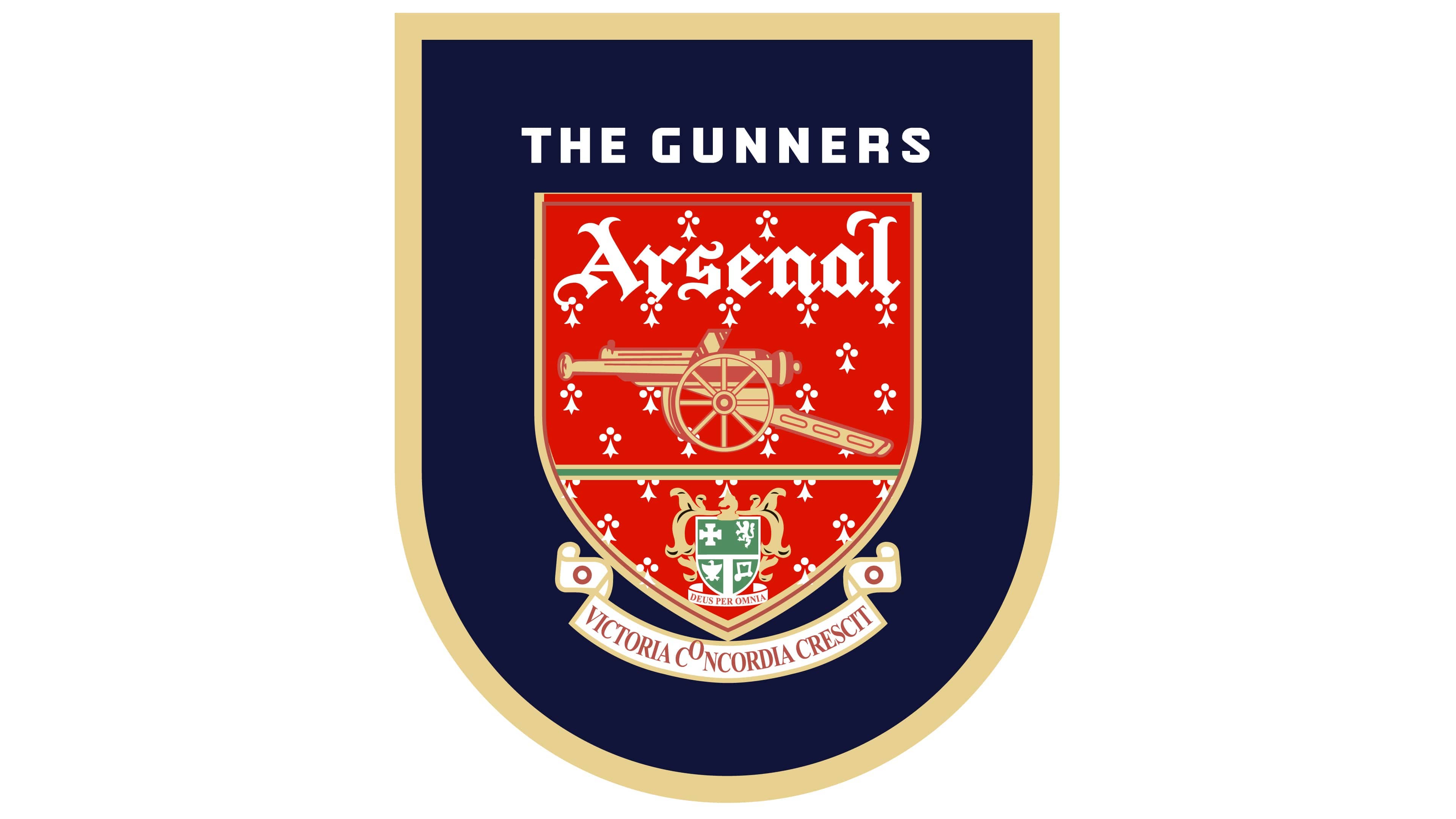
Winning the second-highest number of top-flight matches in football history within the UK, Arsenal has captured the attention of a huge number of fans worldwide. The team is referred to commonly as the “gunners” as a reference to the iconic cannon in their crest.
Arsenal logo history: When did the Arsenal crest change?
The Arsenal logo history dates all the way back to the late 1800s when the group changed its name from “Dial Square” to Arsenal FC for the first time. Throughout the years, the group has based its visual identity primarily on the crest of a local Borough (Woolwich).
Today, it continues to pay tribute to its roots while adapting to a changing visual landscape.
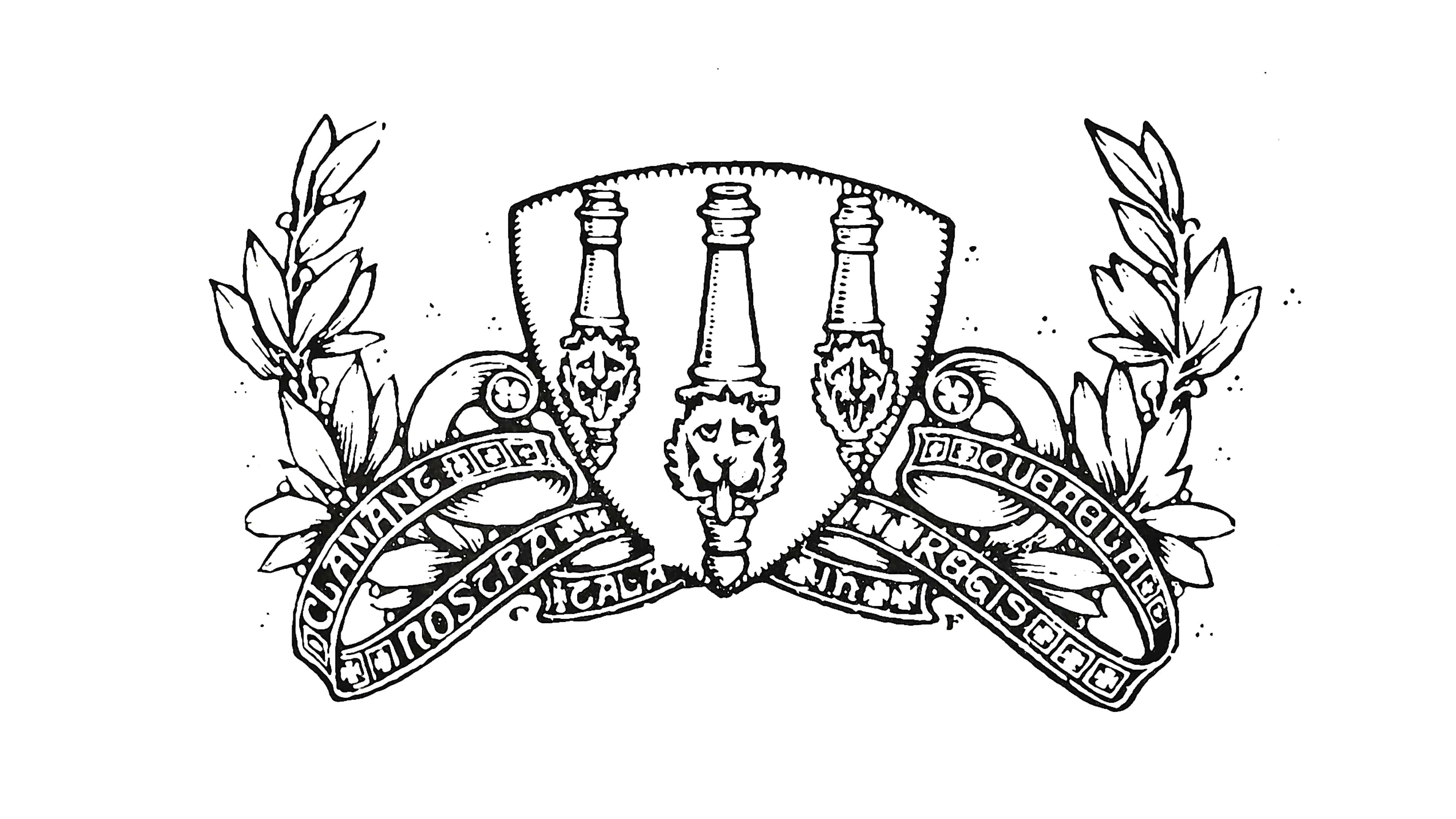
One of the first well-known Arsenal football club logos draws significantly from the Woolwich Borough crest, with laurel leaves, three cannons featuring lion heads, and numerous ribbons. The design aims to highlight the group’s history and heritage with a highly traditional image.
1922
The redesign introduced in 1922 for the Arsenal FC team created a much simpler logo, focusing heavily on the imagery of the cannon. This was the first logo to introduce the nickname “The Gunners” into the group’s visual identity.
The cannon imagery was presented in a simple oval emblem facing to the east.
Shortly after, in 1925, Arsenal updated its logo again, making the cannon even simpler. The inscription for the group’s nickname was placed on the right, and the design itself was made darker and more refined.
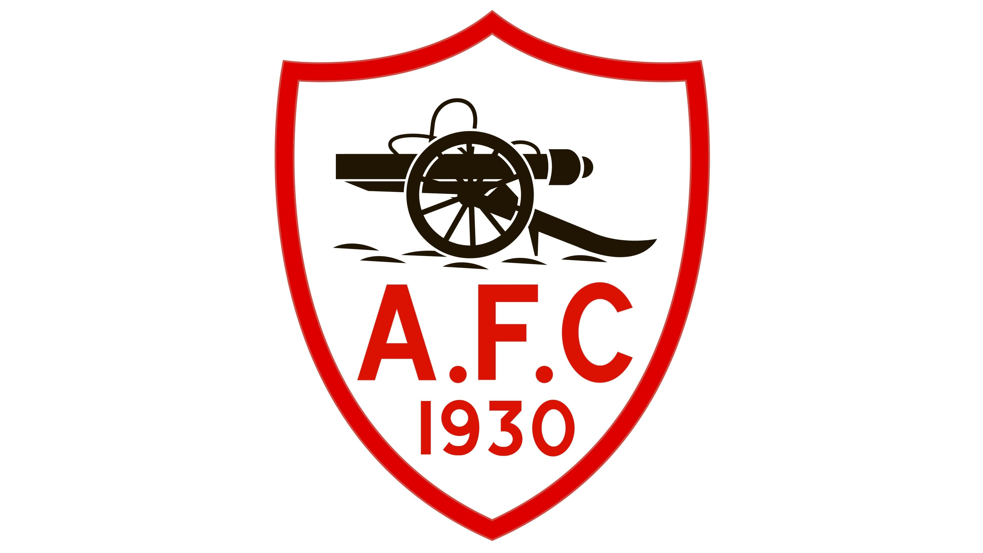
In the 1930s, Arsenal brought a new colour into its logo with a distinctive shield outline. The bright red colouring was also depicted in the date on the emblem and within the letters “AFC.” The letters were depicted in a simple sans-serif typeface.
Later in the 1930s, Arsenal introduced an art deco version of its logo, which stayed with the group for approximately 13 years. The emblem featured a hexagonal frame with the letters “A” and “C” within it. There was also a red football placed in the middle.
The bright emblem completely eliminated the use of canon imagery for the first time.
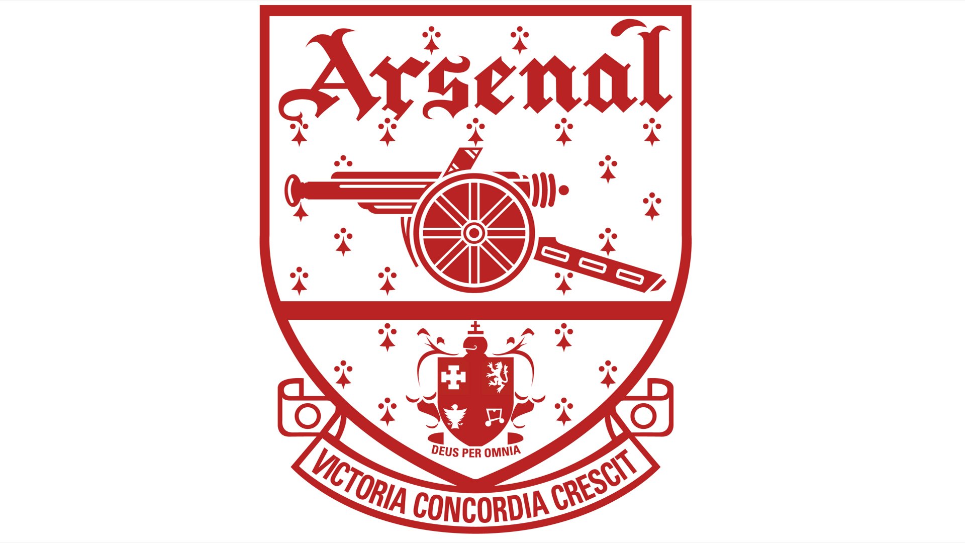
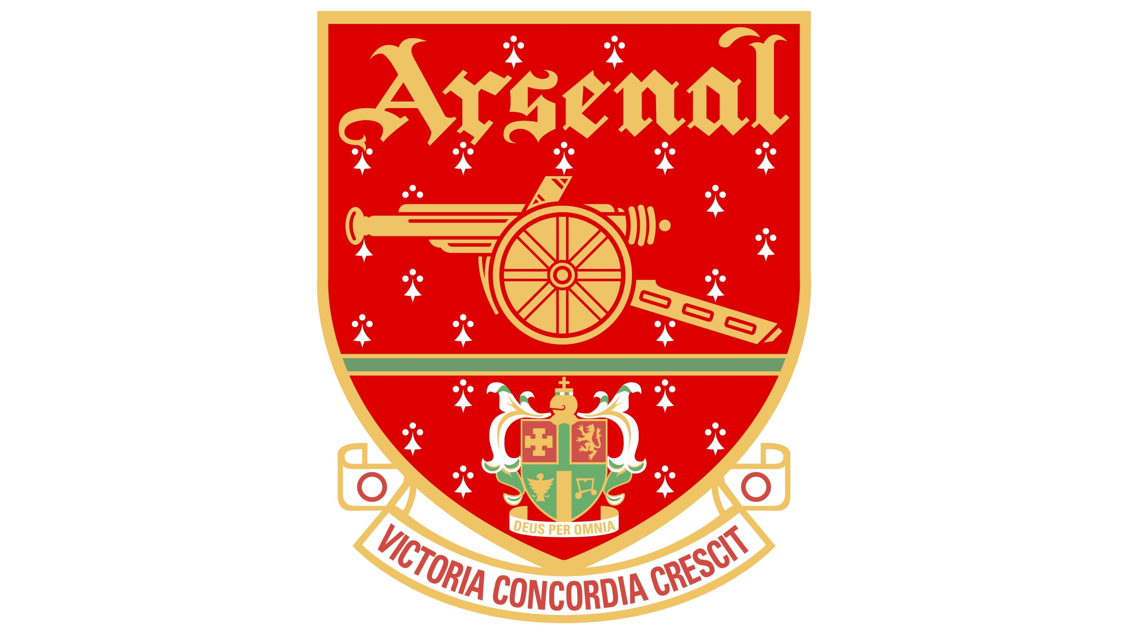
In the late 1940s, Arsenal returned to its roots somewhat, re-introducing the cannon emblem with a white and red shield emblem. The Arsenal wordmark was also introduced in a gothic-style font. Underneath the shield, we see the Latin motto of the team.
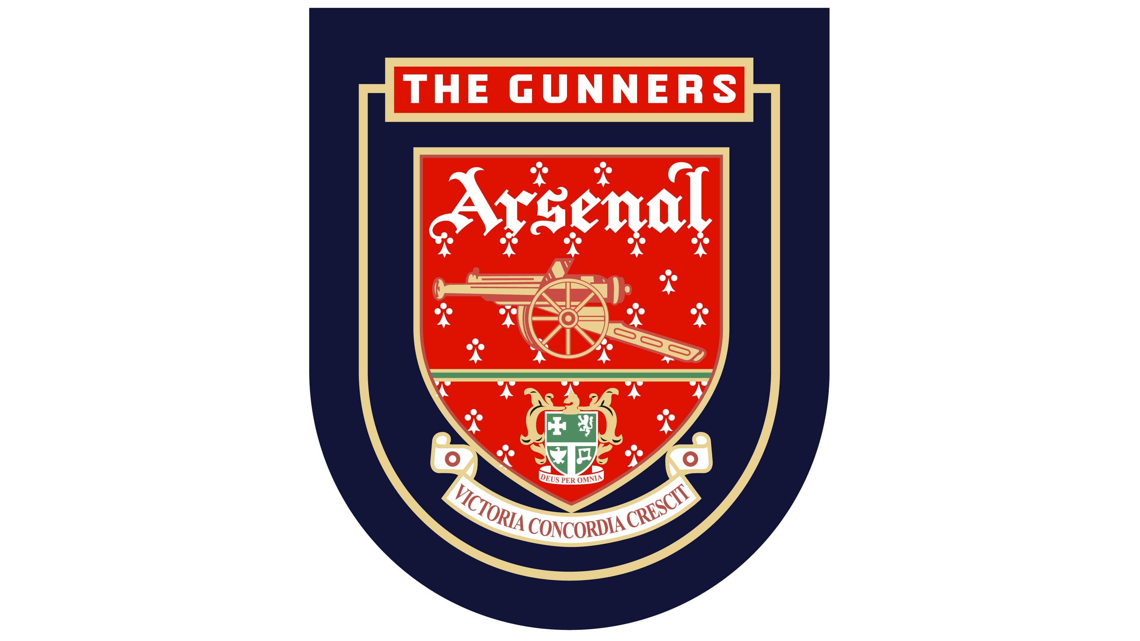
In 1994, the Arsenal logo was updated again, this time with various additional colours, including gold and a dark black or blue shade. The nickname “The Gunners” was once again introduced, placed just above the shield-style emblem in a red nameplate.
A couple of years later, in 1996, the group refined this logo slightly, removing some of the additional elements and refining some of the contours. The Borough of Islington’s coat of arms at the bottom of the shield was made slightly brighter and more distinguished.
For a brief time between 2001 and 2002, Arsenal redesigned its logo again, colouring the letters and lines of the logo in gold and removing a lot of the darker shades. The Latin inscription was also placed on a ribbon underneath the shield, making the whole image appear more traditional.
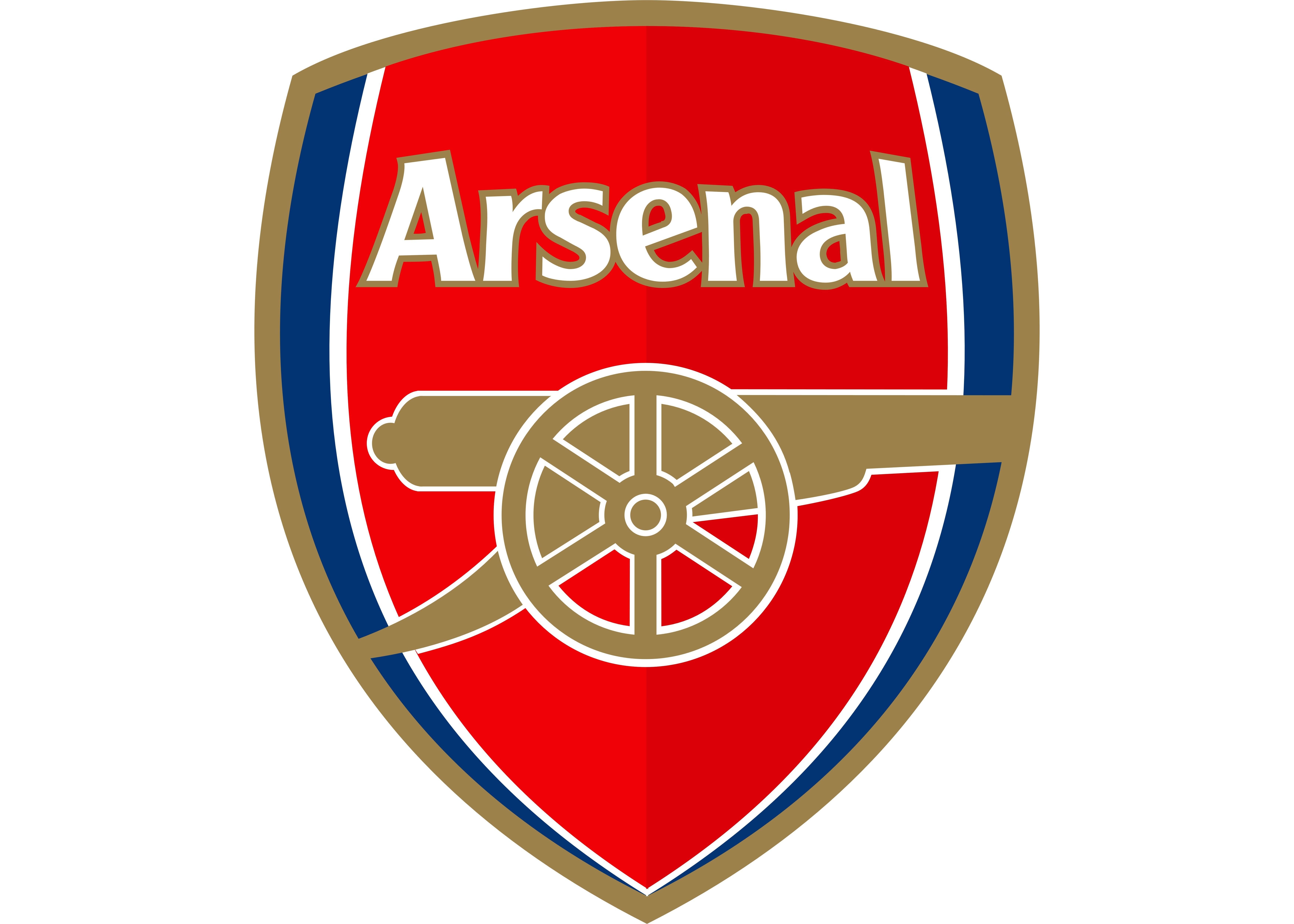
In 2002, Arsenal introduced the most recent version of its logo and the emblem most people are familiar with today. The style of the logo was significantly updated to attract a more modern audience.
The colours blue and white were introduced to the shield, and a simplistic cannon image was created in a deep shade of gold.
The Arsenal lettering lost its gothic styling in this new emblem, taking on a simpler, more modern typeface. The new emblem features none of the previous crests or ribbons, making it more minimalist and contemporary. This image has stayed with the brand for a number of years.
Why does Arsenal have a cannon in its logo?
While there are many iconic elements included in the Arsenal FC logo, few are more eye-catching than the company’s compelling cannon imagery. The cannon comes from the initial logo created for the team, which was based on the Woolwich Borough coat of arms.
The Woolwich crest was designed in 1901, coinciding with the town becoming a Metropolitan borough.
With their crest, Arsenal wanted to draw attention to their military heritage. Although the official ties the club had with the area have diminished over time, the “Gunners” have consistently used a cannon design in most of their logo variations.
For a short time, when Arsenal moved North to Highbury, many fans weren’t sure whether the team would keep the recognizable cannon motif. However, Arsenal’s commitment to its heritage has remained a large part of what sets the group apart from its competitors.
What does the Arsenal logo mean? Colours and fonts
The Arsenal FC logo is a symbol of national pride and heritage. The colours used in the design are intended to capture the hearts and minds of the team’s fans, with psychological connections to concepts like passion, strength, and luxury.
While Arsenal, like many football teams, has made a handful of changes to its design over the years, many core elements remain consistent.
Today, the group has updated its logo to embrace a more contemporary and modern image.
However, the history of the group continues to shine through in its shield and cannon components.
If you’d like to take a closer look at the core elements of the Arsenal FC logo, you can find some useful resources here:
What colour is the Arsenal logo?
For a time, like many football teams, Arsenal maintained a relatively simplistic logo, depicted in the colours of white and black. However, over the years, the group has updated its logo with new colours.
The primary Arsenal logo colours are white and red, but the shades of gold and blue are also evident in the official Arsenal crest.
Here are some of the Arsenal logo colour codes you may need to know:
RED
PANTONE: PMS 2347 C
HEX COLOR: #EF0107
RGB: (239, 1, 7)
HSL: (356, 90, 49)
CMYK: (0, 100, 97, 6)
DARK RED
PANTONE: PMS 2035 C
HEX COLOR: #DB0007
RGB: (219, 0, 7)
HSL: (355, 92, 44)
CMYK: (0, 97, 100, 14)
BLUE
PANTONE: PMS 294 C
HEX COLOR: #063672
RGB: (6, 54, 114)
HSL: (213, 90, 24)
CMYK: (95, 53, 0, 55)
GOLD
PANTONE: PMS 4505 C
HEX COLOR: #9C824A
RGB: (156, 130, 74)
HSL: (40, 33, 46)
CMYK: (0, 17, 53, 39)
What font does the Arsenal logo use?
The official Arsenal logo font is unique to the brand. The typeface looks similar in some ways to the Clearface Gothic font. However, the glyphs have been customized slightly to fit the exact shape of the logo shield.
The simple but effective font choice is far more legible and modern than the traditional Gothic typeface.
Celebrating the powerful Arsenal logo
Today, the Arsenal logo is one of the most recognizable images in the Premier League. The compelling visual identity draws attention to the group’s historical background and highlights their commitment to their heritage.
Additionally, it conveys ideas of strength and protection through cannon and shield shapes.
Rich and colourful, the Arsenal crest has captured the attention of countless fans from across the globe. Today, the simplistic but compelling logo fits well with the contemporary styles of many football team logos throughout the UK.
Fabrik: A branding agency for our times.

Clarity starts with a conversation.
Thanks—we’ll get back to you shortly.
Whether you're navigating a rebrand, merger, or simply need a clearer identity—we’re here to help. No hard sell, just honest advice from people who know the sector.
Let’s start with a simple question…
Prefer to email? Drop us a line.
Fabrik’s been helping organisations rethink and reshape their brands for over 25 years. We’ve guided companies through mergers, rebrands and new launches. Whatever stage you’re at, we’ll meet you there.