


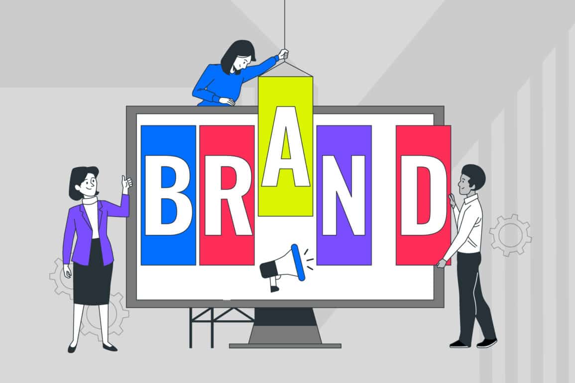


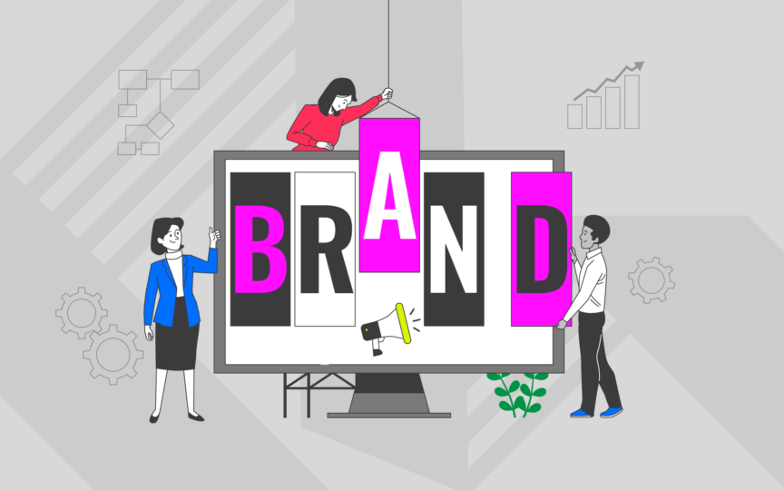
Communicating scientific complexity through brand design
In the fast-evolving world of biotechnology, revolutionary scientific advances are happening daily. Yet for many biotech companies, explaining what they do—and why it matters—remains their greatest challenge.
How do you translate the intricacies of a proprietary platform technology or a novel therapeutic approach into something that resonates with investors, partners, patients and the public?
At Fabrik, we’ve discovered that this translation isn’t merely about simplification—it’s about transformation. Strategic brand design serves as the crucial bridge between complex scientific innovation and meaningful human connection.
When executed thoughtfully, biotech brand design doesn’t dilute scientific rigour—it amplifies it by making science accessible to those who matter most to your business growth.
Why scientific complexity is a branding challenge
The heart of the challenge lies in a fundamental tension: the precision that makes good science doesn’t always make for good communication. Scientists are trained to be meticulous, comprehensive and cautious in their claims.
These are admirable qualities in the lab but can become obstacles when communicating with non-specialist audiences.
Traditional scientific communications—dense with data, methodology and specialist terminology—create significant barriers to understanding.
When addressing investors who may lack deep scientific knowledge but possess financial acumen, or patients seeking hope rather than molecular mechanisms, these barriers can prove costly.
The consequences?
Potential investments lost. Partnerships unrealised. Public interest untapped.
This disconnect between scientific achievement and its wider recognition represents not just a challenge in science communication in branding but a strategic business problem.
The role of brand design in science communication
What brand design can (and can’t) do
Let’s be clear: brand design isn’t magic. It can’t make complex science simple—nor should it try to.
What thoughtful biotech brand design can do is create frameworks that highlight key concepts, establish meaningful connections between ideas, and guide different audiences through varying levels of complexity based on their needs.
What brand design can’t—and shouldn’t—do is oversimplify to the point of inaccuracy. The goal isn’t to dumb down your science but to illuminate its significance through strategic visual and verbal frameworks that respect both scientific integrity and audience needs.
How design creates clarity
Design elements work as sophisticated tools for clarity when applied strategically. Typography hierarchies guide readers through levels of information. Consistent iconography creates visual shorthand for complex concepts.
Colour systems differentiate between product platforms or therapeutic areas. Infographics transform data-heavy content into intuitive visualisations—all essential aspects of scientific visual communication.
At Fabrik, we’ve seen how these elements, when unified by strategic intent, don’t merely decorate scientific content—they fundamentally reshape how it’s understood.
In our work with biotech companies, we’ve consistently found that design clarity directly correlates with audience engagement and message retention.

Principles for designing biotech brands that communicate complexity clearly: A biotech branding strategy
Principle 1 – Lead with conceptual clarity
Start with your audience in mind
Every effective biotech brand begins with audience understanding. What’s the baseline knowledge of your investors? What motivates potential partners? What concerns your patients? These insights should shape every design decision.
For instance, when we developed the MinervaX brand identity, we began by mapping distinct audience journeys—from scientific peers to potential investors—ensuring the visual system could adapt to different knowledge levels while maintaining core scientific integrity.
Clarify what’s truly distinctive in your science or platform
Your scientific breakthrough might involve dozens of innovations, but your brand needs a clear focal point.
What single aspect of your approach represents your most meaningful difference? Is it your unique mechanism of action? Your novel delivery system? Your proprietary screening methodology?
This conceptual clarity becomes the foundation for visual expression. Without it, even the most beautiful design system will fail to communicate effectively.

Principle 2 – Use visual metaphors thoughtfully: Visual storytelling in action
Translating science visually: From abstract concepts to accessible symbols
Visual metaphors serve as powerful cognitive shortcuts, transforming abstract scientific concepts into tangible mental models.
The double helix, the lock-and-key enzyme model, the immune system as an army—these metaphors have fundamentally shaped how we understand biological systems.
For biotech brands, developing proprietary visual metaphors for your unique science can dramatically accelerate understanding. However, these metaphors must be chosen with scientific accuracy in mind, not merely aesthetic appeal.
Avoiding clichés and overused imagery
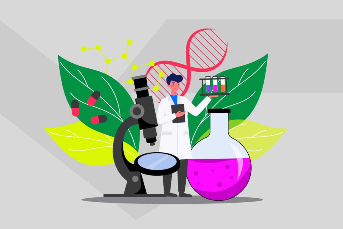
The biotech visual landscape is littered with generic imagery: anonymous lab technicians, ubiquitous DNA strands, and glowing blue microscopy. These visual clichés not only fail to differentiate—they actively undermine the perception of true innovation.
At Fabrik, we challenge biotech clients to develop distinctive visual territory that accurately represents their specific scientific approach.
This might mean focusing on a unique aspect of their technology, an innovative application, or even the particular patient experience their therapy enables.

Principle 3 – Create a cohesive visual language
Harmonising brand assets across touchpoints
Scientific complexity demands visual consistency. When audiences encounter your brand across multiple touchpoints—from your website to conference posters to investor decks—a unified visual system reinforces comprehension rather than requiring repeated learning.
This consistency extends beyond logo application to encompass the entire communication ecosystem: the way data is visualised, how product pipelines are represented, how scientific processes are illustrated.
Like a well-designed experimental protocol, a cohesive brand system allows for reproducible understanding.
How structure, layout and typography support comprehension
The invisible architecture of layout and typographic systems plays a crucial role in making complex information digestible.
Consistent grid structures create predictable information patterns. Typographic hierarchies establish clear relationships between concepts. White space provides cognitive breathing room for processing complex ideas.
In our work for Cochrane, we developed a structured visual system that helped transform dense medical evidence into accessible information resources, demonstrating how thoughtful design architecture can serve both scientific rigour and audience accessibility.

Principle 4 – Balance precision with personality
Designing for both scientific rigour and emotional connection
The most effective biotech brands maintain scientific precision while fostering emotional connection. This balance isn’t contradictory—it’s complementary. Technical accuracy builds credibility, while emotional resonance creates memorability and engagement.
This dual approach is particularly vital when communicating with mixed audiences. Investors need to trust your science but also connect with your vision. Patients need to understand your approach but also feel hopeful about its impact on their lives.
Why tone, palette and image choice matter
Visual tone profoundly influences how scientific information is perceived. A considered palette can differentiate between product lines while maintaining family coherence.
Photography choices can humanise highly technical concepts. Illustration styles can express both scientific accuracy and brand personality.
For Lumeon, we developed a distinctive visual personality that balanced technical sophistication with healthcare warmth, demonstrating how deliberate design choices can express complex positioning with remarkable clarity.

Principle 5 – Make information hierarchy work for you
Highlighting what matters most for different audiences
Not all information holds equal importance for every audience. Effective biotech brand design acknowledges these differences through strategic information hierarchies that prioritise what each audience values most.
For scientific peers, methodological details might take precedence. For investors, market potential and differentiation might be emphasised. For patients, safety profiles and quality-of-life improvements might come first.
These priorities should be reflected in how information is structured and presented.
Guiding attention through structure and design cues
Visual hierarchy serves as a sophisticated navigation system for complex information. Size relationships, colour emphasis, positioning and contrast all direct attention to what matters most in a given context.
When developing scientific slides, website architecture or product literature, these hierarchical systems should be deliberately mapped to audience priorities rather than defaulting to standardised templates or chronological presentation.

Real-world inspiration: How leading biotech brands simplify the complex
The biotech landscape offers several instructive examples of brands that effectively balance scientific credibility with clear communication.
MinervaX, a clinical-stage biotech company developing a vaccine against Group B Streptococcus (GBS), faced the challenge of explaining both their novel vaccine technology and the significant health impact of GBS infections.
Through our collaboration with them at Fabrik, we developed a biotech visual identity system that utilised a distinctive circular motif representing both their vaccine’s mechanism and the protective shield it creates for vulnerable populations.
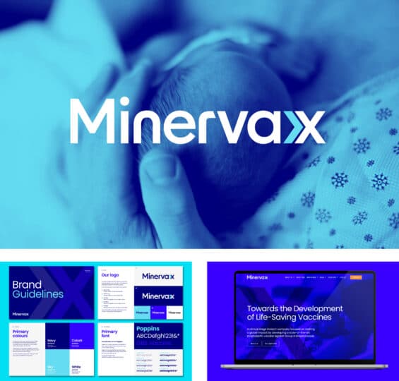
The system included modular graphic elements that could be reconfigured for different communication contexts—from highly technical scientific posters to more accessible patient information.
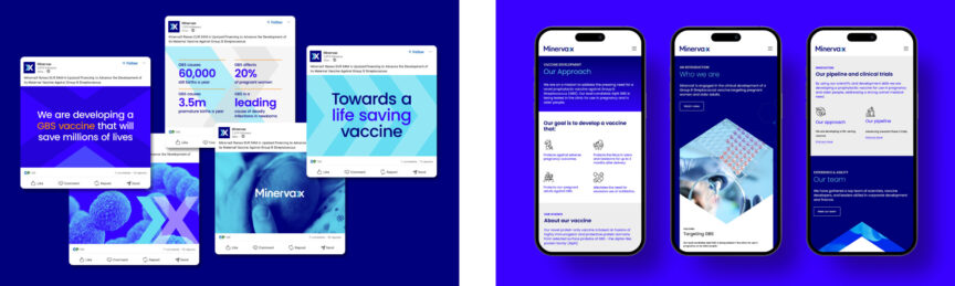
This adaptability allowed one coherent visual language to serve multiple audiences while maintaining core scientific accuracy.
In the wider industry, companies like Genentech have pioneered approachable scientific communication through thoughtful visualisation systems that explain complex biological processes through animated sequences with consistent visual language across platforms.
Product-focused examples include how HRA Pharma approached the naming of their Hana product—creating a name that worked across multiple markets while maintaining clear communication about its purpose.
This demonstrates how even verbal identity elements require thoughtful design when communicating complex products.
For more inspiration on distinctive biotech branding approaches, our article on top biotech brands offers further case studies and analysis.

Common mistakes when designing for scientific complexity
In our experience working with biotech companies, we’ve observed several recurring pitfalls:
Information overload
Attempting to communicate every aspect of your science simultaneously overwhelms audiences and obscures your key differentiators.
Strategic editing—deciding what not to show—is often more important than comprehensiveness when branding complex ideas.
Visual inconsistency
Using different visual systems across communications creates cognitive friction that impedes understanding. When each presentation, website page or brochure follows different visual rules, audiences must repeatedly relearn how to interpret your information.
Misaligned sophistication
Brand expressions that appear either too simplistic (undermining scientific credibility) or needlessly complex (creating accessibility barriers) damage audience trust.
The visual sophistication should match the true complexity of your offering—neither overcomplicated nor oversimplified, which is essential for brand clarity in biotech.
Generic scientism
Defaulting to stereotypical “science visuals” without connection to your specific technology creates forgettable brand experiences. Blue glows, anonymous molecules and stock laboratory imagery fail to differentiate your unique scientific approach.
Disregarding emotional context
Focusing exclusively on technical accuracy while ignoring the human context of your work creates missed connection opportunities, particularly with investors and patients who make decisions based on both rational and emotional factors.
Branding for different biotech audiences
Effective biotech branding recognises that different stakeholders require different depths of scientific detail—all delivered through a consistent brand framework that maintains your core identity.
For scientific peers and regulators
Communications can embrace full complexity, focusing on methodological rigour and comprehensive data presentation. Design for biotech companies at this level should prioritise clarity and precision, with systems for managing dense information without overwhelming the reader.
Effective branding for scientists maintains rigour while enhancing comprehension.
For investors and potential partners
Materials should balance technical substance with strategic relevance. Design should highlight market differentiation, commercial applications and competitive advantages while providing access to deeper technical detail for those who require it.
For healthcare providers
Communications should focus on clinical relevance, patient outcomes and integration with existing treatment protocols. Design should support quick comprehension of key benefits while providing clear pathways to more detailed efficacy and safety information.
For patients and advocacy groups
Materials should emphasise tangible impacts on quality of life, safety considerations and practical usage information. Design should be approachable and reassuring while maintaining scientific integrity.
Our article on biotech brand positioning provides deeper insights into how to strategically position your biotech brand for different audiences while maintaining coherence.

From complex to compelling: The power of strategic design
Strategic brand design transforms biotech complexity from a communication barrier into a distinctive asset.
Simplifying complexity through thoughtful design ensures that when approached strategically, your scientific sophistication becomes not an obstacle to understanding but the foundation of your compelling difference.
At Fabrik, we’ve seen how this transformation creates tangible business value—accelerating investment conversations, enhancing partnership opportunities, strengthening regulatory narratives and deepening patient trust.
For more on emerging approaches in this field, our overview of top biotech branding strategies and trends offers additional perspective.
The most successful biotech brands recognise that good design isn’t cosmetic—it’s fundamental to how their science is understood, valued and ultimately adopted.
By embracing these principles, your complex scientific story can become not just comprehensible but genuinely compelling to all who encounter it.
Fabrik is a strategic brand consultancy specialising in creating distinctive identities for complex technical businesses, including biotechnology companies. To discuss how we can help transform your scientific complexity into compelling brand communications, contact our team.
Fabrik: A branding agency for our times.
Now read these:
—Discover the top biotech branding strategies
—Biotech brand positioning insights for investors
—The top biotech brands leading the industry

Clarity starts with a conversation.
Thanks—we’ll get back to you shortly.
Whether you're navigating a rebrand, merger, or simply need a clearer identity—we’re here to help. No hard sell, just honest advice from people who know the sector.
Let’s start with a simple question…
Prefer to email? Drop us a line.
Fabrik’s been helping organisations rethink and reshape their brands for over 25 years. We’ve guided companies through mergers, rebrands and new launches. Whatever stage you’re at, we’ll meet you there.