


The best and worst Olympic logos from 1896 to today

You don’t have to be athletes or sports fans to recognize Olympic logos. One of the things that makes the ever-changing Olympic logo design so compelling is the fact that each emblem can be both phenomenally unique and globally unifying simultaneously.
While every Olympic Games logo features some version of the five interlocking rings central to the event’s visual identity, each emblem has its own essence and spirit.
Whenever a new location hosts the games, they’re given (some) creative freedom to highlight their specific culture, heritage, and values in the designs they choose.
This has led to the development of endless eye-catching emblems, some more impactful than others. Unfortunately, while there are many great examples of attractive Olympic Games logos dotted throughout history, some designs have failed to live up to expectations.
Today, we’re taking a closer look at the evolution of the Olympic Games symbols, considering which designs would win the gold for creativity and which would be left off the podium.
An introduction to Olympic logos
The official Olympic logo is universal and consistent, though it has appeared in a number of forms.
In 1913, the founder of the modern Olympic Games, Baron Pierre de Coubertin, produced what would become one of the most recognizable emblems in the world. The image consisted of five interlocking rings, all featuring their own distinctive colors.
The design was chosen as a symbol of unity, intended to represent the flags of all participating continents and nations, unified in a joined goal – to become the best.
The International Olympic Committee has retained this symbol over the decades, requiring each country holding the games to embed the design into its own version of the emblem.
Why are there only five circles in the Olympic logo?
Since the Olympic logo is intended to be a symbol of unity between countries, you might wonder why it only contains five rings. Some people assume each color corresponds to a specific continent in the world. However, the Olympic committee argues against this.
According to them, the five colors and white background used in the official emblem are representatives of the flags of all nations at the time when it was created.
The five interlaced rings, all presented in equal dimensions, are intended to represent more than just unity between countries but a sense of overwhelming community and connectedness.
How are Olympic logos designed?
As mentioned above, the official five-ring logo chosen for the Olympic Games remains evident in all emblems produced for the event. However, each location hosting the games does have an opportunity to add its own spin to the design.
Because of this, the Olympic Games have become something of an exercise in branding for many locations around the world.
While the interlocking rings consistently showcase the unity and a universal passion for sport, the additional design elements added by each country are a chance to highlight the unique culture and values of the location. Each country takes a different approach to designing its logo.
The host city may work with designers to produce a range of Olympics logos to choose from.
Alternatively, some cities have also asked for input from their wider community of citizens, running competitions to encourage other creatives to get involved in the design process.
Notably, while the host cities of the Olympic games do have some control over the image they produce, each emblem does need to be approved by the official Olympic committee. Countless emblems have been rejected over the years, forcing design committees back to the drawing board.
Interestingly, however, the Olympic Games leaders don’t reject logos simply because of a bad design, as we can see in some of the examples we’ll outline below. They focus mainly on ensuring the logo design isn’t offensive, plagiarized, or difficult to understand.

What did the original Olympic Games logos look like?
Designing a logo for the Olympic Games isn’t too similar to designing an emblem for a brand or business. Throughout the decades since the modern Olympic Games were established, designers have often been inspired by artistic trends and movements present at the time.
If we look back to some of the initial Olympic Games logos, we can see most featured relatively complex, traditional components. Shields and detailed images were relatively common during the early years.
Additionally, many host cities used memorable imagery from their location, such as pictures of well-known monuments and buildings.
Over the years, however, Olympic logo design has grown more refined. Groups have begun experimenting more consistently with symbolism, color, and even abstract shapes.
The best Olympic logos: Amazing summer Olympic logos
Ultimately, choosing the best Olympic logos is something of a subjective process. Everyone has their own “favorite logo” related to the Olympic Games. However, there are some designs that have achieved greater acclaim and popularity than others.
In our exploration of the best (and worst) Olympic Logos, we’re going to be focusing specifically on the Summer Olympics – the best-known event around the world.
However, you can check out our guide to Winter Olympics logo designs if you want to learn more about the emblems created for the winter games.
Let’s dive in.

Los Angeles 1932
These days, the Los Angeles 1932 Olympic logo would probably be seen as far too traditional to stand out as a compelling emblem. However, at the time, it was a fantastic example of how communities could come together to create a patriotic, pride-inducing symbol.
The shield emblem, with the colors and elements of the American flag, certainly resonated with American viewers at the time. The Latin elements on the banners were inspirational, and the connected rings appeared front and center at the heart of the emblem.

Tokyo 1964
One of the earliest examples of a compelling Olympic logo design was introduced by Tokyo in 1964. Though relatively simplistic, this stunning logo hit all the right notes with both the Olympic committee and the audience for the games.
Designed by Yusaku Kamekura and Masaru Katsumi, the image features a red sun, with the five interlocking rings placed in gold beneath.
The modern and eye-catching logo perfectly epitomizes the minimalistic style relevant at the time. The design was professional, compelling, and dynamic. It was also perfect for representing the larger host country of Japan, thanks to its similarity to the Japanese flag.

Mexico 1968
Widely considered one of the best Olympic logos of all time, the 1968 logo produced for Mexico was considered the perfect blend of cultural identity and modernity. The use of repeat line patterns and bright colors created a mesmeric logo that was even animated for film and TV.
The emblem, like Japan’s Olympic logo, might be simplistic, but it was powerful, eye-catching, and engaging at the time, inspired by art and graphics from Mexico City itself.

Moscow 1980
Another excellent example of a modern Olympic logo came from Moscow in 1980. Five years before the games, the Olympic Organizing Committee for the city organized a competition open to amateurs and professionals alike.
The design of Soviet artist Vladimir Arsentyev was eventually chosen as the winner. The central element of the emblem consists of 3 parallel lines.
The design highlighted the architectural elegance of Moscow, while the five-pointed star above the icon pays homage to the Kremlin flag. A color palette of black, red, and gold was chosen to convey ideas of passion, strength, and power.
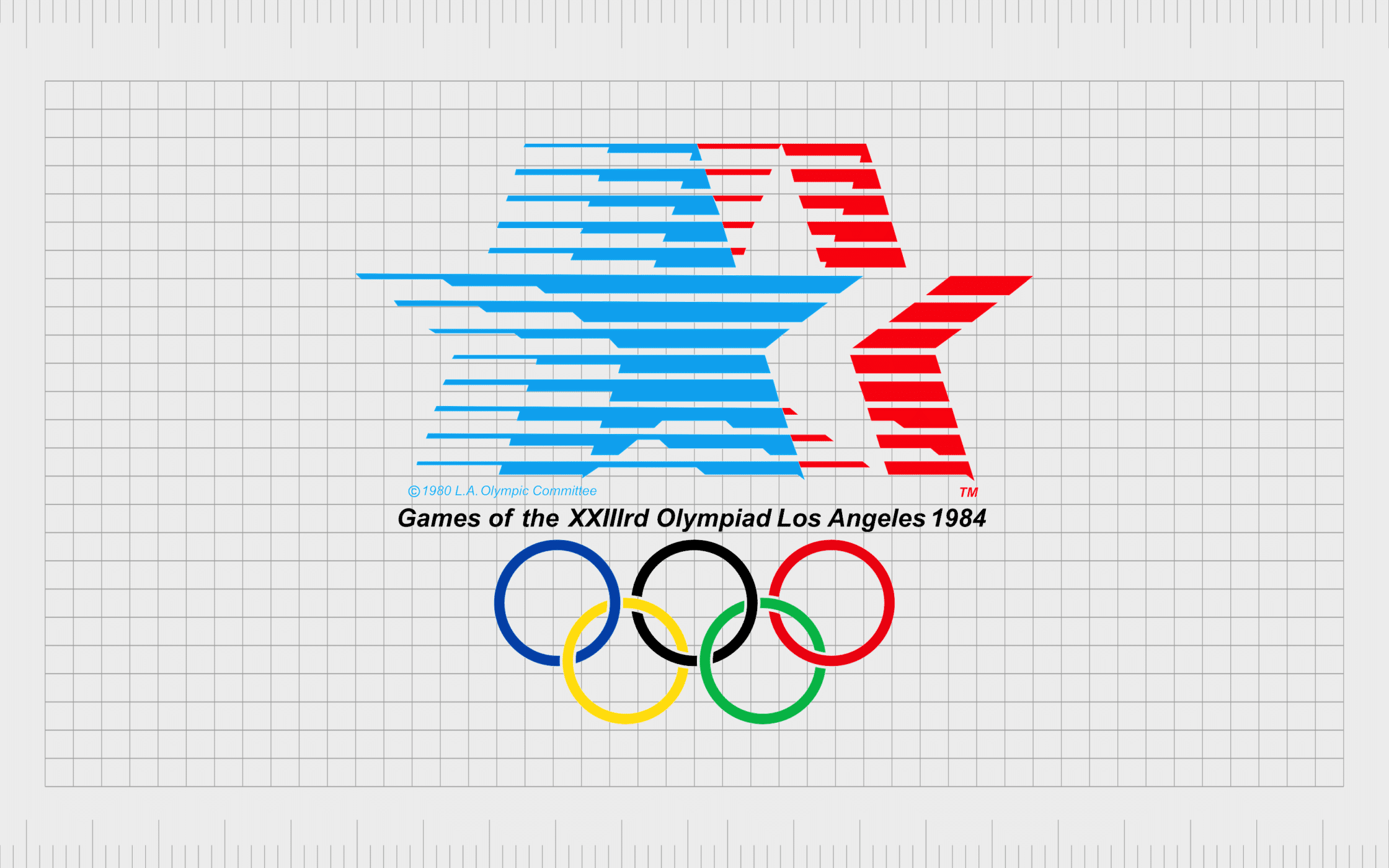
Los Angeles 1984
Though a little outdated by today’s standards, the Los Angeles Olympic logo was a fantastic success when it was originally produced. Designers Paul Prejza and Deborah Sussman created a colorful and fun representation of the Los Angeles landscape, enhanced by stars.
The visually fresh and powerful design was bright and energetic, perfect for showing unity and patriotism. The horizontal bars in the logo are intended to represent the speed at which Olympians race to glory within the various games in the event.
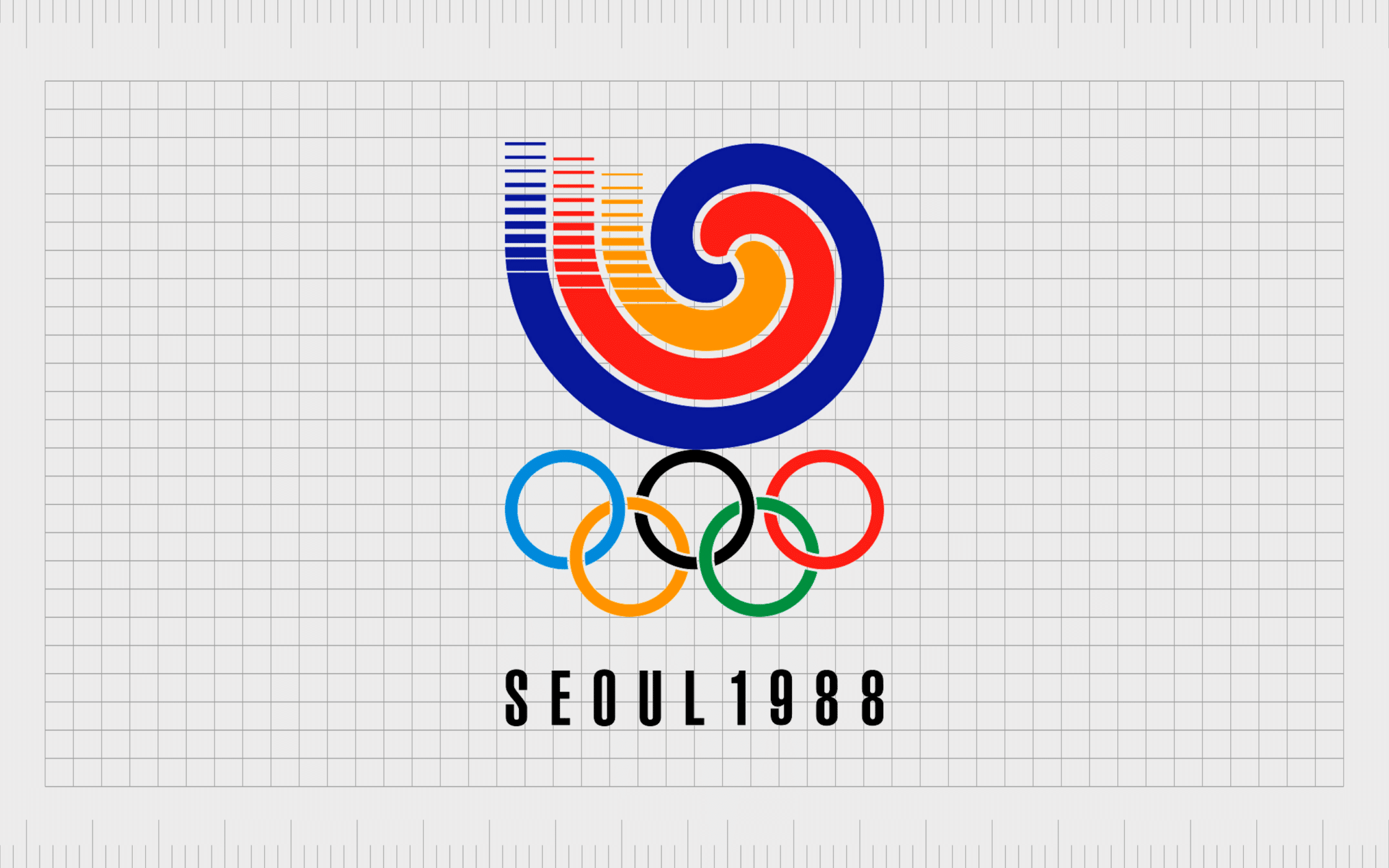
Seoul 1988
By 1988, abstract logos were becoming increasingly common for Summer Olympics logos.
Seoul’s design committee focused on creating a minimalistic logo intended to highlight the motto of “Harmony and Progress.” The abstract shapes in the design blend together perfectly, showcasing unity, passion, and excellence.
The Olympic emblem was also culturally relevant, as it encompassed a Sam Taeguk pattern, which is a traditional symbol for Korea. These patterns are widely used throughout the region as decorations, folk art, and even on the gates of houses.
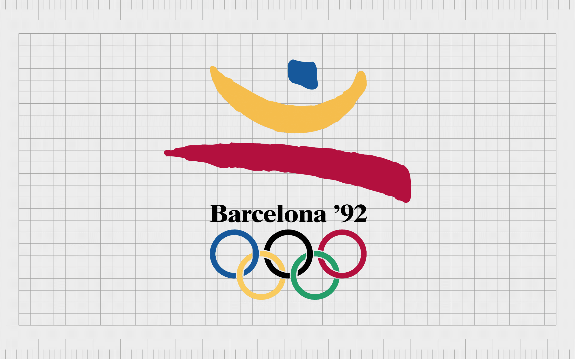
Barcelona 1992
While some people consider the Olympic Games symbols from Barcelona 1992 to be too simplistic, they’re an excellent insight into how the right shapes can convey movement and dynamism.
Designed by Josep Maria Trias, the Barcelona emblem features a leaping figure with arms wide open to symbolize the hospitable and warm culture of the Mediterranean.
The colors of yellow, red, and blue represent the colors of Barcelona, Catalonia, and Spain. Additionally, the logo was considered to be highly relevant to the aesthetic trends of the 90s.

Atlanta 1996
Brimming with hidden meaning, the Olympic Games logo for Atlanta 1996 was created to combine a celebration of 100 years of games with well-known elements from Olympic history. The design is beautifully done, with the five rings and the characters “100” making up the base of a torch.
The flame in the emblem features a number of colors, gradually changing into stars, which taper upwards into the sky. Each color is intended to represent the diversity of the people entering the Olympic games.
It’s a wonderfully unique and modern logo overall.

Sydney 2000
Similar in a lot of ways to the logo design created for Barcelona in 1992, the Sydney Olympic emblem is a simple, abstract image brimming with color and life. The design is bold and energetic, with a number of meaningful components.
The figure in the design is made up of three boomerangs, a common symbol associated with Australia.
The colors in the design also symbolize various aspects of the Australian landscape, from orange (rocks and earth) to the yellow of the sun and the blue of the sea and sky. The blue-ribbon element looks a little like the top of the Sydney Opera House too.

Athens 2004
The Athens Olympic logo is an artistic yet simplistic emblem intended to highlight the history of the landscape and the unity of the game. The wreath in the design is made from an olive tree branch, meant to symbolize peace and unity.
It’s also a direct reference to the ancient Olympic games, where winning champions were crowned with their own olive tree branch, “Kotinos.”
The soft blue coloring universally represents reliability, honesty, and trust. The open circle of the wreath in the image is also intended to highlight concepts of warmth, welcome, and community.

Rio 2016
When designing the logo for the Rio Olympics in 2016, the committee wanted to create something that highlighted feelings of connectivity and community.
At the same time, they were looking for a design that would commemorate Rio’s position as the first South American city to host the Summer Olympics.
The resulting design was a fantastic symbol of unity, inspired by the Brazilian environment and color psychology. Blue represents dependability, green is for growth, and yellow symbolizes the sun, as well as Brazil’s warm and happy nature.
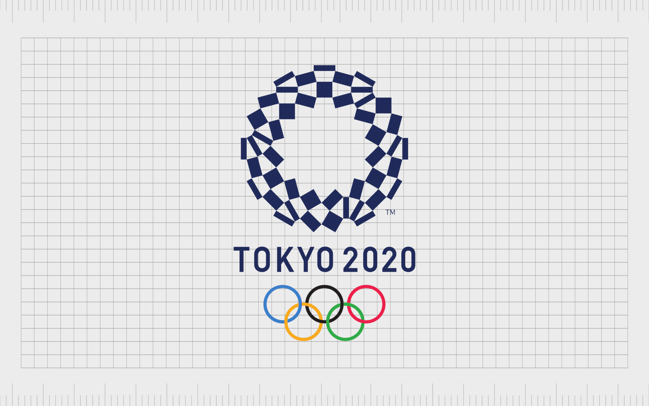
Tokyo 2020
It’s fair to say Tokyo struggled a little with the development of its own unique logo for the Olympic games. The first design created by the group, introduced in 2015, was rejected after it was discovered that it bore a strong resemblance to the symbol for a Belgian theater.
After returning to the drawing board, the Tokyo group came up with the “Harmonized Checkered Emblem.”
The design is made up of various shapes of rectangles, depicted in indigo blue. It’s intended to represent a pattern popularly used throughout kimonos. According to the designer, Asao Tokoro, the logo aims to represent the unity of different cultures and modes of thinking.
The overall design focuses on highlighting unity, diversity, and innovation.
The worst Olympic logos: Summer Olympics design fails
While there have certainly been plenty of great examples of the perfect Olympic logos over the years, not all designs have been met with the same level of support. The wrong color choices and graphic design trends can make an emblem seem more garish than inspiring.
Notably, the logos we’ve chosen to represent some of the worst designs in Olympic history are based on opinion only, as well as some insights from popular culture.

Rome 1960
While there may be nothing wrong with Rome’s Olympic logo from the 1960s from a historical or cultural perspective, it’s fair to say it’s just a little creepy. The three-dimensional wolf design seems to showcase the ribs of the animal, which is a little disturbing.
Additionally, the depiction of Romulus and Remus, while relevant to Roman culture, is a little odd.
Overall, this logo just doesn’t appear to send the right message as an Olympic emblem. It does draw attention to Roman culture quite well, but it doesn’t convey much about unity or community.

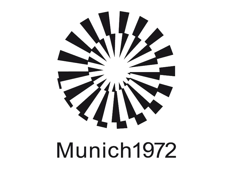
Munich 1972
Probably the most problematic thing about the Munich Olympic emblem is how difficult it is to look at. The design of the interlocking white and black lines makes it seem as though the circle is constantly in motion.
This may have been a deliberate choice from the designer, but it’s a little nauseating after a while. Just stare at it for a bit, and you’ll see what we mean.
Another issue we have with this particular Olympics logo is that it’s one of the few which doesn’t seem to showcase the Olympic rings at all.

Montreal 1976
There are plenty of Olympic fans out there who love the Montreal Summer Olympics logo. However, for us, the design is just a bit too basic. The design was intended to build on the standard Olympic rings with “M” shape curves extending the emblem into the sky.
While there’s nothing too visually distracting about this logo, it just doesn’t seem to say much about Montreal or its culture overall. We think Montreal might have missed an opportunity to really shine with its Summer Games logo here.

Beijing 2008
The use of abstract human imagery is nothing new among Olympic logos. However, Beijing seems to have missed the mark somewhat in this logo. The design features a figure dancing in the middle of a red mark, which earned the emblem the title “Dancing Beijing.”
While the abstract logo might have appeared to graphic design trends at the time, it lacks impact.
While we can see the design committee was trying to convey passion and excitement in this logo, it just doesn’t hit as well as some of the other well-known Olympic logos throughout history.
If you looked at the icon on its own, you probably wouldn’t be able to tell it was for the Olympic games.

London 2012
Probably the Olympic emblem to spark the biggest controversy in the history of the Olympic games is the one produced for London in 2012. The abstract logo was intended to be fun and edgy, created by Wolff Olins to convey the vibrancy of London as a city.
However, most people felt the emblem didn’t represent London at all.
Some people even said that the shapes represented characters from the Simpsons, with Lisa Simpson depicted in two abstract shapes on the right.
Ultimately, this logo felt rushed and inauthentic, which led it to become one of the biggest failures in Summer Games logo history.

Paris 2024
Although the Paris Olympic games have yet to officially take place at the time of writing, a logo design has already been submitted to the Olympic committee. The emblem aims to convey luxury and elegance with the colors of gold and white.
The white shape in the center of the circle is intended to represent the flame of the Olympic torch. However, the added golden lips also make it look a little like a woman.
The design apparently tries to connect the gold medal, Olympic flame, and the Marianne into a reflection of Olympic heritage and Parisian flair. However, the design just doesn’t work as well as it should.
The ever-changing Olympic emblem
For decades, the Olympic logos produced by host cities and countries have stood as powerful, symbolic icons. More than just a way to convey feelings of community and inclusion, many of these logos have effectively highlighted the unique culture of each location hosting the games.
While not every Olympic logo has been able to capture the attention of the rest of the world as powerfully as others, each certainly has its own unique impact.
The various Summer Olympic logos produced across the generations have helped to consistently expand the reach and impact of the Olympic games, capturing the minds and hearts of countless audiences.
However, as we can see from some of the less effective logos above, designing the perfect emblem isn’t always easy. If you need help creating a logo that conveys the right message to your target audience, contact Fabrik Brands today.
Fabrik: A branding agency for our times.

Clarity starts with a conversation.
Thanks—we’ll get back to you shortly.
Whether you're navigating a rebrand, merger, or simply need a clearer identity—we’re here to help. No hard sell, just honest advice from people who know the sector.
Let’s start with a simple question…
Prefer to email? Drop us a line.
Fabrik’s been helping organisations rethink and reshape their brands for over 25 years. We’ve guided companies through mergers, rebrands and new launches. Whatever stage you’re at, we’ll meet you there.