The Street Fighter logo history: How it changed the face of fighting games

For most fans of video games, the Street Fighter logo is likely to be a highly recognizable emblem. Designed to showcase the fast-paced and creative nature of the franchise, the Street Fighter logo has captured the attention of gamers across the globe for several years.
However, while most people are familiar with the Street Fighter franchise, not everyone knows where the series got its iconic brand identity.
Today, the Street Fighter logo stands alongside some of the best-known video game emblems of all time, instantly engaging audiences with its colorful, rich, and even slightly aggressive aesthetic.
If you’ve ever wondered where this stunning logo began or how it evolved over the years, you’re in the right place. Today, we will be exploring the evolution of the Street Fighter logo and how it changed to attract a new generation of gamers.
When was the Street Fighter logo created: An introduction
The Street Fighter logo was first designed in 1987, with the introduction of the first game in the long-lasting franchise. Commonly known as “SF” in some circles, Street Fighter is a Japanese media franchise centered around a series of fighting and arcade games published by Capcom.
Over the years, Street Fighter has produced six main series games, as well as various spin-offs and crossovers. The Street Fighter franchise has even inspired the production of various other forms of media, including television shows, movies, and even graphic novels.
In the original Street Fighter game, players take control of the main protagonist, Ryu, as he competes in a worldwide martial arts tournament spanning five countries. A second player was also able to control Ryu’s American rival, Ken.
The second game in the franchise, Street Fighter II, was best known for establishing many of the conventions used in one-on-one fighting games today.
Now one of the highest-grossing video game franchises of all time, Street Fighter is one of Capcom’s flagship games, with a total sales volume of around 49 million units as of 2022. It’s also the highest-grossing fighting game franchise of all time.
Street Fighter logo history: The evolution
Over the years, the Street Fighter series has produced a huge selection of video games and spin-off titles, each with its own distinctive title cards and unique branded components. For the purpose of this article, we’re looking at the core games in Street Fighter logo history.
Street Fighter (1987)
Street Fighter logo history began in 1987, with the creation of the first game. The original logo chosen for the franchise was very similar to the one most people are familiar with today.
It featured a wordmark, set across two levels, with textured font designed to look as though each letter was almost painted onto the screen. The emblem featured a gradient color palette of red, yellow, and orange.
Over the years, the logo was refined for a younger audience. The shadow was removed from the background of the letters and replaced with a bold black outline. The colors and contours of the letters were also updated slightly to fit with modern aesthetics.
Street Fighter II (1991)
The second Street Fighter logo, introduced in 1991, was produced for the second and perhaps most popular game in the franchise. This emblem featured a lot of the same aesthetics as the previous logo, with some major differences.
While the color palette was very similar, it was turned upside down, with the yellow on the top and the red elements on the bottom.
Certain aspects of the wordmark were also changed, with the top bars of the “T” characters becoming longer. A Roman-style “2” was also added to the emblem.
Street Fighter III (1997)
Otherwise known as “New Generation,” the third Street Fighter game built on the previous two logos, using the same fiery color palette. Instead of placing the number of the game alongside the wordmark, the designers chose to place a much larger numeral behind the main title.
Once again, the letters in the Street Fighter logo have been refined here, making them look more jagged and aggressive. However, the style does match the previous logos quite well.
Street Fighter IV (2008)
The fourth Street Fighter logo marked one of the most significant changes to the emblem’s design. Though the font style in the emblem was still relatively harsh and jagged, the letters were a lot smaller, and the color palette was reduced to simply orange and yellow.
The IV component of the logo here follows the same typeface style as the rest of the emblem, with a lot of jagged edges and rough components.
Street Fighter V (2016)
The fifth game in the Street Fighter series was a return to form for the company’s logo design. The wordmark looked a lot more similar to the previous emblems than the Street Fighter IV logo. Additionally, the red elements were added back into the fiery gradient.
Like with the Street Fighter III logo, the company placed the V to represent the number five behind the main title. The “V” includes a golden border, with splashes of color placed throughout the black background in the numeral.
The Street Fighter 6 logo: The latest controversy
While each Street Fighter logo introduced for the main games in the series has maintained a relatively consistent aesthetic for the most part, the latest introduction to the franchise breaks the mold.
At the time of writing, Street Fighter 6 is still in development, but the Capcom team did release a trailer in 2022 to showcase the new game.
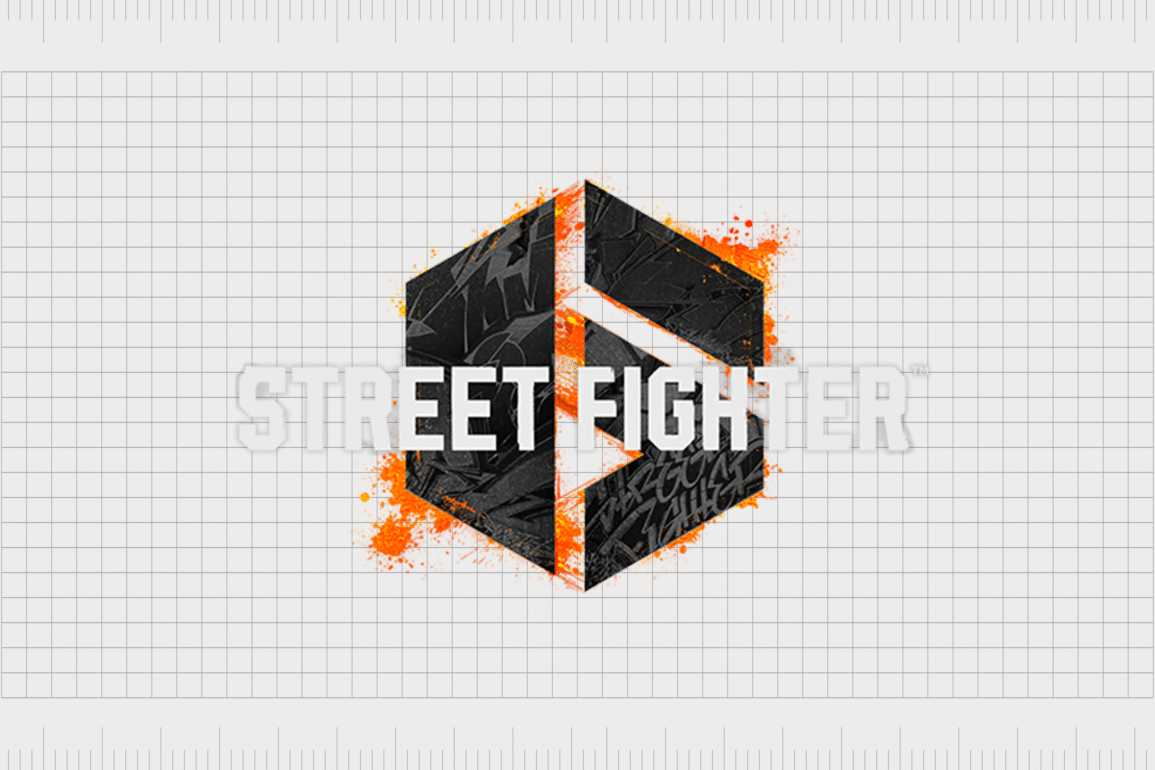
As part of this trailer, a new logo was revealed featuring a simple monogram “SF” in a hexagon shape border. The “6” is placed alongside the monogram in black against a splash of white, making the design look as though it’s glowing.
This simplistic logo sparked significant controversy among Street Fighter fans, who believe the new emblem doesn’t represent the personality of the series.
Not only did fans consider the new emblem to be relatively dull, but some also suggested the design was similar to a stock image available from Adobe. Though Capcom’s logo is a little different from the stock image, there are certainly some similarities.
It remains to be seen whether the Capcom team will redesign the logo based on the negative feedback from their audience.
The Street Fighter logo: Colors and fonts
For the most part, the Street Fighter logo has always maintained a very consistent aesthetic, with sketchy, jagged, and rough edges on all of its wordmarks, typically set across two levels.
Additionally, the Street Fighter emblem is usually associated with a fiery, gradient-style color palette, which combines shades of orange, red, and yellow in different quantities.
While the latest Street Fighter logo is a world away from the designs most fans are familiar with, it could be an insight into a new strategy by Capcom to take its visual identity in a simpler, more minimalistic direction.
If you want to take a closer look at the Street Fighter logos, you can find some useful resources here:
What color is the Street Fighter logo?
As you can see from the Street Fighter logo history above, the shades used throughout the games in the franchise have varied slightly over the years.
However, for the most part, the Street Fighter logo colors have always included a combination of yellow, orange, and red shades, with accents in both white and black.
The Street Fighter logo color palette for the primary franchise, known by most fans today, includes a bright orange shade, followed by a lighter orange, into a soft white/yellow color. The wordmark is also surrounded by a thick black border.
What font does the Street Fighter logo use?
Perhaps unsurprisingly, the Street Fighter logo font is unique to the brand and was created by the Capcom team for the franchise.
The wordmarks in each of the logos created for different Street Fighter games have differed slightly, but most retain the same jagged edges and sweeping components. There are Street Fighter-style typefaces available to download online.
The impactful Street Fighter logo
The Street Fighter logo has consistently maintained a powerful, eye-catching, aggressive aesthetic intended to engage gamers worldwide for decades.
The bright and warm colors make us think of fire and vitality, while the sharp and jagged wordmarks convey the internal battles and disputes within the game.
For most fans, the Street Fighter logo is a core part of the game’s identity and something regularly associated with arcade history. This may be why the choice to simplify the logo for the sixth game in the franchise caused so much controversy.
Fabrik: A branding agency for our times.
Clarity starts with a conversation.
Thanks—we’ll get back to you shortly.
Whether you're navigating a rebrand, merger, or simply need a clearer identity—we’re here to help. No hard sell, just honest advice from people who know the sector.
Let’s start with a simple question…
Prefer to email? Drop us a line.
Fabrik’s been helping organisations rethink and reshape their brands for over 25 years. We’ve guided companies through mergers, rebrands and new launches. Whatever stage you’re at, we’ll meet you there.


