The New England Patriots logo: A symbol with heritage

If you’re a fan of American football, there’s no doubt you’re familiar with the New England Patriots logo. Nicknamed the “Flying Elvis”, the Patriots symbol is one of the most recognizable in the sporting world. But, how much do you know about New England Patriots logo history?
The design on the Patriots helmet and uniform has gone through a number of changes over the years, evolving from a relatively traditional brandmark to something sleek and modern.
Like many NFL team logos, the Patriots’ logo symbol is more than just an abstract image for the team’s fans. It’s an emblem football lovers treat with reverence.
Today, we’re taking a closer look at the origins of the NE Patriots logo, and exploring how the image has evolved through the years.
The Patriots symbol: Introducing the New England Patriots
Before we dive into the New England Patriots logo history, let’s take a closer look at the team. Founded initially as the “Boston Patriots” in 1959, the New England Patriots are a professional football club, competing in the National Football League (NFL).
The team started life as a charter team for the American Football League (AFL). However they joined the NFL in 1970 during the famous AFL-NFL merger. Over the years, the Patriots have become some of the most watched professionals in the football arena.
Though the team was somewhat unsuccessful before the 21st century, the franchise experienced a fantastic winning streak thanks to the guidance of head coach, Bill Belichick, and the notable quarterback, Tom Brady.
Between 2001 and 2019, the Brady-Belichick era became known as one of the greatest sports dynasties, allowing the Patriots to claim almost every major Super Bowl record. They currently hold the record for the most Superbowl wins (6) of all time, tied with Pittsburgh Steelers.
They’ve also had the most Super Bowl appearances of any team (11), and the most Super Bowl losses (5). Other NFL records achieved by the team include the most playoff wins of any group (37), and the most wins in a ten-year period (126).
The Patriots even had the longest winning streak in both playoff and regular season games between 2003 and 2004 (21 wins in total).
New England Patriots logo history: Old Patriots logos
Though the New England Patriots old logos might seem quite different to the symbol used by the team today, they do share some similarities, including a relatively consistent color palette. The patriotic emblem has always featured the colors of the American flag.
Let’s take a closer look at how the team’s visual identity has changed through the years.

1960
The first New England Patriots logo was actually designed by a fan. The Patriots changed their name from the “Boston Patriots” by hosting a fan submission contest, asking for a new title. Walter Pingree won the competition, and designed the new logo for the group.
It featured a blue tri-corner hat on a white background, alongside a wordmark, designed with the stars and stripes of the American flag.

1961
Only a year after unveiling their first logo, the Patriots updated their image with the first instance of the team’s mascot, “Pat Patriot”. Throughout the 1960s season, a Boston Globe cartoonist, Phil Bissel would regularly draw cartoons for game day programs.
When depicting the New England Patriots, Bissel drew a Revolutionary War Figure, often wreaking havoc on the group’s opponents. The cartoon appealed to the team’s owner at the time, Billy Sullivan, who requested an image of Pat getting ready to throw the ball for the official logo in 1961.

1965
The Patriots helmet design and logo didn’t change much after they found their mascot. Though the coloring and detail in the Pat Patriot figure changed a couple of times over the years, most of the components remained the same. The group simply refined their existing image.
The team’s uniform did change a little during this time, however. For the most part, the team consistently used white uniforms with red numbers and letters, opposite contrasting pants. However, after 1972, a blue outline began to appear around the lettering.

1993
It wasn’t until 1993 when the Patriots introduced the first version of their new “Flying Elvis” logo. This design was clearly a world apart from the previous image used by the NFL team. The Revolutionary War figure was shelved, replaced by a man who looked a lot like Elvis.
Initially, the iconic symbol used by the Patriots included a wordmark, with white lettering, surrounded by a blue border. The “Flying Elvis” head which was intended to be based on Pat Patriot’s image, curved over the top of the letter “P”.
The part of the design often confused with the “hair” on the figure’s head is actually intended to be a waving flag, featuring the red and white stripes of the US flag, and a white star on the blue section.
The team updated this image very slightly in the year 2000, with a small tweak to the color palette. The new variation included a darker shade of navy blue, though the other elements stayed the same.
The evolution of the Patriots logo: The symbol today

In the year 2000, the Patriots unveiled a new emblem, and their most recent logo to date. After more than a quarter of a century, the team felt the image needed to be revised and renewed for a more modern audience. The Flying Elvis received a slight tweak.
The blue color was slightly darkened, and more detail was added to the facial features. The new look also brought more definition to the “flag” design above the figure’s head. The white space between the red stripes was widened, creating a sharper image.

The white five-pointed star on the logo grew a little bigger, and for the most part, the wordmark was removed from the Patriots helmet design entirely. However, a new wordmark was introduced to accompany the brand’s image.
This wordmark was very different to the previous designs used by the team.

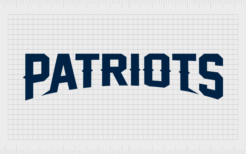
It featured dark blue font, matching the blue color scheme used on the Patriots mascot image. Small lines were also added to the center of each letter, giving it an almost three-dimensional appearance, when combined with the curved component at the bottom of the banner.
Notably, there is an alternative version of the New England Patriots uniform, which features the Patriots “throwback logo”, from the 1960s. The helmet in this uniform includes the famous fell length Pat Patriot figure, in his military uniform.
The NE Patriots logo: Fonts and Colors
The current version of the New England Patriots logo is certainly a lot more refined and modern. Although the original throwback logos had their charm, they were somewhat outdated and more complicated than the majority of sports logos in the current market.
Today, the color schemes and components used in the NE Patriots logo stand as a testament to the group’s patriotic values. With their new team mascot, the “Flying Elvis”, the Patriots have carved a space for themselves in the minds of football fans worldwide.
You can see the New England Patriots logo in closer detail here:
The New England Patriots logo font
As mentioned above, the New England Patriots logo used on the team’s helmets no longer contains a wordmark. However, there is a wordmark that appears on the team’s uniform, often just below the neckline.
The Patriots logo font used in this inscription is a somewhat traditional looking sans-serif font, with interesting components around the middle section. The Flying Elvis emblem often sits in the curved lower section of the inscription, creating an incredible sense of balance.
The New England Patriots logo colors
While many aspects of the New England Patriots logo have changed over the years, the color palette has remained relatively consistent. The Patriots logo colors have always included shades of red, white and blue, reflecting the American flag.
The current New England Patriots colors are:
Blue
Hex color: #002244
RGB: 0 21 50
CMYK: 100 65 0 60
Pantone: PMS 289 C
Red
Hex color: #c60c30
RGB: 213 10 10
CMYK: 10 100 100 0
Pantone: PMS 186 C
Silver
Hex color: #b0b7bc
RGB: 176 183 188
CMYK: 3 0 0 32
Pantone: PMS 429 C
Celebrating the Patriots logo, symbol, and helmet design
Whether you’re familiar with the Patriots’ winning record in NFL, you’re a fan of their performance, or you’re not interested in football at all, it’s hard to ignore the impact of the group’s visual identity. Over the years, the Patriots symbol has evolved into a modern and powerful image.
Today, the symbol positions the Patriots as not just a strong team in the American sports landscape, but also a group with their eyes on both the future, and the past.
The logo pays homage to the franchise history of the New England Patriots, while also giving the group a modern and timeless new aesthetic.
Fabrik: A branding agency for our times.
Clarity starts with a conversation.
Thanks—we’ll get back to you shortly.
Whether you're navigating a rebrand, merger, or simply need a clearer identity—we’re here to help. No hard sell, just honest advice from people who know the sector.
Let’s start with a simple question…
Prefer to email? Drop us a line.
Fabrik’s been helping organisations rethink and reshape their brands for over 25 years. We’ve guided companies through mergers, rebrands and new launches. Whatever stage you’re at, we’ll meet you there.


