


The rise of the Red Devils: A look at the Manchester United logo history
Bright, eye-catching, and undoubtedly iconic, the Manchester United logo is one of the most recognizable emblems in the football landscape. Looking back at the Manchester United logo history shows us how the team’s visual identity and impact have evolved over a century.
At present, it’s hard to find a football fan in the UK unfamiliar with the “Red Devils.”
The Manchester United FC logo has become a staple of not just the Premier League but also the global football industry. Showcasing a combination of passion, power, and strength, this unforgettable logo has helped to keep Man United in the public eye for generations.
But where exactly did it all begin? What prompted Manchester United to choose a devil for the mascot of their emblem? Why are the colours of gold and red so significant to the team, and what has prompted the various changes to the crest’s design over the decades?
Today, we will be taking a closer look at the details of the Manchester United badge to help you learn everything you need about the team’s branding.
The Man UTD logo: An introduction to Manchester United
So, who is Man UTD? Manchester United Football Club (FC) is one of the better-known football teams in the UK and a member of the Premier League. Based in Greater Manchester (Old Trafford, to be exact), Manchester United competes in the top division of the English football league.
Originally, the team was founded as “Newton Heath LYR Football Club” in 1878. However, the name and visual identity changed drastically in the 1900s. Over the years, Manchester United has proven itself to be quite the competitor in the football landscape, winning a record 20 titles.
What’s more, the team has taken home 21 FA community shields, 12 FA cups, and five league cups throughout its history. They’ve won numerous European Champions League titles, as well as the Intercontinental Cup and the FIFA World Cup.
Worldwide, Manchester United has become one of the most widely supported clubs around, and it was also the highest-earning club in the football world for a period.
Many regard the team as one of the most historical in the football landscape, as they were the first English club to win the European Cup.
They were also one of the first teams in the history of English football to earn the treble achievements of the EUFA Champions League, FA, and Premier League cups.
Manchester United logo history: The evolution
The Manchester United logo history begins in 1878 when the team was initially founded as Newton Heath LYR FC.
Over the years, the group has embraced a number of different designs, motifs, and colour schemes within their logos. Let’s take a closer look at some of the most iconic Manchester United logos to emerge over the decades.
1878
Perhaps unsurprisingly, when Man UTD was first launched as the Newton Health LYR FC club, they had a very different emblem to the one we know today.
The design features almost none of the components we know from the current logo. Instead, it highlights the image of a rather detailed train on a green and yellow banner.
However, there is a shield-style shape present here that could be connected to the shield used in the current Manchester crest.
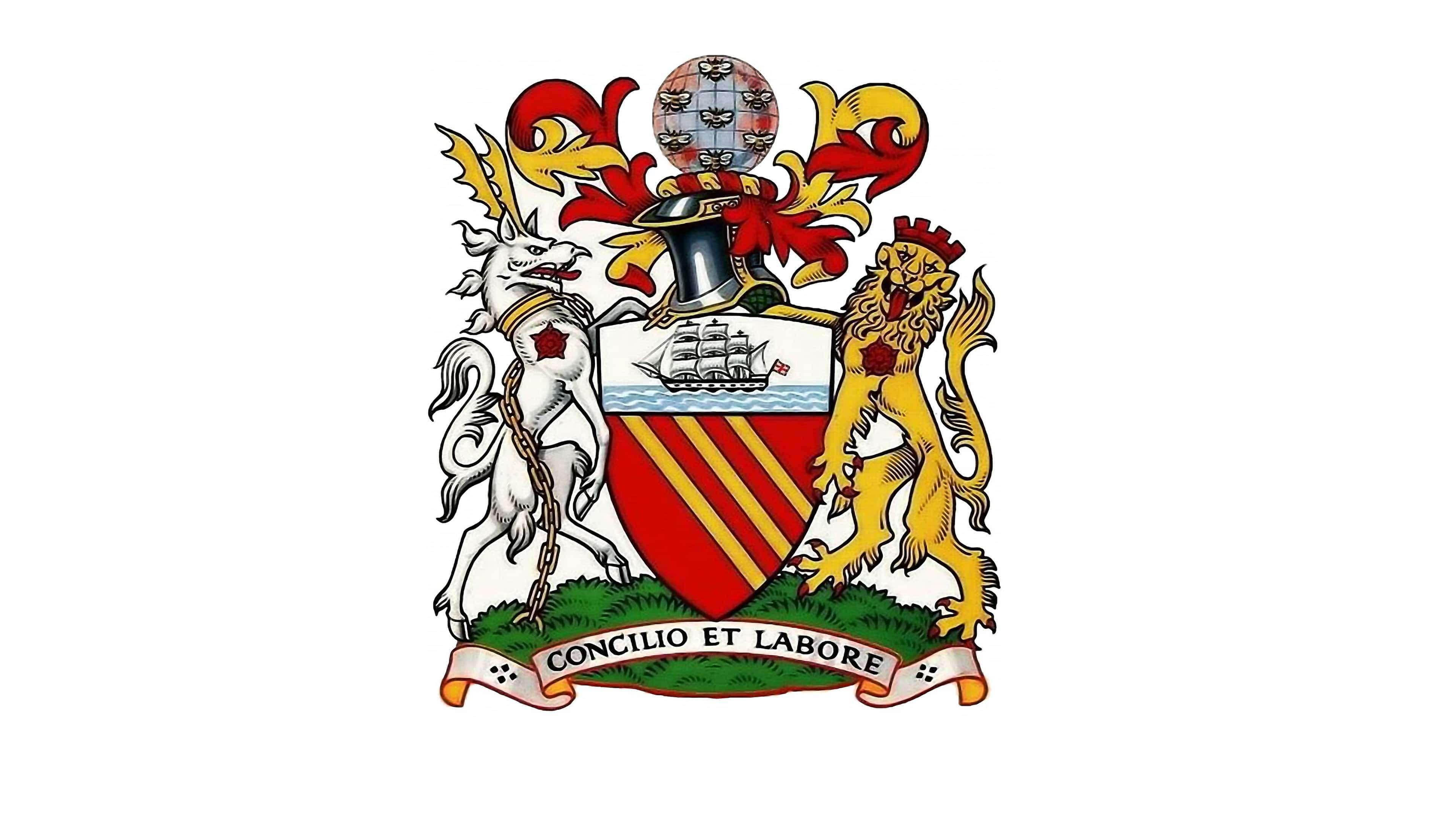
In 1902, Manchester United changed its name and its brand identity with a highly ornate and traditional crest. The new badge, like many Premier League logos of the time, was based on the coat of arms for the team’s city.
There are various iconic components worth noting here, from a golden lion to a ship (Still present in the current logo).
A Latin motto appears at the bottom of the logo, which translates to “By Council and Work.” Elsewhere, throughout the logo, we see a gold and red striped shield, as well as a number of bees presented on top of the image of a globe.
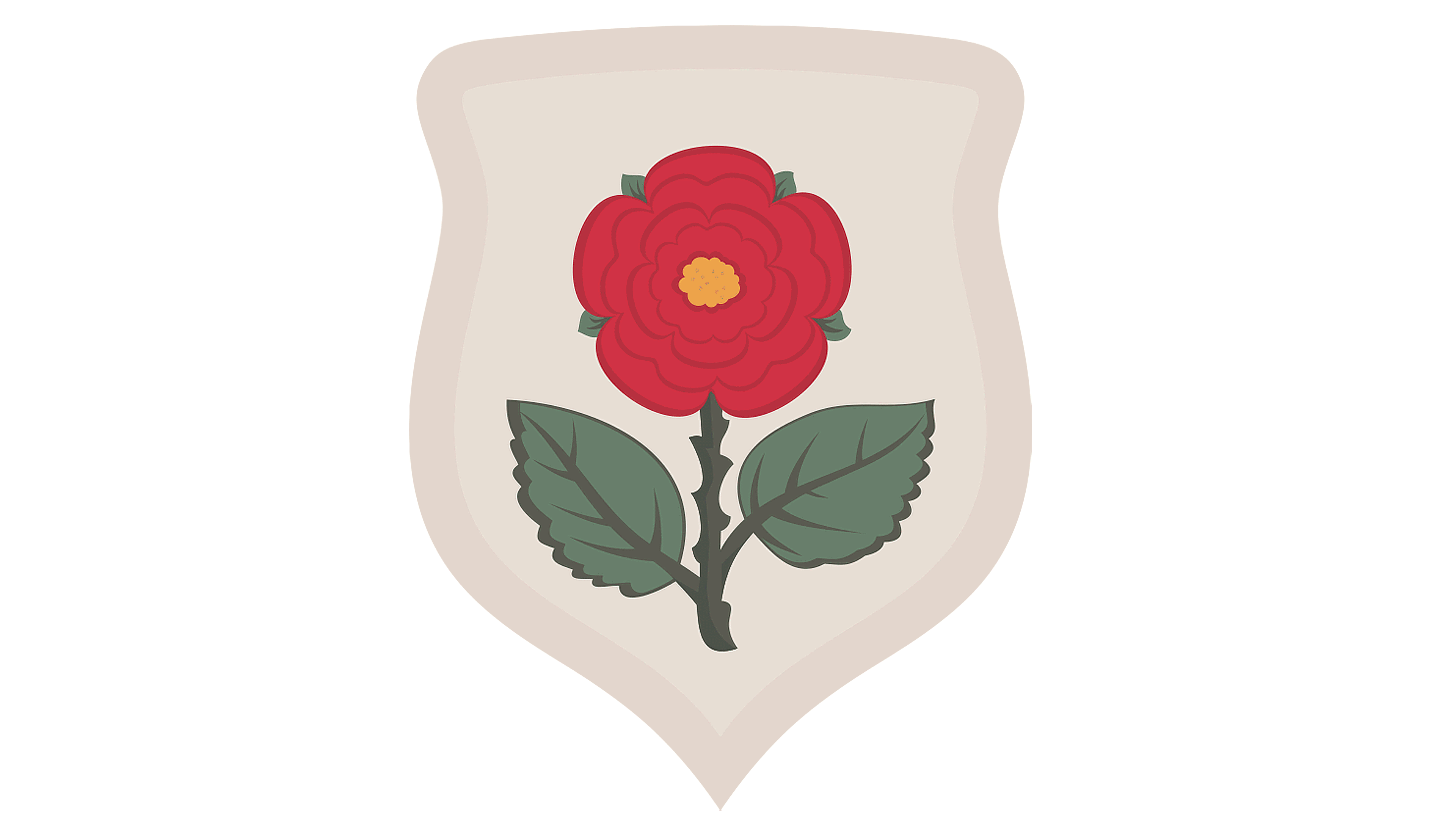
For a brief time in 1909, a unique logo was introduced, which featured none of the prior elements of the traditional-style Manchester United crest. This shield-style logo featured a red rose on a white background. The red rose is a common symbol of England.
1943
During the 1940s, Manchester United introduced the “Red Devil” emblem for the first time. Many of the aspects of this logo are very similar to the design we know today, though the colour palette is simpler, and some of the components are less refined.
In this logo, we also see the Manchester United team name and the words “Football Club” presented for the first time. The ship imagery from the previous design is also present.
1960
The red devil disappeared again for a time between the 1960s and 1970s, replaced by a simple striped triangle in red underneath the image of the ship from previous designs. The two footballs on either side of the emblem were replaced with roses.
Once again, the name appears in a sans-serif font, and the colour palette is primarily red, white, and black.
1970
During the 1970s, Manchester United updated its colour palette with some additional golden elements. The roses were once again replaced with footballs, and the typeface was switched from black to gold. However, the majority of the elements of the previous crest remained for some time.
In 1973, Manchester United refined its colour palette slightly and replaced the striped shield with a golden block design featuring the red devil.
In the years following, certain aspects of this logo were updated and refined from time to time, with brighter golden and red colours featuring across the years. However, the majority of the components were kept the same.
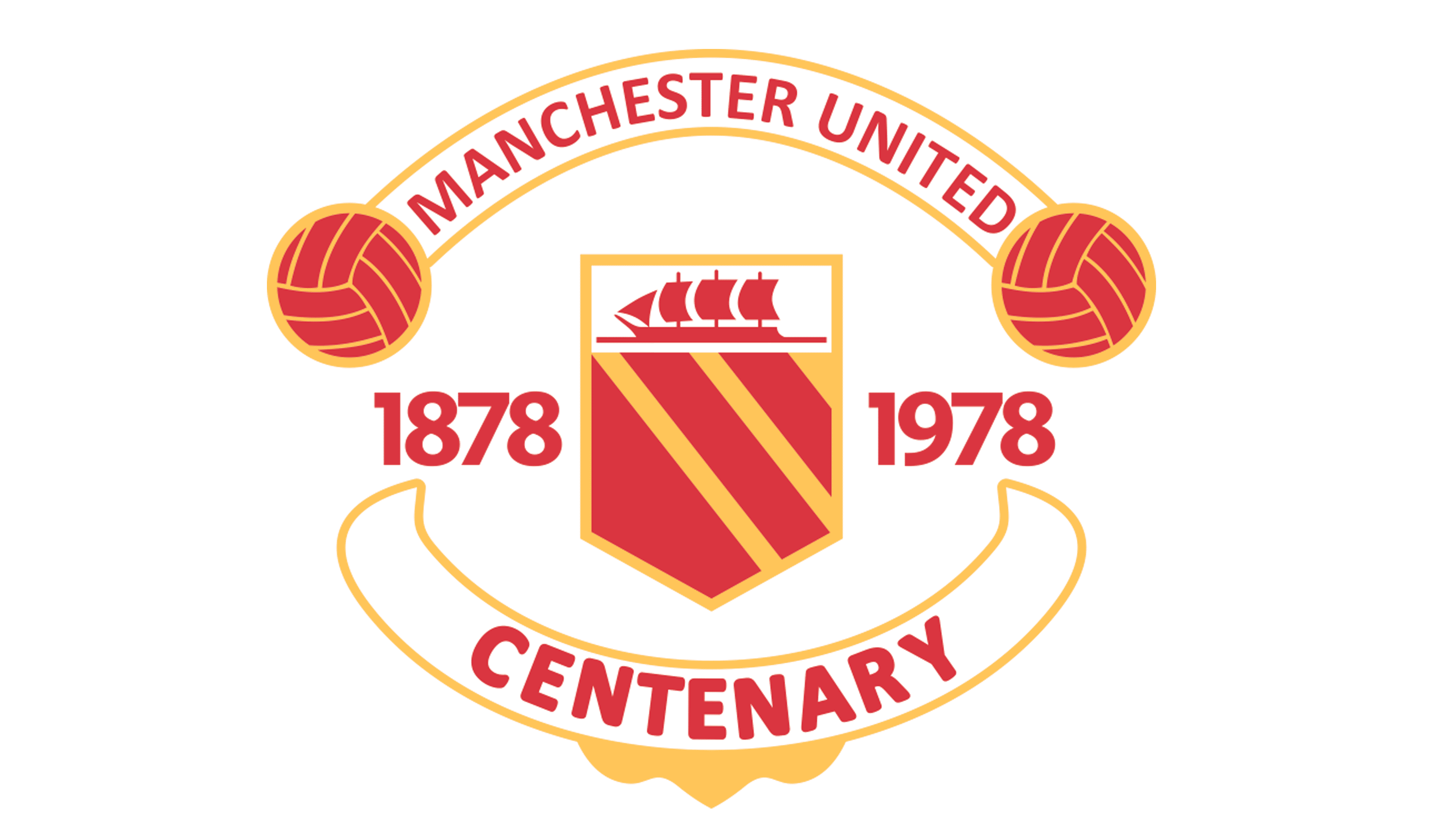
In 1978, Manchester briefly celebrated 100 years of history with a new logo, similar in a lot of ways to the previous designs. In the “Centenary” logo, the red devil was removed, and the striped shield returned. The words “Football Club” were also replaced.
Following the use of this logo for a single year, the team returned to its previous design from 1973. However, in the updated logo, the colours were a little brighter.
1998
1998 marked the introduction of the most recent logo for the Manchester United team. This emblem is similar in a lot of ways to the 1973 Manchester United Crest.
All of the core elements remain, though the “Football Club” component has been removed, allowing more space for the words “Manchester United” to be spread across two levels.
In this Manchester United FC logo, the colour palette of gold and red has been brightened and refined. We also see various shadows and gradients intended to make the image look more robust.
What is the Manchester United Red Devil?
Given the current logo, it’s easy for most people to see why the Manchester United team is often referred to as the “Red Devils.” Rather than opting for an animal as their core mascot, like many other football clubs of the era, Man UTD decided to showcase a devil-like creature with a pointed pitchfork.
However, the devil hasn’t always been the symbol of Manchester United. During the 50s and 60s, most people referred to the club as the “Busby Babes,” referencing one of the team’s most well-known and successful managers.
However, during the 90s, another athletic club was emerging from Manchester, known as the “Reds” or the “Red Devils.”
The Salford Rugby Club had its own devil logo, which seemed to attract a lot of attention from fans. After Busby saw this logo, he decided to adopt the nickname for his own club and created a logo featuring a stylistic devil in the centre.
The devil imagery was intended to make the team seem somewhat more aggressive, powerful, and a little controversial. It has since remained a core part of the Man UTD visual identity.
The Manchester United crest: Colours and fonts
As you can see, the Manchester United FC logo has certainly gone through quite a few changes over the years.
However, ever since the team changed its name, various aspects of the Manchester United Crest have remained somewhat consistent.
The colours gold and red have always been a core part of the Manchester United identity. Additionally, the team has also used the image of a ship in most of its logos since the 1900s.
Today, the colour is bold, eye-catching, and passionate. It highlights the incredible performance and strength of the team, as well as pays homage to the history of Manchester.
If you want to take a closer look at the Manchester United Crest, you can find some useful resources here:
What colour is the Manchester United logo?
For the most part, the official Manchester United logo colours have remained quite consistent since the 1960s. Although the team has experimented with a number of colours and shades over the years, gold and red remain a core part of its identity.
The current logo is quite complex, with numerous gradients, shadows, and highlights.
However, the two core shades of the Manchester United logo colour palette are:
RED
PANTONE: PMS 485 C
HEX: #DA291C
RGB: (218, 41, 28)
CMYK: (0, 95, 100, 0)
YELLOW
PANTONE: PMS 107 C
HEX: #FBE122
RGB: (251, 225, 34)
CMYK: (0, 0, 92, 0)
What font does the Manchester United logo use?
Just as the Manchester United colour palette has remained relatively unchanged, the group has also chosen relatively consistent typefaces. For the most part, the Manchester United logo font has always been a sans-serif typeface, written in a bold, eye-catching format.
The Manchester United logo font is unique to the team, but it’s similar in a lot of ways to the ITC Stone Sans Semi bold or II font.
The transformation of the Manchester United badge
Looking back at the Manchester United logo history, we can see the team’s quest to create a highly iconic and interesting emblem over the years. Today’s Manchester United FC logo is one of the most recognizable in the industry, featuring bright colours and numerous unique components.
Alongside the unforgettable red devil, the logo also includes:
- Ornate banners.
- The image of a ship (in gold).
- Two footballs on either side of the shield.
This vivid and engaging logo has ensured the Manchester United team will always be recognized by football fans worldwide.
Fabrik: A branding agency for our times.

Clarity starts with a conversation.
Thanks—we’ll get back to you shortly.
Whether you're navigating a rebrand, merger, or simply need a clearer identity—we’re here to help. No hard sell, just honest advice from people who know the sector.
Let’s start with a simple question…
Prefer to email? Drop us a line.
Fabrik’s been helping organisations rethink and reshape their brands for over 25 years. We’ve guided companies through mergers, rebrands and new launches. Whatever stage you’re at, we’ll meet you there.