


Iron Man logo history: Unlocking the Iron Man symbol and its meaning
From the character’s unique symbol to his ever-changing wordmark, the Iron Man logo is one of the most recognizable in the comic book hero world. Like many superheroes, Iron Man has undergone several visual transformations over the years, growing increasingly modern to attract new fans.
Today, Iron Man is one of the more iconic heroes in the Marvel universe, thanks partly to his incredible outfit, impressive powers, and eye-catching appearance. Unlike many other heroes in the Avengers franchise, Iron Man has always had a relatively strong and brandable image.
Though the character didn’t have much of a symbol attributed to him during the early years, his creators experimented with various wordmarks to identify the hero.
Today, we will look at the story of Iron Man, the Iron Man symbol, and everything else you may need to know about this fantastic fictional character.
Iron Man history: Where did the Iron Man emblem begin?
Iron Man is an American superhero created by the incredible Marvel Comics.
According to the publication, the character was co-created by Stan Lee in collaboration with Larry Lieber, and artists Jack Kirby and Don Heck. Iron Man, otherwise known as Tony Stark, appeared for the first time in volume 39 of “Tales of Suspense” during 1963.
Soon after, Iron Man also received his own comic book series aptly titled “Iron Man” and helped to create the Avengers alongside the Hulk, Wasp, Ant-Man, and Thor.
According to Stan Lee, he had been experimenting with the idea of a businessman-type superhero for some time before coming up with Iron Man. He wanted to create a glamorous, wealthy character with a secret persona committed to protecting those in need.
When initially introduced, Iron Man was an anti-communist hero who defeated several Vietnamese agents, but Lee regretted this focus later. Eventually, the character developed into a more complex and vulnerable character, with many personal difficulties, including alcoholism.
Over the years, Iron Man has appeared in several different types of media, including television shows, films, and video games. Before his death in the Marvel Cinematic Universe, Iron Man was portrayed by Robert Downey Jr.
Iron Man logo history: The evolving Iron Man symbol
Like many superheroes over the years, Iron Man hasn’t always had a traditional symbol or emblem to identify the character. Instead, the most recognizable elements of Iron Man have always been his unforgettable red and gold suit and a range of wordmarks used in his comic books.
The best way to explore Iron Man logo history is to look back on the various font styles used to depict the title of comic books over the years.
1968
The first version of the Iron Man logo wordmark was quite simplistic. It featured a bold red logotype in all uppercase letters, with a slight shadow and thin black outline. The words “The Invincible” were often depicted above the character’s name in the early years.
In 1969, the design was updated to feature more depth and color. This logo variation was much more three-dimensional and remained with the superhero’s visual identity for 15 years.
The new wordmark included a blue border around the red lettering and the words “The Invincible” were also written in the same shade of blue.
1984
In the 80s, the Iron Man logo was simplified to feature a white typeface with a black outline for depth. The words “The Invincible” were removed from the wordmark, followed by an image of Iron Man mid-flight placed alongside the lettering for a short time.
In 1985, the image was adapted again. Though the white font remained the same, it gained a bulky red outline for an extra three-dimensional appeal. The visual of the character placed alongside the wordmark was also removed.
1988
In the late 80s, the blue coloring returned, and the red was removed entirely in favor of a bright yellow typeface. The font choice remained thick and bold, though we could see more mechanical elements within the typeface this time.
The small dots within each letter were intended to represent bolts screwed into iron. These components stayed with the design when it was once again transformed in 1996. However, the 90s version of the logo featured a more luxurious-looking text written in all metallic grey.
1997
In the late 90s, the Iron Man logo returned to its roots somewhat, re-introducing “The Invincible” above the superhero’s name. Once again, the colors yellow and blue were used to highlight the bright and confident identity of the character.
In 2002, a completely new version of the Iron Man logo was rolled out. A white font on a red background created a modern image with a technology theme. Various lines and dots were used to create the appearance of circuits.
2008
In 2008, a simple and compelling version of the Iron Man logo appeared, written in bold black letters with a glossy silver outline. The inscription also had a slight shadow, which helped to make the letters jump out from the page.
In 2013, the designers switched tactics to re-introduce the red coloring commonly associated with Iron Man. Like many previous designs, this wordmark featured bold, blocky letters with a unique texture. A light flare in the middle of the “N” makes the design look reflective and glossy.
2014
The design of Iron Man’s logotype changed again in 2014, this time featuring the arc reactor in the center of the character’s chest as the “o” in “Iron.” The image still included various elements from previous designs, such as the geometric-style font and the red and yellow coloring.
This font also included several eye-catching elements, such as a sharpened point in the “M” and interesting shaping in the characters “R” and “A.”
Later variations of the Iron Man logo introduced for the cinematic universe built on this visual identity. Many logos associated with the movie franchise have included a red font with a golden or yellow outline.
What does the Iron Man symbol mean?
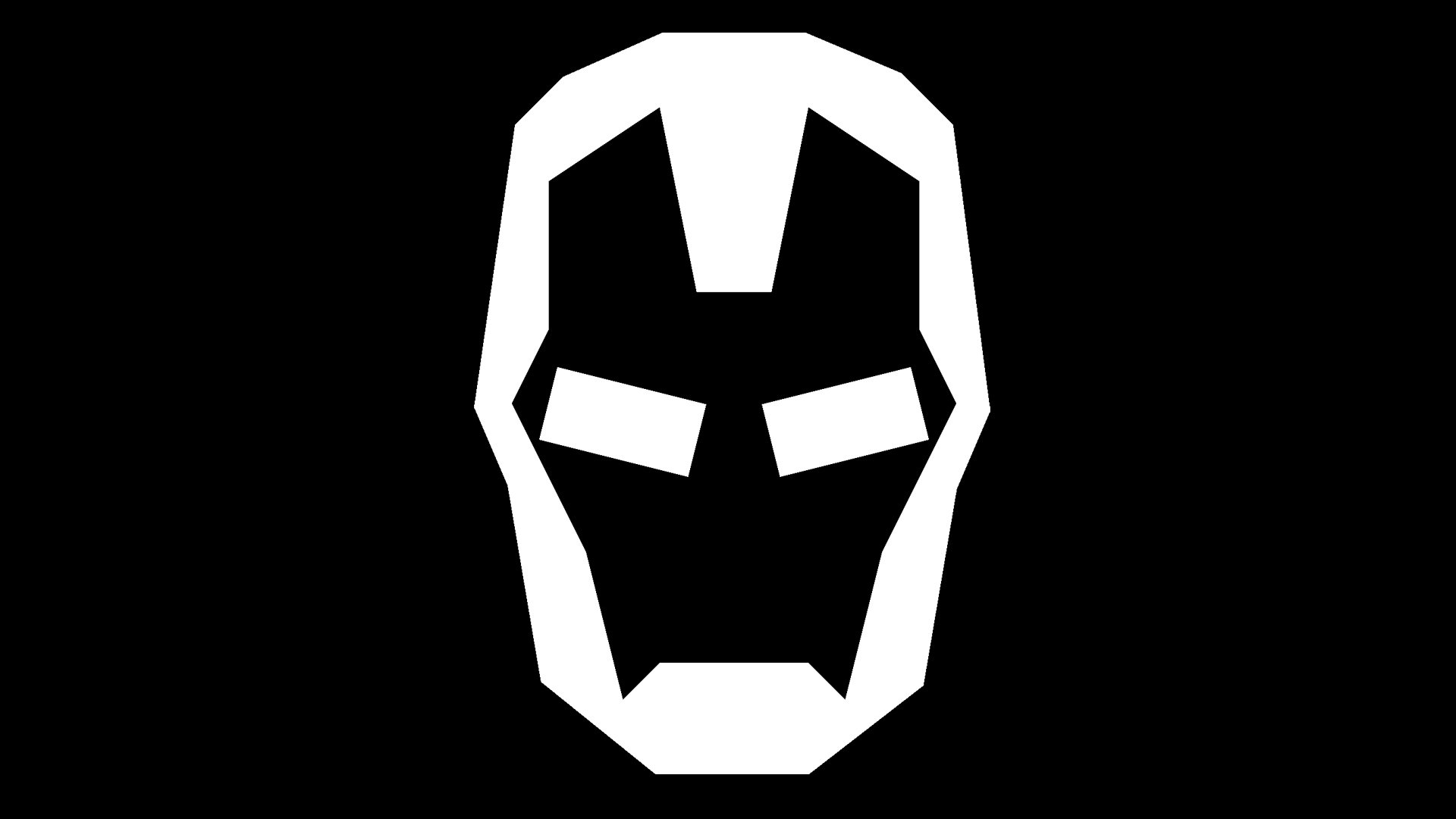
Alongside the Iron Man wordmark, we’ve also seen a few symbols emerge to accompany Iron Man’s identity. The most common version of the Iron Man emblem features a simplified version of the character’s helmet, depicted in white or black on a contrasting background.
The symbol references the character’s incredible engineering skills, which he used to create his phenomenal outfit.
Why is Iron Man red and yellow?
Although the exact origins of Iron Man’s outfit color choices are unknown, some experts say the colors yellow and red reference Tony Stark’s elementary school colors.
Why does Iron Man have a triangle on his chest?
The triangle shape on Iron Man’s chest is simply the arc reactor that powers his suit. Before Iron Man created the new version of this reactor for his later suits, the shape was a circle. There’s no specific information available about why the shape was changed.
Can I use the Iron Man logo?
The Disney company owns Iron Man, so you can’t use the symbol without permission in any artwork or business assets. However, you can find variations of the Iron Man logo for personal use here:
Marvel Iron Man logo symbol, fonts, and colors
The Iron man logo is an instantly recognizable image, whether you’re looking at the simplified version of the character’s helmet or his phenomenal variety of wordmarks. Notably, however, various depictions of this logo are available online in multiple colors.
What color is the Iron Man logo?
The Iron Man logo colors can vary depending on where they’re presented. Some people use the colors red, yellow, and white to recreate the simplified Iron Man symbol. However, it’s also possible to find this image in black and white, red and black, and various other shades.
What font does the Iron Man logo use?
The latest variations of the Iron Man logo font are usually depicted in a bold, sans-serif typeface. It’s similar in style to a sans serif font called “Stark” by Neale Davidson. Notably, this font is only available in all capital letters.
The bold and blocky nature of the font is an excellent reference to the confidence and strength of the character.
Looking at the Iron Man logo today
The Iron Man logo and wordmark are excellent insights into how the visual image of a character can evolve over the years. Iron Man’s visual identity is a fantastic insight into the character himself, featuring bold colors and confident font choices.
You can learn more about the visual assets used to represent some of the best-known superheroes in the comic book universe here on Fabrik’s blog.
Fabrik: A branding agency for our times.

Clarity starts with a conversation.
Thanks—we’ll get back to you shortly.
Whether you're navigating a rebrand, merger, or simply need a clearer identity—we’re here to help. No hard sell, just honest advice from people who know the sector.
Let’s start with a simple question…
Prefer to email? Drop us a line.
Fabrik’s been helping organisations rethink and reshape their brands for over 25 years. We’ve guided companies through mergers, rebrands and new launches. Whatever stage you’re at, we’ll meet you there.