The art of rebranding: The Elevance Health logo transformation

The Elevance Health logo might be one of the better-known emblems in the healthcare industry today, but the company’s visual identity has gone through a number of changes over the years. Looking back through Elevance Health logo history, we can see the company hasn’t just used a number of different logos, but a variety of brand names too.
Branding evolution is nothing new in the healthcare sector. Over the years, countless well-known medical brands have updated their image, personality, and messaging to attract and engage a wider audience.
Fortunately for Elevance Health, the rebrand has paid off, helping the organization to grow into one of the biggest health insurance providers in the US.
Today, we’re going to take a closer look at the history of the Elevance Health brand, and the numerous names, and logos it has used over the years. Let’s explore how the Elevance Health rebrand actually helped to drive the company to new heights.
Is Elevance the same as Anthem? An introduction
Before we break down the basics of Elevance Health logo history, let’s take a closer look at the origins and purpose of the company. Elevance Health is an American Health Insurance provider, known for offering a range of services.
The company delivers insurance for long-term care, disability, behavioral health, as well as dental, pharmaceutical, and medical cover.
Currently ranked as the largest for-profit managed healthcare business within the Blue Cross Blue Shield Association, the brand had more than 46.8 million members at the start of 2022. It also ranked as the 20th biggest company on the 2022 Fortune 500 list.
Initially, Elevance Health started life as “Anthem”, which was formed from the two companies: Mutual Hospital Insurance, and Mutual Medical Insurance Inc. By the 1970s, these companies held about 80% of the medical insurance market.
In 1985, the two companies eventually merged into the “Associated Insurance Companies” group, using the name “Anthem”.
It wasn’t until 2022 when Anthem announced it would be changing its name to “Elevance Health” following various mergers and acquisitions with other major insurance and medical companies. The new name aimed to highlight the company’s focus on innovation, vitality, and the future.
Elevance Health logo history: Evolving from the Anthem logo
While numerous logos have been associated with the company throughout the decades, a handful of emblems make up the core components of Elevance Health logo history. Let’s take a closer look at some of the major emblems worth exploring throughout the years.

Before Anthem Health: Wellpoint and Anthem Blue Cross, Blue Shield
Long before it officially became “Anthem Inc” in 2014, the Anthem company was already using its moniker. One of the first logos associated with the brand was produced in 1995, when the Anthem Blue Cross and Blue Shield business was introduced.
The emblem only stayed with the business for a year, before the “Associated Group” responsible for Anthem Insurance changed its name to the “Anthem Insurance Company” in 1996.
The original logo featured the name “Anthem” in serif letters, depicted in blue, above the words “BlueCross” and “BlueShield”, in black. Next to the wordmark was a blue and white cross, and a matching shield, featuring common symbols from the healthcare industry.

The Anthem brand as it came to be known in 2014 was also influenced by the WellPoint Health Network, the company that emerged from the Blue Cross of California.
In 2004, the Wellpoint Inc company was formed by the merger of WellPoint Health Networks, and the Anthem Insurance Company. The name “WellPoint” was retained for a number of years, until 2014, when the new “Anthem Inc” monitor was officially introduced.
The Wellpoint logo used during the years between 2004 and 2014 was a traditional emblem, featuring dark blue, serif letters, on a white background, with plenty of spacing between each character. Above the inscription were three curved red lines.
The color palette was highly patriotic, featuring all of the classic shades of the American flag.

2014: The Anthem logo
In 2014, WellPoint officially announced it would be changing its name to “Anthem Inc”, inspiring the creation of a new logo. This was already a relatively well-known title in the insurance industry at the time, thanks to the previous Anthem brand.
A new logo was introduced, which featured a lot of similar characteristics to the first Anthem logo, created in 1995.
The serif-style wordmark remained, in the same trustworthy shade of blue. However, the inscription was now much larger, with all additional decorative elements removed. The design was sleek and clean, ideal for a company in the medical sector.

2022: The Elevance Health logo
In 2022, Anthem announced yet another major rebrand, choosing the new name of “Elevance Health”, to symbolize innovation and transformation. The rebrand required the creation of a brand-new logo.
While elements of the previous design remained, such as the blue and white color palette, the design was significantly different.

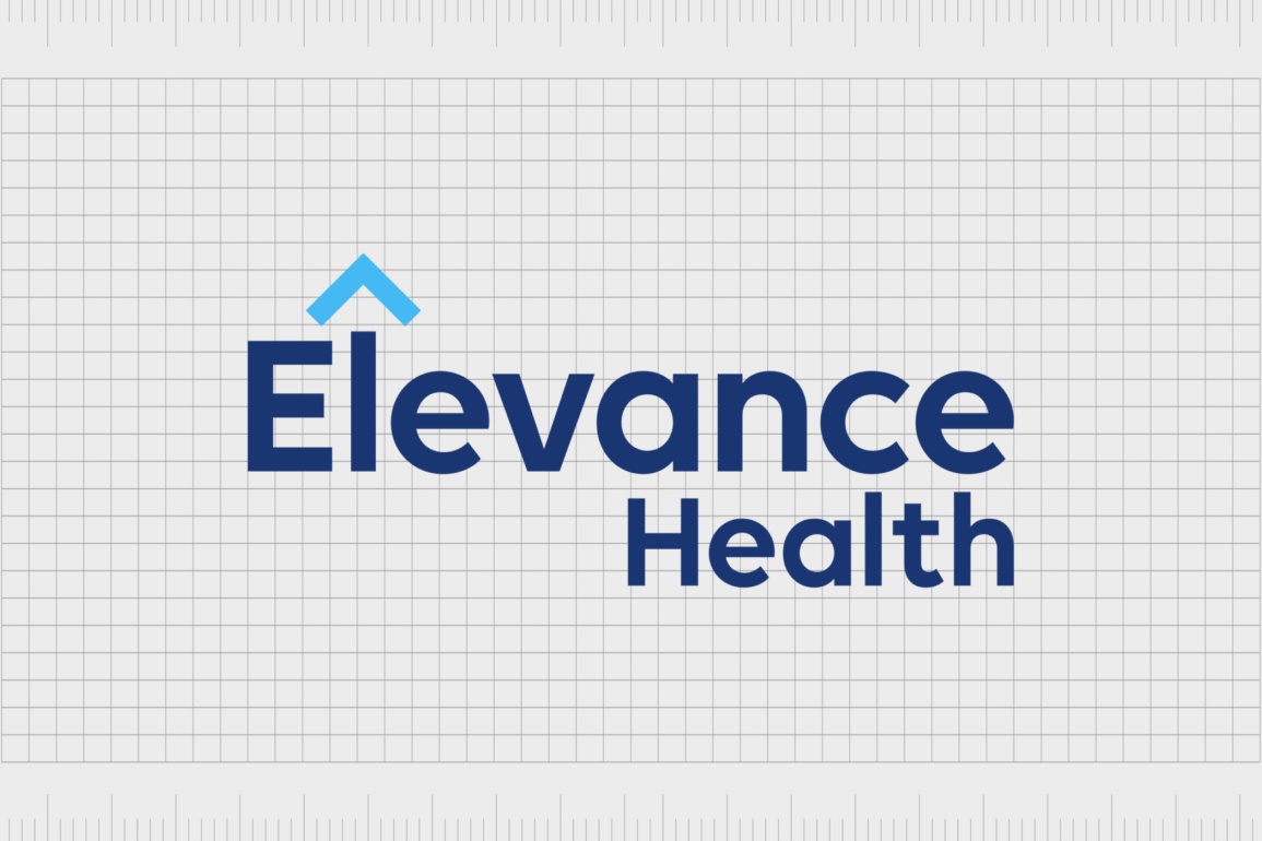
The serif style typeface was switched to a bold sans-serif font, with dark blue lettering placed against a white background. Above the “L” in Elevance, we see an arrow pointing upwards, in a lighter shade of blue, symbolizing forward momentum and movement.
To accompany their new full logo, Elevance Health also revealed a new icon, which combined the large letter “E” at the beginning of the wordmark, with the iconic arrow shape.
The Elevance Health logo: Colors and fonts
Sleek and modern, the current Elevance Health logo is a fantastic example of a powerful, contemporary wordmark. The blue color palette, commonly associated with concepts like reliability and trust in the world of color psychology, is an ideal choice for an insurance company.
The decision to switch from a serif to sans-serif font makes the brand seem more friendly and approachable.
Additionally, the arrow symbol, used in both the icon for the company, and the full logo, is more than just a simple geometric design. The arrow symbolizes progression, innovation, and transformation, all concepts enhanced by the unique name of the business.
You can see some excellent examples of the Elevance Health logo here:
What color is the Elevance Health logo?
Officially, the two primary Elevance Health logo colors are blue and white, with two different shades of blue used in the inscription, and the accompanying arrow. However, the company has also produced black and white, as well as greyscale versions of its emblems for different use cases.
The Elevance Health logo color palette clearly builds on the design choices of the previous logo used for the Anthem company.
Additionally, the colors blue and white are extremely common in the healthcare and insurance sector, as they’re frequently connected with concepts like trust, transparency, and credibility.
What font does the Elevance Health logo use?
While the color choices used in the new Elevance Health logo take inspiration from the previous Anthem emblem design, the font choice is very different. In the past, Anthem relied heavily on a strict, yet simple serif font, conveying concepts of authority and traditionalism.
However, during the rebrand, this typeface was updated to a sans-serif font.
The bold sans-serif font is a far more modern and legible option for the evolving brand. The typeface has a lot of similarities with many common geometric options, such as the Abside or Visby fonts. They inscription is simple, legible, and confident, drawing attention to the growth of the brand.
What is the Elevance Health symbol? The new icon
Throughout Elevance logo history, there have been a number of changes to not only the visual identity of the health insurance brand, but its name too.
While the Anthem logo was steeped in history when it was introduced in 2014, the new emblem moved away from this previous design, swapping a trustworthy serif font, for a more modern inscription.
The introduction of an updated color palette, with darker blue shades helped the company to retain some of its sophisticated aesthetic. Additionally, the use of an arrow shape within the logo gave more depth and meaning to the emblem, separating Elevance Health from its competitors.
Today, the new Elevance Health symbol showcases the modernity and innovation of the brand and it’s commitment to constantly moving the healthcare industry forward.
Fabrik: A branding agency for our times.
Clarity starts with a conversation.
Thanks—we’ll get back to you shortly.
Whether you're navigating a rebrand, merger, or simply need a clearer identity—we’re here to help. No hard sell, just honest advice from people who know the sector.
Let’s start with a simple question…
Prefer to email? Drop us a line.
Fabrik’s been helping organisations rethink and reshape their brands for over 25 years. We’ve guided companies through mergers, rebrands and new launches. Whatever stage you’re at, we’ll meet you there.


