


Domino’s logo history – The story of the Domino’s Pizza logo
How much do you know about Domino’s logo history? If you’re a pizza fan, there’s a good chance you’re familiar with this iconic symbol. However, plenty of people still don’t know much about its origins or why dominos would be associated with pizza in the first place.
Today, Domino’s is one of the biggest pizza restaurant chains in the world, with one of the most memorable and recognizable pizza logos around. Across the globe, the blue and red domino emblem has become an unforgettable part of the fast-food landscape.
If you’ve ever wondered where the Domino’s logo began or why it looks the way it does today, you’re in the right place. Today, we will discuss everything you need to know about the famous Domino’s symbol.
The origins of the Domino’s symbol: Introducing Domino’s
Domino’s Pizza, trading simply as Domino’s, is a popular pizza restaurant, founded in 1960. The company had approximately 15,000 stores as of 2018 and is one of the largest Pizza companies in the world. Within the US, it’s ranked among the top 3 biggest pizza brands in terms of sales.
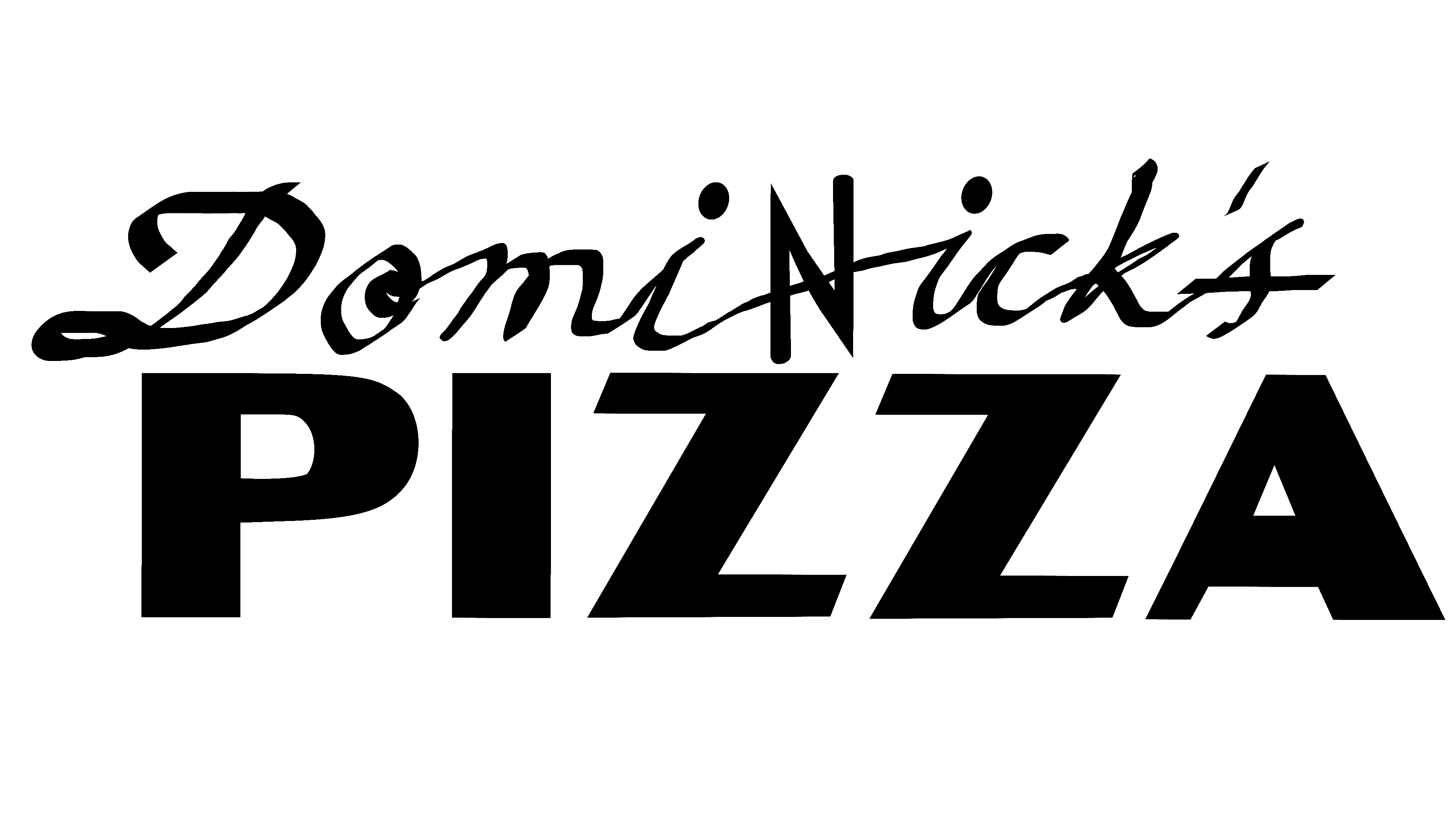
The Domino’s Pizza company’s origins and logo began in 1960. A man named Tom Monaghan joined forces with his brother James to purchase a small pizzeria named “DomiNick’s.”
By 1965, the pair had already purchased another two pizzerias, which they wanted to share the same consistent branding. However, the name DomiNick was already taken.
Eventually, an employee named Jim Kennedy suggested using the name “Domino’s.” Monaghan loved the idea and officially renamed the three locations. The company logo created to accompany the new name featured three dots representing the three stores.
Though there was a plan to add a new dot with every store, this idea was quickly scrapped as the franchise grew.
Domino’s logo history: When did Domino’s change its logo?
The Domino’s Pizza logo has undergone several changes over the years. However, certain design aspects have remained relatively consistent since the company chose its new name. Let’s take a closer look at Domino’s logo history.
When the brothers behind Domino’s first purchased their original store, they maintained the branding for a short time. The logo for DomiNick’s Pizzeria was a dual-level wordmark with two different font styles.
The top part of the design looked like it was written by hand, while the “Pizza” element was depicted in a bold, sans-serif font with wide letters.
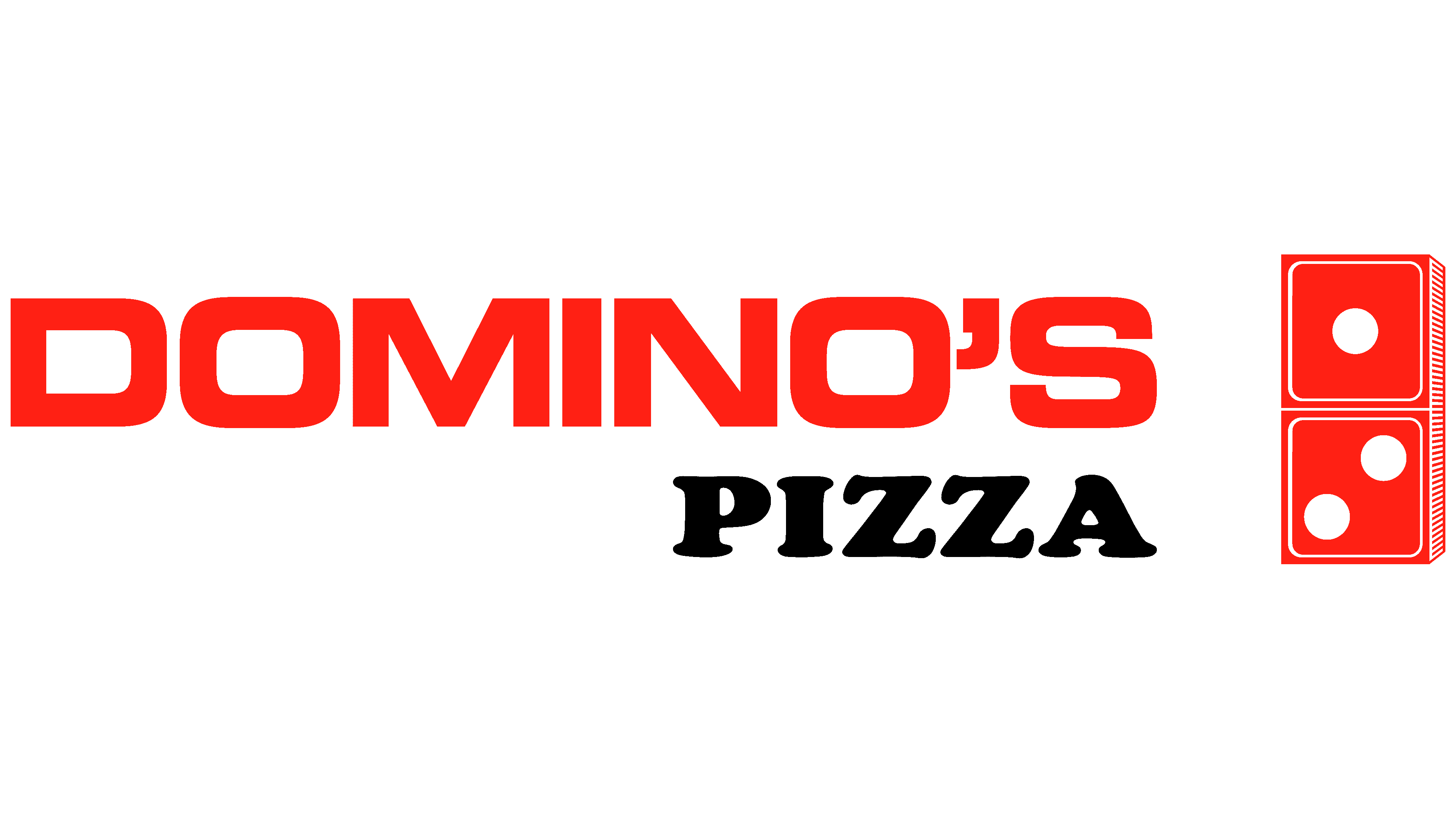
After choosing a new name for their growing pizza franchise, Domino’s introduced a new logo with an image to represent the moniker.
The company’s name was depicted in two levels again, with Domino’s on the top in bold, all-caps red font. The “Pizza” element was placed below in stylish serif typography, again in all uppercase.
A 3-dimensional red domino was placed alongside the wordmark on the right-hand side, with three white dots representing the company’s three locations.
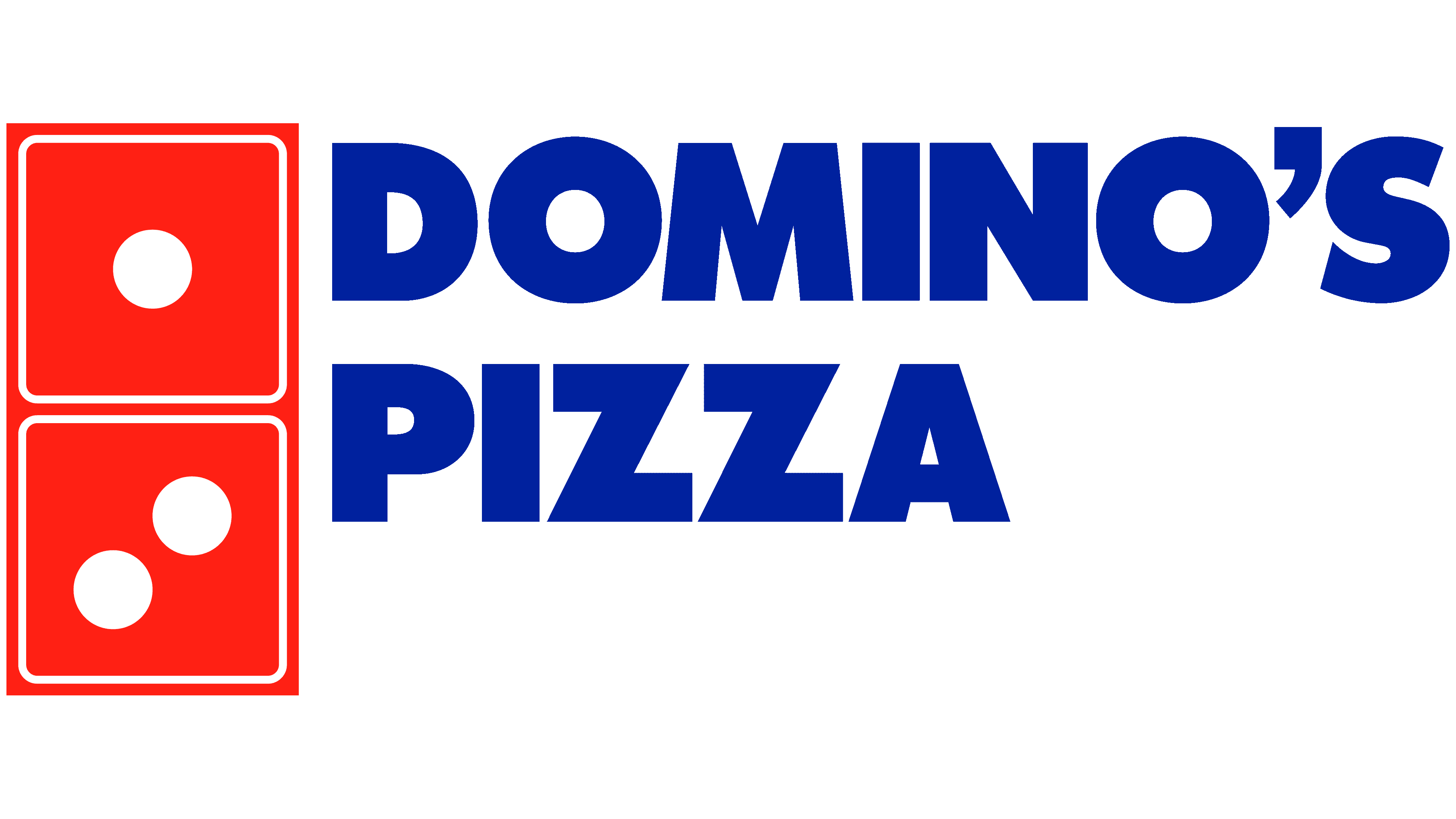
In the late 1960s, Domino’s updated its visual identity with new colors and more streamlined elements. The design became more streamlined and even. The lettering was moved to the right side of the symbol and was depicted in the same font.
The name still occupied two levels but appeared more modern and compact.
The domino emblem included in the design was still present, but this time it was two-dimensional. The colors also appeared a little more vibrant.
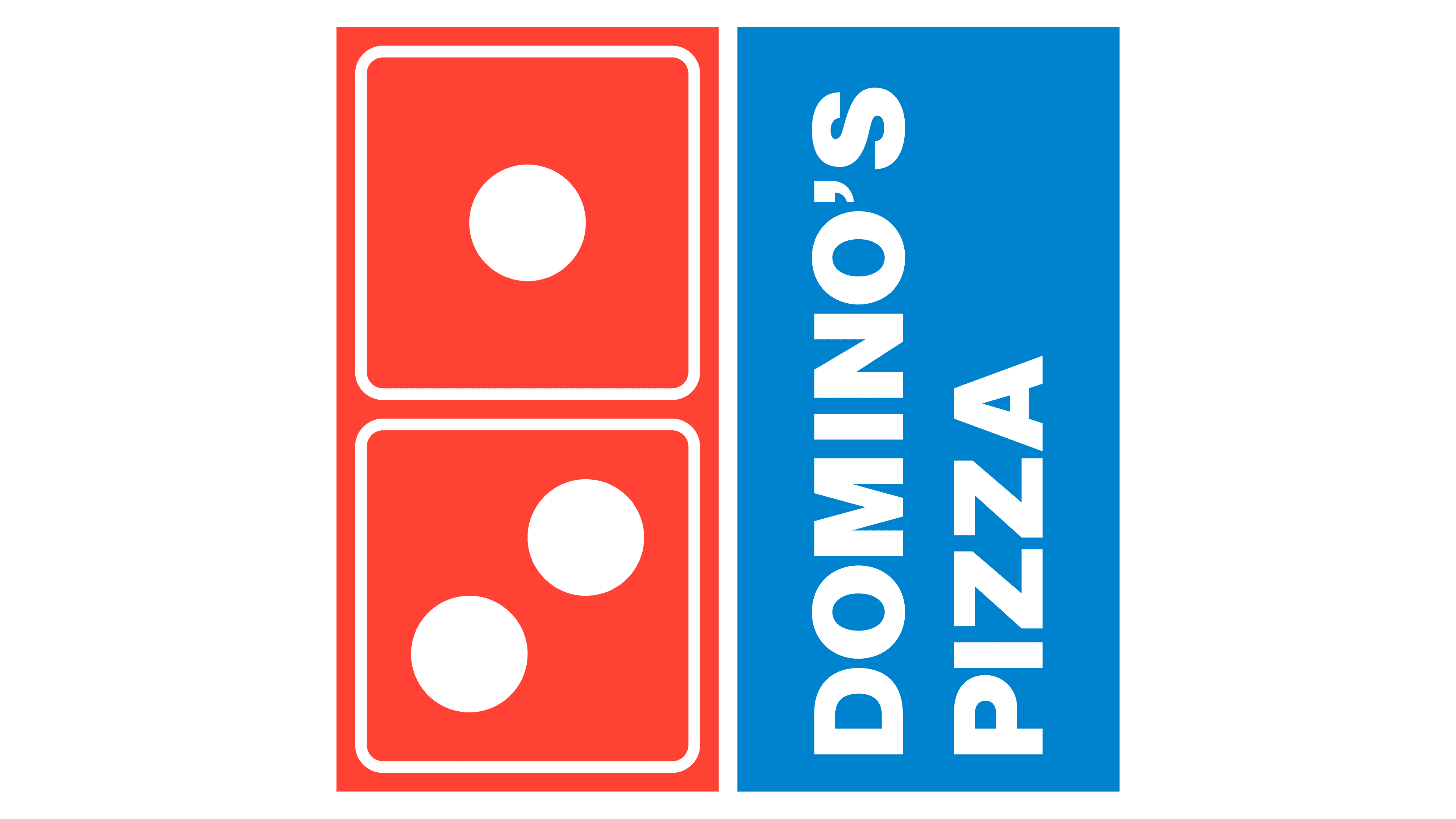
In 1975, the logo evolved again, placing the company’s name in a blue box, written in white font, alongside the domino shape. The wordmark was rotated to make the overall image into a square shape, similar to that of a pizza box.
The blue coloring was altered slightly to a brighter, softer shade, reducing the contrast between the two elements.
In 1996, Domino’s refined the logo again, tilting the box shape slightly on its side to make the wordmark more legible. The lettering in the wordmark was adjusted, so only the P and D were in uppercase. The corners of the square were rounded to make them appear softer and friendlier.
While the shape of the overall logo may still have reminded customers of pizza boxes at this time, it was also meant to look a little like a diamond to represent quality.
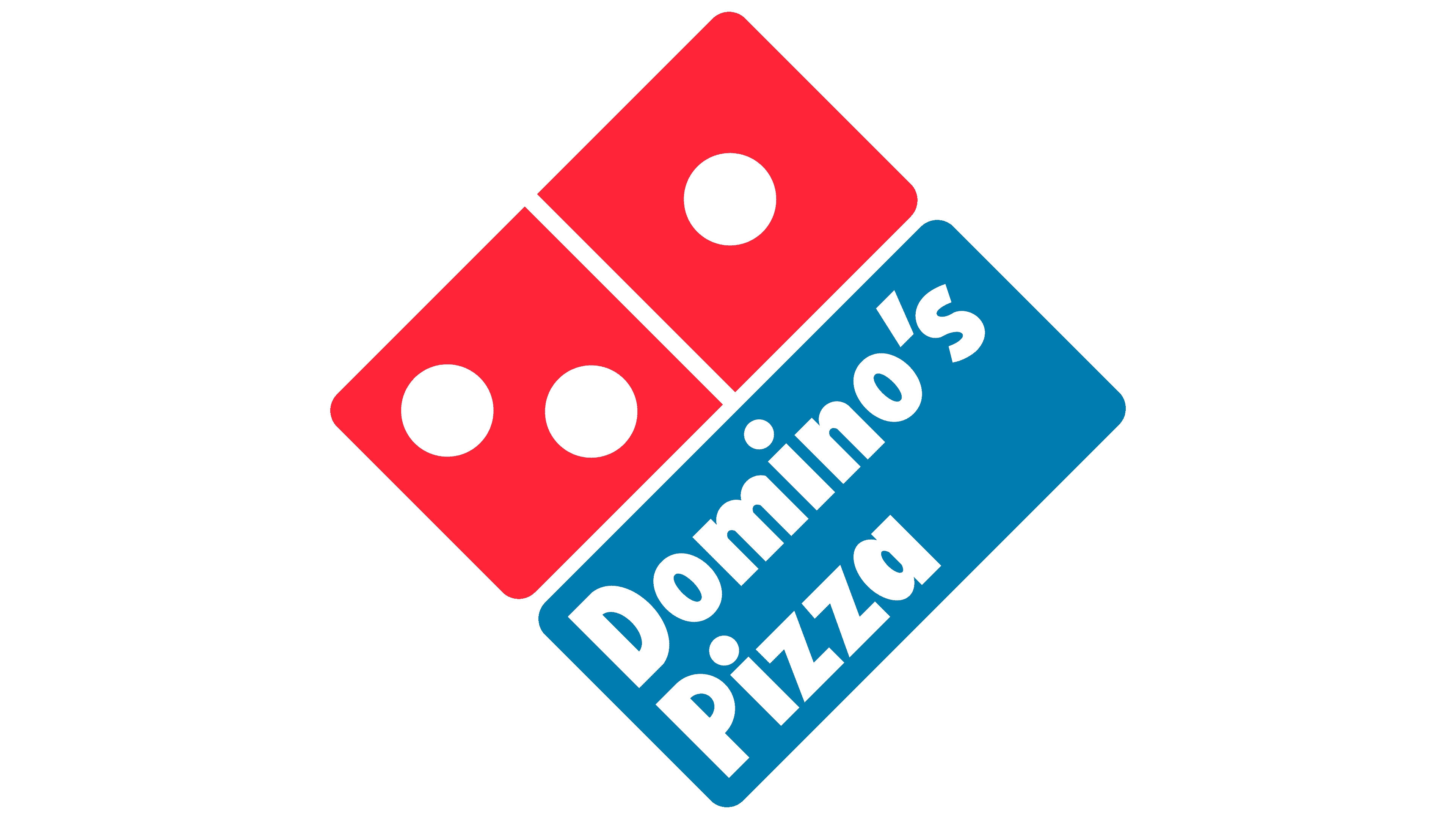
The most recent version of Domino’s logo was introduced in 2012 as part of a global rebranding strategy. The “Pizza” aspect was removed from the name entirely to allow for a more streamlined image.
Domino’s leaders also believed it was unnecessary to include “Pizza” in the name, as the company had begun offering other types of food.
One of the components of the domino in this logo was switched from red to blue to create a unique contrast. In some cases, this logo can also appear without the wordmark, showing just the domino symbol on its own.
Why are three dots in Domino’s logo?
While numerous questions have emerged about Domino’s logo choices over the years, perhaps the most common revolves around the use of three dots. After all, dominos can have a wider range of different dot combinations. The simple answer is it’s a reference to the brand’s history.
When the Domino’s team chose their new name, they wanted to use a domino in their branding to improve recognition and awareness. Using three dots in the symbol allowed them to draw attention to the company’s three locations at the time.
While there was some talk about adding new dots when new locations were opened, the company evolved too rapidly to make this idea feasible.
Why is Domino’s logo red and blue? Domino’s logo colors and fonts
The Domino’s logo today is a modern, simple, and compelling emblem with a huge impact on the fast-food market. Even without the wordmark, the design of the domino instantly reminds customers of the company they’re dealing with.
Even Domino’s packing features aspects of the logo design today, with pizzas boxed in red and blue containers.
The two colors in Domino’s logo form a bright contrast. They’re catchy and memorable, and easy to see from any distance. Red is commonly associated with pizza sauce and heat. It also stimulates the appetite as a color and is frequently linked to concepts like power and passion.
Blue, on the other hand, represents strength and reliability.
If you’d like to explore the Domino’s logo in closer detail, you can find some useful resources here:
What color is the Domino’s logo?
While the Domino’s logo color palette has undergone several changes over the years, the colors blue and red have been a consistent part of the brand’s identity. Today, Domino’s logo colors consist of a light shade of blue and a bright red tone.
There are also white components in the dots within the domino emblem.
Red:
Hex: #E31837
RGB: (227, 24, 55)
CMYK: (5, 100, 83, 1)
Pantone: PMS 199 C
Blue:
Hex: #006491
RGB: (0, 100, 145)
CMYK: (93, 58, 23, 4)
Pantone: PMS 647 C
What font does the Domino’s logo use?
Over the years, several typefaces have been used for the Domino’s logo font. The most recent version of the emblem includes a Futura-style font designed by Paul Renner. The simple, modern, and sans-serif font makes the company appear friendly and approachable.
What does the Domino’s symbol mean?
Exploring Domino’s logo history offers a unique insight into the brand’s evolution. The logo we know today is an evolution of the original visual identity chosen for the company when it first selected its new title.
The name “Domino” inspired the company to use an emblem featuring a domino, with three white dots to represent the three locations it initially held.
The logo’s white, red, and blue symbolize virtue, strength, passion, and reliability. They’re bright, well-balanced, and easily approachable. The simple geometry in the logo also ensures it’s easy to remember and timelessly modern.
Fabrik: A branding agency for our times.

Clarity starts with a conversation.
Thanks—we’ll get back to you shortly.
Whether you're navigating a rebrand, merger, or simply need a clearer identity—we’re here to help. No hard sell, just honest advice from people who know the sector.
Let’s start with a simple question…
Prefer to email? Drop us a line.
Fabrik’s been helping organisations rethink and reshape their brands for over 25 years. We’ve guided companies through mergers, rebrands and new launches. Whatever stage you’re at, we’ll meet you there.