


Dallas Cowboys logo history: A symbol of pride for fans everywhere
For sports fans, the Dallas Cowboys logo is likely one of the most iconic emblems in the world. Though relatively simple compared to other athletic logo designs, this symbol has captured the hearts and minds of supporters worldwide.
But where did Dallas Cowboy’s logo history begin, and has the emblem changed over the decades?
Most people are familiar with the simple five-pointed blue star representing the Dallas Cowboys. Though the team has used several alternate logos to celebrate events and anniversaries, the star has long been a part of the group’s visual identity.
A symbol of excellence, hope, and reliability, the blue star logo of the Dallas Cowboys has become a source of pride for countless supporters.
Today, we will be taking a closer look at the history of this iconic emblem and how it has evolved over the years.
Introducing the Dallas Cowboys
Before we dive into our exploration of the Dallas Cowboys logo history, let’s introduce this iconic team. The Dallas Cowboys, otherwise referred to as just the “Cowboys,” are an American football team based within the Dallas, Fort Worth area.
They compete in the National Football League as a member of the East Division of the National Football Conference.
The Cowboys originally joined the NFL as an expansion team during the 1960s. Instantly a national success, the team attracted significant attention from football fans. In fact, they sold out more than 190 games in a row, starting in 2002.
The franchise has made it into the Super Bowl event eight times in totals, tying with the Denver Broncos and Pittsburgh Steelers for the second-most appearances in the Super Bowl landscape.
Overall, the Cowboys have won 8 championships within the NFC, the most in the conference’s history. They’re also the only NFL team to achieve 20 straight winning seasons, during which time they only missed the playoffs twice.
Additionally, in 2015, the Cowboys became the first sports team to be valued at a massive $4 billion, making them the globe’s most valuable team.
Dallas Cowboys logo history: The iconic emblem
Though the Dallas Cowboys have created and used a variety of temporary alternative logos over the years, the group has retained a consistent visual identity. Perhaps the most significant aspect of the group’s logo is the blue, five-pointed star, which has remained with the team since its inception.
However, there have been some slight changes to the Dallas Cowboys logo over the years. Let’s dive into history.
The original version of the Dallas Cowboys logo is very similar to the emblem we know today. The design featured a simplistic five-pointed star, depicted in the Cowboy’s color of dark navy blue. The star was a symbol of excellence and achievement for the team.
However, it was also a reference to the “lone star” state of Texas, where the Dallas Cowboys hailed from.
A few years later, in 1964, the Dallas Cowboys updated its logo to make the emblem a little more unique and memorable. Building on the original five-pointed star, the group added a double outline in white and a matching shade of Navy blue. This gave the design a sense of dynamism.
The modification was created by Jack Escridge and was intended to give the overall design a slightly more 3-dimensional appearance.
The Dallas Cowboys wordmark
While the primary Dallas Cowboys logo is simply the five-pointed star, the group does have its own wordmark too, which appears on some branded merchandise and apparel. The Cowboy’s wordmark features the same coloring as the star emblem, a dark navy blue.
The inscription is depicted in a blocky, serif-style font, often associated with the Old West and Texas in general. The characters feature bold serifs combined with simple curves.
Has the Cowboys logo ever changed?
The only major change to happen to the Dallas Cowboy’s official logo over the years happened in 1964 when the group added the distinctive outlines to its five-pointed star. However, there have been some alterations to the group’s visual identity throughout the years.
In different stages of the Dallas Cowboy’s history, the team has introduced new logos to represent different things.
One logo included two white stars inside of a blue circle, intended to represent Texas pride. Another emblem featured three interlocking circles in different colors to symbolize strength, speed, and stability.
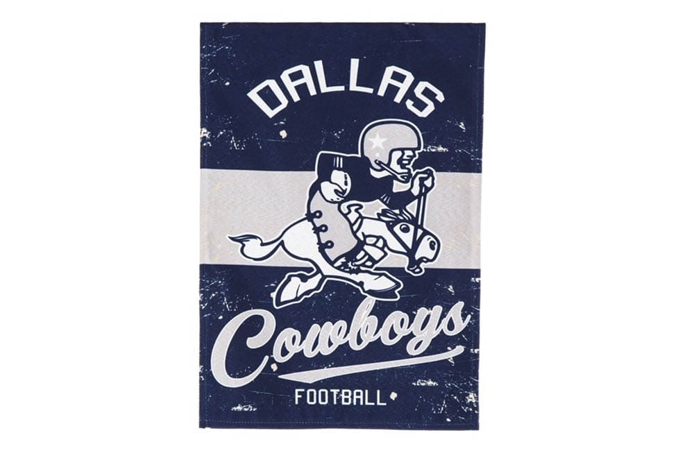
During the 1960s, the Dallas Cowboys introduced a version of their logo that depicted a polo player, on top of a horse, with a football in his arm. The character was created in the colors blue and white associated with the brand and had a helmet featuring the five-point star.
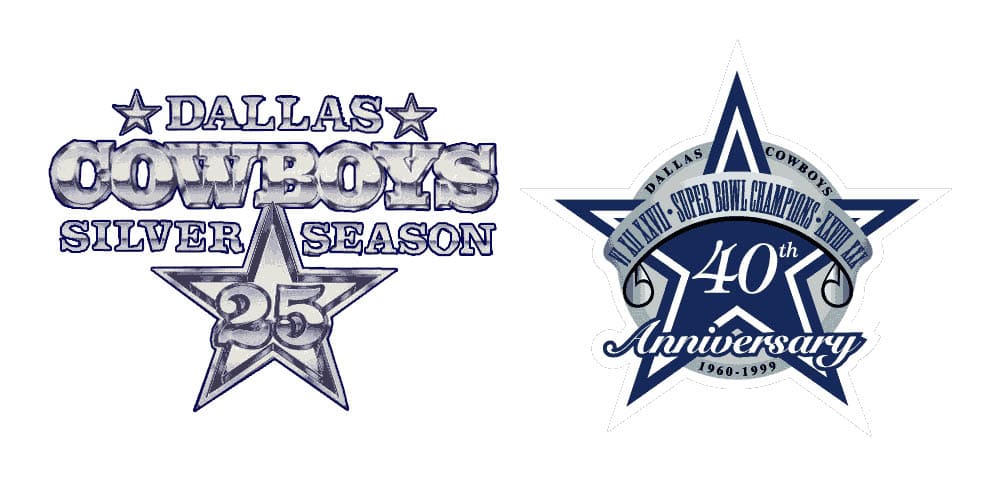
The team has also produced different logos for anniversary seasons. During the team’s 25th anniversary, a compelling logo was created for the Dallas Cowboy’s Silver Season, featuring a three-level wordmark and a silver star with the number “25” written on it.
For the team’s 40th anniversary, a similar emblem was created based on the official logo of the Dallas Cowboys. It included a banner over the top of the image, as well as the words “40th Anniversary”. The founding date of the team was added to a silver circle behind the star.
The Dallas Cowboys logo: Fonts and colors
The consistency of the Dallas Cowboys logo over the years is part of what gives the symbol its phenomenal strength.
Even when the team decided to make a slight change to its visual appearance, it maintained its core color palette and the iconic five-pointed star shape. This has helped the group to become a recognizable identity for fans all over the globe.
Today, the Dallas Cowboys logo is a symbol of strength, ambition, and excellence. It’s something people can easily associate with the lone star state of Dallas. It also highlights the group’s focus on reliability and trustworthiness with a deep blue color palette.
You can find some useful assets connected to the Dallas Cowboy logo here:
What color is the Dallas Cowboys logo?
The Dallas Cowboys logo color palette has remained consistent since its inception.
Even in anniversary and temporary logos, the team continues to use the core color of Navy blue in most of its branding assets. The Dallas Cowboys logo colors are generally white and blue, but the Navy blue shade is the color most associated with the brand.
HEX COLOR: #003594
RGB: (0, 53, 148)
CMYK: (100, 64, 0, 42)
PANTONE: PMS 661 C
What font does the Dallas Cowboys logo use?
For the most part, the Dallas Cowboys logo features only the five-pointed star.
However, there are instances wherein the wordmark for the team might appear too. This font choice is similar to a typeface called Cowboys by Sharkshock, which you can find online. The script logotype features bold serifs and deep curves, as well as relatively blocky characters.
Why do the Dallas Cowboys have a star as their logo?
Looking back at Dallas Cowboys logo history, we can see the team has made very few changes to its visual identity. The consistency of the Dallas Cowboys logo is one of the core reasons the emblem has become so well known and respected over the years.
The single five-pointed star is a powerful symbol for the brand, highlighting ideas of integrity, excellence, and ambition. It’s also closely connected with the lone star state of Texas, where the Dallas Cowboys come from.
Fabrik: A branding agency for our times.

Clarity starts with a conversation.
Thanks—we’ll get back to you shortly.
Whether you're navigating a rebrand, merger, or simply need a clearer identity—we’re here to help. No hard sell, just honest advice from people who know the sector.
Let’s start with a simple question…
Prefer to email? Drop us a line.
Fabrik’s been helping organisations rethink and reshape their brands for over 25 years. We’ve guided companies through mergers, rebrands and new launches. Whatever stage you’re at, we’ll meet you there.