NFL logo history: From Leatherheads to Super Bowls

The NFL logo isn’t just one of the most iconic emblems in the sporting industry; it’s also one of the better-known symbols in the world. Even if you don’t follow the American football league, the chances are you’ve seen this iconic logo at some point.
A symbol of hope, patriotism, and achievement, the NFL logo was designed to highlight the players’ incredible accomplishments and inspire fans.
Like many iconic company logos with stars, the NFL logo uses globally recognizable imagery to connect with its audience on a deeper level. Even as the group’s emblem has changed over the years, it has never lost its impact.
Of course, even if you’re familiar with the NFL logo today, you may not know much about where this amazing design began. Today, we will be taking a closer look at NFL logo history, exploring the tweaks and changes made to the design over the decades.
Introducing the National Football League logo
Before we begin our exploration of NFL logo history, let’s start with an introduction to the National Football League and the impact it has had on the athletic landscape. The NFL is perhaps the most iconic professional American football league.
It consists of 32 teams, divided between the National Football Conference (NFC) and the American Football Conference (AFC).
Considered the most important league of professional American football in the world, the NFL captures the attention of countless consumers across the globe. Originally, the group was founded in 1920 as the American Professional Football Association.
However, it quickly updated its name to the “NFL” in 1922.
Initially, the association determined champions for matches via end-of-season standings.
However, in 1933, a system was implemented that culminated with the NFL championship games until 1966. After the NFL and the American Football League (AFL) merged, the Super Bowl was created in 1967 to choose a champion from the best teams between the two leagues.
Today, the NFL is the wealthiest sports league worldwide by revenue, and it’s also the sports league with the most valuable teams in the industry. What’s more, the NFL boasts the highest average attendance for its games of any professional sports league in the world.
NFL logo history: The evolution over the years
As the world’s most famous football league and perhaps the most reputable athletic organization of all time, the NFL has evolved beyond the borders of the American landscape. Today, people all over the globe gather to watch the Super Bowl each year, as well as countless other games.
Let’s take a look at where the iconic NFL logo began.

NFL logo history began in 1922, with the choice to rename the American Professional Football Association to the National Football League. The simplistic logo chosen for the group featured a shield-style emblem designed in the colors of the American flag.
Inside the shield, we can see the upper portion depicted in blue, with the letters “NFL” written in gold. Underneath this, the shield is divided into a series of white and red stripes.

During the 1940s, the NFL updated its logo, making it more refined and professional, to represent its growing presence in the market. The shield-style shape remained, though it featured more significant points and contours.
The colors were also updated, with the red stripes now presented as pink pillars with a red outline.
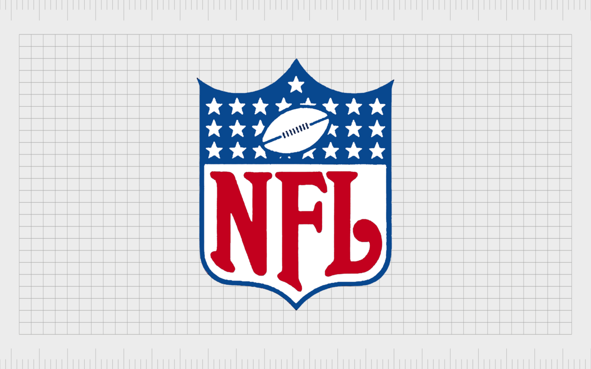
The “NFL” monogram was placed at the bottom of the shield, in large, decorative red characters, while the upper portion of the shield showcased a series of white stars on a blue background. The group also added a simplistic image of an American football to the design.

In 1953, the NFL team made a few changes to its logo, switching the pink stripes back to red in the shield and updating the monogram to a burgundy color. The color palette of American football was also updated to make it more realistic.
This logo featured clean contours with no outlines around the shield design. It also maintained the decorative font choice.

In 1959, the NFL redesigned its logo with a modified version of the previous crest. The positioning of the monogram letters was changed slightly to create a better sense of balance. The red stripes in the bottom portion of the emblem were also made a lot thinner.
In this design, the NFL wordmark was updated to a red color, matching the shade of the stripes on the shield. The colors of the football were also changed to red and white.

Taking a slightly simpler approach to logo design in 1962, the NFL updated its emblem by removing the stripes in the bottom half of the shield entirely. The NFL monogram, refined again to allow for a more decorative appearance, now consumed the majority of the design.
Once again, the color palette for the football in the top portion of the logo was changed, this time to white and blue.

The NFL made a few simple changes to its logo in 1983, thickening the blue border around the shield and brightening the color of the NFL monogram. The whole emblem was also made slightly wider, giving it a stronger stance and a more confident appearance.

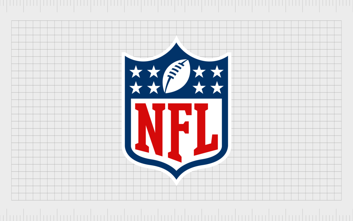
In 2008, the NFL moved away from its decorative script font for the first time, switching to a simple yet authoritative serif font. The coloring of the letters was darkened slightly, though they still retained the same hue. The emblem was once again widened and made a little shorter to improve balance.
The design of the upper portion of the logo was also changed slightly, featuring fewer white stars, and a larger white football, with blue accents. The ball was placed at a slight angle.
The NFL logo: Fonts and colors
The NFL logo is easily one of the most recognizable emblems in the world today for sports fans and American patriots alike. Brimming with national pride, this simple but eye-catching logo has evolved over the years, becoming increasingly more powerful and refined.
Today, the National Football League logo is a symbol of strength and excellence. Not only do the colors in the emblem represent the American flag, but they also convey ideas of passion, reliability, strength, and courage.
You can find some great resources to help you explore the NFL logo here:
What color is the NFL logo?
The colors of the NFL logo are based on the American flag. They have always consisted of a combination of red, white, and blue. However, the exact shades in the NFL logo color palette have changed slightly over the years.
The current shades of red and blue are a little darker than in previous designs today, but they help to convey the strength and professionalism of the group.
Dark Midnight Blue
Hex: #013369
RGB: (1, 51, 105)
CMYK: 0.990, 0.514, 0, 0.588
Rosso Corsa
Hex: #D50A0A
RGB: (213, 10, 10)
CMYK: 0, 0.953, 0.953, 0.164
What font does the NFL logo use?
For a long time, the NFL group used a decorative script-style typeface for its logo. However, the most recent version of the emblem opted for a more refined serif-style typeface instead. Today, the NFL logo font is unique to the group, and each uppercase letter has a different height.
The official logotype is known as the “NFL font” However, the design is similar to various other typefaces, such as the Freshman font.
The unforgettable NFL logo
Today, the NFL logo symbolizes excellence, sporting professionalism, and quality. The stars in the emblem reflect not just the American flag but also the ambition and accomplishments of the teams within the National Football League’s roster.
The red and blue colors, combined with the iconic shade of white in the NFL logo, symbolize passion, quality, and reliability.
Both a symbol of patriotism and national pride and an emblem of inspiration for all who see it, the NFL logo is one of the most powerful emblems in the world today.
NFL logo FAQ
Why did NFL change its logo?
The NFL changed its logo numerous times to make its image more modern and refined for a younger audience. At the same time, the NFL also made specific changes to aspects of its logo for certain reasons.
The ball was redesigned to look similar to the one on top of the Vince Lombardi trophy. The eight stars in the emblem represent the eight divisions in the NFL.
Is NFL only American?
Although the teams playing in the National Football League all come from American states, the NFL is enjoyed by people all over the globe. Today, the NFL has a strong presence in countries worldwide, including Europe.
Is the NFL logo a shield?
While aspects of the NFL logo have changed over the years, the group has always used a shield-style emblem in its visual identity. The shield is commonly seen as a symbol of authority and excellence and aligns well with the group’s values.
Fabrik: A branding agency for our times.
Clarity starts with a conversation.
Thanks—we’ll get back to you shortly.
Whether you're navigating a rebrand, merger, or simply need a clearer identity—we’re here to help. No hard sell, just honest advice from people who know the sector.
Let’s start with a simple question…
Prefer to email? Drop us a line.
Fabrik’s been helping organisations rethink and reshape their brands for over 25 years. We’ve guided companies through mergers, rebrands and new launches. Whatever stage you’re at, we’ll meet you there.


