Manchester City logo history and Man City badge evolution

If you’re familiar with the UK football league, you’re also familiar with the Manchester City logo. The Man City logo represents one of Britain’s most popular football teams, founded more than 100 years ago in 1880.
Throughout Man City history, the emblem of the sporting team has evolved to suit the trends of the current landscape. However, even with multiple changes, the Manchester City badge has continued to capture the hearts and minds of fans across the globe.
Today, we’ll take a deep dive into Manchester City logo history, exploring where the first design originally came from and how the symbol has changed over the years.
Manchester City history: The Man City symbol
Man City history goes back a lot further than most people realize. The first ever Man City badge, and the Manchester City Football club itself, was established in 1880, over 142 years ago at the time of writing.
Despite being founded in one of the poorest districts of Manchester (West Gorten), the Man City club has evolved to become one of the most popular teams in the Premier League.
Officially, Manchester City entered the Football League for the first time in 1982, winning their first FA Cup shortly after in 1904. Throughout the 1960s, the club also had a long-standing period of success, winning the European Cup, League Cup, and FA Cup, all in quick succession.
Like most football teams over the years, Man City has had its fair share of ups and downs. The group lost the 1981 Cup Final and went through a period of decline, taking it all the way to the third tier of British football for the only time in its lifespan.
Since then, the group has regained promotion back into the top tier and once again competing alongside the greats.
Manchester City logo history: The Man City emblem
The start of Man City logo history began with the introduction of a simple black and white design in 1880, established even before the team took on their official home colours of white and sky blue.
The old Man City logos didn’t even feature the club’s new name. Instead, they used the title “St Mark’s Football Club.”
1880

The original badge used by the Manchester City team was as simple as they come. It featured a white cross shape, in a black background. While the standard cross is a traditional symbol for Christianity, representing salvation and sacrifice, it has appeared in many forms over the years.
The cross Pattee used in the Man City logo has Greek origins, and was very popular during the Victorian era. In fact, it was regularly used to represent knightly virtues such as bravery, honour, and loyalty. This cross was based on some of the decoration used for the St Mark’s church, an important icon to the group when it was still operating as the “St Mark’s Football Club”.
The symbol demonstrates a strong connection between the original football club, and the church. Although it was replaced in later years, it offers an insight into the birthplace of the team.
1894

The first Manchester City badge designed for the newly named Man City FC club was far more detailed than the previous iteration. This image featured an impressive coat of arms based on the City of Manchester’s official coat of arms.
The group used the design for a significant amount of time up until the 2000s. The coat of arms featured an orange shield with three yellow lines. The top of the shield showed a ship, taken from Manchester’s coat of arms, placed on a blue and white background.
The shield emblem is surrounded by animals, including a powerful horse and a golden lion. There’s certainly a lot going on in this image, which may be why the group decided to change to something more straightforward in the long term.
1960s

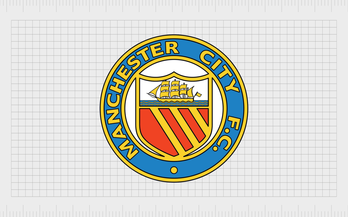
Though the coat of arms emblem was still in use during the 1960s, Man City also introduced a slightly simpler variation for use on branding and uniforms.
This image is a little closer to the design we know today, featuring the orange and yellow shield on a white circular background, with a light blue border. Within the blue border was the name of the club, written in bright yellow.

During the 1970s, this Man City emblem variation was updated slightly to adhere to a different colour palette. The patterns were refined, and the lettering spacing was updated to create a more balanced image.
1972

In 1972, a new version of the simplified shield logo appeared, replacing the bottom of the shield with the red rose of Lancashire. The emblem’s colouring changed again, placing the shield on a light blue background with bold black letters on the white border.

During the 1980s and 90s, the tones of the logo were enriched and updated. The shield gained new gradient white and blue shades, adding depth and volume to the emblem. The background of the circle was also made significantly brighter.
1997

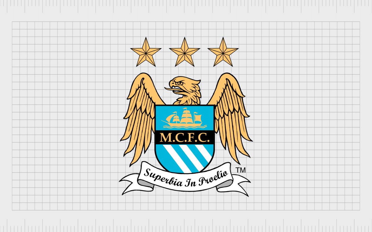
In the late 1990s, Man City updated its traditional coat of arms logo, going for a robust and eye-catching new design with a golden eagle and the team’s primary colours of sky blue and white.
This version of the logo once again introduced the shield with the three coloured stripes, but this time the tones were in the new team colours.
In this image, the team used a series of three five-pointed stars in gold to represent the winnings and trophies of the team. A Latin club motto also appeared underneath the shield in a standard script-style banner. The motto translated to “pride in battle.”
2016

Today, the current Man City logo is a simple and engaging version of the group’s badge-style symbols. This design builds on the previous Man City emblems, returning the rounded badge and red rose back into the mix.
The boat is still a significant component within the image, and the date “1894” also appears on the design.
The design uses the official colours of the Man City team as its primary tones, including white and sky blue. However, shades of gold and red are also evident, alongside a deeper dark blue.
The Man City badge today: colours and fonts
Though the exact elements of the Manchester City logos evolved throughout the years, the purpose has always been to draw attention to the heritage of Manchester and its history in the United Kingdom.
The image we see today features the red rose of Lancashire, as well as a shield based on the original coat of arms for Manchester City.
The accompanying elements of the logo, such as the bold lines and simple sans-serif font, create a highly modern and appealing image that works well alongside other designs in the British football industry.
Here are some valuable resources if you’re interested in the Man City badge:
What font does the Manchester City logo use?
The Manchester City logo font is a simple sans-serif typeface explicitly chosen for the football club. This design looks very similar to a range of modern fonts, including Calibri. The minimalistic and easy-to-read typeface choice is excellent for a badge in various formats.
What colour is the Manchester City logo?
The official Manchester City logo colour palette has changed a few times over the years. Today, it focuses heavily on the team’s home colours of sky blue and white.
There are also a handful of other shades in the Manchester City logo colours, like deep red for the rose and a golden colour for the ship in the shield.
Sky blue:
Hex: #6CABDD
RGB: 108, 171, 221
PANTONE: PMS 292 C
Blue:
Hex: #1C2C5B
RGB: 28, 44, 91
PANTONE: PMS 281 C
Gold:
Hex: #FFC659
RGB: 255, 198, 89
PANTONE: PMS 135 C
Dark gold:
Hex: #D4A12A
RGB: 212, 161, 42
PANTONE: PMS 7555 C
Red:
Hex: #EC3325
RGB: 236, 51, 37
PANTONE: PMS 485 C
The incredible Man City logo
Like many of the most famous sporting logos throughout history, the Manchester City logo is incredibly successful at inspiring love and excitement among football fans.
Despite its changes over the years, this logo has helped to join people worldwide in a mutual appreciation of sporting skill and ability.
The Man City logo today is a testament to how traditional designs can evolve through the years to suit the changing needs of their audience.
You can find more fantastic logo stories here on the Fabrik Brands blog.
Fabrik: A branding agency for our times.
Clarity starts with a conversation.
Thanks—we’ll get back to you shortly.
Whether you're navigating a rebrand, merger, or simply need a clearer identity—we’re here to help. No hard sell, just honest advice from people who know the sector.
Let’s start with a simple question…
Prefer to email? Drop us a line.
Fabrik’s been helping organisations rethink and reshape their brands for over 25 years. We’ve guided companies through mergers, rebrands and new launches. Whatever stage you’re at, we’ll meet you there.


