The Jet’s Pizza logo: Soaring through generations

Lovers of Detroit-style pizza are sure to be familiar with the Jet’s Pizza logo. While this iconic fast-food emblem might not seem particularly unique on the surface, it has something most emblems don’t: long-lasting consistency.
Most famous pizza brands worldwide have made several changes to their visual branding over the years. Like many companies, these organizations have updated their logos, color palettes, and typography to suit an evolving identity and customer base.
Yet, Jet’s Pizza, originally launched more than 45 years ago, has retained the same emblem since 1978.
The long-lasting image of Jet’s Pizza may be one of the reasons why the company has generated such a passionate fan following over the years. Although Jet’s Pizza hasn’t expanded quite as far as some other pizza brands or achieved the same fame, it’s still extremely popular.
So, what exactly is the Jet’s Pizza logo, and where did it come from?
Today, we will take a behind-the-scenes look at this iconic company and its memorable brand.
Who founded Jet’s Pizza? Introducing Jet’s Pizza
Jet’s Pizza, legally named “Jet’s America Inc,” is a franchise and casual dining restaurant. Launched in Sterling Heights, Detroit, back in 1978, Jet’s Pizza appears most frequently in the state of Michigan.
However, over the years, the franchise has expanded across 20 US states, with more than 400 locations now available to choose from.
Jet’s Pizza was opened by two brothers, named John and Eugene Jetts, in 1978. According to the history of the brand, when Eugene was in the process of saving money for his first house, he ended up instead signing a lease for a location that would eventually become the first Jet’s Pizza outlet.
Together with his brother, he named the location “Jetts Party Shoppe and Pizzeria.”
The brothers were committed to serving deep-dish, Detroit-style pizza, which helped them to capture the attention of various pizza fans from across the state. Eventually, the company ended up expanding both its presence and its menu, with appetizers, sandwiches, and desserts.
Why is it called Jet’s Pizza?
Jet’s Pizza comes from the original name of the company, “Jetts Party Shoppe and Pizzeria.”
The title was based on the names of the two brothers who founded the pizza company, Eugene and John Jetts. The name was eventually changed officially to Jet’s America Inc, and the restaurants began doing business under the much simpler title of “Jet’s Pizza.”
While the reason for the name change hasn’t been shared, it’s fair to assume the brothers were looking for a simpler, more memorable title for their restaurant, which still referenced their own names.
Is Jet’s Detroit-style pizza?
Jet’s Pizza is best known for its square, deep-dish pizzas, which are cooked in the Detroit style. The Detroit-style pizza wasn’t necessarily new to customers when the company first opened, but square pizzas were something of a novelty.
Every outlet across the country now serves these Detroit-style pizzas, preparing the dough each morning by hand.
Alongside traditional square-cut pizzas with a range of topping options, Jet’s also serves gluten-free, thin-crust, and vegan pizzas alongside a range of other foods. One of the core ingredients of each pizza is its signature sauce, which was inspired by the special recipe of the Jetts brothers’ mom.
Jet’s Pizza logo history: The one and only icon
Square, deep-dish pizzas aren’t the only thing that sets Jet’s Pizza apart from the competition. As mentioned above, the company has also never made any significant changes to its logo. The Jet’s Pizza logo history, starting in 1978, introduced a simple combination mark, still used to this day.
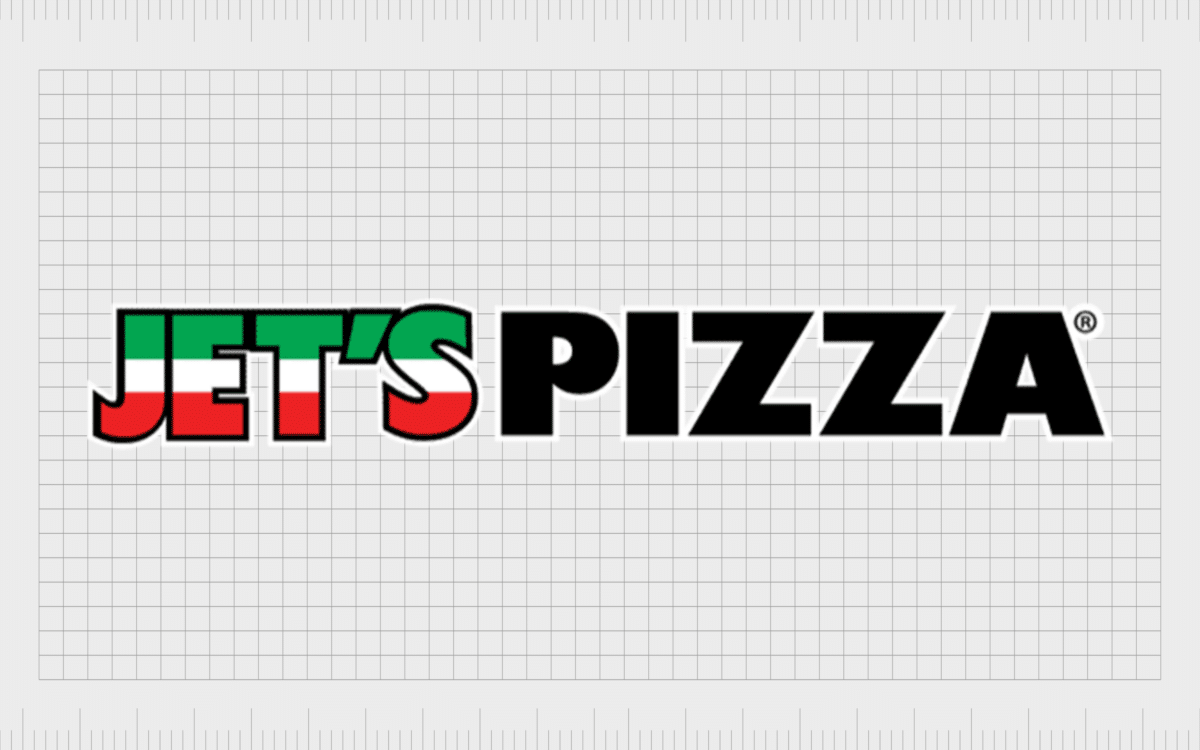
The official Jet’s Pizza logo features the word “Jet’s” written in uppercase, block font, with gradient colors of red, green, and white. These shades are often used to refer to the flag of Italy, the country most commonly associated with pizza.
The same shades also appear in the accompanying graphic, sometimes used alongside the wordmark.
The graphic features a mustached man wearing a helmet, a Jet’s Pizza sweater, and a pair of green pants flying through the air with a jetpack. He’s holding a fresh pizza in his hand, covered in slices of pepperoni and green pepper.
The word “Pizza” also appears on the logo, in a simple black font, also in uppercase. In some instances, the Jet’s Pizza logo drops the mascot icon and uses only the wordmark. When the mascot is removed, the two words included in the Jet’s Pizza logo are often presented on the same line.
The Jet’s Pizza icon: Colors and fonts
The Jet’s Pizza logo has been a consistent part of the company’s brand identity since it first began. While many companies have made the decision to update their logo over the years, Jet’s has chosen to stick to its traditional image in virtually every franchise.
Notably, not all of the franchise locations will show the Jet’s Pizza logo mascot alongside the wordmark, but this graphic still remains an official part of the company’s brand identity. Jet’s Pizza is evidence that sometimes a compelling logo can stand the test of time.
The colors of the emblem immediately connect the company to Italy and the home of Pizza. Additionally, the colors green and white make us think of purity, freshness, and passion.
The simplistic sans-serif font, presented in all uppercase letters, conveys a sense of strength and stability while making the company seem more friendly and accessible. At the same time, the adorable mascot humanizes the brand, allowing it to form deeper connections with its audience.
You can find some handy Jet’s Pizza icon resources here:
What color is the Jet’s Pizza logo?
The Jet’s Pizza logo colors were chosen to highlight its focus on the Italian food landscape and pizza in particular. The colors red, white, and green appear both in the name “Jet’s” on the emblem, as well as in the outfit chosen for the mascot.
There are even shades of red, green, and white in the pizza the flying man appears to be holding.
Black is also another consistent shade in the Jet’s Pizza color logo palette; it’s used to outline the “Jet’s” word, as well as for the word “Pizza.”
We also see the color throughout the mascot icon. The company hasn’t shared the official hex codes for the shades, but we can see they use relatively light and bright shades of red and green.
What font does the Jet’s Pizza logo use?
Since there are no brand guidelines available for the Jet’s Pizza logo, the typography is open to speculation. The Jet’s Pizza logo font is a relatively straightforward sans-serif typeface with no complex embellishments or components. Each character used is presented in uppercase.
The bold font is remarkably similar for both words. However, the word “Pizza” on some of the versions of this logo appears to be slightly more stretched out, while the letters of “Jet’s” are closer together.
Different variations of the Jet’s Pizza wordmark have been used, which present the words either on a single line or on two levels. In the two-level variation, the word “Pizza” is often a little smaller than “Jet’s,” as you can see on the website emblem:
The Jet’s Pizza logo: An untouched emblem
The Jet’s Pizza logo is one of the most long-lasting emblems in the pizza landscape. For around 45 years, the icon has remained almost entirely untouched, with no major changes to its font colors or typography choices.
The only real changes we can see occur within the positioning of the words for the logo, which are sometimes placed on one or two lines.
Additionally, while the Jet’s Pizza mascot is sometimes present in the logo today, the company often uses the wordmark as a standalone icon. The graphic accompanying the words usually doesn’t appear on signage or the company’s website.
The Jet’s Pizza logo is quickly becoming a part of Pizza brand history, with its iconic colors and simple but effective visual impact.
Fabrik: A branding agency for our times.
Clarity starts with a conversation.
Thanks—we’ll get back to you shortly.
Whether you're navigating a rebrand, merger, or simply need a clearer identity—we’re here to help. No hard sell, just honest advice from people who know the sector.
Let’s start with a simple question…
Prefer to email? Drop us a line.
Fabrik’s been helping organisations rethink and reshape their brands for over 25 years. We’ve guided companies through mergers, rebrands and new launches. Whatever stage you’re at, we’ll meet you there.


