The Dove Soap logo history and background

The Dove Soap logo is one of the better-known designs in the beauty and skincare landscape. An organization most renowned for its commitment to nurturing products designed to suit a wide selection of customers, Dove has earned quite a reputation over the years.
Not to be confused with the Dove chocolate brand, the Dove Soap organization is an American personal care company with years of experience producing many soaps, moisturizers, and other popular products.
While the Dove Soap logo has changed a few times throughout its history, it has always maintained a welcoming, gentle aesthetic. Whether you’re a fan of Dove Soap products or want to know more about the well-known brand, you’re in the right place.
Here’s your guide to the official Dove history and the company’s iconic logo.

Dove Soap history: How did Dove get started?
Before we explore the logo and visuals of the Dove Soap brand, let’s take a closer look at Dove history and where the organization began. Initially launched in 1957, Dove is an American brand with a British owner (Unilever), known for producing various skincare products.
Dove’s portfolio of moisturizers, creams, and bath items are sold across the globe in more than 150 countries. Moreover, the company has also expanded its range over the years to include products specifically intended for women, men, and babies.
The Dove company history began with the introduction of a revolutionary “cleansing” bar, a soap product designed to combine standing cleaning ingredients with moisturizing cream to soothe and nurture the skin.
Quickly, Dove became the number one brand recommended by dermatologists in the US, France, and Canada. It’s also strongly endorsed by professionals around the world.
Part of what makes the Dove brand so compelling today is its unique marketing approach. For almost 20 years, Dove has been committed to representing women, men, and children from all backgrounds in its advertisements.
Dove believes beauty isn’t defined by shape, size, or color, and its promotional methods focus on highlighting this sense of universal acceptance.
Is Dove Soap a high-end brand?
Dove is an affordable brand of soap and toiletry products designed for people from all walks of life. It’s one of the cheaper options on the market, despite its high levels of acclaim.
What is Dove Soap named after?
According to some experts, Dove Soap was named as a reference to Aphrodite, the goddess of beauty and love. Others simply say Dove is named after the bird commonly associated with grace and romance.
Who is Dove Soap owned by today?
Dove currently belongs to the British brand Unilever.
The Dove Soap logo throughout the years
Now you know a little about the official Dove Soap background, let’s start exploring the company’s logo over the years. With more than 65 years of history in the cosmetics landscape, it’s little surprise the Dove logo has changed a few times over the years.
However, many elements of the emblem have remained the same, from the cursive font to the Dove symbol.
1955

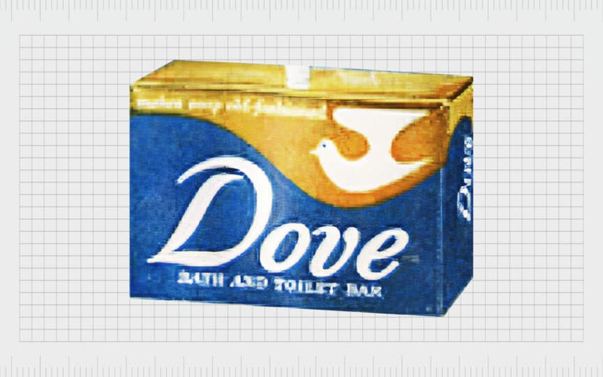
The logo first used on Dove’s cleansing bar featured the name “Dove” in a white cursive font on a soft blue background. The upper portion of the packaging featured a gold stripe, with a white Dove in the right-hand corner.
The bird was slightly abstract in shape, but it was clearly meant to represent a dove.
1969

In 1969, Dove built on its existing color palette, introducing a new design with the same elegant appeal. The wordmark for the brand was still depicted in cursive, but this time in a deep blue shade on a white background. The Dove bird appeared in gold, placed just above the “v” in the wordmark.
The bird’s direction also changed in this variation of the Dove logo. The dove now appears to be flying to the right, which conveys a sense of growth and movement.
This logo remained with the brand for over 30 years.
2004

In the early 2000s, Dove slightly refined its logo, but many main elements remained consistent. The coloring of the wordmark became a little darker and lost some of its more obvious flourishes. The letters here are also much slimmer and more graceful.
The bird design appears underneath the wordmark in this variation of the Dove logo. Once again, the bird’s color is cold, but it has a gradient to it which makes the design look much softer and more metallic.
The “v” in the Dove logo is eye-catching here, as it’s much sharper and more defined than in previous variations.
2012

In 2012, Dove introduced the most recent version of its logo, a design many people are familiar with today. This Dove logo is based on the previous design, with many aspects unchanged. The coloring of the wordmark is almost exactly the same.
However, the letters are a little slimmer and have less of a cursive flourish.
The “v” in the “Dove” wordmark is sharper still, and the D has a much shorter swirl at the top, helping the logo to look more contemporary and minimalistic. The golden bird appears in a slightly yellower shade in this logo variation, with the same shining gradient.
The bird also looks a little slimmer.
Dove Soap brand: Elements of the Dove logo
Dove has refined its logo and brand image many times over the years, adapting to a more modern image as the industry has evolved. The most recent variation of the Dove logo is an insight into the company’s commitment to keeping its finger on the pulse of the health and beauty sector.
Despite several changes, however, the designs applied to Dove products have also maintained a lot of consistent elements through the years. The picture of the dove bird accompanying the wordmark in the logo helps the company to appear elegant, caring, and tender.
The use of the color gold conveys a sense of luxury, along with the cursive font choice, while the blue gives the brand a sense of reliability.
Here are some helpful Dove Soap logo resources:
What color is the Dove Soap logo?
The core Dove Soap logo colors have remained consistent throughout the brand’s history. Gold, blue, and white have always been components of the Dove image. However, the exact shade and tone used for each color have changed over the years.
The most famous Dove logo color is blue, which helps to highlight excellence and reliability, while gold demonstrates joy, luxury, and prosperity. The blue shade is close to Cetacean Blue:
Hex: #09094A
RGB: 9, 9, 74
CMYK: 0.878, 0.878, 0, 0.709
What font does the Dove Soap logo use?
The Dove Soap logo font is a simple cursive typeface designed to convey a sense of sophistication and elegance for the brand. Similar to the Dove logo, the closest official font available is the Civita Light Italic type.
The actual font Dove uses is specific to the cosmetics company and designed exclusively for the brand, based on previous logo variations.
Celebrating the Dove Soap logo today
If you’re a cosmetics fan, you’re probably familiar with the Dove Soap logo. The design is one of the easiest to recognize in the world of beauty and skincare, with a significant marketing presence in countries worldwide.
Dove’s logo has evolved a few times over the years, but it continues to maintain the same critical elements which define the brand to its target audience.
The Dove Soap logo is a celebration of elegance, tenderness, and trustworthiness, chosen for a brand committed to creating an authentic and transparent relationship with its customers. Every aspect of the logo, from the blue wordmark to the golden bird, plays an essential part in making Dove stand out.
Fabrik: A branding agency for our times.
Clarity starts with a conversation.
Thanks—we’ll get back to you shortly.
Whether you're navigating a rebrand, merger, or simply need a clearer identity—we’re here to help. No hard sell, just honest advice from people who know the sector.
Let’s start with a simple question…
Prefer to email? Drop us a line.
Fabrik’s been helping organisations rethink and reshape their brands for over 25 years. We’ve guided companies through mergers, rebrands and new launches. Whatever stage you’re at, we’ll meet you there.


