How to create a brand logo: Your first step in visual branding

They might just be small images or basic graphics, but logos are powerful things. Creating a brand logo means distilling the meaning and essence of your company into a visual element that can convey your personality in a split second.
As the most recognisable representation of any business, logos help you to (literally) make your mark in your chosen industry. That means that learning how to create a brand logo that not only identifies your company but becomes a valuable asset in your strategy for awareness is crucial.
Logo creation is the first step on the path to visual branding, and there’s more involved in this process than placing a name within a shape and calling it a day. Creating a brand logo is a huge responsibility because it means finding a visual way to quickly, and effectively communicate the ideals of a brand.
Your logo is your first chance to make an impression on your audience – one that could influence their perception of your company, and the interactions they have with your business forever. The trouble is, in such a competitive market, it’s hard to choose a design that’s powerful enough to attract, engage, and inspire.
In a world that’s already covered in memorable logos, how do you create one that has the right impact on your target audience? That’s the question we’re going to try and answer here…
Designing the ideal logo isn’t easy, but in this article, we’re going to give you a few simple steps, some key information, and plenty of advice to help you start on the right track.
Creating a brand logo: Types to choose from
Learning how to create a brand logo means understanding which options you have to choose from. There are various “styles” of logo available, and most companies will play around with multiple options before settling on their final design.
Although most logos are a combination of imagery, graphics and typography, it’s worth noting that every style impacts your brand in its own unique way. Since your logo is often the first thing a new customer will see, you need to make sure that you get it right. The styles of most logos can be broken down into five distinct categories: emblems, combination marks, brand marks, letter marks, and wordmarks.
How to create a brand logo: The wordmark
A wordmark, or “logotype”, is one of the simplest ways to begin creating a brand or company logo. It involves using your company name in a specific type of text. The best way to make the most out of your wordmark is with a custom font that can work as part of your brand recognition strategy. Famous examples include Disney, Coca-Cola, Facebook, and Google.

A wordmark can be a great choice for a budding business because it helps to spread your name throughout your industry. It also conveys a sense of stability and confidence. However, a long name may be difficult for your audience to remember.
How to create a brand logo: The letter mark
Similar to a wordmark, the letter mark, or “monogram logo”, is another text-based solution for creating a brand logo, based on the initials of the company, rather than the full name. Some famous examples include CNN, IGN, HBO, and even NASA.

A letter mark logo is often the ideal choice for companies who have names too long to remember or pronounce easily. It can also be ideal for big companies who have grown out of the need to use their entire name.
How to create a brand logo: The brandmark
Known to some as a “pictorial” logo, the brandmark doesn’t contain any text at all. Instead, it’s all about creating a brand logo with an image, symbol, or icon that represents the fundamental nature of the brand. Consider the Apple silhouette, for example, the Twitter bird, or the Nike Swoosh.

A brandmark is great for building relationships with an audience because the brain is more responsive to pictures than written text. However, the value of a brandmark relies on your audience’s ability to perceive what the picture means. The SNP had a few problems with this when creating their logo.
How to create a brand logo: The combination mark
As its name might suggest, a combination mark uses a collection of symbols and wordmarks. For instance, famous examples include Microsoft, Doritos, Xbox, Adidas, and McDonald’s. Known to some as “iconic” logotypes, these visual elements focus on creating a brand logo that combines creativity with clarity.

Because you get a brand name, and an image, you can establish an emotional connection with your audience, while improving awareness and recognition at the same time. Plus, the complexity of these logos makes them far easier to trademark.
How to create a brand logo: The emblem
Finally, similarly to a combination mark, an emblem involves both symbols and text, but in these cases, the text is located within the symbol. For instance, famous examples include Ford, Starbucks, UPS, and the NFL.

An emblem is a less flexible solution to creating a brand logo than a combination mark because the elements are harder to separate. However, they can offer an air of authority and history to a modern-day brand.
How to create a brand logo: Getting started
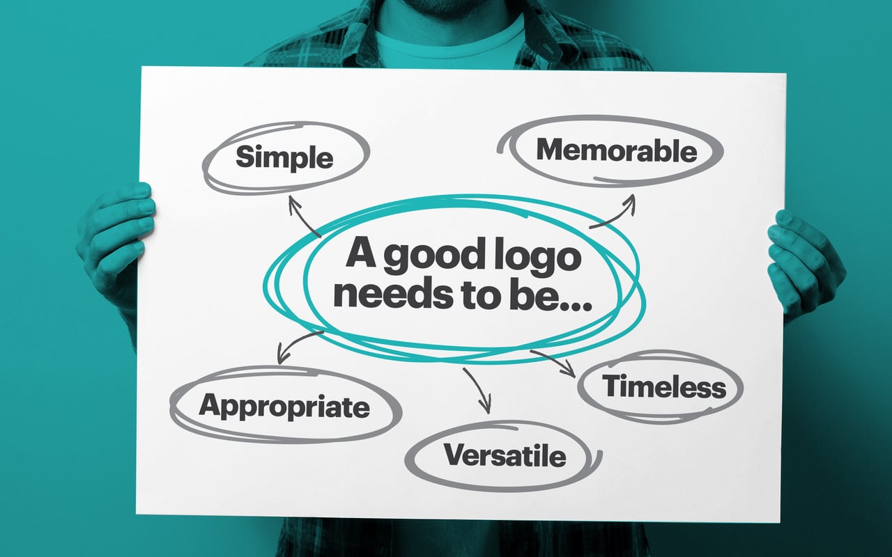
Okay, so you know which “styles” of logo you have to choose from. Now, you just need to focus on making your logo as effective as possible. Although creating a brand logo is a subjective experience, the most effective marks need to be:
- Simple: Simple logos are easier to recognise and remember.
- Memorable: The best logos set your brand apart, and distinguish you as unique.
- Timeless: A logo needs to be able to evolve and adapt to the trends.
- Versatile: A logo should be available in a range of sizes, colours, and mediums.
- Appropriate: Great logos are appropriate for the brand’s intended audience.
Before you start sketching or turning to experts for help on how to create a brand logo, you’ll need to establish a plan of action that takes each of those elements into account. That means designing a “brand logo strategy”. To inform your strategy, make sure you follow these steps:
Creating a brand logo step 1: Research
Research is essential to any branding process. Not only do you need to examine the trending logos in your space to decide how you should begin your own design, but you also need to figure out how you can set yourself apart from your competitors. You’ll need to take inspiration from the competitors that have earned a loyal following with their logos, without simply copying their ideas. At the same time, you’ll also need to research your customers, and their preferences to help you make your design more appealing.
Creating a brand logo step 2: Push your brand message
Your logo is the visual way to portray what your company is all about. In other words, you need to make sure that it’s evocative of your brand message or story. Try to position your company by using a logo that outlines your unique personality and approach to business. If possible, you could even consider creating a brand logo that highlights your USP. For instance, the Nike swoosh conveys speed and confidence, which is exactly what Nike strives to give their customers.
Creating a brand logo step 3: Be consistent
When discovering how to create a brand logo, it’s important to remember that your company mark doesn’t exist in a silo. It needs to connect seamlessly with the other aspects of your brand identity, including your name, your personality, and even your business colours. Even if you don’t use a wordmark or letter mark for your logo, the other elements of your brand will affect what you create.
Creating a brand logo that resonates with your customers
For many companies, a logo can be the element that dictates which customers do business with your organisation, and which go elsewhere. If your ideal customer can resonate with the image, typography, or colours you’ve used in creating a brand logo, then they’re more likely to show loyalty to your brand.
Though most companies know how important it can be to find the right logo for their marketing mix, designing something that’s both visually appealing, and appropriate for your brand can be complicated. Fortunately, the following tips should help.
1. Put simplicity first
Creating a brand logo is exciting. It can be tempting to get carried away with things like colour gradients and shadows that seem to make your image more exciting. However, if you go too far, then your customer will have no idea what kind of message you’re trying to send with your design. Too many complicated elements distract from the core idea of the logo.

Look at Microsoft Windows, for instance. While the brand has evolved numerous times over the years, their latest logo design is their simplest yet, offering a modern shift from the more complex logos that came before. As a company that sells digital innovation, Windows clean, simple logo helps to represent the clarity the brand gives their users.
2. Make your logo functional
Whether you’re in the midst of a rebrand, you’re creating a brand logo from scratch, or you’re sprucing up an existing logo, you need to think about how the image is going to be used. The icon you create should be just as clear and beautiful on a business card, as it is on your website, your packaging, and even your mobile apps.

Uber, for instance, recently re-designed their logo to better capture the attention of their audience. Because they knew that their customers used the app most often on their smartphones, they created a logo that would appear well on a small screen.
When learning how to create a brand logo, try to think about functionality for the long-term. You need something that you can use in a range of mediums – even if you might not be using that media right now.
3. Don’t be afraid to evolve
Even the best logos don’t last forever. Just like web design trends and marketing ideas, logo design evolves with the times, adapting to the preferences of new audience members. If you want to keep yourself in front of the most relevant consumers and ensure that your company remains as up-to-date as possible, then you need to be prepared to evolve when necessary.

Updating your logo to suit the latest trends doesn’t necessarily mean making drastic changes. In fact, it’s usually a good idea to maintain the most important elements of your logo design, to ensure a sense of consistency for your customers. Look at Marriot’s decision to change their logo into something more modern. Though they kept the style of the iconic “M” typography, they changed the colouring for an updated feel.
4. Make your logo timeless
I know what you’re thinking. How can I be timeless and flexible enough to evolve at the same time? As we noted in the paragraph above, eventually your logo will be due for an update, but that doesn’t mean you should be changing it all the time to jump on the latest bandwagon. A general rule to making your logo “timeless”, is to avoid anything trendy because trends don’t last forever.
Even if you’re trying to appeal to a new audience, or give your personality a tweak, it’s important to stick to a design that’s clean, timeless, and easy to understand. There’s nothing wrong with adapting a modern “feel” when you’re creating a brand logo, just don’t cling to the latest trend.
5. Be eye-catching
What’s visually stunning to one person, might not be as appealing to another. That’s why it’s so important to assess the preferences of your customers before you start creating a brand logo.

When it comes to imagery, there are a few things to keep in mind:
- Meaning: Never underestimate the appeal of meaning in a logo. Snapchat is a social media app that allows users to share self-deleting pictures. What better logo for this ethereal company than a ghost?
- Use of negative space: The use of negative space in your logo can offer fantastic visual appeal, as it can create a separate image on its own. For instance, everyone knows the FedEx arrow, and how it adds to the appeal of the brand mark.
- Typography: Just like colours, fonts can communicate their own unique message. For instance, “Nest”, a company that provides energy efficiency and smart home products, uses the “N” in their font to create a door to the house in their icon.
Tips for creating a brand logo that stands the test of time
A truly memorable logo can be one of the most powerful resources a brand has. Unfortunately, a lot of companies struggle to find something that’s unique, flexible, and timeless at the same time. There’s a good reason why logo design companies are in such high demand. With one image, they can create a single icon that tells the story of your business in a split second.
So, how do those branding businesses design something that has the power to truly enhance your company? It’s all about focusing on the things a logo should do. For instance:
Your logo should be memorable
It can be tempting to choose a descriptive logo that tells your audience exactly what your brand does. If you’re a computer company, then the image of a computer would be an obvious way to convey your niche. However, it’s not very creative, is it?
When using something other than your brand name or initials for your logo, it’s important to think about how you can communicate the key facts of your brand without being too obvious. Think about what your customers associate with your company. For example, the Nike “Swoosh” emerged in 1971 to represent the wings of the Greek goddess, Nike. While the icon is a representation of the brand name, it’s also a way for the company to highlight what the company stands for – speed, victory, and grace.
The more meaning you put into creating a brand logo, the more memorable it will become. After all, it’s easier to remember a business that stands for something, than it is to keep an obscure image in your mind.
Your logo should be flexible
We mentioned above that it’s important for a logo to be functional. To some extent, that means thinking about how you’re going to use your logo across a range of different media. The image or typography you choose should be just as appealing on a huge billboard, as it is on a tiny smartphone screen.
A good logo needs to be able to convey the nature of your brand in any medium. That means it should work just as well in greyscale as it does in full colour, and be just as appealing on a shirt as it is on a business card.
By creating a flexible logo, you increase your chances of having a brand mark that you can take with you through the years. That helps to enhance the consistency of your brand so that you can begin to develop affinity with your audience.
Your logo must use the right colours
Colour is more powerful than you think. When it comes to learning how to create a brand logo, you need to make sure that you’re using the right colours not just for functionality, but for effect too. Did you know that different colours create different psychological responses in your customers?
A combination of the right colours can help to give volume to your marketing tone and show off some of the key elements of your brand. By way of an example, blue represents trust and professionalism, which makes it ideal for technology and finance companies. Green represents freshness, life, and growth, which makes it ideal for companies based in nature.
The colour you choose should represent the characteristics of your company, while also ensuring the practicality of your design. Choose colours that work well on any background, and avoid any unnecessary complexity. While gradients might look great on a website, they won’t appear as well on a tiny app screen, or when reproduced on merchandise.
Your logo should be unique
Above all else, a logo needs to be unique.
Your logo is a representation of your brand – it should be ownable, a seamless insight into what makes your business different. If your logo looks the same as a million other companies in your industry – then how is your customer going to tell you apart?
With thousands of fonts (including custom designs), billions of colour combinations, and infinite images to choose from, there’s no excuse for choosing a logo that isn’t unique to your company. Try to avoid the clichés that always appear in your market or niche, and stay away from any images that you’ve found online.
If people start to notice your logo, or something that looks a lot like your logo on other products and websites, then they’re going to start feeling confused. If you can’t create your own new idea from scratch, get help from someone who can.
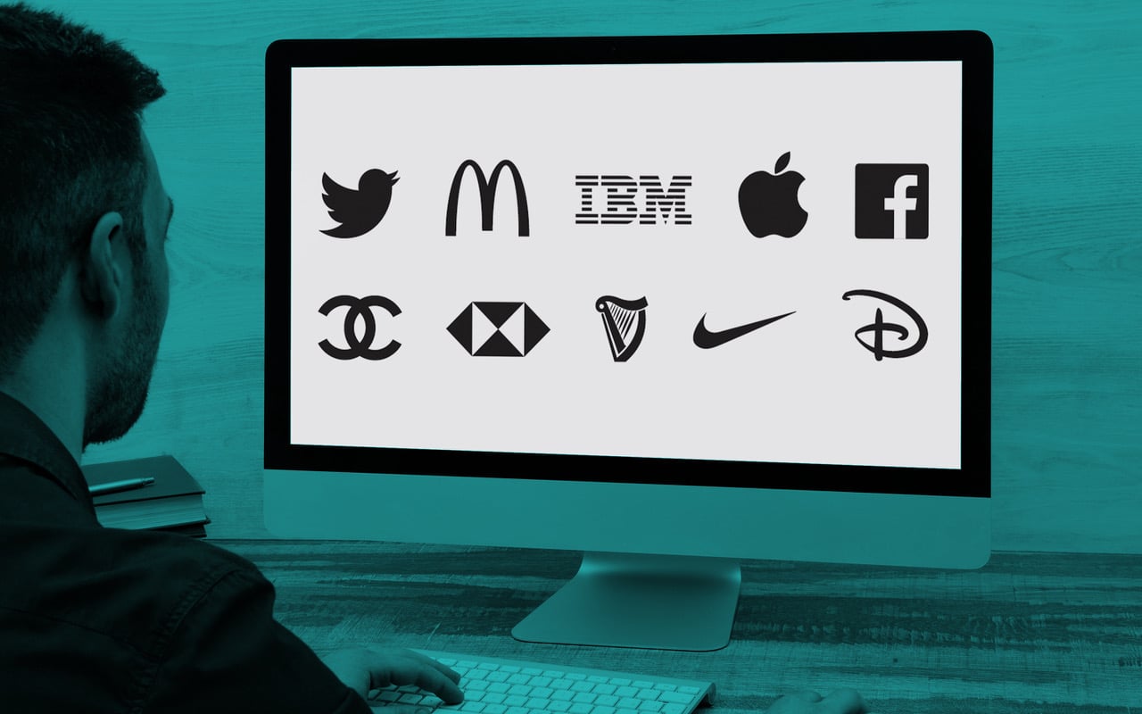
How to create a brand logo: It’s not simple
On the surface, creating a brand logo seems simple enough.
All you need to do is choose a couple of colours, an image, and a shape, right?
Of course, when you drill down into the features that make logos truly memorable, you begin to discover that although anyone might be able to create a basic logo – few companies can design something effective, without the right help.
Though there’s nothing wrong with brainstorming a few logo ideas on your own to help you create your own unique business image – trying to design your logo entirely on your own can be a huge mistake. Sure, it means you get to avoid the cost of a professional design agency – but it also means you’re avoiding their expertise and guidance too. A little investment in the short-term could easily save you a great deal of embarrassment and lost custom in the long-term.
Even if you feel you have a good eye for design, it’s still worth consulting a professional logo design agency for your finished product. After all, these experts know how to design a logo that’s functional – they can tell you which images you should stay away from, and which colours might be detrimental to your brand appeal.
Logo design companies can show you the impact of your brand mark in the context of your entire company image, and ensure you’re making the right decisions to appeal to your target audience. As the foundation for all your promotional materials, a logo isn’t something you can afford to mess up. This is one area where investing now, can really pay off later.
Clarity starts with a conversation.
Thanks—we’ll get back to you shortly.
Whether you're navigating a rebrand, merger, or simply need a clearer identity—we’re here to help. No hard sell, just honest advice from people who know the sector.
Let’s start with a simple question…
Prefer to email? Drop us a line.
Fabrik’s been helping organisations rethink and reshape their brands for over 25 years. We’ve guided companies through mergers, rebrands and new launches. Whatever stage you’re at, we’ll meet you there.


