


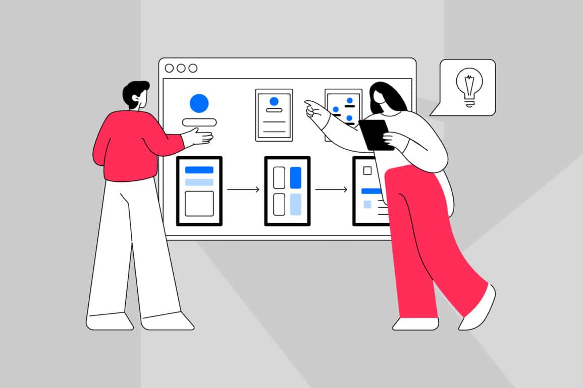
Online brand guidelines: from reference doc to daily tool
Most brand systems gather digital dust. Teams can’t find the logo file they need. Marketing uses the wrong tone.
Regional offices quietly redesign everything themselves. The problem isn’t commitment but usability.
Static PDFs and labyrinthine microsites fail because they don’t fit how people work. However, effective brand enablement requires online brand guidelines that are searchable, modular and built around actual user tasks.
This article shows you how to create digital systems that teams open daily, not quarterly. You’ll get a practical blueprint covering the minimum viable structure, search-first information architecture, governance without bureaucracy and integration patterns that meet people where they work.
If your guidelines live in a drawer (physical or digital), this is your roadmap out.
Why traditional brand systems fail
Too many organisations still treat their brand systems as digital versions of print manuals. They publish 200 pages of rules no one can navigate. Teams give up, make it up, or quietly ignore the whole thing.
Brand consistency suffers not because people don’t care, but because the tools don’t work. Effective brand enablement requires systems that fit how people work. When your creative director needs a social template at 4pm on Friday, they’re not reading fifty pages on brand essence. They’re Googling “quick Instagram post”.
That’s why poor brand adoption follows poor user experience.
Static formats don’t flex with real-world decisions. Search either doesn’t exist or returns every page that mentions “logo”.
Governance is invisible, so no one knows if content is current. The brand becomes a rumour, not a reference point.
Static formats don’t support behaviour
Static formats can’t adapt to how people work. PDFs can’t be updated in real time, don’t link to live assets, and force everyone to read the same document regardless of their role.
A product manager and a comms lead need different information, but they get the same 80-page file.
Teams can’t find what they need quickly
Poor information architecture turns every search into a scavenger hunt. A junior designer searching for “email banner size” won’t find a page titled “Digital asset specifications: overview and governance”.
After three failed attempts, people stop looking. They improvise instead.
No governance, no updates, no trust
Without clear ownership, documentation becomes digital landfill. Outdated examples stay live for years, new templates never appear, and teams start sharing unofficial resources in Slack channels instead.
Trust evaporates. The official source becomes the last place anyone looks.
What makes guidelines work
Effective online brand guidelines aren’t comprehensive manuals but task-oriented systems. They help people do things: grab a logo, check tone rules, download a pitch deck. That shift changes everything.
Instead of documenting the brand for posterity, you’re enabling real decisions in real time. The best digital brand guidelines share four traits:
- Modular structure based on user tasks
- Search-first information architecture
- Component-led content design
- Cross-functional ownership
Each trait reinforces the others. Modularity makes updates faster. Strong IA makes search work.
Components ensure consistency. Distributed ownership keeps content current. Together, they transform documentation into operational systems that drive brand adoption and earn trust across teams.
As a result, good brand governance becomes intuitive rather than bureaucratic. Users don’t need training or taxonomy knowledge. They type what they need, click a result and get on with their work.
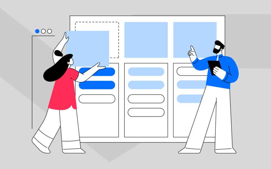
Modular structure based on user tasks
Build your guidelines like LEGO blocks, not chapters in a book. Each piece should stand alone and update independently without affecting the rest of the system.
Instead of nested chapters, create discrete pages: “Logo usage”, “Tone: social media”, “Presentation templates”.
Search-first information architecture
Design for how people search, not for your internal org chart structure. “Invoice template” beats “Financial communications: transactional formats” every time because that’s what people type.
Every page needs clear metadata and logical URL structures so search engines surface the right result first time.
Components, tokens and reusable patterns
Think design system, not just brand rules. Show the building blocks first: colour tokens, type scales, grid systems. Then demonstrate how they combine into components and patterns.
This makes design system documentation easier to maintain.

The minimum viable structure (MVS)
You don’t need fifty pages to launch useful online brand guidelines. You need seven core sections that answer the questions teams ask most. This minimum viable structure covers:
- Brand foundations
- Identity rules
- Tone principles
- Reusable components
- Template library
- Roles and approvals
Each section serves a specific user need. Brand enablement works when you give people enough to make confident decisions, not everything you could possibly say.
The MVS can live on a simple microsite, Notion space or documentation platform. What matters is that it’s searchable, mobile-friendly and fast to load. You can always expand later.
Start with the essentials that unblock daily work. This structure also aligns with how we approach internal brand alignment, ensuring the brand works as a practical system across every team, function and touchpoint.
Foundations that guide decisions
This section explains why your brand sounds and looks the way it does. Cover purpose, positioning, audience and core message house content without overwhelming people.
It’s not the full strategy deck but the “why we sound this way” primer. Keep it under 1,000 words.
Identity rules people can apply instantly
Make the visual basics immediately actionable. Cover logo usage, colour palette, typography and photography style. Each element needs downloadable assets, clear do’s and don’ts, and examples in context.
Link directly to your asset library or Figma file so people don’t have to email someone for the logo.
Templates, libraries and self-serve support
Give people production-ready assets they can grab and go. Build your template library: pitch decks, social assets, email signatures, proposal covers, one-pagers. Each should be ready to use with brief notes.
If 80% of requests are “Where’s the slide deck?”, put it here with a big friendly button.

How to build guidelines people use
Building online brand guidelines that drive real brand adoption means starting with user research, not assumptions. Who uses them? What are they trying to do? Where do they get stuck?
Show examples, not theory. Include “when to use” guidance alongside every rule. Integrate with the tools people use: Google Workspace, Microsoft 365, Figma, Slack.
The best systems feel invisible because they’re embedded in workflow. Make doing the right thing easier than improvising.
User research and task mapping
Start by understanding what people need, not what you think they need. Interview 8–10 people across different teams: marketing, sales, product, comms, regional offices.
Ask what they need, how they find it, and where they give up. Map the top ten tasks.
Patterns, examples and “good vs bad”
Every rule needs a real, concrete example. Abstract principles like “Use friendly, active language” don’t teach people anything. Show a before-and-after email or social post instead.
Label it clearly: “Good: ‘We’ll send your order tomorrow’ / Bad: ‘Your order will be dispatched'”. These comparisons stick.
Integrations that meet people where they work
Bring the guidelines to where decisions happen. Embed them into Figma libraries, add branded templates to Google Slides, create Slack shortcuts for FAQs, link from your intranet homepage.
Our digital branding specialists can help map integration opportunities.

Governance and upkeep without bureaucracy
Online brand guidelines only stay useful if they stay current. That requires brand governance, but not the kind that adds six approval layers to every update.
Good governance is lightweight, distributed and visible. It creates accountability without bureaucracy.
Assign clear owners for each section. Set review cycles (quarterly is usually enough). Use version numbers and change logs so people know what’s new.
Collect analytics to see what’s working and what’s ignored. If a page gets zero traffic, either improve it or delete it.
Governance isn’t about control but about maintaining trust. When teams know the documentation is accurate and up to date, they use it. When they suspect pages are stale, they invent their own rules.
That’s the difference between a living system and digital landfill that everyone avoids.
Ownership, RACI and review cadence
Use a RACI model: one person Responsible for each section, one Accountable, several Consulted, the rest Informed. This prevents “everyone’s job is no one’s job” drift.
Set a review cadence: quarterly for high-change areas, annually for stable content. Make ownership visible on the site itself.
Versioning and change logs
Every update needs a version number and a change log. “v2.3: Updated social media templates, added new colour token for accessibility.” This takes five minutes but saves hours of confusion.
It also helps onboarding. New starters can see how the brand has evolved without asking around.
Analytics that improve adoption
Track what people search for, which pages they visit, and where they bounce. Use Google Analytics or your platform’s tools. An analytics dashboard with 5–6 key metrics tells you what’s working.
If everyone searches “logo” but lands on the brand story page, your IA needs work.

Real-world examples that do this well
A few organisations have built online brand guidelines that get used. They’re not perfect, but they share common traits: clarity over cleverness, search over structure, examples over rules. GOV.UK is the gold standard for content design and findability.
Zeroheight powers some of the best design system documentation in the business. High-performing brand teams (often in tech, finance and professional services) treat their digital brand guidelines like products, constantly iterating based on user feedback.
These examples prove that usable, searchable systems aren’t theoretical. Atlassian’s Team Playbook offers useful rituals for keeping documentation alive.
Task-based structure works
GOV.UK’s content design guidance is famously readable. Short sentences, plain language, examples everywhere. The structure is task-based: “Writing for the web”, “How to publish”, “Style guide”.
Every page is scannable and searchable.
Modular systems scale better
Zeroheight shows how to combine design tokens, components and usage rules in one platform. It’s modular, visual and version-controlled. Teams can see how components are built and when to use them.
This model works equally well for broader documentation if you adapt it to verbal identity and messaging frameworks.
Living systems beat static manuals
Many fast-moving organisations treat documentation as living systems. They use Notion, Confluence or custom platforms. They update monthly, run quarterly surveys and act on feedback.
These teams don’t wait for perfection. They ship, learn and iterate. That mindset shift separates thriving systems from stagnant ones.

Build guidelines that work, not guidelines that sit
Documentation only delivers value when people use it. That means designing for behaviour, not just completeness.
Start with the minimum viable structure. Make it searchable and modular. Integrate it into daily tools.
Keep it updated with lightweight governance. Use analytics to improve continuously.
If you follow these principles, your guidelines become something that supports brand consistency across every team and market. They’ll be the first place people look, not the last.
Want guidelines people use? Explore our brand guidelines approach or speak to our team about a modular, searchable platform that drives real adoption.

Clarity starts with a conversation.
Thanks—we’ll get back to you shortly.
Whether you're navigating a rebrand, merger, or simply need a clearer identity—we’re here to help. No hard sell, just honest advice from people who know the sector.
Let’s start with a simple question…
Prefer to email? Drop us a line.
Fabrik’s been helping organisations rethink and reshape their brands for over 25 years. We’ve guided companies through mergers, rebrands and new launches. Whatever stage you’re at, we’ll meet you there.