Bank of America logo history: The Bank of America symbol
The Bank of America logo is one of the best-known symbols in the financial world. Ever since the origins of the institution began in 1784, the Bank of America has been rapidly gaining popularity and attention from consumers across the United States.
At present, the Bank of America symbol is an eye-catching and meaningful emblem intended to show the modern and reliable nature of the company. However, the organization has changed its appearance several times over the decades in the search for the perfect emblem.
Today, we will be taking a brief look at the history of the Bank of America, the evolution of its iconic logo, and how the organization has changed over the years.
Bank of America history: An introduction
Before we explore the Bank of America branding and logo, let’s take a closer look at the business itself. The Bank of America Corporation is a multinational financial service holding company and investment bank.
It’s one of the “Big Four” banking institutions in the United States, responsible for serving around 10.74% of all American banking deposits.
The Bank of America has a rich history. In 1784, the origins of the Bank of America began with the introduction of the predecessor financial group: The Massachusetts Bank.
Another branch of the Bank of America’s story stretches back to the US-based company, the “Bank of Italy,” founded by Pietro Giannini in 1904.
Giannini purchased a company named the Bank of America and Italy in 1922 and experienced rapid growth through the 1950s.
Meanwhile, after suffering a significant loss following the 1998 Russian bond default, the NationsBank brand purchased another company named “BankAmerica” for $62 billion. The official “Bank of America Corporation,” was founded after this huge acquisition.
The Bank of America we know today results from a series of mergers and acquisitions throughout financial history.
Bank of America logo history
Branding experts often divide the Bank of America’s logo history into two distinct eras. At first, the logo designs used by the company were elegant and traditional.
Each Bank of America icon introduced between 1969 and 1998 revolved around a classic aesthetic designed to make the company appear as credible and authoritative as possible.
After 1998, however, the Bank of America branding evolved as the company searched for new ways to present itself as modern, compassionate, and innovative.
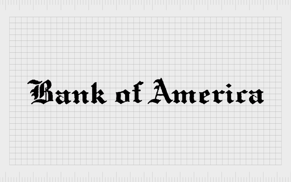
1930
The original Bank of America logo was a simple but effective wordmark designed in a script-style black font. Today, this emblem might remind viewers of the logos associated with well-known broadsheets such as the Times or the Wall Street Journal.
The original wordmark stayed with the company for 39 years and focused heavily on using gothic, traditional lettering to make the bank appear as sophisticated as possible. Though this emblem was relatively complex, it did give the Bank of America a sense of heritage and history.
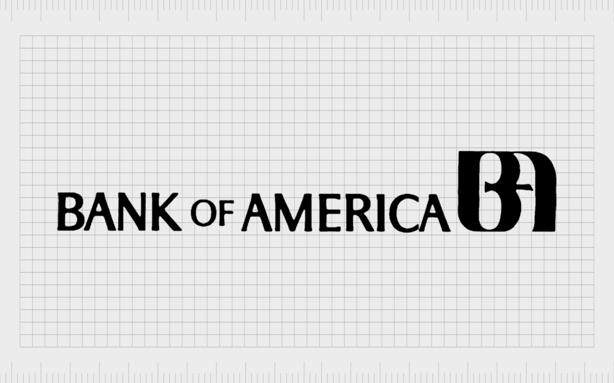
1969
In 1969, the Bank of America refined its logo with a more modern combination-style emblem. This new logo was designed by Walter Landor and featured the name “The Bank of America” in a new sans-serif font.
The letters of the wordmark were all depicted in uppercase, intended to show the confidence and stability of the company.
Next to the wordmark, Landor also created a monogram “BA” graphic, where both letters appeared to merge into one, with smooth and thick rounded lines. This BA monogram would later be refined and used in various iterations of the Bank of America symbol.

In 1980, the Bank of America made a few minor changes to its logo. First, the all-uppercase lettering was replaced with a standard sentence-case alternative. The font style changed slightly to a more simplistic, serif-style font, similar to Helvetica Black.
The monogram was still present in this logo, but it was placed above the wordmark instead of alongside it, helping to make the overall image a little more compact.
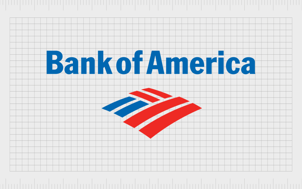
1998
1998 marked a significant change in the visual identity of the Bank of America brand. The company completely refreshed its look, focusing on making itself appear more modern and appealing to younger audiences.
The black and white logo was infused with blue, white, and red, giving the emblem a patriotic vibe. The font choice remained largely the same, though the letters were compressed slightly in this new logo variation.
Additionally, the “BA” monogram was replaced with the first Bank of America flag symbol, comprised of six red and blue rectangles.
Not only did the flag remind customers of the patriotic nature of the Bank of America brand, but it also looked a little like a patchwork blanket, which conveyed ideas of safety, protection, and warmth.
2018
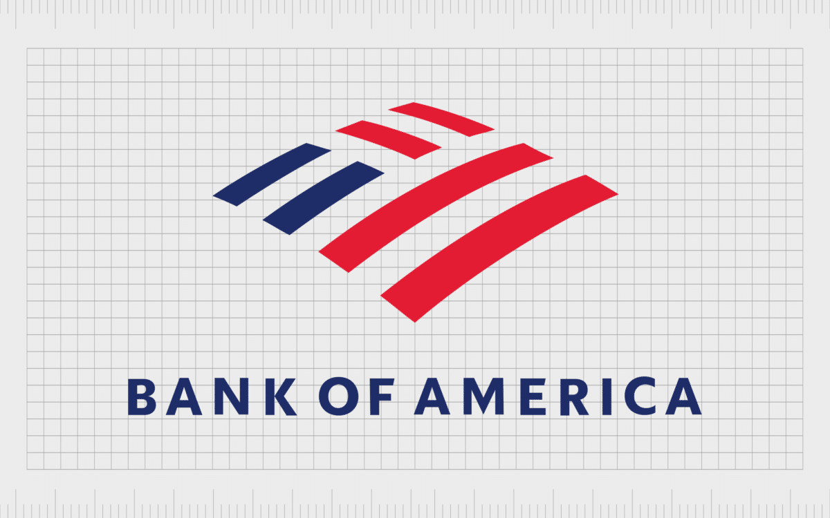
The most recent change to the Bank of America logo occurred in 2018. While many of the components of the previous logo remained, the icon was refined and made more sophisticated.
The white lines between the rectangles in the Bank of America flag were thickened, separating the different components and removing the sense of overlap between the different elements.
The Bank of America wordmark was also redrawn, this time in all uppercase letters, with a simple and clean sans-serif typeface. There’s a significant amount of spacing between each letter in this typeface to boost legibility and help convey the brand’s stability.
Bank of America branding: The Bank of America brand guidelines
The Bank of America logo has undergone significant changes over the years as the company has refined and rediscovered its brand identity. Today, the logo symbolizes the market-leading company’s strength, history, and credibility.
The color choices emphasize the bank’s significance in its chosen market and highlight a sense of patriotism. Using a blanket-style flag as the symbol in the logo shows the company’s commitment to protecting and serving its customers.
If you’re interested in the Bank of America logo, you can find some valuable resources here:
What color is the Bank of America logo?
Initially, the Bank of America logo colors were relatively simple. The company stuck religiously to a black-and-white color palette for several years before eventually changing tracks towards the end of the century.
Today, the Bank of America logo color palette is a testament to the company’s patriotic personality.
Not only do the colors red, white, and blue represent the US national flag, but they also send important messages about the company’s values. The deep blue stands for reliability and stability, while white demonstrates purity and virality. Red is the color of passion, power, and strength.
The two core colors of the Bank of America logo include:
Royal Blue:
Hex: #012169
RGB: 1 33 105
CMYK: 99 69 0 59
Alizarin Crimson:
Hex: #E31837
RGB: 227 24 55
CMYK: 0 89 76 11
What font does the Bank of America logo use?
The Bank of America logo font has also seen a number of changes over the years, evolving from a complex gothic serif font to a simple and robust sans-serif typography. Today, the typeface is a straightforward and clean option, written in all uppercase letters.
The font choice is similar to the Elisar DT Infant typeface.
Celebrating the Bank of America logo
The Bank of America logo has come a long way over the years. What started as a relatively complicated script-style wordmark has since transformed into a bold, modern brand emblem.
Today, the Bank of America icon symbolizes the company’s strength, stability, and customer commitment. The colors red, white, and blue highlight a patriotic personality while sending important messages about reliability and passion.
Similarly, the blanket-style flag shares an insight into the customer’s mission to protect its customers.
Fabrik: A branding agency for our times.
Now read these:
—How to brand a financial services product
—Discover popular bank logos and names
—How the HSBC UK logo evolved over time
—Explore Fabrik’s financial branding services
Clarity starts with a conversation.
Thanks—we’ll get back to you shortly.
Whether you're navigating a rebrand, merger, or simply need a clearer identity—we’re here to help. No hard sell, just honest advice from people who know the sector.
Let’s start with a simple question…
Prefer to email? Drop us a line.
Fabrik’s been helping organisations rethink and reshape their brands for over 25 years. We’ve guided companies through mergers, rebrands and new launches. Whatever stage you’re at, we’ll meet you there.


