


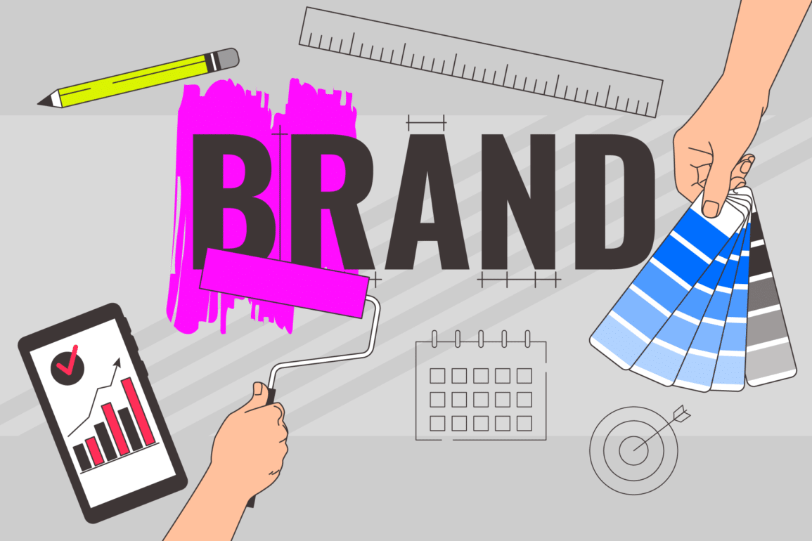

Design systems for brands that scale consistently

Growing brands face a familiar challenge: more teams, more channels, more digital products. Without shared structure, quality fragments. Design systems for brands create the backbone that protects brand integrity whilst enabling speed and scale.
These aren’t just UI toolkits. Strong design systems translate brand strategy into repeatable, predictable practices that reduce rework, align teams and eliminate ambiguity.
They turn brand decisions into infrastructure, making every touchpoint feel intentional, coherent and unmistakably yours. When built with governance, tokens and clear documentation, design systems for brands become the engine that powers consistent execution across every surface your brand inhabits.
The alternative? Teams improvising. Designers guessing.
Products that look related but don’t quite feel like family. A design system removes that risk by embedding your brand into the tools, workflows and decisions your teams make every day.
Why brands need design systems to scale
As organisations grow, brand execution becomes harder to control. Product surfaces multiply. Teams work asynchronously across geographies.
Stakeholders interpret the brand differently. Without design systems for brands, maintaining brand consistency becomes a manual, reactive exercise that doesn’t scale.
Design systems provide the shared backbone that ensures repeatable quality. They remove ambiguity by encoding brand decisions into reusable standards, so teams can move quickly without compromising coherence.
Instead of slowing work down, well-built systems accelerate it. They act as both guardrails and accelerators: keeping execution aligned whilst giving teams the confidence to ship faster.
That combination (structure plus speed) is what separates brands that scale gracefully from those that fracture under growth. The best design systems for brands don’t just document standards. They operationalise them, connecting strategy to daily execution and turning abstract brand principles into tangible tools teams actually use.
When properly governed, they ensure consistent execution isn’t an aspiration. It’s embedded in how work gets done. They transform brand execution from an exercise in interpretation into a repeatable process that scales as the organisation does.
Growing teams need shared structure
As teams expand, duplication and misalignment multiply. A shared component library eliminates redundant work, giving designers and developers access to pre-approved, reusable elements that speed collaboration whilst maintaining design system brand consistency.
This shared foundation means every team builds on the same components, not parallel interpretations of them. The result? Faster delivery, tighter alignment and less technical debt accumulating from bespoke solutions that should have been standardised from the start.
Google’s Material Design proves this works at scale: thousands of teams building coherent products from a single component library.
Digital channels multiply complexity
Your brand stretches across web, mobile, email, apps and emerging platforms. Design tokens (standardised values for colour, typography, spacing and motion) ensure that every channel reflects the same brand DNA, encoding UI standards that eliminate manual translation.
Tokens act as the connective tissue between brand strategy and technical implementation. A colour decision made in one context automatically propagates across every digital surface.
Shopify Polaris uses this token-based approach to maintain perfect visual consistency across web, mobile, email and point-of-sale. All from a single set of design decisions.
This systematic approach to multi-channel execution removes the need for designers to manually interpret brand guidelines for each new context. It reduces both workload and the risk of unintentional variation.
Consistency depends on clear decision-making
Without brand governance, systems drift. Governance defines who makes decisions, how contributions are reviewed and when exceptions are acceptable, keeping teams aligned and protecting the integrity of your design-ops workflow without introducing bureaucracy.
Lightweight governance structures (clear ownership, transparent review protocols, documented decision criteria) provide the clarity teams need to move quickly whilst maintaining quality standards.
GOV.UK Design System manages contributions from hundreds of government departments through transparent guidelines and community review. It’s governance done right: protective without being restrictive.
The goal isn’t control for its own sake; it’s creating the conditions where teams can confidently make brand-aligned decisions.

What strong design systems look like
High-performing design systems for brands share a common anatomy: principles, tokens, components, patterns and documentation. Together, these elements create a living framework that translates brand strategy into everyday execution, ensuring brand consistency across every team and touchpoint.
Principles ground the system in your brand’s purpose. Tokens encode those principles into reusable technical specifications. Components turn tokens into interface elements that speed delivery.
Patterns guide how components combine to solve common problems. Documentation ties it all together, making the system accessible, maintainable and easy to onboard against.
This layered approach (from abstract values to concrete tools) is what makes design systems for brands operationally powerful, not just aesthetically consistent. The strongest systems feel intuitive because they mirror how teams already think and work, providing clarity without imposing rigid constraints.
They evolve: treating the system as a product that grows alongside the brand, not a static artefact that ossifies over time.
When paired with visual identity standards, these systems transform brand execution from subjective interpretation into structural inevitability.
Principles and tokens as the brand’s technical DNA
Principles articulate why your brand looks and behaves the way it does. Design tokens translate those principles into usable, scalable values (colour palettes, type scales, spacing units) that create a single source of truth for technical execution.
This transformation from abstract brand values to concrete technical specifications is what makes design systems operationally powerful. Developers don’t need to interpret the brand. They implement tokens that already encode those decisions, ensuring technical fidelity to brand intent across every platform and product.
Components and patterns that reduce ambiguity
Reusable components (buttons, cards, navigation, forms) speed delivery by eliminating design-from-scratch work. A component library encodes not just visual style but interaction logic, accessibility standards and usage guidelines, reducing interpretation whilst keeping teams aligned through UI standards.
Patterns take this further, showing how components combine to solve common scenarios:
- Search experiences
- Checkout flows
- Content hierarchies
- Navigation patterns
Together, components and patterns create a shared vocabulary that accelerates collaboration, reduces decision fatigue and ensures every team member is building with the same foundational understanding of how the brand behaves in interactive contexts.
IBM Carbon built over 50 reusable patterns for enterprise scenarios, from data tables to complex workflows, giving teams proven solutions rather than forcing them to reinvent common interactions.
Documentation that accelerates onboarding
Documentation explains the “why” behind decisions, demonstrates correct usage and provides code snippets, design files and accessibility notes. Strong documentation functions as the single source of truth, accelerating onboarding whilst ensuring design system brand consistency across every team member.
It transforms the system from a collection of assets into a teaching tool: helping new team members understand not just what to use, but why it exists and how it connects to broader brand strategy.
Good documentation anticipates questions, provides context and makes the system accessible to people with different roles, skill levels and technical backgrounds.

Making design systems deliver consistency in practice
Design systems for brands only deliver value when teams adopt them. That requires governance, workflows and habits that embed the system into everyday practice. Without this operational layer, even beautifully crafted systems gather dust.
Governance keeps quality high by defining roles, decision rights and review processes. Workflows prevent divergence by creating contribution models and feedback loops that keep teams aligned. Adoption habits (rituals, onboarding modules, manager cues) sustain system use over time, ensuring aligned execution becomes easier than going rogue.
The organisations that succeed with design systems treat them as products, not projects. They invest in evangelism, education and continuous improvement.
They measure adoption. They listen to users.
And they evolve the system in response to real-world needs, not theoretical purity. That’s how design systems for brands move from documentation to daily practice.
The system becomes infrastructure: something teams rely on because it makes their work better, not because they’re mandated to use it.
When integrated with comprehensive brand guidelines, these systems create the infrastructure that makes consistent execution inevitable across every touchpoint.
This combination, structural clarity plus voluntary adoption, is what turns coherent brand delivery from aspiration into operational reality.
Governance that keeps quality high
Effective brand governance doesn’t slow teams down, it protects them from fragmentation. Define clear roles:
- Who owns the system
- Who reviews contributions
- Who decides on exceptions
For organisations managing a multi-brand design system, governance ensures each brand maintains identity whilst sharing infrastructure. The key is finding the right balance: enough structure to maintain quality and alignment, but not so much process that teams find workarounds to avoid it.
Regular reviews, transparent decision logs and published contribution guidelines create clarity without bureaucracy, making governance feel like support rather than obstacle.
Workflows that prevent divergence
Contribution models determine how teams add to or modify the system. Design reviews ensure new components meet quality standards before merging. Feedback loops keep the system responsive to real needs.
These design-ops workflows prevent teams from building workarounds or duplicating existing components. Successful workflows strike a balance: accessible enough that teams feel empowered to contribute, rigorous enough that contributions maintain system integrity.
Version control, staged releases, deprecation protocols and usage analytics all play a role in keeping the system healthy and responsive whilst preventing fragmentation that undermines its core purpose.
Adoption habits that embed the system
Systems succeed when woven into daily routines. Onboarding modules teach new hires why the system exists and how to use it. Manager cues remind teams to check the component library before designing new elements.
These adoption rituals turn scalable brand implementation from occasional reference into instinctive practice. Successful adoption depends on multiple mechanisms:
- Regular showcase sessions
- System champions embedded in each team
- Tool integrations that surface components at the moment of need
- Onboarding modules and documentation
- Manager reinforcement and team rituals
These mechanisms transform the design system from something teams reference occasionally into infrastructure they rely on constantly. Adoption isn’t a one-time achievement; it’s an ongoing investment in education, evangelism and empowerment.

Design systems as engines of brand scale
Design systems for brands aren’t overhead, they’re infrastructure. They translate brand strategy into operational reality, ensuring that every team, channel and product reflects a consistent, intentional experience.
When built with tokens, components and clear governance, they eliminate ambiguity and enable speed without sacrificing quality. The brands that scale gracefully encode it into systems, govern it through workflows and sustain it through habits that make aligned execution the default. That’s how design systems move from aspiration to advantage.
Digital branding projects thrive when underpinned by robust systems architecture. Combined with strategic brand activation, these systems ensure every customer interaction, from campaign to checkout, reinforces the same distinctive brand experience.
And when teams are aligned through effective internal brand alignment, design systems become the connective tissue that turns brand ambition into lived reality across the entire organisation.
Want to build a design system that strengthens every brand interaction? Explore our visual identity services and discover how Fabrik transforms brand strategy into systematic execution that scales.

Clarity starts with a conversation.
Thanks—we’ll get back to you shortly.
Whether you're navigating a rebrand, merger, or simply need a clearer identity—we’re here to help. No hard sell, just honest advice from people who know the sector.
Let’s start with a simple question…
Prefer to email? Drop us a line.
Fabrik’s been helping organisations rethink and reshape their brands for over 25 years. We’ve guided companies through mergers, rebrands and new launches. Whatever stage you’re at, we’ll meet you there.