
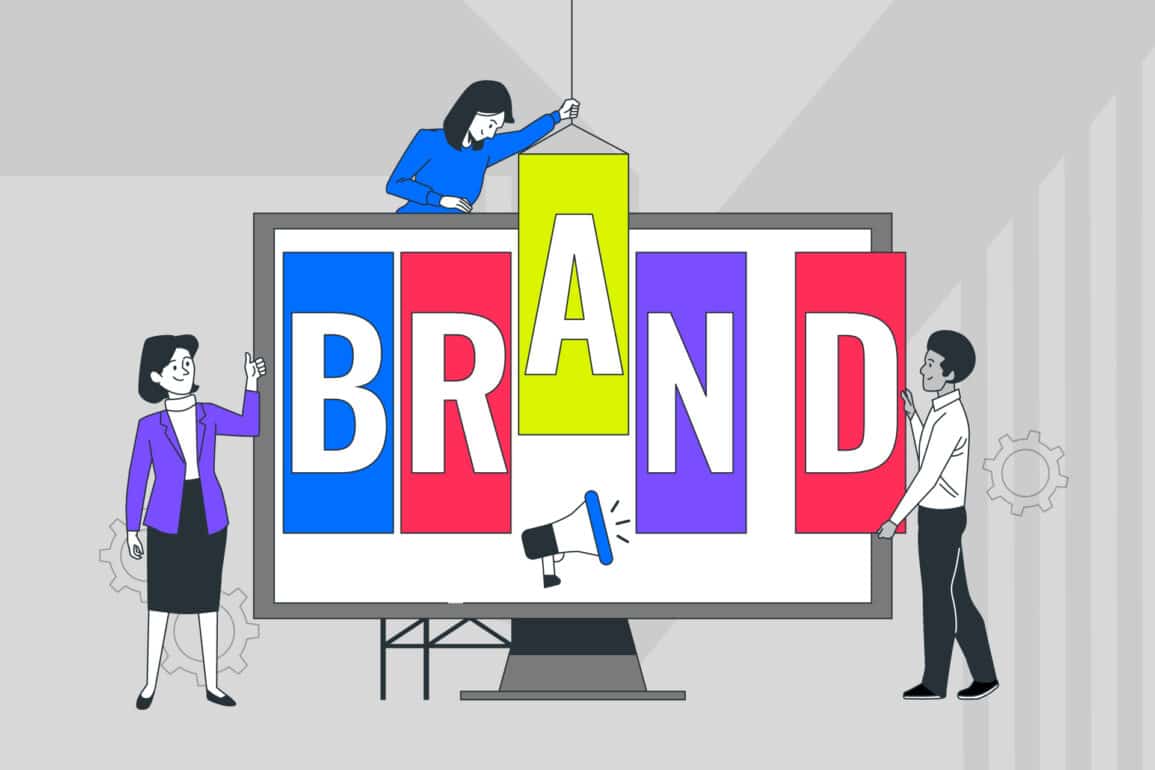


How to create a visual identity system that actually works
Too many visual identity systems gather dust in a shared drive. They’re too rigid to use, too vague to be helpful, or disconnected from the brand strategy they’re meant to serve. The result? Inconsistent executions, confused teams, and a brand that looks different depending on who’s designing it.
A functional visual identity system does the opposite. It brings clarity to decision-making, consistency to execution, and creative freedom within clear boundaries. It’s the difference between a logo and some guidelines, and an operating system that helps your brand perform across every channel, format, and moment.
This guide walks through how to build a visual identity framework that works in the real world—not just in a deck. You’ll learn what makes a system cohesive, why flexibility matters as much as consistency, and how to structure design rules that empower teams rather than restrict them.
Whether you’re building from scratch or refining what’s already there, this is about creating systems that scale with your business.
What is a visual identity system?
A visual identity system is the complete set of design elements, rules, and principles that define how a brand looks and behaves visually. It’s not just a logo or a colour palette—it’s the strategic framework that ensures every piece of design, from a website to a billboard, feels unmistakably part of the same brand.
Think of it as the operating system of brand expression: the structure that keeps things consistent across teams, media, and moments.
Where a brand identity system covers the full strategic and creative architecture of a brand—values, positioning, voice, and visuals—a visual identity framework focuses specifically on the design layer. It’s what allows a brand to show up coherently whether it’s being applied by an in-house designer, an external partner, or an intern updating a slide deck.
Without a robust visual identity framework, even the strongest brands fracture into inconsistency. The framework acts as both a reference and a decision-making tool, answering the hundreds of small creative questions that arise in day-to-day brand work.
Beyond logos and colour palettes
A logo and a palette are starting points, but a visual identity is the connective tissue that brings them to life. It includes typography, image style, layout systems, motion principles, iconography, and the design logic that holds it all together.
These visual identity elements work in concert to create recognition, reinforce meaning, and adapt across contexts without losing coherence.
The strongest systems think beyond static assets. They consider how elements behave in motion, how imagery conveys brand personality, how typography shifts across hierarchies, and how layout principles create rhythm and consistency. Each component has a job to do, and the system defines how they work together to tell a unified story.

Why visual identity systems matter
A cohesive visual identity isn’t about creative control for its own sake. It’s about building a brand people recognise, trust, and remember. In a fragmented media landscape where brands show up across dozens of channels simultaneously, consistency becomes a competitive advantage.
Research into the wider impact of design on business performance shows that companies with strong design practices outperform their peers significantly—not just in perception, but in measurable business outcomes. Insight into how design leadership drives measurable business outcomes reinforces that visual systems aren’t just about aesthetics; they’re strategic business tools.
But consistency without flexibility creates problems of its own. A system that’s too prescriptive becomes a straitjacket—slow to use, frustrating to work with, and incapable of evolving. Teams start working around it rather than with it.
The goal is to create a cohesive visual identity that maintains brand consistency while giving teams the room to adapt, experiment, and respond to new contexts. That balance is what separates a working system from one that’s quietly ignored. When systems feel enabling rather than restrictive, adoption happens naturally.
Consistency builds recognition
Strong visual systems create familiarity, and familiarity drives recognition. When Apple, Monzo, or Spotify show up, you know it’s them before you see the name. That’s not luck—it’s the result of disciplined repetition of core visual principles. Colours, type, layout logic, and image treatment combine to create a fingerprint that becomes instantly recognisable.
Recognition isn’t superficial. It reduces cognitive load, builds trust over time, and makes every subsequent interaction feel more coherent. The more consistent the system, the less work an audience has to do to understand who’s speaking and whether they should pay attention.
In practical terms, this means your marketing budget works harder—every touchpoint reinforces the last, and brand recall compounds over time rather than resetting with each new campaign.
Consistency also builds internal confidence. When teams know the rules, they can move faster and make better decisions without constant creative direction. The system becomes a shared language that helps everyone from product designers to social media managers stay aligned.
Flexibility fuels creativity
The best visual identity systems scale across formats, languages, and channels without diluting the brand. A modular design system allows components to be remixed and reconfigured depending on the application—what works in print adapts for digital, what lands on social translates to signage.
Flexibility isn’t the opposite of consistency; it’s what makes a cohesive visual identity sustainable across diverse contexts.
A scalable visual identity anticipates change. New platforms emerge, audience behaviours shift, and internal teams need to move quickly. Systems built with flexibility in mind empower rather than constrain, giving designers the tools to solve problems creatively while staying within the boundaries of the brand.
This means thinking in principles rather than prescriptions, and building components that can be adapted rather than replicated exactly.
The most effective systems define clear guardrails—non-negotiable elements that preserve brand recognition—while leaving room for interpretation everywhere else. It’s the difference between “always use Pantone 485” and “use red to signal energy and action.” One is a rule. The other is a principle that can flex across contexts while maintaining intent.
How to create a visual identity system that works
Building a visual identity system isn’t a linear process, but it does follow a strategic sequence. The brands that get this right start with clarity—about what they’re trying to achieve, who they’re speaking to, and what makes them distinct.
From there, it’s about translating strategy into design principles, then codifying those principles into a flexible, usable framework. Guidelines for building design systems that scale effectively emphasise modularity, documentation, and real-world testing as core requirements for success.
This isn’t about perfection at launch. It’s about creating something robust enough to guide decisions, flexible enough to evolve, and practical enough that teams will use it. The best systems are never truly finished—they’re designed to grow with the organisation.
Aligning identity with brand strategy ensures every creative choice serves a purpose rather than existing for its own sake, and that the visual work ladders up to broader business objectives.
Start with strategy
A visual identity system should never begin with design. It begins with understanding what the brand stands for, who it’s for, and how it needs to behave in the world. Define objectives, audience, and personality before touching a design file. Without strategic clarity, even the most beautiful identity becomes arbitrary—aesthetically pleasing but strategically inert.
Strategy shapes decisions at every level. Is the brand premium or accessible? Disruptive or reassuring? Global or local?
These aren’t aesthetic questions—they’re strategic ones, and they determine whether you lean into minimalism or maximalism, restraint or energy, tradition or innovation. Your visual identity framework flows from these choices, not the other way around.
This is also where you define the functional requirements of the system. How many teams will use it? Across how many markets? What level of design literacy can you assume?
These constraints shape how flexible or prescriptive the system needs to be, and whether you’re optimising for creative freedom or operational consistency. Get the strategy right, and design decisions become clearer. Skip it, and you’ll spend months iterating on solutions to problems you never properly defined.
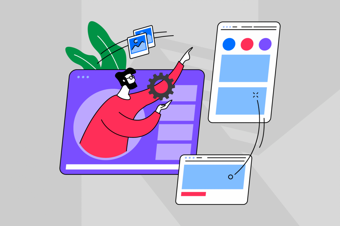
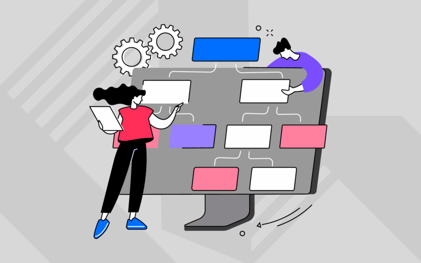
Build your core elements
Once strategy is clear, it’s time to define the building blocks: logo, colour, typography, imagery, iconography, layout, and motion. Each element should reinforce the same story and feel like part of the same system. Visual identity elements aren’t chosen in isolation—they’re designed in relationship to one another, each decision informing and supporting the next.
Colour carries emotional weight and creates immediate recognition. Your palette needs to work across media—on screen and in print, in large formats and small, in isolation and in combination.
Typography sets tone and establishes hierarchy, from headlines to body copy to interface text. Choose typefaces that reflect brand personality but also perform functionally across applications.
A comprehensive visual design system considers how these elements interact, ensuring typographic and colour choices work harmoniously together.
Imagery style communicates values and sets emotional tone. Whether you lean into photography, illustration, or graphic devices, consistency in approach creates coherence. Define what good looks like—composition, subject matter, treatment—and what falls outside the system.
Iconography provides visual shorthand and reinforces personality through style and execution. Layout principles establish rhythm, structure, and the underlying grid that holds everything together.
Motion adds character and dimension, particularly in digital contexts. Even subtle animation can reinforce brand personality and improve user experience. Define how elements enter, exit, and transition, and ensure motion feels purposeful rather than decorative.
The work here is about coherence—ensuring that when someone encounters your brand, every design choice feels intentional and interconnected, not random or piecemeal.
Create design rules, not restrictions
Rules bring freedom, not limitation. A strong visual design system establishes clear principles—how colour is used, how type is paired, how layouts are structured—but leaves room for creativity within those boundaries. The goal is to make good design easier, not to eliminate judgement or reduce every decision to a template.
Think of it as designing the edges, not filling in the middle. You define what stays consistent (brand colours, primary typeface, logo treatment) and what can flex (layout compositions, image cropping, type scale). The system should answer common questions quickly while still allowing designers to solve unique problems.
Flexible frameworks encourage designers to solve problems creatively while maintaining cohesion across outputs. Examples of tools that help maintain brand consistency across teams show how structure and creativity can coexist when systems are designed with flexibility in mind.
Documentation matters here. Show good examples and bad examples. Explain the why behind decisions, not just the what. When teams understand the intent, they make better judgements in situations the guidelines didn’t anticipate.
The best systems feel like a conversation between the framework and the user, not a set of commandments.
Test across real contexts
A system that works in a brand deck doesn’t always work in practice. Prototype and stress-test your identity across the channels and formats where it will live—PowerPoint templates, social assets, print materials, web interfaces, email signatures, merchandise, signage. This is where you discover what breaks, what’s missing, and what needs refinement before launch.
Digital and print consistency matters because brands rarely exist in one medium. Testing reveals whether your colour palette works on-screen and in print, whether your typography is legible at small sizes and across resolutions, and whether your layout system adapts or fractures under pressure.
Real-world application always surfaces gaps that theory misses—colours that vibrate on screen, logos that disappear at small sizes, type that doesn’t render properly in certain applications.
Test with real users, too. Give the system to designers who weren’t involved in creating it and watch what happens. Where do they get stuck? What do they misinterpret? What’s missing that they need?
This feedback is invaluable—it’s the difference between a system that looks good in presentation and one that functions in daily use. Build in iteration time before finalising anything, because the first version is never the final version.
Maintaining your system
A visual identity system isn’t a one-time deliverable. It’s a living framework that evolves as your brand grows, new channels emerge, and teams change. The brands with the strongest systems treat them as dynamic tools, not static documents.
Maintenance isn’t an afterthought—it’s part of the design from the beginning, with clear processes for how updates happen and who’s responsible for quality control.
Without clear governance and a process for updates, even the best systems decay. Elements get misused, new assets diverge from the original intent, and consistency erodes until the system becomes meaningless.
The goal is to create infrastructure around your brand identity system that keeps it relevant, usable, and aligned with where the business is going, not where it’s been. This means treating the system as product, not project—something that requires ongoing investment and attention.
Governance and ownership
Someone needs to own the system. Whether it’s an internal brand lead, a design ops team, or a cross-functional working group, clear ownership ensures quality and consistency over time. Without ownership, systems drift. Decisions get made in silos, exceptions become rules, and the framework loses authority.
Turning systems into practical brand guidelines gives teams the tools they need to work autonomously while staying on brand.
Governance doesn’t mean gatekeeping. It means creating processes that help people use the system correctly—approval workflows, regular audits, accessible documentation, and training for new team members.
Make it easy to do the right thing and hard to do the wrong thing. Build approval processes that are proportionate to risk: high-visibility work gets more oversight, routine applications move quickly.
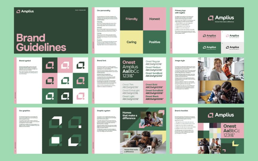
See how we unified multiple brands under one visual system in our work with Amplius, where governance enabled consistency across a complex merger without slowing teams down.
A real-world case study of a large-scale design system in action demonstrates how structure and accessibility can coexist when systems are designed with users in mind.
The best governance models balance control with enablement, ensuring consistency without creating bottlenecks. They also include mechanisms for feedback—ways for users to suggest improvements, flag issues, and contribute to the system’s evolution over time.
Updating and evolving
Visual identities shouldn’t fossilise. Culture shifts, design trends evolve, and brands need to stay relevant without losing recognition. The best systems are designed to evolve—with clear processes for when and how to refresh elements while maintaining the core DNA that makes the brand recognisable. Your visual identity framework should anticipate change, not resist it.
Small updates happen continuously. You add new components as needs arise, refine existing elements based on usage, and respond to new channels or formats. Larger evolutions happen periodically—perhaps every few years—when you assess whether the system still serves the brand strategy or needs more significant revision.
The key is knowing the difference between modernising and starting over, and having the discipline to evolve without abandoning what already works.
Ensuring visual and verbal identities tell the same story means that when one shifts, the other needs to follow—keeping the brand coherent across every expression. Visual and verbal should never feel like they’re coming from different brands. When you update the visual system, check whether the tone of voice still fits. When messaging evolves, consider whether visual expression needs to follow.
This kind of connected thinking keeps the entire brand ecosystem aligned and working together rather than pulling in different directions.

Bringing your visual identity system to life
A successful visual identity system is strategy made visible. It’s what keeps brands consistent without stifling creativity, scalable without losing meaning, and flexible enough to evolve as the business does.
The work isn’t just about making things look good—it’s about building the infrastructure that makes coherent, recognisable, differentiated brand expression possible at scale.
The difference between a system that works and one that doesn’t comes down to strategic clarity, modular thinking, and real-world usability. When those three things align, you create something that teams can use confidently, audiences recognise instantly, and brands can build on for years.
It’s the foundation that turns good design from a one-off achievement into a repeatable, scalable capability.
Building a cohesive visual identity system requires strategic thinking as much as creative execution—see how we approach visual identity development when working with brands at scale.

Clarity starts with a conversation.
Thanks—we’ll get back to you shortly.
Whether you're navigating a rebrand, merger, or simply need a clearer identity—we’re here to help. No hard sell, just honest advice from people who know the sector.
Let’s start with a simple question…
Prefer to email? Drop us a line.
Fabrik’s been helping organisations rethink and reshape their brands for over 25 years. We’ve guided companies through mergers, rebrands and new launches. Whatever stage you’re at, we’ll meet you there.