


Visual identity mistakes that create a faceless, invisible brand (and why yours might be one)

Most brands don’t die with a bang. They fade quietly into the background, victims of their own mediocrity. In today’s hyper-crowded marketplace, invisibility is a bigger threat than failure.
You’ve seen it before: another safe logo, a colour palette that blends into the category, visuals that say nothing new. The brand exists, but it doesn’t register. We call this the invisible brand — faceless, forgettable, and failing to make the impression it should.
Here’s the uncomfortable truth: your brand might be invisible right now. Not broken, not ugly, just… there. Existing without impact.
The good news? Invisibility isn’t permanent.
It’s a problem that can be solved with sharper, bolder, more distinctive visual identity.
What is an “invisible brand”?
An invisible brand is one that technically exists but fails to be recognised, remembered, or differentiated. It’s not that people actively dislike it — they simply don’t see it at all.
These brands occupy the vast middle ground of visual mediocrity, where decent design meets zero personality.
Think of it as brand wallpaper. Functional, inoffensive, utterly forgettable.
The invisible brand phenomenon isn’t about poor quality. Many of these organisations have perfectly competent logos, reasonable colour schemes, and professional-looking materials.
The problem isn’t execution — it’s ambition. Or rather, the lack of it.
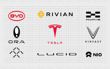
When every competitor chooses navy blue, your navy blue disappears. When every law firm uses the same serif typeface, typography becomes meaningless. When every tech startup adopts the same minimal aesthetic, minimalism stops being a choice and becomes camouflage.
This is where strategic visual identity services become crucial. The goal isn’t just to look good — it’s to look unmistakably like you.

Why brands become invisible
Brand invisibility isn’t an accident. It’s the predictable result of specific choices — or the failure to make brave ones. Understanding these patterns is the first step toward breaking free from them.
Playing it too safe
Safe branding is the enemy of memorable branding. When brands prioritise avoiding offence over making an impression, they guarantee their own irrelevance.
Category conventions exist for a reason, but following them religiously is creative suicide. Every industry has its visual clichés: healthcare loves blues and greens, finance gravitates toward navy and gold, law firms default to serif fonts and eagle imagery.
The result? A sea of sameness where individual brands dissolve into generic category soup.
The irony is that safe brand identity often feels riskier in the long term. While bold choices might initially feel uncomfortable, bland choices guarantee you’ll never stand out from competitors. Safety becomes the riskiest strategy of all.
Consider how many consulting firms look virtually identical — same colour palette, same font choices, same stock photography of people in suits pointing at charts. They’ve optimised for professional respectability and achieved collective invisibility instead.
Visual identity mistakes that kill recognition
Poor brand recognition often stems from fundamental visual identity mistakes that compound over time.
The most common culprit? Inconsistency.
An identity that works differently across touchpoints isn’t an identity at all — it’s a collection of loosely related design elements. When your website uses one font, your business cards use another, and your presentations follow their own rules, you’re not building recognition.
You’re fragmenting it.
Another critical error is treating visual identity as decoration rather than communication.
Logos that say nothing about brand personality, colour palettes chosen for aesthetic appeal rather than strategic meaning, imagery that could belong to any brand in any category — these choices create faceless brands that exist without purpose.
The worst visual identity mistakes often happen gradually.
A new designer tweaks the logo slightly. Marketing chooses different fonts for a campaign. Sales creates their own PowerPoint template. Each individual change seems minor, but collectively they erode the consistency that makes brands recognisable.
Take Minervax, for instance.
Before the MinervaX team commissioned Fabrik, their visual identity suffered from exactly these issues — inconsistent application, unclear messaging hierarchy, and a disconnect between their innovative science and their visual expression.
These common visual identity mistakes undermined their credibility in a competitive market.
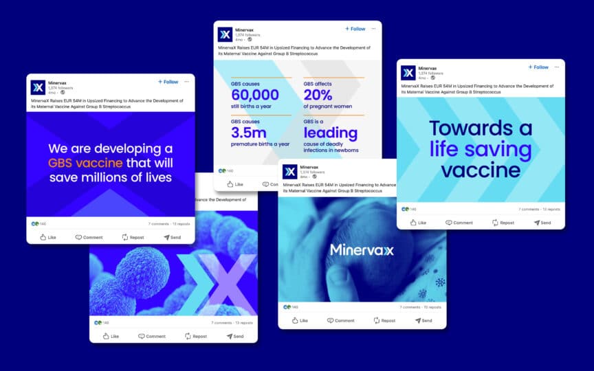
The rebrand transformed them from invisible to unmistakable, with a cohesive system that works seamlessly across all touchpoints.
Forgetting personality
The fastest route to becoming a faceless brand is forgetting that brands are fundamentally human constructs. They need character, voice, and point of view. Without these elements, even the most professionally executed visual identity feels hollow.
Weak branding often results from treating design as a cosmetic exercise rather than a strategic tool. Beautiful visuals that communicate nothing meaningful create the illusion of brand strength while delivering none of its benefits.
Personality-free brands speak in corporate generalities: “innovative solutions,” “customer-focused approach,” “excellence in everything we do.”
Their visuals follow the same pattern — stock photography, safe colour schemes, typography that offends no one and inspires no one.
This approach might feel professionally appropriate, but it guarantees invisibility. When every brand in a category uses the same visual and verbal language, none of them can claim meaningful differentiation.

The impact of invisibility
Brand invisibility carries real business consequences that extend far beyond marketing metrics. When your visual identity fails to register, everything else becomes harder.
Poor brand recognition translates directly into lost opportunities.
Prospects scroll past your content because nothing visual catches their attention. Potential employees choose competitors because your brand doesn’t signal the culture they want to join. Investors struggle to remember which company you are after pitch presentations blend together.
The talent implications are particularly severe. In competitive hiring markets, weak brand identity becomes a recruitment liability. The best candidates have options, and they often choose organisations whose brands suggest interesting work, strong culture, and future growth potential.
Consider the accumulated cost of invisibility over time.
Every missed opportunity to make an impression compounds. Every interaction that fails to build recognition represents wasted investment. Every touchpoint that doesn’t reinforce your unique value proposition is a chance for competitors to claim that mental real estate instead.
The most expensive consequence of brand invisibility might be the premium you pay for everything else:
- When prospects don’t immediately recognise your value, you compete primarily on price.
- When employees don’t feel proud of where they work, retention becomes more expensive.
- When investors can’t quickly grasp what makes you different, raising capital takes longer and costs more.

From invisible to impossible-to-ignore
Escaping brand invisibility requires systematic change across multiple dimensions. It’s not enough to update your logo — you need to rethink how your entire visual system communicates value.
Embrace distinctiveness
Brand distinctiveness isn’t about being different for difference’s sake. It’s about being memorable for the right reasons. The goal is to create visual language that only you could own.
This often means making choices that feel uncomfortable initially.
When Maxa Group needed to signal their transformation from separate companies into a unified powerhouse, safe choices wouldn’t suffice.
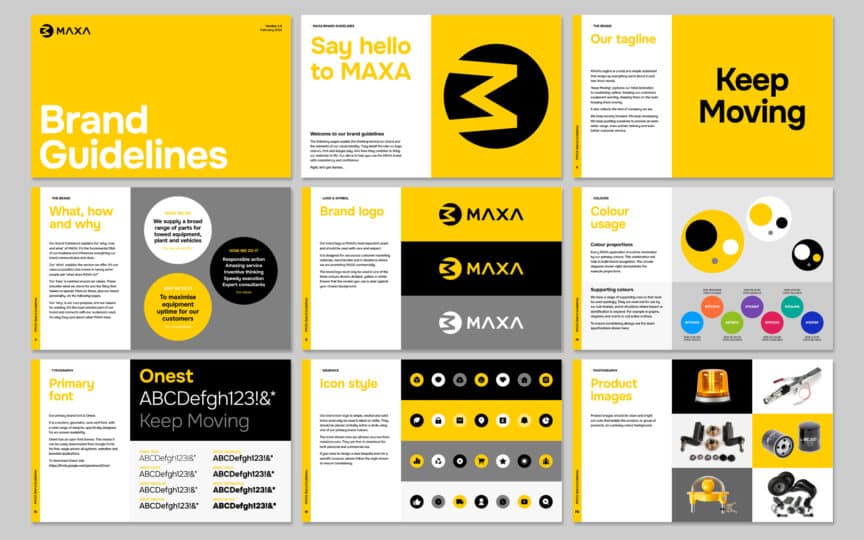
The bold rebrand they chose — strong typography, confident colour palette, systematic approach to messaging — reflected their ambition rather than their comfort zone.
Distinctiveness requires courage.
It means choosing the unexpected colour, the unconventional layout, the font that competitors wouldn’t dare use. These decisions feel risky in isolation but create competitive advantage over time.
The research supports this approach.
Studies from the Ehrenberg-Bass Institute consistently show that distinctive brand assets — colours, fonts, symbols that only you use — drive recognition more effectively than purely aesthetic choices.
Build a flexible design system
Recognition comes from consistency, but consistency doesn’t mean rigidity. The most effective visual identities are systematic enough to maintain coherence while flexible enough to work across diverse applications.
A robust design system includes more than logos and colour palettes. It defines typography hierarchies, photography styles, graphic treatments, layout principles, and tone of voice. These elements work together to create a cohesive brand experience regardless of touchpoint.
This systematic approach prevents the drift that creates forgettable branding. When everyone in your organisation has clear guidelines for how brand elements should be used, consistency becomes automatic rather than accidental.
Without these systems, even well-intentioned teams make visual identity mistakes that fragment brand recognition over time.
The investment in proper brand guidelines pays dividends over time. Clear rules make decision-making faster, ensure quality control, and maintain the coherence that builds recognition.
Inject character and story
The most memorable brands feel like people rather than corporations. They have personality, perspective, and point of view. This character needs to be visible in every aspect of their visual identity.
Character emerges from specific choices rather than generic ones.
- The typeface that feels slightly unexpected and breaks category conventions.
- The colour combination that suggests confidence rather than compliance with industry norms.
- The photography style that reveals authentic culture rather than hiding behind generic stock imagery.
Consider Touching Distance’s transformation. Their original identity said nothing about their innovative approach to crisis communications.
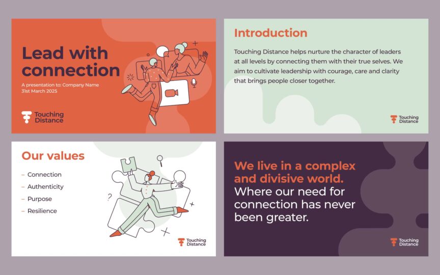
The strategic rebrand created visual language that matched their strategic thinking — bold, direct, and utterly distinctive. Every element, from typography to colour palette, reinforces their unique position in the market.
This character-driven approach requires integration between visual and verbal identity. The best brands ensure their verbal identity align perfectly with their visual expression, creating seamless brand experiences that feel authentically human.

How Fabrik helps brands stand out
At Fabrik, we believe invisibility is a choice. Maybe not a conscious one, but a choice nonetheless. When brands prioritise safety over distinctiveness, consistency over character, they choose to fade into the background.
Our approach to visual identity starts with strategy rather than aesthetics. We begin by understanding what makes you genuinely different, then create visual systems that amplify those differences rather than hiding them.
This process combines creative ambition with systematic thinking. Bold visual choices supported by robust design systems. Character-driven aesthetics backed by comprehensive brand guidelines.
The result is identity that works as hard as you do.
We’ve seen the transformation happen repeatedly:
- Organisations that felt invisible discover their visual voice and begin standing out in crowded markets.
- Teams that struggled to explain their value proposition suddenly have tools that communicate it clearly and consistently.
- Brands that blended into their categories emerge as distinctive category leaders with unmistakable presence.
The secret isn’t more beautiful design — though that often happens. It’s more strategic design. Visual identity that connects directly to brand strategy, supports business objectives, and creates the recognition that drives growth.
Whether you’re launching something entirely new, evolving an existing brand, or navigating complex brand architecture challenges, the principles remain consistent: be distinctive, be systematic, be brave enough to be memorable.
Most importantly, avoid the common visual identity mistakes that turn promising brands into invisible ones.

Time to become unforgettable
Being invisible might feel safe, but it’s the fastest route to irrelevance. Brands that don’t stand out don’t get remembered. And brands that don’t get remembered don’t grow.
The question isn’t whether your organisation has a visual identity. Every brand has some form of visual expression.
The real question is whether that identity is powerful enough to cut through the noise, distinctive enough to build recognition, and strategic enough to support your ambitions.
Invisible brands aren’t accidents.
They’re the predictable result of safe choices, inconsistent application, and character-free design. But they’re also fixable. With the right combination of strategic thinking and creative courage, any organisation can transform from faceless to unforgettable.
The marketplace rewards brands that dare to be distinctive. In a world where attention is the scarcest resource, invisibility isn’t just a missed opportunity — it’s an existential threat.
The key is recognising and correcting visual identity mistakes before they compound into complete brand invisibility.
At Fabrik, we specialise in turning faceless into unforgettable, blending strategy with creativity to create identities that can’t be ignored. Ready to step out of the shadows? Explore our visual identity services and let’s make your brand impossible to overlook.

Clarity starts with a conversation.
Thanks—we’ll get back to you shortly.
Whether you're navigating a rebrand, merger, or simply need a clearer identity—we’re here to help. No hard sell, just honest advice from people who know the sector.
Let’s start with a simple question…
Prefer to email? Drop us a line.
Fabrik’s been helping organisations rethink and reshape their brands for over 25 years. We’ve guided companies through mergers, rebrands and new launches. Whatever stage you’re at, we’ll meet you there.