


Thor logo history: The thunderous journey of the Thor logo
If you’re a fan of superhero movies and comics, then you’re probably familiar with the Thor logo. Even if you don’t know much about Thor logo history, most people have a basic understanding of the famous character, inspired by Norse lore and thrown into the spotlight by Marvel.
The Thor logo history is quite a long and complex one, particularly if you consider the various versions of the symbol introduced throughout the life of the comic series.
Interestingly, the visual identity of Thor as a comic book character is quite different from the one we see in the Marvel cinematic universe, as the movie version has been adapted to appeal to a new audience.
Today, we’re taking a closer look at one of the most famous superhero logos ever and how it has transformed over the years. Let’s dive in.
What does Thor represent in Marvel?
Thor, the God of Thunder, is one of the better-known characters from the Marvel comic book universe. The name of the character, as well as his powers and some of his back story, has been inspired by Norse lore.
Nordic legend depicts Thor, the God of Thunder, as the son of Odin, similar to the comic books and movies we know today.
Some know the Marvel version of Thor as “Thor Odinson.” He’s a “alien” race member known as the Asgardians. Like the Nordic version of Thor, the Marvel character is well-known for his enchanted hammer, Mjolnir, which assists him in channeling his godly powers.
Why did Stan Lee create Thor?
According to Stan Lee, the creator of the famous figure Thor, the character was his attempt to create the biggest, most powerful superhero he could think of. He believed no other superhero could be more powerful than an actual God.
What is Thor’s actual name?
Thor’s name in the Marvel universe is simply “Thor Odinson.” The name follows the Norse tradition of naming children with a surname related to their patronage. Thor Odinson just means “Thor, Son of Odin.” The title comes from the Norse God of the same name.
What does Thor represent in Marvel?
Thor is represented as an infinitely powerful being in the Marvel cinematic universe. However, he’s also depicted as somewhat immature and childish. He’s intended to represent good, honesty, and virtue.
Thor logo history: The Thor hammer logo and other symbols
Marvel’s Thor was first introduced in 1966 and has been associated with several symbols and emblems since then. One of the most common symbols associated with Thor is the image of a hammer. However, there has never been an official “Thor hammer logo” per se.
Thor is often associated with a hammer because of the mythical weapon he wields. Mjolnir was created by the dwarves (similar to the tale from Norse mythology). However, those deemed “worthy” of incredible, god-like powers can only wield the weapon.
The majority of the early editions of the Thor comic books published by Marvel didn’t include an official logo. Instead, like many other comic books of the time, they simply featured a stylized nameplate. Initially, the typeface used for the Thor comic books was relatively rough and rugged.
Over time, this title was stylized to appear more Nordic or “Viking” in nature, with sharper edges and bolder components. Various versions of the Thor wordmark have been introduced throughout the years to coincide with different issues of the comic book series:
1972:
1983:
1993:
1995:
The most recent version of the Thor comic book logo is similar in style to many of the others that came before it. Over the years, the creators of the character decided to remove the “The Mighty” aspect of the logo, to focus on the character’s name alone.
Today’s “Thor Volume 6” logo is a Nordic-style wordmark, depicted in white and black, with blue embellishments resembling stars or sparkles.
Thor movie logos: The Thor symbol in film
While many people may not be familiar with the Thor logo from the comic book landscape, the logos introduced in the cinematic universe are a lot more recognizable. Similar to the designs created for the comic book series, the Thor movie logos generally focus heavily on typography.
As each new movie has been released, the styling of the Thor wordmark has changed, becoming brighter and more enigmatic.
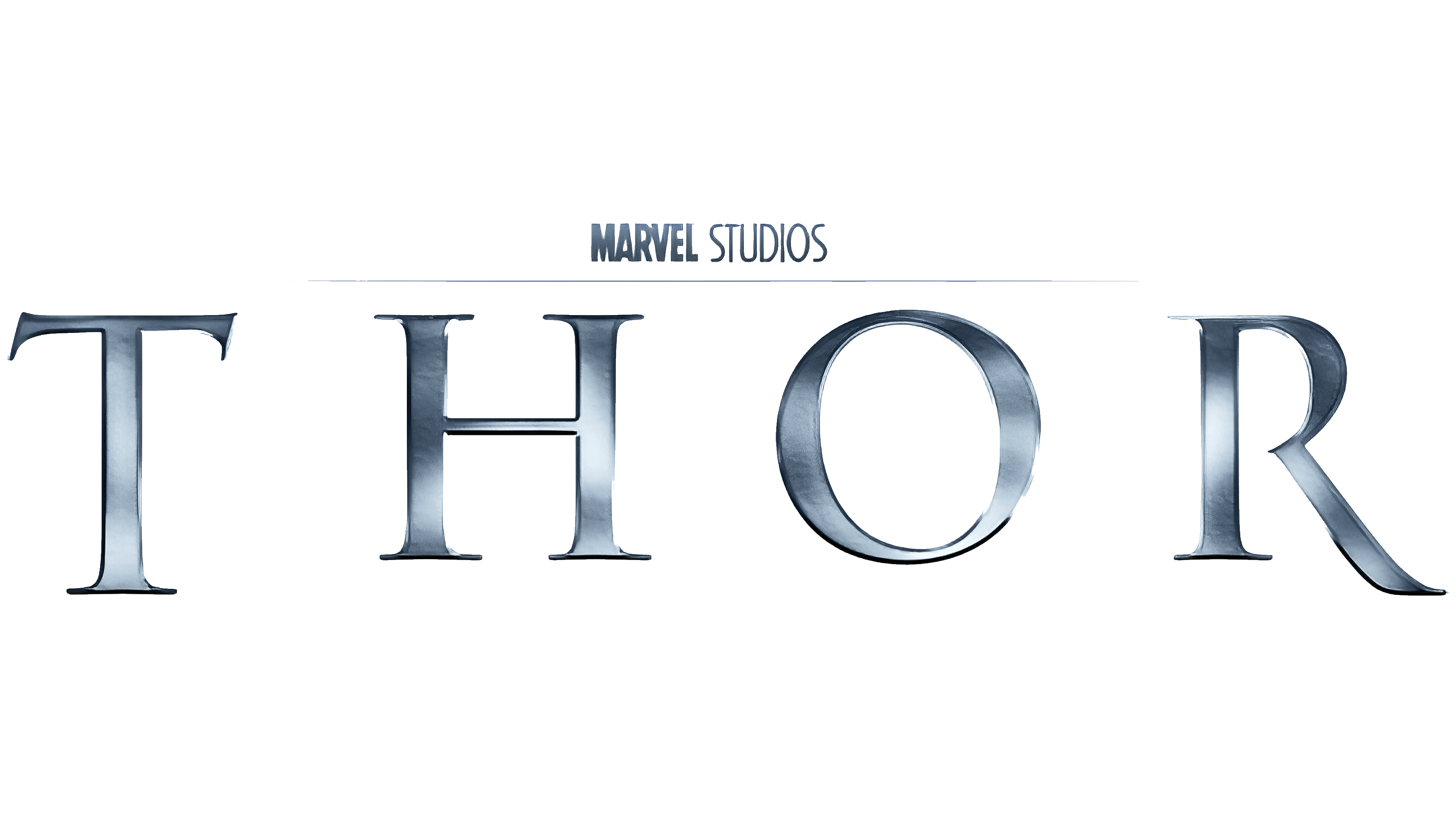
2011: Thor movie logo
The first Thor movie logo was introduced in 2011 for the initial debut film. The artist chose a simple design with metallic-looking letters evenly spaced across the screen. The image is highly minimalistic, yet powerful.
The letters are sharp and elegant, with unique serifs to represent the royalty and strength of the character.
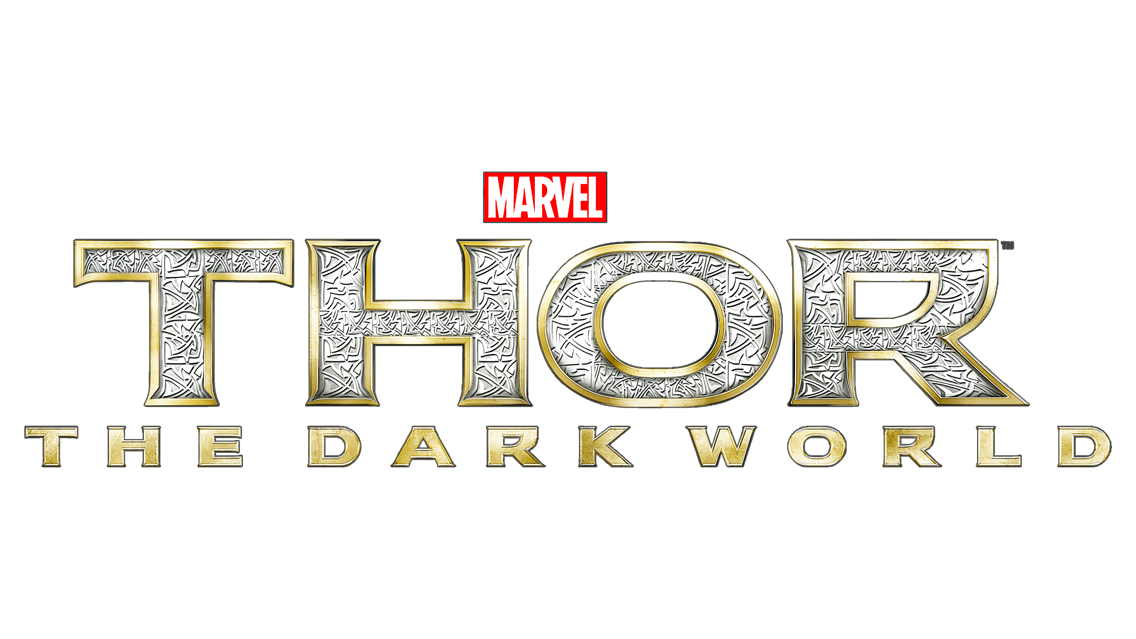
2013: Thor: The Dark World
Thor: The Dark World used metallic colors similar to the previous Thor logo, though we see additional gold elements this time. The design is made to look a little like iron or precious metal. The letters have been flattened on the top as though forged by an anvil.
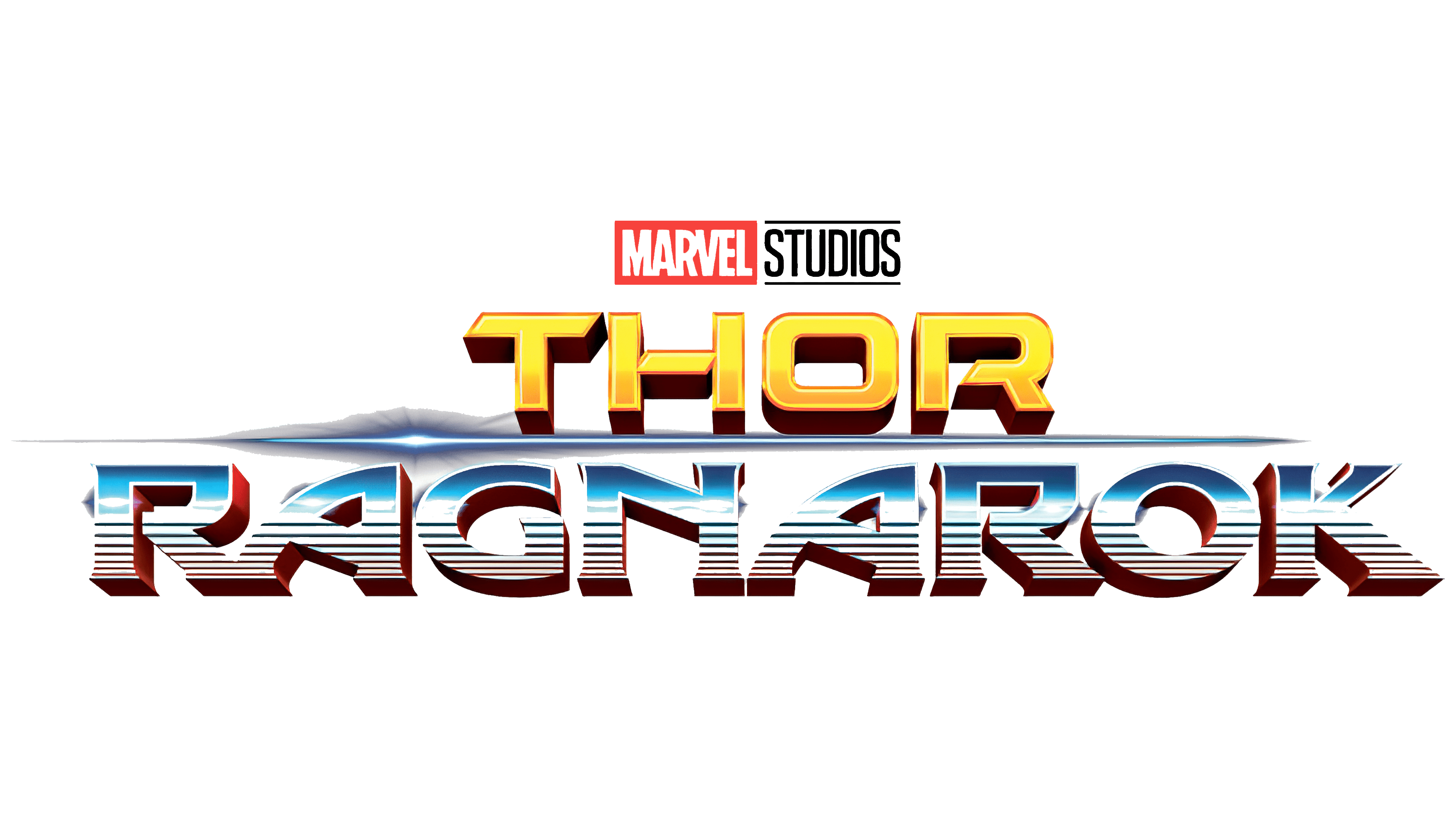
2017: Thor Ragnarok logo
The Thor Ragnarök logo is perhaps the key moment when Marvel started experimenting with the character’s visual image. This image is a lot more colorful than the previous variations.
Here, we see bold, confident letters in a three-dimensional format, as well as a spear of light between the two levels of the wordmark.
At the top of the design, the Marvel Studios logo has also been implemented, using the standard Red, white, and black emblem.
2022: Thor: Love and Thunder logo
The Thor Love and Thunder logo builds on the colorful and eye-catching elements of the previous design, with a slightly more “retro” feel. The design almost looks like something we would expect to see on the front of a rock and roll album.
The glyphs are geometric and bold, with the colors red, white, and blue throughout. There are also small dashes of gold included throughout the wording. There’s a shining star on the T, at the top left, to help draw attention to Thor’s god-like nature.
All of the letters in this wordmark appear to be shining, and they’re all three-dimensional.
The Thor Marvel logo: Colors and fonts
It’s safe to say the visual identity of the Thor logo has changed quite a lot over the years.
The core logo has always been a wordmark in the comic book series and the Marvel cinematic universe. In the cinematic landscape, the Thor logo has evolved from a relatively simple and minimalistic design into something extremely charismatic and complex.
This may have been a strategic decision by Marvel to help highlight the evolution of the character and his unique personality over the years. If you’d like to see some Thor logos in closer detail, you can find some useful resources here:
What color is the Thor logo?
The Thor logo colors introduced by Marvel over the years have been extremely varied. The design for the comic book series and the cinematic universe has embraced virtually every color imaginable, from bright gold and yellow to red, black, blue, and silver.
One color that tends to be missing from the collection is green, which is often associated with Thor’s brother, Loki.
The most recent version of the Thor logo, for Love and Thunder, contains the colors white, blue, cyan, and red, as well as a small amount of gold on the borders of the letters. There’s also significant black shadowing around the 3D glyphs.
What font does the Thor logo use?
Just as the Thor logo has experimented considerably with its color choices over the years, there have also been several different font choices in use. The Thor logo font has evolved in the cinematic universe from a relatively simple serif design to a highly decorative block typeface.
The font for the Thor Love and Thunder movie is known as “God of Thunder.” Alternatively, the font type chosen for Thor Ragnarok is based on Dameron Regular, created by Iconian Fonts. In Thor Dark World, the font in use is similar to Modi Thorson, which was also created by Iconian Fonts.
The power of the Thor logo
The Thor logo is one of the most diverse and versatile we’ve seen in the superhero universe. Unlike many other superhero emblems, Thor’s design has changed drastically over the years, perhaps to appeal to a younger, more varied audience.
One thing has remained consistent throughout the history of this logo, however. Thor’s emblem is always depicted as a strong, powerful wordmark. While many people associate the character with the “Thor hammer logo”, the font makes the Thor logo so compelling.
Fabrik: A branding agency for our times.

Clarity starts with a conversation.
Thanks—we’ll get back to you shortly.
Whether you're navigating a rebrand, merger, or simply need a clearer identity—we’re here to help. No hard sell, just honest advice from people who know the sector.
Let’s start with a simple question…
Prefer to email? Drop us a line.
Fabrik’s been helping organisations rethink and reshape their brands for over 25 years. We’ve guided companies through mergers, rebrands and new launches. Whatever stage you’re at, we’ll meet you there.